Our highlights from Offscreen’s Rebranding Diaries
Around September last year, we received news that Offscreen was crowdfunding for an overhaul. After 15 issues, founder Kai Brach said that the tech-focused magazine and its website were in need of an update that would enable it to grow with its audience. And he promised that anyone who pledged would receive weekly email updates from Melbourne about how everything was going.
The emails offered insight into the nitty-gritty of making a magazine (and its website), which we ate up eagerly every Sunday morning. In fact, the emails were so good that we decided to present our highlights from the 25 or so updates sent between September last year and today. Read on to see the top things we learned from Kai and his publishing adventure…

1. Getting comfortable with a font is like being in a relationship
Kai wrote about collecting sans-serif faces that caught his eye for months before narrowing down to a pool of around 15 to play with (Fontstand or SkyFonts, he mentioned, are helpful tools for trialling a font.) Though he’d been using one typeface for the new website templates, and had grown quite fond of it, he was still not 100% sure until closer to going to print — “It has its ups and downs, like any relationship”.
2. Quick brown fox jumps over the lazy underdog
I loved Kai’s reason for eventually choosing Acumin, the font that shapes the rebrand of Offscreen: “Acumin seemed boring at first. It’s a pretty ‘straight-faced’ sans-serif type with few characteristics that stand out. It doesn’t really make much of an effort to grab your attention or sell itself, and writing this I’m realising that I’m kinda describing myself/Offscreen.”
Though he liked a lot of other fonts, he felt that they could be either too cold or too “amiable” or “friendly” and get in the way of reading long-form text. “Essentially, I was looking for a less cool and overused version of Helvetica.” After running a variety of tests, Kai decided to go for the quieter, lesser-known and less “trendy” underdog.

3. Paper stock: coated vs uncoated
In his email for week six, Kai mentioned the unspoken rule for independent magazines to use uncoated paper. Offscreen itself has always used uncoated recycled stock, but as he came across a particular matte-coated paper, he started to appreciate the more vibrant colours and the crisper text it was able to display. After working with his printer Heftwerk and creating a dummy issue, he decided to go with Cyclus (sold in Germany by Igepa under the name ‘Circle Matt White’), which is a 100% recycled, matte-coated stock.
4. Binding: hitches get stitches
Previously, Offscreen had been perfect bound – a fairly standard binding technique with a layer of glue holding the pages together, strengthened by a flexible cover. But this technique tends to swallow up some of the centre-spread content into the spine, and the magazine doesn’t stay open on its own, meaning it can’t easily be read with one hand.
After researching the Otabind (Layflat) binding and noticing how the spine of the cover can become loose, he settled on a technique called Schweitzer Broschur (Swiss brochure). With this binding method, the pages are only attached to one side of the cover, which can either be glued or stitch-bound, as with Nang magazine. After requesting dummies for both versions, he realised that pages can be easily torn from the glued one, so decided to go with the stitch option with a layer of glue covering the spine.
It’s important to note that even after all of the careful planning, the test magazine didn’t work out as Kai wanted. A myriad of reasons (including glue consistency and air temperature) resulted in the cover not closing properly, and the magazine not staying flat by itself despite the stitch-binding. In the end, Kai worked with his printers to change the paper of the cover and sacrificed the un-exposed, taped spine, to arrive at the final version (below).
5. Finding sponsors when you’re not sales-y
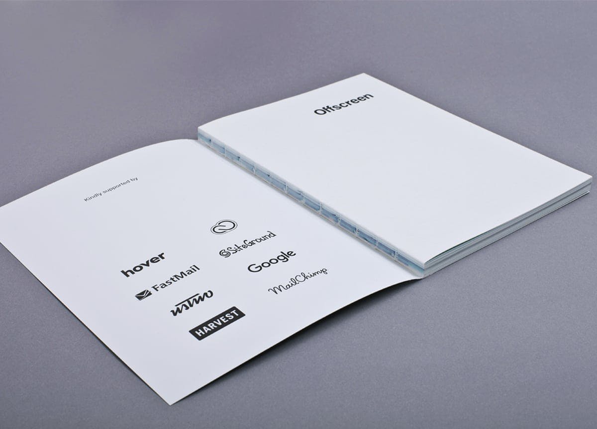
Sponsors and advertisers are an important financial source for independent publishers. Kai admitted to “not being a good salesperson”, so created a “non-cringeworthy” way of describing and selling the Offscreen sponsorship model when emailing potential sponsors. His emails carry a non-pushy, friendly tone, explaining how the sponsor pages in Offscreen differ from normal ads. In the footer of the new site, you’ll see the current list of sponsors that “understand the value of unobtrusive advertising and a great reader experience”, which features companies like Adobe, Google, Harvest and Mailchimp.
6. Juggling the ad space
It was also interesting to learn how Offscreen created the right type of feature space in the magazine for their sponsors. Those familiar with older issues will know their plain, monotone, but spacious advertising pages in a dedicated section. These are surprisingly effective, Kai explained, as readers say that they pay attention to them “not despite being subtle, but because of it.” But long-term sponsors have been asking for more freedom to tell their own stories, so Kai found a balance by now offering sponsors a double-page, yet retaining the minimal, text-only design (below). The magazine’s overall page count was due to increase from 128 to 160 pages, so allowing sponsors more room didn’t change the overall editorial/advertiser content ratio much.

7. Redefining the subscription model
A major reason for Kai’s remodelling of the Offscreen website was to integrate a new subscription system that allows him to offer ongoing subscription plans. This means that during a purchase readers can choose from several subscription tiers depending on how much they’d like to support the publication – from Standard ($20 per issue) to Patron ($50 per issue). Subscribing to Offscreen now means that readers always pay the next issue upfront with their credit card and are then charged on a per-issue basis until they cancel their subscription.
Kai hopes that this will help retain subscribers because they don’t have to come back every year to renew their subscriptions. He described in detail the complexity of building such a multi-tier, infrequently charged subscription model, which, under the hood, hooks into his custom-built order management system. Creating the software that powers the new Offscreen website consumed most of the money raised during his fundraiser, according to Kai.
Offscreen’s Rebranding Diary finished with the launch of the new issue last week. However, Kai promised to send one more ‘closing email’ with a breakdown of costs, showing where the money he received from his backers went.
—
We sent Offscreen to Stack subscribers in 2014 — join our magazine club where we send out a surprise independent magazine each month


