Highlights: QVED 2016 – day one
QVED 2016 is well under way, with an almost sadistically packed schedule featuring talks and panels from some of the world’s most exciting art directors, editors and assorted magazine heads.
Scroll on for our pick of the best bits from day one, and watch out for more highlights posts coming over the next couple of days as we turn our frantic note-taking into blog post form…
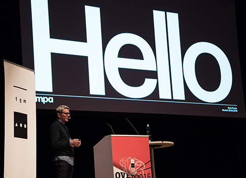
Mark Porter – From print to digital and beyond…
Best known as ‘the guy who redesigned The Guardian’, Mark Porter opened the conference with a keynote speech that gave a brief overview of his design practice, and presenting his method with incredible clarity of thought. For example he showed how his work designing Colors magazine was ‘pure art direction’, with every spread beginning from a sketch, whereas his work for the Guardian focused on creating a system – a set of containers and elements for others to use.
He noted that today, “Every editorial design project is an identity project”, because newspapers and magazines have their content distributed across so many different platforms, so it’s all the more important that they have a clear and recognisable brand wherever people encounter them.
Finishing with a fascinating look at his recent venture into broadcast design, he showed the process that guided his overhaul of Dutch TV news network RTL, and concluded that being a designer today is like being in full-time education; you have to be adaptable and constantly learn new things.

Ibrahim Nehme – The Outpost
A familiar voice of the independents, Ibrahim Nehme presented his work on The Outpost, the magazine of possibilities in the Arab world, and spoke about its background and the challenges he’s faced along the way. Describing magazines as a package of surprises, he showed how they can function as a record of time, as engines of ideas and as laboratories of social action.
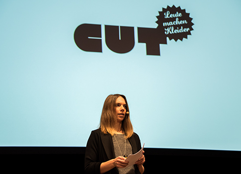
Anke Eberhardt – Cut magazine
One of the German contributions to the first day of the conference, Cut is one of the titles I personally hadn’t come across before. The magazine was started in 2009 as a response to the growing DIY craft movement, and it covers fashion, design and arts, all underpinned by the idea of having fun with what you do – an imperative that comes through loud and clear in the design of the magazine.
They’ve published a range of themed issues that play with ingenious ways of creating artwork (sewing, knitting, hand-painting, etc) but their most recent issue was based on a collaboration with Monotype.
Anke says there was initial hesitation at the idea of a sponsored issue, but she went on to explain the factors that made the partnership a success: First and foremost it was the right fit for the magazine; the editorial team worked autonomously; and there was mutual respect between Cut and Monotype, as well as the obvious benefit of the financial sponsorship. Later on she also talked about the importance of knowing your readership and staying true to them, and ultimately having fun.

Marcroy Smith – People of Print
Print fanatic Marcroy Smith flew in from London to talk about his journey from leaving university to setting up print directory People of Print, which then led to him publishing his own magazines (Print Isn’t Dead and Posterzine) and experimenting with special inks, papers and printing techniques.
In the end, he said, it’s all about doing the things you’re passionate about, following your intuition and embracing the opportunities that come your way as a result.
Nelson Ng – Lost magazine
Nelson’s presentation also told the story of a personal journey, though this one began with him growing up in Singapore and eventually starting travel magazine Lost. He said his early family holidays tended to be quite regimented, being bussed from one place to the next by tour companies, and as a result he wasn’t really interested in travelling.
It wasn’t until he took a two-day boat-trip from Shanghai to Kobe, spent gazing out at the never-ending horizon, that he realised travel is really “an exploration into our inner landscapes”, and the idea for Lost magazine was born.
A travel magazine that leaves the tourist attractions behind, Lost focuses on travel as a means of self-discovery. It’s bilingual, written in both English and Chinese, and it was really interesting to learn Nelson’s approach to designing the magazine; he compared the languages to instruments in a band, and sometimes you want them to play the same melody, but “sometimes you just want one guy to step back so the other can solo”. The result is a beautifully balanced approach to the two languages that doesn’t strive for symmetry across a spread, and instead presents them individually in a way that is both logical and pleasing to the eye.
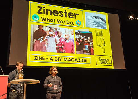
Harrison Thane and Tom Grass – Zinester
Returning home after finishing a project for the Nike Foundation’s Girl Effect in Rwanda, Harrison and Tom realised they wanted go back to Africa, but asked themselves whether they could do it without the corporate apparatus. The result was Zinester, an NGO that works with marginalised groups by teaching them skills to tell their own stories.
For their first project, Harrison and Tom spent six weeks working with children living in the Kibera slum in Kenya, teaching them basic photography and journalism skills. But what began as a citizen journalism project quickly changed into something more creative, when they realised the kids wanted to mix folktales and tall stories with the retelling of their everyday experiences. The result is a fresh, energetic and fantastically exciting piece of zine making.
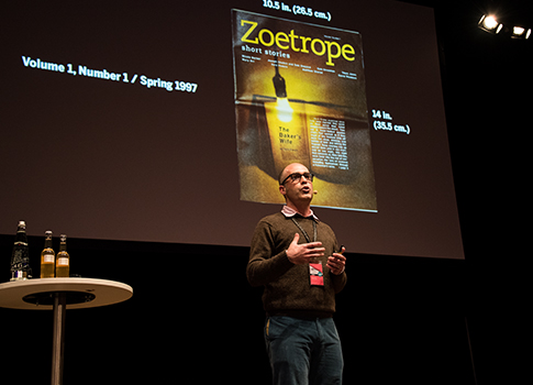
Michael Ray – Zoetrope
Michael Ray might have the best job in the world. The editor of Francis Ford Coppola’s Zoetrope magazine works with a different art director every issue, and has a long repertoire of stories from his time working with people like David Bowie, Zaha Hadid and Wim Wenders. He regaled the audience with his tales of the time Tom Waits insisted on building an issue around photographs of oil stains in car parks, or the time PJ Harvey created the artwork for an issue in between creating her Mercury Prize-winning album Let England Shake.
Of course it’s not all plain sailing and he also spoke about the stress and dogged determination that inevitably comes with the job, but concluded that it has to be worth it to make something so unique.
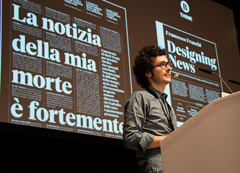
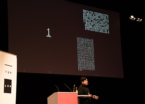
Francesco Franchi
The final talk of the day came from art director, journalist, academic and editorial graphic machine Francesco Franchi. His keynote flew by at breakneck speed, as he zipped from one layout to the next, zooming in and out to show details and draw broader conclusions.
Key to his process is the new approach to newsroom workflow, which he described as “functional hierarchy”, with the editor still in charge but accessible by everyone else in the team. He considers all his visual output on a spectrum from “Utilitarian” to “Arty”, demonstrating the usefulness and immediate aesthetic appeal of the infographics and data visualisations that have made him so famous.
–
Photos courtesy of QVED


