Highlights: QVED 2016 – day three
And it’s over. After three great days of editorial design (and information graphics – more on that below) QVED has closed its doors for another year. Scroll on to see our favourite bits from the final day…

Nigel Holmes
For its final morning, QVED made a quick costume change and became QVIG – Quo Vadis Information Graphics. The first speaker of the day was Nigel Holmes, who began by acknowledging that he probably wasn’t going to be able to deliver on the ambition of the lecture title he’d been given – ‘Meaning and function of dataviz and infographics in society today and tomorrow’.
Instead he used his lecture as a plea that we should not be “dazzled by data”, emphasising that any information must first be checked and edited before it can be used to communicate. Employing a funny and informative selection of examples, he railed against the temptation to put blobs on maps, draw circles around things, colour things in and otherwise produce graphics without any real meaning or rigour.
He then turned to Harry Beck’s iconic and ground breaking London Underground map, the Isotype pictograms and Herbert Bayer’s World Geo-Graphic Atlas as classic examples of clear visual communication, demonstrating the principles he’d argued for.
Paul Blickle – Zeit Online
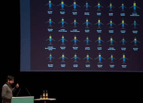
For Paul Blickle, creator of digital graphics for Zeit Online, the key to success is in simplicity and detail. He showed how the interactive team worked to filter complex stories, presenting them in a way that can be easily consumed on a small screen and looking for at least one “aha effect” in each story.
For a story on the number of asylum seekers being deported from Europe, for example, they dug down to present the number of deportees, the countries they were sent to and how much it cost. But the fact that really struck Paul and his team was that the deportations happen via regular commercial flights, and so they based their graphics on the seating plans we all use when we book a flight on a commercial airline. Using this familiar detail, he said, was intended to make something click with the reader, helping the story to resonate with them and stay in the mind afterwards.
Jen Christiansen – Scientific American
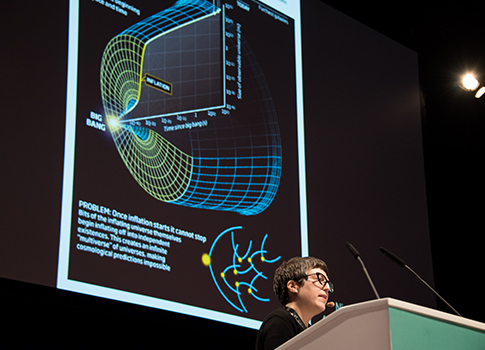
In many ways, the message of Jen Christiansen’s presentation was the opposite of the first two – whereas they had both argued for simplicity and fact, Jen pointed out that before you can even begin to communicate a complex or abstract idea, you must first engage your audience.
As senior graphics editor at Scientific American that’s a challenge she faces on a daily basis, and she showed how she uses figurative detail and “fanciful illustrations” to draw readers into difficult stories. I was particularly interested in this approach when used with hypothetical or unproven theories, and the power of graphics in giving shape and form to phenomena that have literally never been seen before (and probably never will, other than via graphics like the ones Jen and her team creates).
Andreas Volleritsch – Bibel als Magazin
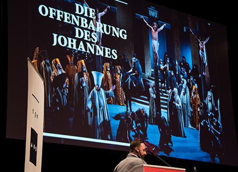
Andreas took to the stage to talk about his award-winning project to turn history’s most bookish book, the New Testament, into a magazine. He spoke about the careful design process that went into it; from text design and typography, to choosing the right image material.
What started out as a personal project quickly started to take up far more time and money than Andreas had planned. Ads were out of the question, so he ended up funding a print run of 30,000 out of his own pocket, but the investment and hard work payed off and the project has sold well around the world, receiving widespread press coverage and multiple awards.
Kirsten Algera and Sandra Kassenaar – MacGuffin magazine
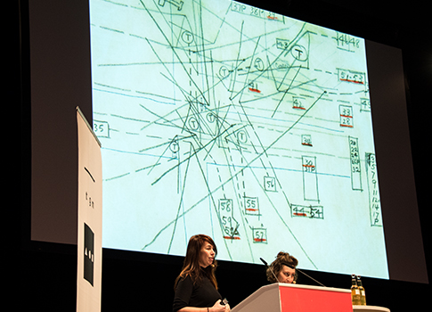
MacGuffin is a term coined by the master of suspense, Alfred Hitchcock, referring to an object used to advance the plot. Often unassuming objects, apparently unrelated to the rest of the story, the cinematic MacGuffin was the inspiration for MacGuffin magazine – an ode to everyday objects and the extraordinary side of ordinary life.
Each issue focuses on one object (the first issue was the bed, the second issue was the window, and next up is the rope) which in turn informs the carefully contemplated design of the issue, and Kirsten noted the enormous amount of painstaking work that goes into making something look everyday and unplanned.
The pair also talked through the process of landing the right covers, including Kirsten hand-writing page after page of ‘MacGuffin’ in a quest to come up with the logo, turning down Wolfgang Tillmans, and a last-minute redesign on the train to the printer.
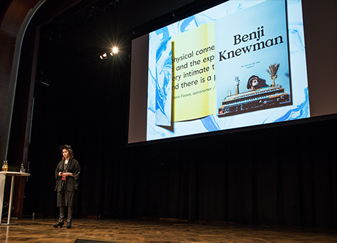
Agnese Kleina – Benji Knewman
Last up of the independents was Agnese Kleina, founder and editor of the Riga-based magazine Benji Knewman – a magazine about how people spend their lives. It’s an inclusive, feel-good magazine that aims to unite its readers though personal stories, to create a space where you can simply be, and to tell the story of Latvia to an international audience.
Agnes spoke about her always-curious approach to interviewing; letting the interviewee lead the conversation, and allowing things to take an unpredictable turn – “because that’s what life is all about”. Similarly to MacGuffin, the design of Benji Knewman is shaped around the stories and people it features. For example in the time after the fall of the Soviet Union Latvia was particularly poor, so for a story on that period they printed on the cheapest newsprint they could find, a reference to the fact that the country’s biggest newspaper once had to limit its print run because of a paper shortage.
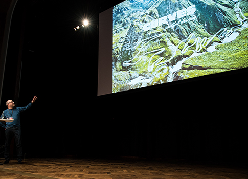
Stefan Bogner – Curves magazine
Stefan told us about his passion for driving and how this sparked the idea to create a magazine dedicated to the most beautiful stretches of road in the world. It’s a car magazine without cars, all about soulful driving, and has a beautifully empty, lonely aesthetic that allows the reader to project their own thoughts onto the landscape.
Without any external budget, Stefan was unable to convince contributors to join him, so he determined to do it himself. Using €10,000 from his own savings, he was able to cover the print bill and had enough to hire a friend to help with the editing, but he took all the photographs himself and became publisher, art director, ad sales manager and editor-in-chief.
It was a inspiring story about following your passion, having a good time, and how persistence pays off in the end. Two years into the project, Stefan has created six issues of the magazine, sold a total of 150,000 copies, and published two books in partnership with Porsche.
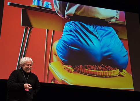
Horst Moser – Introduction to food magazines
One of my favourite presentations last year was Horst Moser’s dive into the visual vocabulary of magazine covers, and this year he turned once again to his vast collection for a wide-ranging survey of cover art.
This time his subject was food magazines, and he began by showing titles from the German mainstream, all of which focused on photographs of food, nicely lit and surrounded by cover lines. Even through the abstraction of the English translation his disdain was clear, but he then switched gears and began a tour de force through the variety and invention of independent magazines.
Beginning with the sexy weirdness of Toiletpaper, he went on to show the many and varied approaches taken by Root + Bone, Rotten Apples, Lucky Peach, Kinfolk, Alla Carta, Smith Journal, Diner Journal, MOOD, Yummy, Sabor, Fuet, Condiment, Doghouse, Meatpaper, Gather, Port, Fool, The Gourmand, Cherry Bombe, Cereal, Fricote, Caffeine, Hot Rum Cow, Noble Rot, Put A Egg On It, Fire & Knives and Modern Farmer.
Of course they’re not all food magazines, and not all of them are still publishing, but he pointed to them as an example of what the mainstream could be doing if it were prepared to be more adventurous.
And that wasn’t even the end of the day’s presentations – after a break several food magazines took to the stage to talk well into the night, but with the translators heading for home I’m afraid we couldn’t follow the German. In fact it’s worth noting that all our highlights posts from the last few days have necessarily left out several talks, just because we haven’t had time to cover them all.
It was another year of excellent presentations and after-hours fun, and we’re already looking forward to returning in 2017. But first, we’re going to get some sleep.


