Printout review
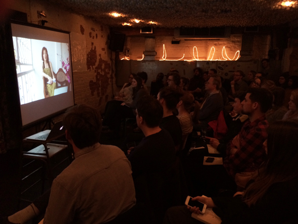
Thanks very much to everyone who came down to The Book Club last night for the first Printout of the year, and of course to all our speakers who made the evening such a success.
They shared their experiences of four very different types of magazine relaunches, but the one thing they all had in common was their dedication to building on what had gone before to create something even better.
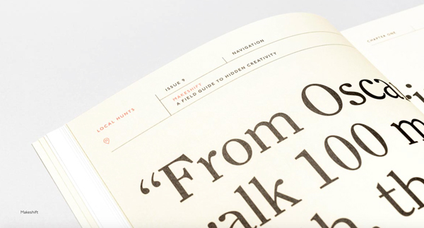
Makeshift
Alexia Liakounakou from Makeshift kicked the night off with her account of the magazine’s transition from “a journal of hidden creativity” to “a field guide to hidden creativity” – a change in focus that guided all parts of the relaunch and informed their three design principles:
1. “Make me hold onto it” – the idea that readers should be able to take the magazine away with them on their own adventures, hence the more compact size of the redesign.
2. “Guide my journey” – the need for readers to be able to move easily through each issue, hence the “navigator” at the top of each page, carrying essential information like issue number, theme, etc, and inspired by the signage at old train stations (see above).
3. “Call from the shelf” – the all-important cover, featuring striking photography that is selected by group vote (a fact that elicited an audible gasp from the art directors in the room).
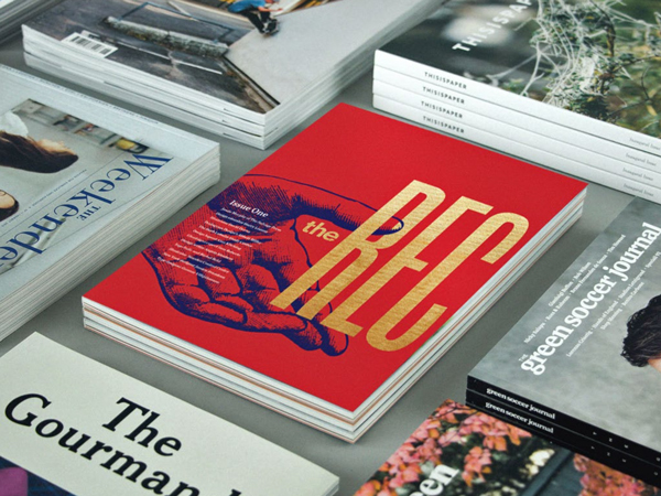
The Recorder
Emma Tucker, editor of The Recorder, spoke about her challenge to revive Monotype’s 113-year-old magazine, and her desire to be provocative and playful, and deliver a magazine relevant to new audiences that may not otherwise engage with the subject of typography.
Unsurprisingly, the cover was the element that she and art director Luke Tonge spent the most time on, determined to find something that would stand out from the crowd but not feel forced. And after hours spent agonising over which foil to choose, looking for something not too shiny, but just shiny enough, a last-minute print emergency meant the printer arriving at her house with a completely different set of foils and asking her to make a snap decision on the spot.
The result, though, is a fantastic magazine that is accessible without dumbing down, and which, in her words, “looks like itself”. They’re already hard at work on the next issue, and from the quick glimpse of spreads she showed, it looks like it’s going to be another fantastic read.
Boat
Erin Spens, editor of Boat magazine, spoke to the room via video from a balcony in Bangkok, where she and the team are currently putting together their next issue. She spoke about the challenges of running a magazine that was started “without commercial intention”, and the steps they have taken to move it in a slightly more deliberately commercial direction.
Design studio She Was Only have been at the heart of the changes, redesigning the magazine to give it more flexibility. The biggest challenge, Erin said, was that they’d always wanted each issue to feel like it came from the city featured, but with some continuity retained. She Was Only addressed that by recreating the masthead as a logo that can be used on its own rather than in the blocky lockup they had before. And they also “lightened up” the design, taking design cues from things like signage in the cities, but keeping it subtle to let the content speak for itself.
I thought the redesign really reinvigorated the magazine, and helped to bring a sense of excitement back to the project that was clearly visible on the page.
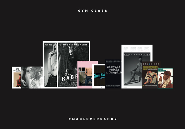
Gym Class
Our final speaker of the night was Steven Gregor, the “editor-in-mischief” of Gym Class magazine. Steven began with the spoiler alert that “I don’t know what I’m talking about”, and then proceeded to give the most virtuoso sweep across not only his own magazine’s continual relaunches, but also the relaunches of several other titles.
Setting out his approach to relaunches, he gave three principles:
No plan
Boredom is bad
Surprise is good
Following that mantra has taken Gym Class through a wide range of sizes and formats, from A5 to A3, across print and digital, and from an “anti-GQ magazine” to the magazine about magazines it is today. Reflecting on the issues one by one he was brutally honest about the things he thought had worked and those that had not, but he noted that through all the changes the one thing that has remained the same is the tone, which has always been characterised by the sense of fun and enthusiasm that is so absolutely his own.
He’d never say so much himself, but it’s the tone that makes Gym Class such a special magazine, and which makes it such a firm favourite with its readers. It’s also the tone that links the printed magazine up so effectively with Gym Class across its various social media, including the incredibly popular Instagram feed of excellent magazine covers.
—
And now you can hear it all for yourself. We recorded the audio for the first time, and as Jeremy says, it’s not perfect, but it’s all here. Let us know what you think…


