
Inside the cover: MacGuffin magazine
The most delightful and surprising independent magazine on the newsstand, MacGuffin recently released its tenth issue. To mark the milestone, we asked co-founder Kirsten Algera to give us a look under the hood of how MacGuffin comes up with its (always fabulous) cover designs.
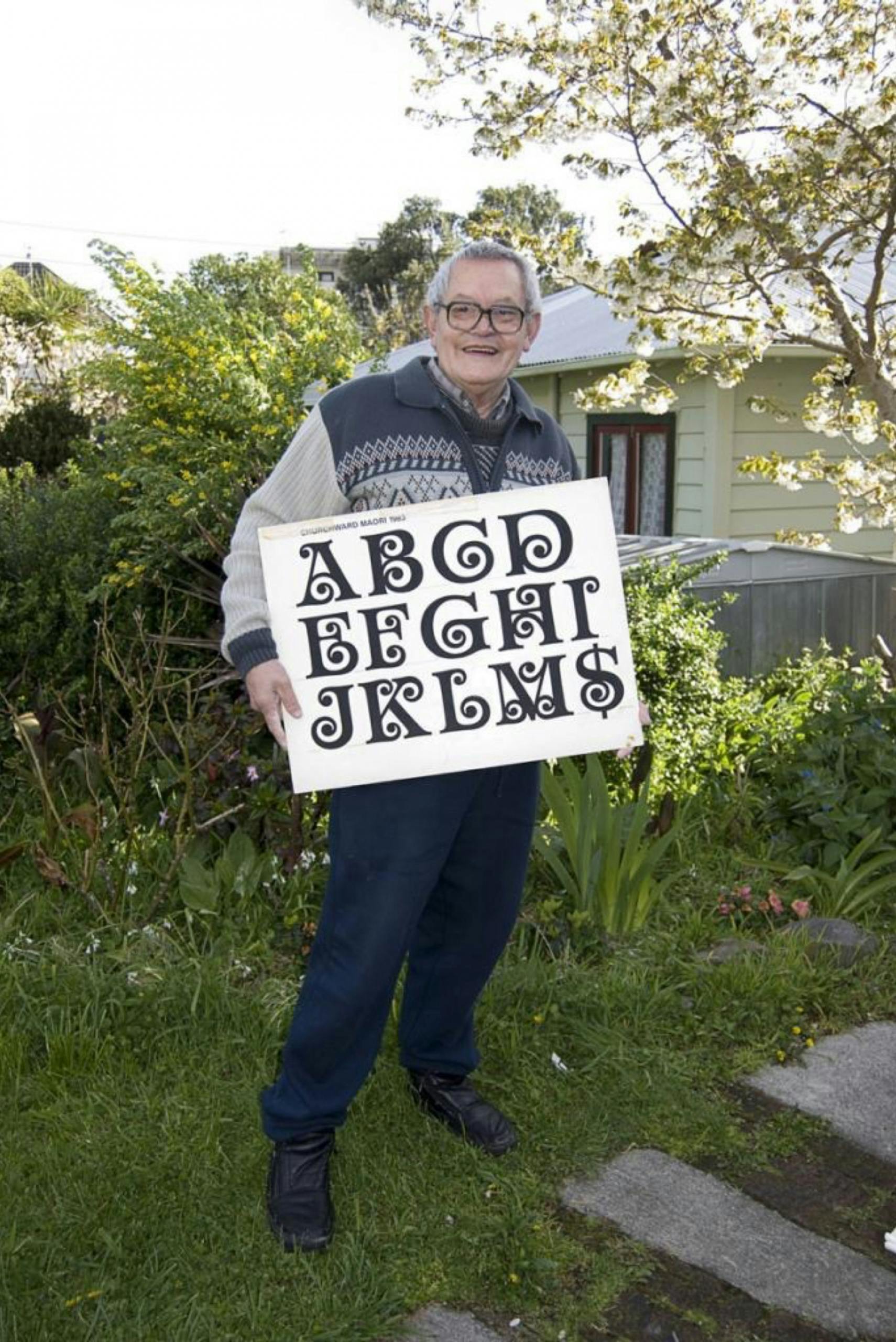
I think the typeface is very important for a magazine. It’s like a voice. You need to have the right tone. Of course, the magazine is not just my project, or Ernst’s project. It’s also Sandra Kassenaar’s, who is our graphic designer. Sandra’s boyfriend had made a book about the type designer Joseph Churchward, which was how we found out about him. He was a very special type designer because he made every single one of his letters — 600 in total — by hand. I think the only piece of electrical equipment he had was a photocopier.
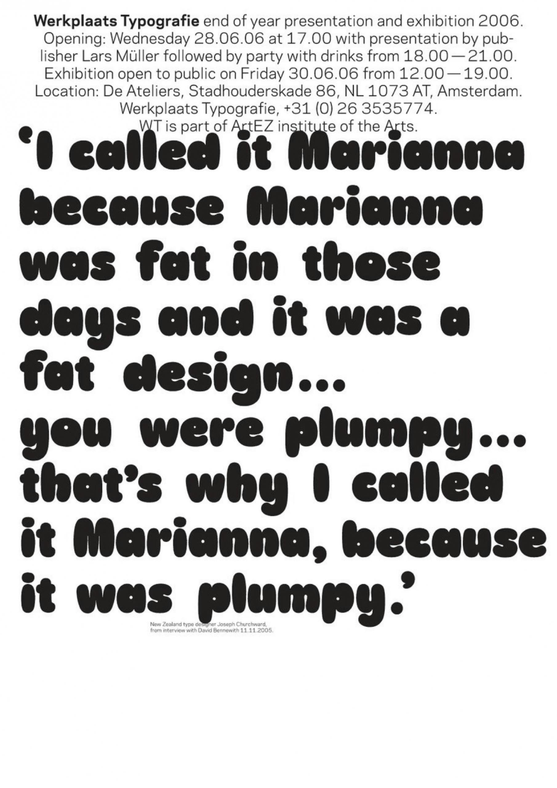
He named the typefaces that did well after his daughters, Georgina, Lorina, Maricia and Marianna, which was his “plumpy” typeface. When I first saw it I thought: this is rather rude, naming a plumpy typeface after your daughter, but Churchward was Samoan-born, and I think “plumpy” is meant as a complement. We loved the fact that he crafted all his typefaces by hand, but also that they were so autobiographical. It was something that we wanted to do with MacGuffin as well. To tell stories that are not only very informative and detailed, but also very personal.

This is a picture of my handwriting. We wanted the hand of one of us to literally be on the magazine. So I had to write MacGuffin about 1000 times.
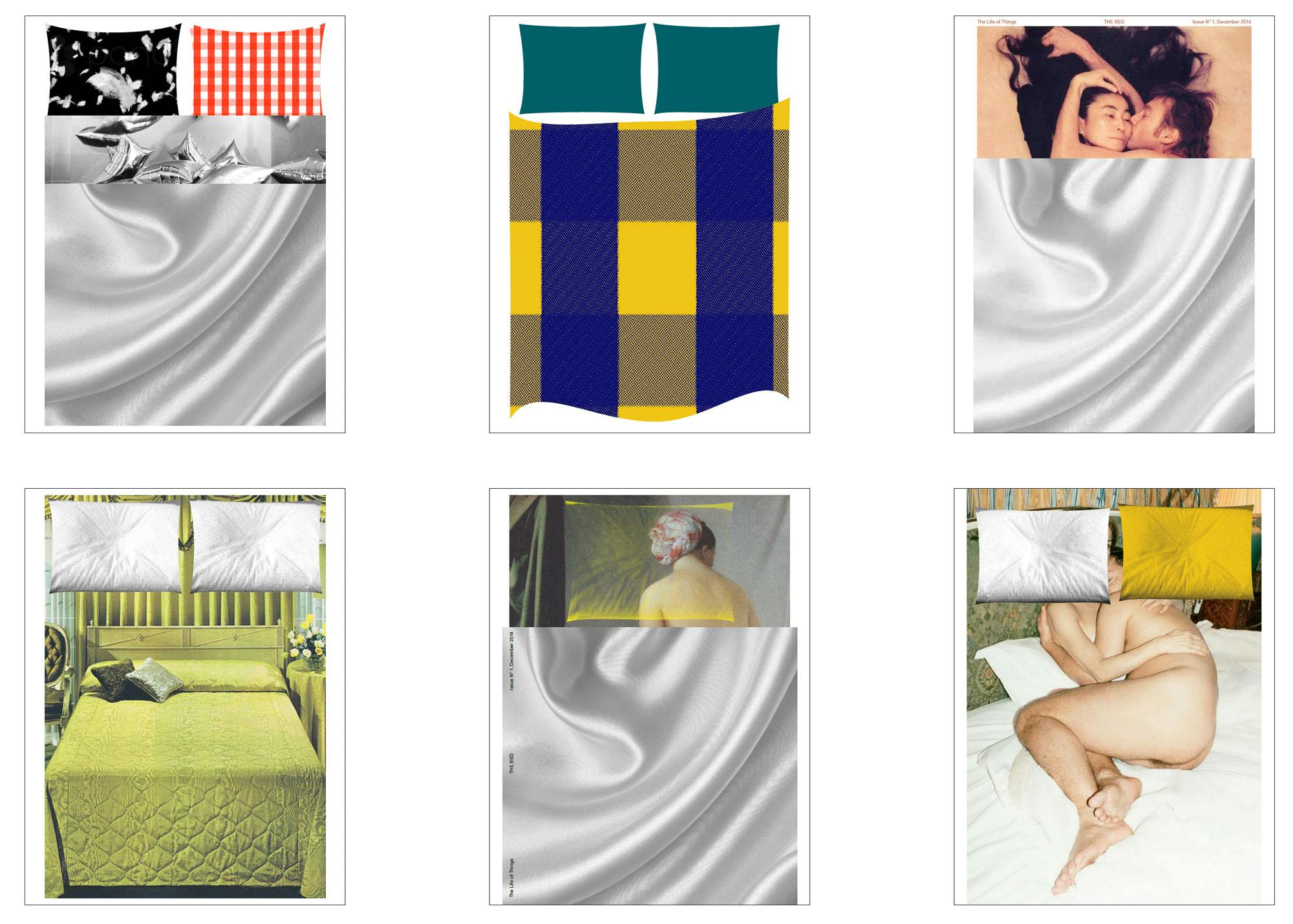
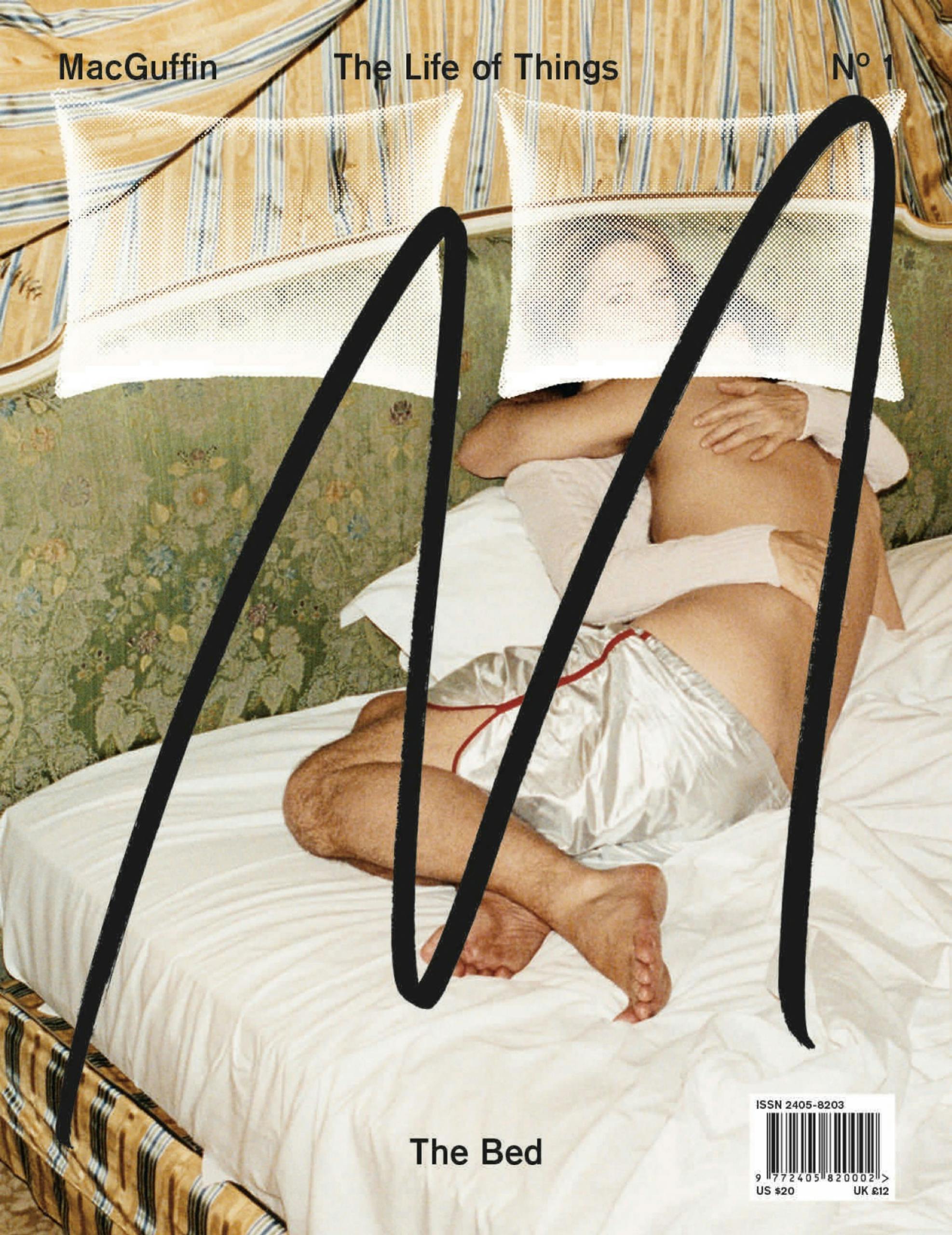
We went through a long selection process with that first cover. At first we wanted to use photos already in existence, so for our debut ‘Bed’ issue we looked at lots of different well known bed images, from the John and Yoko image, to James Bond’s Goldfinger.
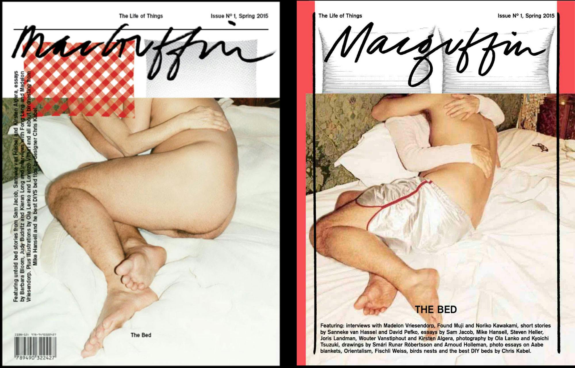
We finally decided on a Juergen Teller photograph of the photographer himself in a bed with Charlotte Rampling. But when we showed it to one of our distributors, he told us that this was impossible because Juergen has visible pubic hair. We would never sell any copies in Asia, for example, with a cover like this.
We thought about that for a long time: should we censor ourselves or not? But finally we discovered that there was also a photograph of Juergen with pants on, so we decided to use that instead.
But we still weren’t completely happy with the cover, and that had to do with my handwriting as well. We were on the train literally on the way to the printer, and we thought: ‘MacGuffin’ written in full is just too long. We need something stronger and more centred, and more iconic. And we thought of ‘La Marque Jaune’ which was a comic from the 1950s where the villain always made a big M.
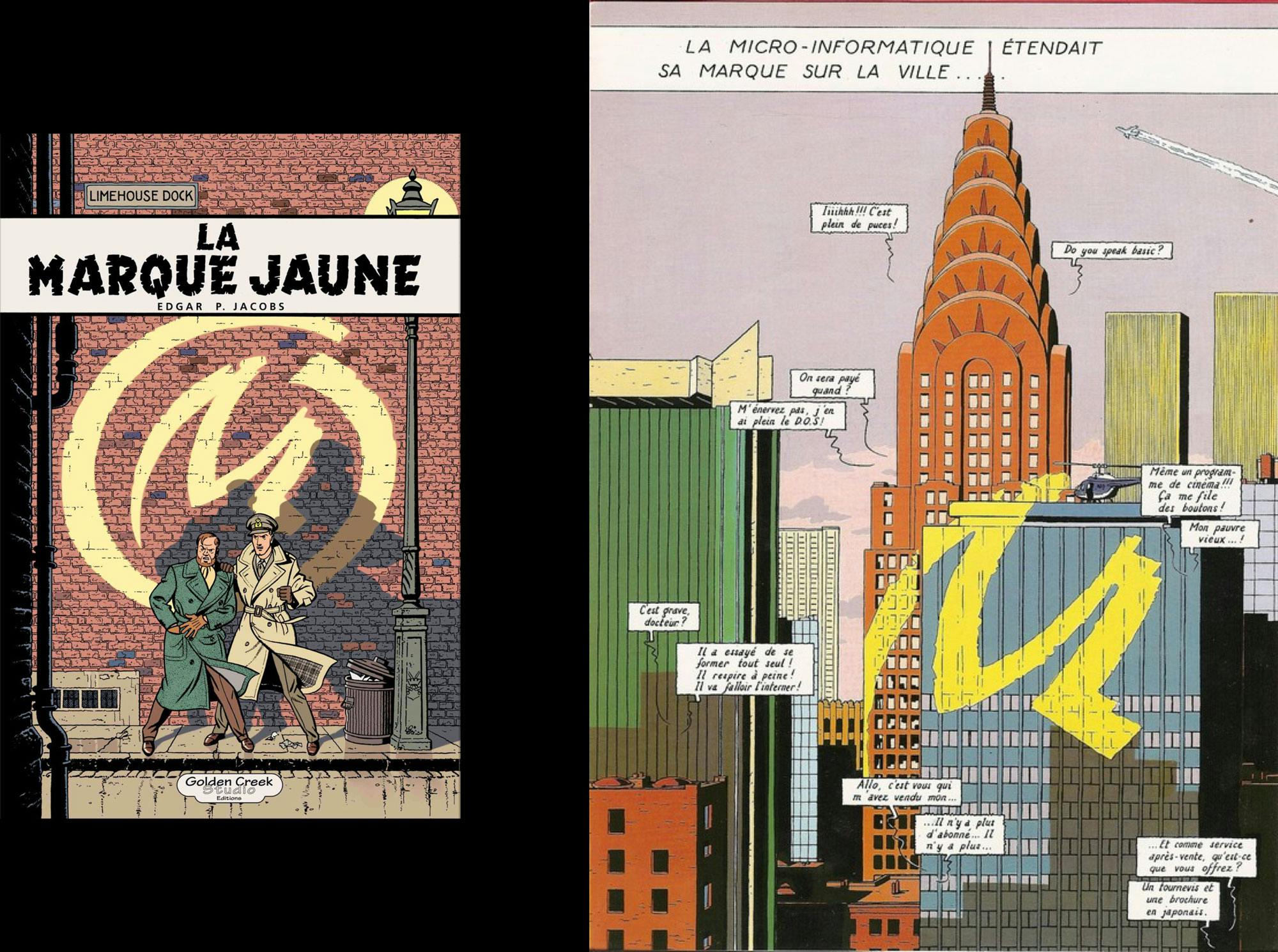
So I drew a big ‘M’ right there on the train and that’s what our final logo became.
After a few issues, we decided to break our rule about only using photographs that already existed, and that worked out so much better, in my opinion.

This is the shoot for the cover of our ‘Desk’ issue, which was inspired by office pranks. Apparently there’s the office prank where you wrap a colleagues entire desk in tinfoil, and we thought, yeah — lets make that the cover!

We covered the whole of our friend’s office in Amsterdam in tinfoil. We wrapped everything. But the final image came out a little cold with all that foil, so we decided to put a human in the frame. Another friend, Alexander, became a model. Mathijs Labadie did the photography.
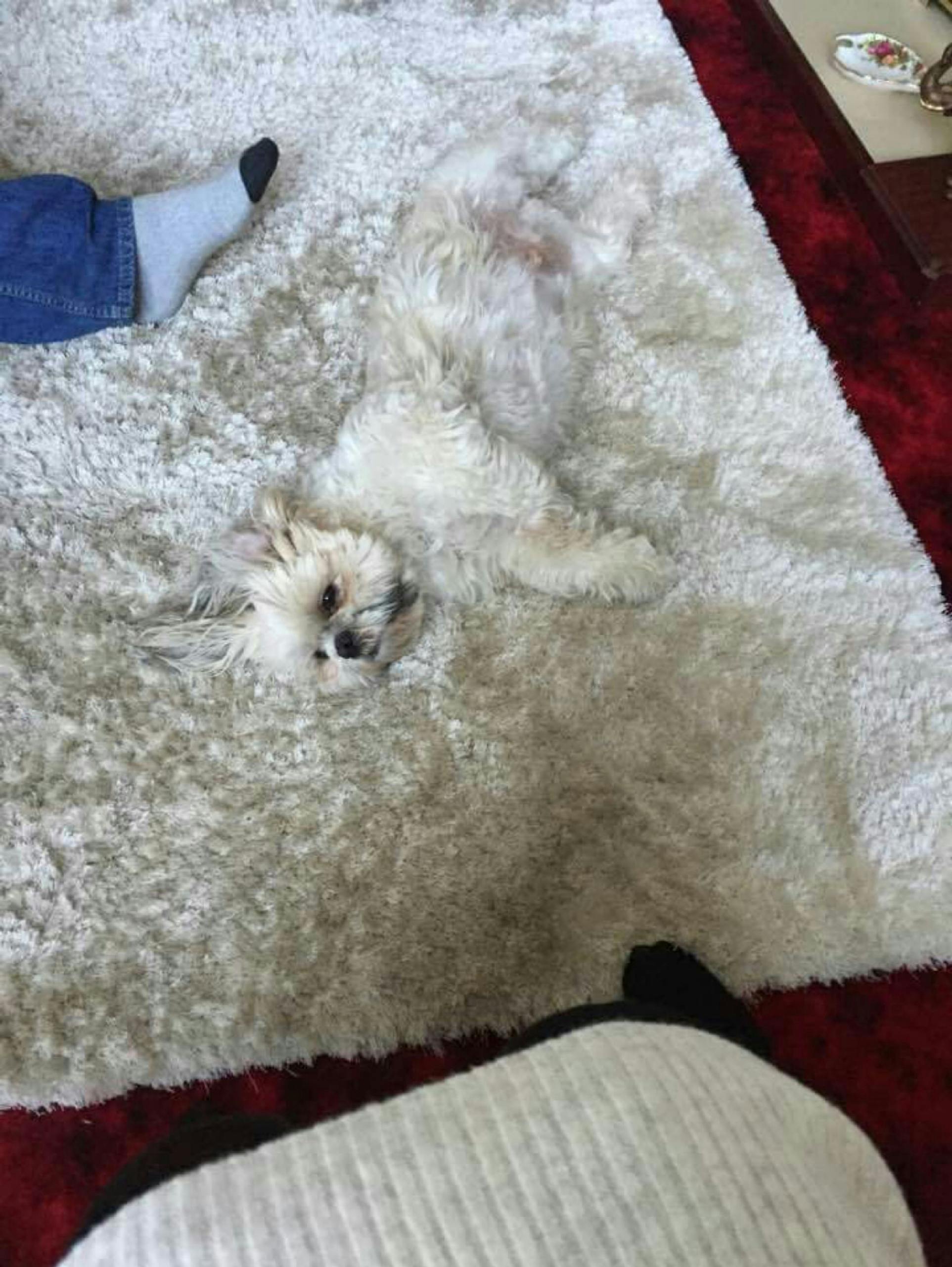
This is the shoot for our ‘Rug’ issue. I found this instagram account of ‘camouflage dogs’, where animals disappear into a rug. The photographers that we work a lot with, Blommers/Schumm, have two dogs called Louis and Mitzi, who became our stars. Sandra went to every single carpet shop in Amsterdam to find rugs that were the exact same colour as the dogs. When I showed the photos to my boyfriend he said: what’s this? A carpet? They completely blended in! I think that cover reflects the way we are connected with objects. It’s not always a serious relationship.

Sandra always adds a little something to the cover to make it look like an object. In the rug cover above you can see she added fringes.
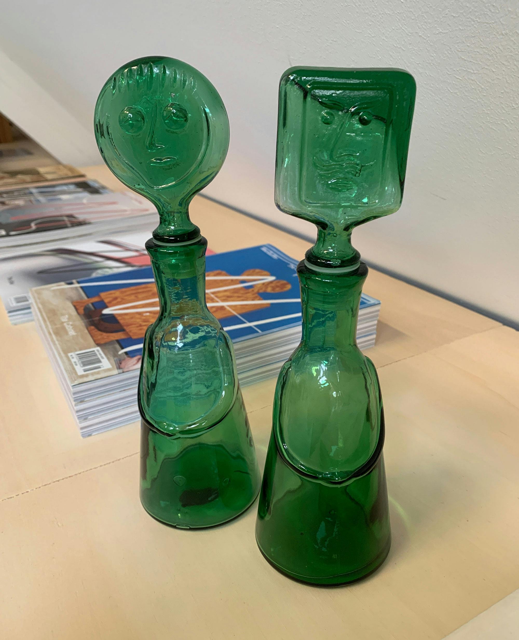
Planning the cover for our latest issue, on the ‘Bottle’, we discovered bottles by the Swedish designer Erik Höglund in a thrift store and we thought they were so funny, so we asked Qiu Yang and Sarah Jane Hoffmann to make a photo session. We love this cover.


