Jean Jullien wraps Wrap
Issue 10 of Wrap launches today, fronted by some very beautiful and very newsstand-friendly cover art by illustrator extraordinaire Jean Jullien.
I first saw the cover a couple of weeks ago when I bumped into Wrap founders Polly and Chris after appearing on Jeremy’s Pick Me Up internet radio hour, and I was fascinated to hear the story of how it came about – so much so that I called Polly up and asked her to repeat the whole thing for the benefit of the blog…
So let’s pick up where we left off – what was the process that led to this new cover?
We’re always reviewing past issues of Wrap and thinking about what worked well and what we might improve. And we noticed that issue eight, which had the mask by Martin Nicolausson on the cover, drew a particularly strong response from readers – people really seemed to like it.
I suppose that made us have another think about the best way to do Wrap covers. We’ve always picked one of the illustrations made for use inside the magazine and edited it to be the cover image, but this issue we went in thinking that we really wanted to make artwork specifically for the cover. We wanted a really strong, clear image that would be more eye-catching, and which would communicate the theme of the issue.
So we had these ideas floating around, and we also knew we really wanted to interview Jean Jullien because we love his work and we thought it would be cool to hear more from him. We’d been kind of secretly thinking that we wanted to ask him to do the cover as well, but we know how busy he is so we didn’t know whether he’d be up for it or not, when he actually wrote to us asking whether we’d be interested in him doing the cover.
It was kind of a dream! His work is so brilliantly strong and recognisable, and it has that amazing impact in its simplicity, so we knew it would be perfect for the cover.
So what was the process like after that? How tightly did you brief him on what you wanted?
We told him the theme of the magazine, which is plants, and explained that we were asking all the contributing illustrators to explore the theme. But we never really set tight briefs, because Chris and I always want illustrators working for Wrap to have as much freedom as possible.
We want them to express their own style, and for Wrap to be a project that they enjoy and maybe use as a way to try something new, or at least don’t feel restricted by a client. Hopefully that way we get the best out of illustrators.
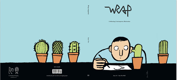
So he sent a couple of ideas through and we developed them for there, but it didn’t take very long to get to the finished cover. The front cover is part of a wider scene, because the image runs all the way around, onto the back cover and two gatefolds as well, so it’s actually a really long image.
We tried lots of different colour combinations and Chris worked quite closely with him to get that right for a really summery, bright, cheerful feel. We’re always aware with Wrap covers that we want them to reflect the time of year and the mood people are in, so that’s why we went for the blue because we felt it was a really zingy, summery colour.
You mentioned the mask on issue eight resonating with people, which I suppose bears a resemblance to the tried and tested tactic of putting faces on covers. How are you hoping people respond to this one?
I think it’s just the idea of connecting with an image and having that experience of getting it straight away. It’s a really simple idea, somebody sketching a plant, and I think that’s easier to connect with than, say, a more complicated image or a pattern.
And it’s fun too – the fact that he added the little eye on the cactus… it could have just been a plant but that wouldn’t have had quite the same feel to it. Adding that one dot to give the cactus an eye suddenly brought it to life.
So looking beyond the cover, what do you have inside that should send people running out to the shops this morning?
Well hopefully our feature on Jean Jullien is a good start! There’s loads of stuff in there – we’ve been pretty busy.
We’ve got interviews with our five contributing artists, all of whose work is amazing. They’ve all made artwork for the wrapping paper and inside spreads, and their interviews are now over two double spreads, which has allowed us space to give a more in-depth look into how they each work.
Go on – give me your personal favourite. Which one do you think is the strongest?
I particularly enjoyed reading Saskia Pomeroy’s interview – she’s great at talking about how she works and she’s just the most amazingly motivated person who is getting out there and doing so much stuff. It was really exciting reading what she’s into, and actually really empowering and uplifting too. She’s an illustrator but she’s doing lots of 3D design at the moment, and she works at Topman, so it was cool to hear about her job designing prints for them.
I’ve admired her work for a while, but that’s the fun thing about making the magazine – we can talk to people whose work we love, and ask them all the questions you want to ask people who you admire. That’s the joy for me of sitting down and thinking about what I want to know from them.