Nothing to see here
Of all the pages in a magazine, there’s one that matters more than the rest. The front cover is tweaked, primped and argued over more than any other, and with good reason — it’s the page that gazes out at customers from the newsstand; it’s shrunk down to thumbnail size for social media profiles; and years from now, whenever you or anyone else thinks back to a specific issue, that’s the single, defining image that will spring to mind.
Or at least that’s normally the case. Because as with any other facet of magazine making, there are exceptions to the rule — particularly in the world of independent publishing, where editors and art directors can do whatever they want, free from the stringent eyes of clients and senior executives. And it seems that when you don’t have to answer to anyone but yourself, sometimes the best way of communicating your magazine’s message is by saying (almost) nothing at all. We’ve gathered eight examples of independent magazines that use emptiness and absence as the core of their cover design, to see what we can read into their blank spaces.


Published in Shanghai, Untitled Folder describes itself as “a Mandarin and English bilingual oriental queer magazine”. When the features director, who goes by the artist name Boihugo, wrote a piece for us on that city’s independent publishing scene, he described his unease at having to hide his sexuality from the authorities. Producing a queer magazine under such a restrictive regime means they need to be careful not to attract the wrong sort of attention, and for Untitled Folder, the blank cover is a way of hiding in plain sight; a pure, inoffensive front that gives no hint of the content inside.
This same tactic is used by several other magazines containing sexual content — see the lovely single colour covers of erotic literary journal Mal, or the deliberately boring exterior of progressive sex magazine Math. But Untitled Folder also added an extra detail; a subtle clue for those in the know, in the form of “a hard cover with a harder spot”, wedged inside the cover’s bottom right-hand corner. As Hugo explained: “The small metal spot between the hardcover and the cloth finishing could be interpreted as a life-sized nipple, as it pretty much looks like one. The more you touch it, the darker it gets.”


As reasons for publishing a blank cover go, running out of time isn’t the most purposeful creative statement. But issue three of Year Zero was released earlier this year with an almost blank cover; just the magazine’s logo appearing on a white page, along with a bullet-pointed list of potential ideas for designs. The magazine’s opening statement notes that it was, “Designed in collapsing time,” and we have to take some responsibility for that — the team was rushing to send the magazine out as our February delivery to Stack subscribers, shepherding it through the final stages of production over Christmas, and then sprinting to get it printed in early January. So we can confirm there was a very real deadline to meet, but it also seems to have presented itself as an opportunity. The issue’s theme is ‘Process’, so this candid opening up of the publishing process functions as a stark introduction to what will follow, and also delivers the bonus of a big, striking, high contrast black and white page.


Published by the Harvard University Graduate School of Design, this clever and ambitious journal was redesigned in 2014 with a cover concept that revolves around a rectangular space positioned above the issue’s theme. Ten issues have been published since then, with varying degrees of blankness, from the plain green of issue 45’s ‘Into the Woods’, to issue 47’s ‘Inside Scoop’, which prints the page’s InDesign grid on the cover. But my favourite piece of almost entirely absent cover design came with issue 40’s ‘Well, Well, Well’, which considers health and the human body, and includes a rectangle printed with thermochromatic ink so that the reader’s own hand leaves a fleeting mark against the plain pink. The current issue of Harvard Design Magazine has been redesigned once again, meaning that its minimal, system-driven covers are now a thing of the past.


A magazine considering feminist perspectives on horror, Suspira has published three issues so far and each one has become progressively more blank, its obscured imagery hinting at things hiding out of sight, and also the suppression of our own darker desires. The magazine moves easily between tones. In the ‘Vampire’ issue, for example, it switches between disturbingly frank conversations about the ‘real’ vampires who actually drink the blood of others, and a fond reminiscence of Buffy the Vampire Slayer. The mirrored cover works well as an expression of this movable feast; at once a kitsch reference to gothic vampire mythos, as well as an inscrutable blank that gives no clue to the nature of the content inside, this is another example of the blank cover as a way of hiding in plain sight.
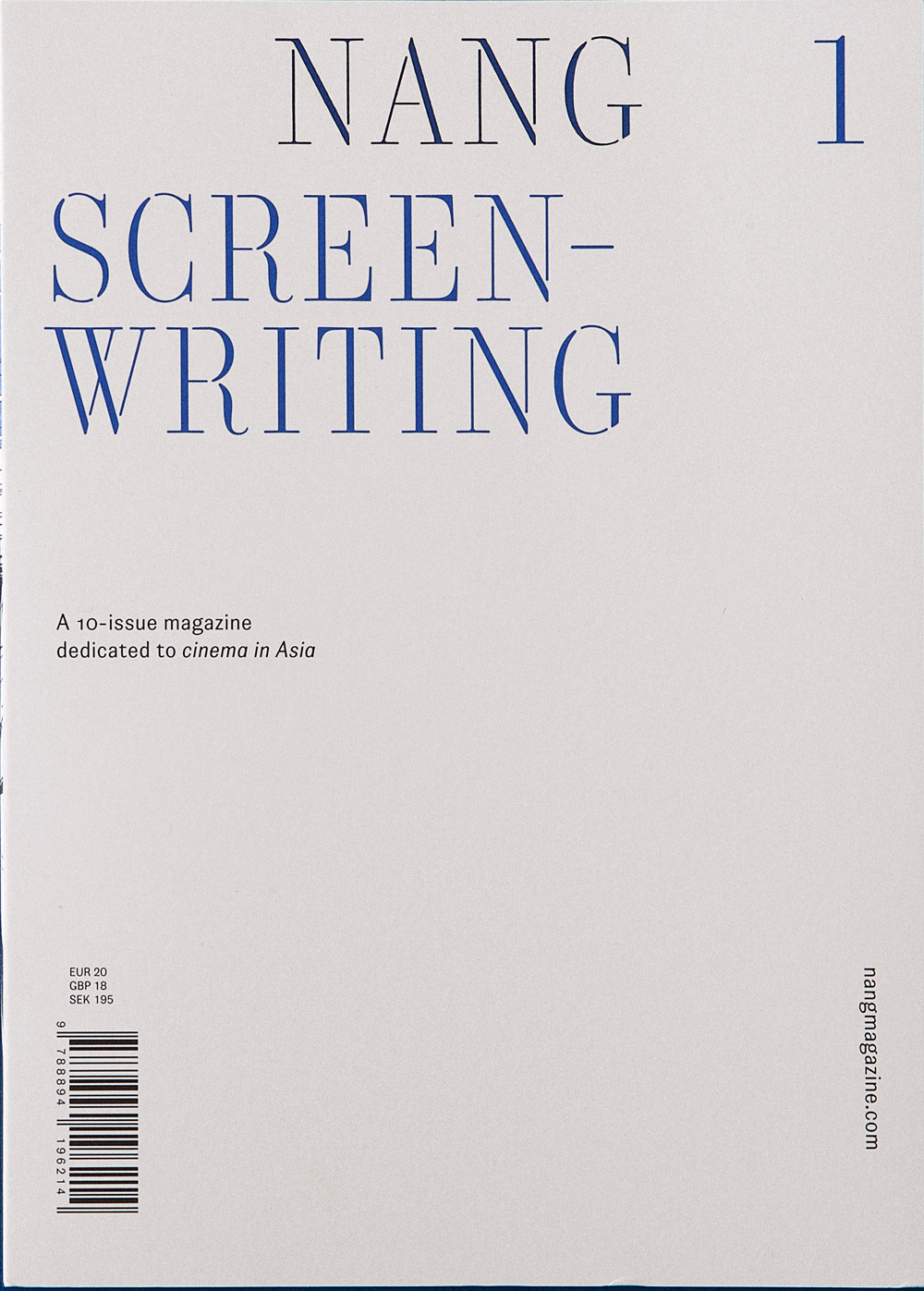


A conceptual, enigmatic magazine about Asian cinema, each issue of Nang delves into the history and culture of moving image in Asia, with a different team of guest editors brought in each time to explore this huge and varied subject. The cover design is an extension of the concept: ‘nang’ is a Thai word for the puppets in shadow theatre, and is also the Thai word for ‘film’, which, the magazine tells us, is “considered as a new incarnation of these theatre performances given that it, too, has to be screened.” Opening the magazine reveals that the masthead has been laser cut out of the cover, a reference to the original shadow theatre, and so to the history of Asian cinema.
The magazine’s stencil-style headline font is explained by this idea of cutting the masthead out of the cover — it calls for shapes that can work in negative space, and the same font is used throughout for headlines and titles. Each issue of Nang takes the same systemic approach to cover design, with the masthead, issue number and theme presented in a single colour, and a simple strapline, website and price information also arranged on the white background. This is the magazine cover as blank screen, waiting to have its imagery projected onto it.


A brilliantly playful fine art photography magazine, each issue of Ordinary picks a different everyday object and challenges artists to create an image using that object. Beginning with the ubiquitous green sponge dish scrubber that can be found in kitchen sinks around the world, the magazine has since created art out of cotton buds, toilet roll tubes and tampons, amongst other things. Each magazine comes with the art object wrapped in a plastic bag and mounted on the cover, an invitation to the reader to go and create their own bizarrely democratised art. The job of the cover in this case is clear; to frame the star of the show with a bold single colour backdrop, drawing readers into the (extra)ordinary photography inside.


The editor’s note to Rueville gives some clue to the thinking behind its stark white cover: “Rueville brings together the clean and contemporary and the raw and rugged, and explores how these themes influence one another.” Featuring skaters, graffiti artists and “the unofficial fourth Beastie Boy”, it’s full of lowbrow art from outside the mainstream, drawing its content from the streets. But these stories are presented in a minimal layout, stripped back to the cleanest, most spare design possible, providing an interesting contrast between style and content. The cover takes that minimalism to an extreme, printing just the magazine’s name and the date it was published, along with a small silver line that runs around the spine to the back cover. This, then, is how editors and designers Jacob and Jack saw the clean and the contemporary and the raw and the rugged influencing one another… with one clear winner emerging on the cover.


Pecan
For most of the magazines in this list, exploring a concept or aesthetic is more important than the straight up practicalities of selling copies, but even in the present company, Pecan stands out. Printing the surnames of contributors you’ve almost certainly never heard of, in a spot varnish you almost can’t see, is deeply impractical cover design. But then that’s probably the point, as extrapolated from the magazine’s mission statement: “We are not a practical guide to a place. Think of us, instead, as a roaming print documentary series, with each instalment introducing a city through visions of its inspired inhabitants.”
The first issue set off for Paris to capture an alternative side of the iconic city, with illustrations and photographs that focus on unloved suburbs and pedestrian laundrettes. It was intended as a triannual publication, visiting a different city each issue, but this is the only one I saw and I think the first issue might also have been the last.
Discover more strange and beautiful magazines – sign up for our surprise monthly delivery