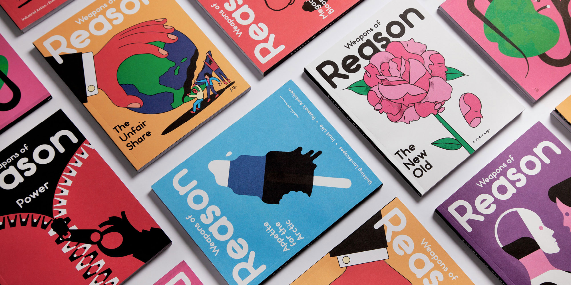
Picturing change with Weapons of Reason
Conceived in 2013 as a magazine to change the world, Weapons of Reason focuses on a different global challenge each issue, and over the years it has tackled pressing problems around subjects like food, megacities, inequality and power. The plan from the outset was that the magazine would run for eight issues, and while the last edition is about to hit shelves, the team is busy working on the next phase of the project.
Launched on Kickstarter a few weeks ago, the Weapons of Reason book collects and updates a selection of the best articles from the magazine alongside new material. Of course the themes already explored by the magazine remain evident, and here they’re unified by the single problem of short-term thinking, which the book argues is the greatest obstacle to real, lasting progress.
If you’ve seen the magazine before you’ll know that Weapons of Reason is renowned for its use of illustration, which is bold and always strikingly simple. So to mark the launch of the book, we asked creative director Paul Willoughby to talk us through six of his favourite illustrations from the project so far.

Arctic issue cover – Adrian Johnson
“This was the very first illustration we commissioned for Weapons of Reason. Working with Adrian Johnson was a big deal for us: we wanted someone that we’d worked with before and that we trusted to help nail the conceptual approach of the mag on its first cover. We had a vision to approach difficult subjects in a disarming, almost playful way — making incredibly scary and complicated world problems seem approachable and relatable. The simple use of saturated blues and black and white on the ice lolly give the piece an iconic, graphic immediacy. The piece encapsulates how countries and companies are exploiting the oil of the region, whilst the ice melts around them. It would work equally as well as a postage stamp as it would a magazine cover, a principle we often try to adhere to.”
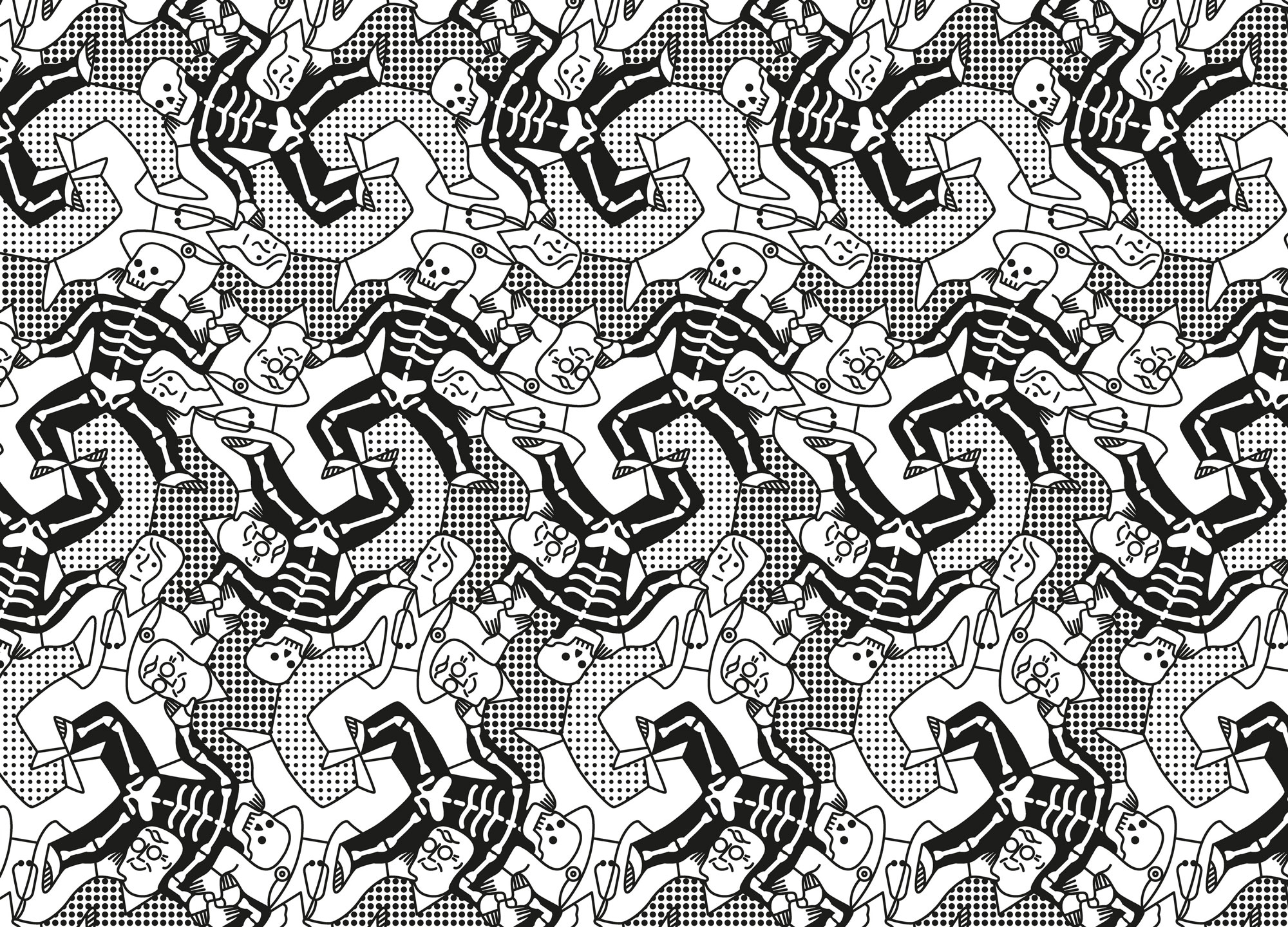
Ageing issue pattern — Mei Stoyva
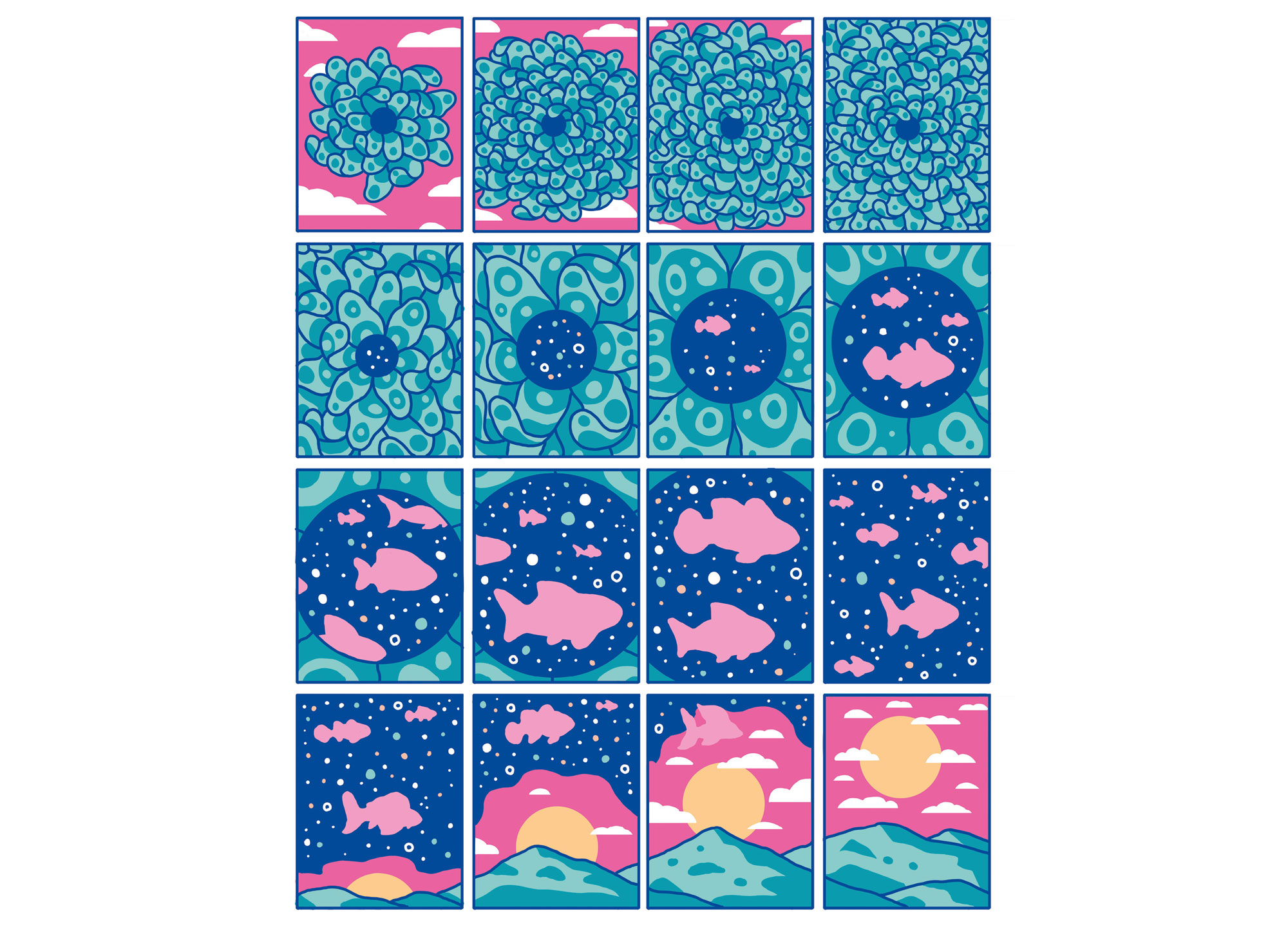
“We’ve always loved elaborate endpaper patterns as a beginning and end to our magazines, and Weapons of Reason is no exception. Throughout our eight issues, we featured endpapers that take the great, symbolic forces at work in the issue and tesselate them into a seamless, Escher-esque pattern in strong black and white. This pattern, from our Ageing issue, intricately shows three dynamic elements at play: the dance of death, a human trying to escape it, and the doctor employed to help them cheat death. It’s phenomenally hard to get three separate graphic elements to tessellate perfectly, so props to Stoyva for pulling this off with such skill.”
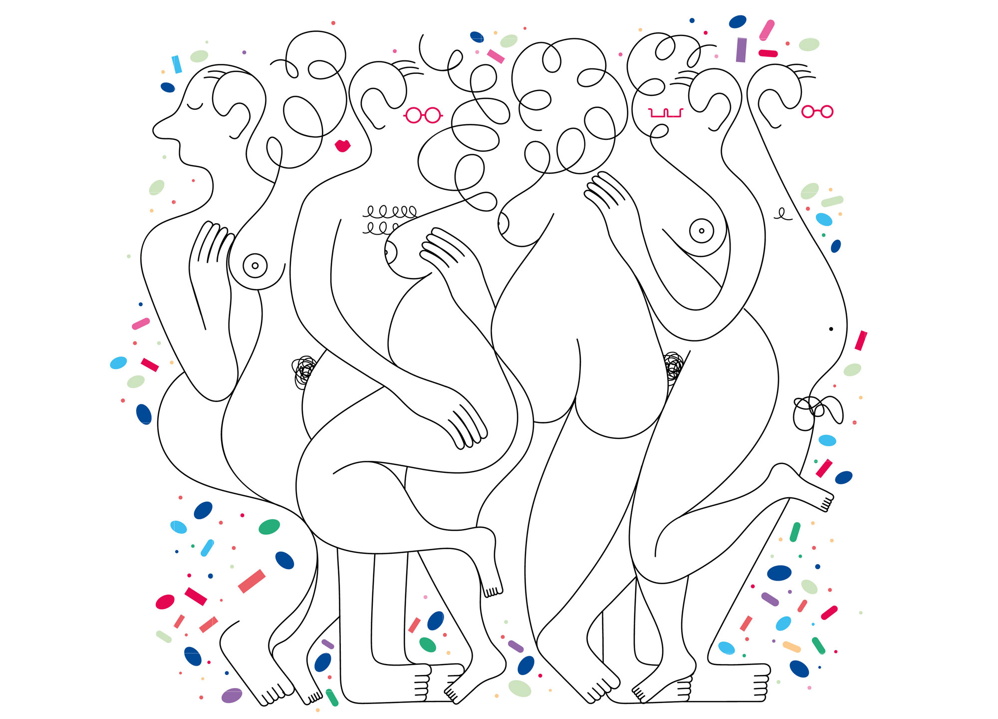
Sex in our 60s — Jonathan Calugi
“This is one of the most fun commissions I worked on, but also the most difficult. It’s a playful look at older people having sex well into later life. The story spoke of the high rates of STDs in care homes due to the promiscuous practices of the residents, and the lethal cocktail of drugs they are downing to achieve such feats. Calugi was the perfect illustrator for this — his loose and flowing style blends an orgy of elderly folks, whilst keeping the tone upbeat and celebratory. This illustration has definitely attracted the most chuckles during the keynote presentations we’ve given.”
Culture Clash — Evan Cohen
“Evan Cohen turned up on our radar quite early on in his career, and we immediately fell in love with his work. He’s pioneered a distinctive method of showing a subject changing state, evolving, or blending into new forms using a sequential comic book cell approach. In this piece, he shows how aquaculture can complement and combine with certain crops, creating an ecosystem of symbiotic growth. Even further, he shows us how everything in nature is deeply connected: that a healthy ecosystem relies on the interconnectedness of its many parts to thrive. Having seen the large-scale destruction that monocultures can wreak on a landscape, this illustration was a real eye-opener for me — giving beautiful form to a hard to communicate subject.”
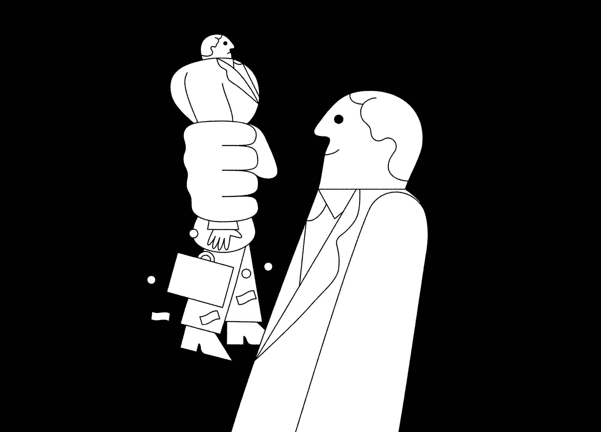
You are the Product — James Graham
“I greatly admire James Graham’s work for using the most simple, reductionist shapes to land a powerful idea. This illustration shows the conscience-free strength of huge corporations as a kind of tragic comedy. The ‘suits’ depicted exist to squeeze revue out of whatever falls within their giant reach, all in service to their shareholders and the bottom line.”

Two Tribes — Timo Meyer
“This illustration tackles the rampant tribalism at play in contemporary mass media, where polarisation, fear-mongering, and fake news run rife. I love Meyer’s use of a simple, contrasting colour palette, with shapes that overlap, intersect, and blend. The effect is disorientating and clashy; it heightens our sense of anxiety and drama around the subject. It also echoes how the media feeds our addiction to sensationalism. The mouths of the two figures are depicted as smartphones — the device through which we all now view news. We were delighted when this was shortlisted for best editorial illustration in the World Illustration Awards.”
weaponsofreason.com
kickstarter.com/projects/humanafterall/weapons-of-reason