Shortlist: Art Director of the Year
We have been going through the Stack Awards shortlists for 2017 and taking a closer look at the individual titles. Today, we’re singling out the magazines from the Art Director of the Year category, which will be judged by Debbie Millman, host of Design Matters, and Will Hudson, the founder of It’s Nice That. Keep reading to see the 15 magazines that made the cut…
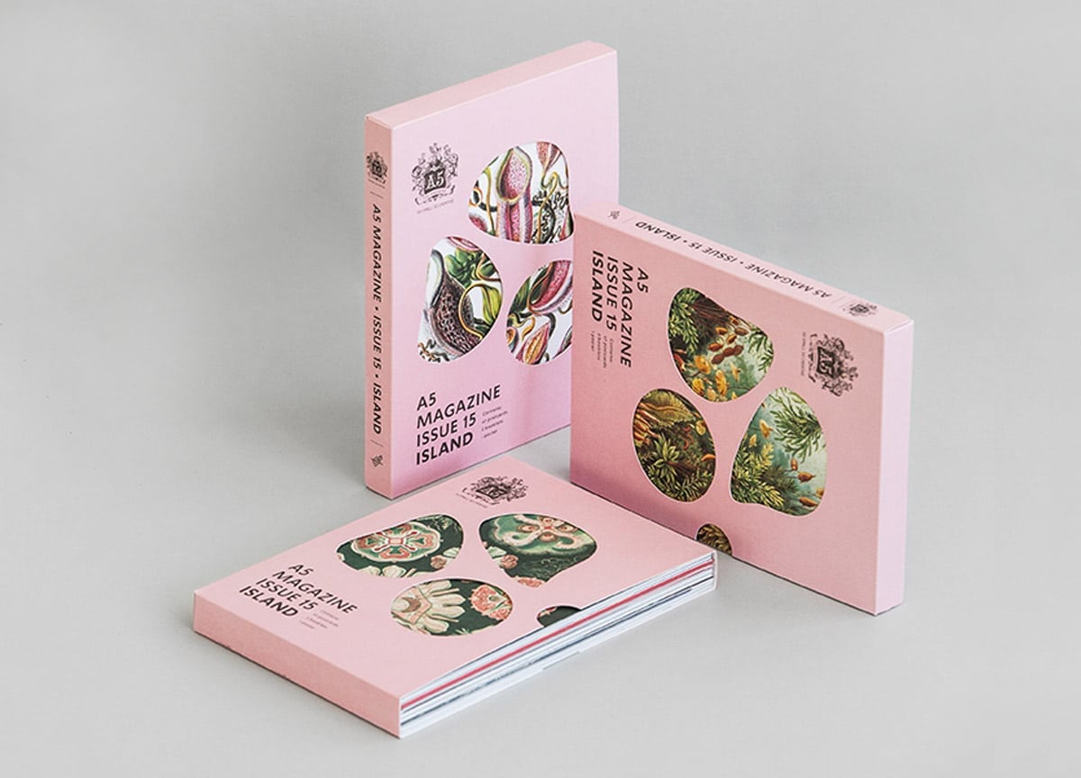
A5 | Tel Aviv | Golan Gafni & Keren Gafni & Tali Green
Like a themed exhibition you can hold in your hands, A5 contains a collection of loose prints that reimagine what form a ‘magazine’ can take. Their latest issue explores ‘Islands’, and is made up of 47 postcards, one folded poster and two booklets.
Benji Knewman | Riga | Madara Krievina
Packed with charming stories from Latvia, Benji Knewman is one of those magazines that will show you people and things you wouldn’t come across elsewhere. This most current issue sees a redesign that blends the style of books and magazines from 1960s-80s Soviet Latvia with the aesthetics of Instagram in 2017.
Double Dagger | Cheltenham | Pat Randle & Nick Loaring
This carefully handcrafted, 16pp newspaper is made entirely via an analogue process. Find out more about their masterful technique, and the way they employ hot metal characters on a 1970s printing machine in our Q&A with the editors.
Elsie | Cheshire | Les Jones
Covering photography, illustration and found typography, Elsie shows an array of some of the most exciting “visual stuff” that’s out there at the moment.
Chuffed to say that @elsiemagazine #5 is now here! 128 pages of visual eclectic-ness. Get your copy here: https://t.co/OJyQ9YiDD9 pic.twitter.com/gdkRn2Ff0S
— les jones (@elsiemagazine) September 11, 2017
Esopus | Brooklyn | Tod Lippy
Esopus is an epic volume of artworks that gives you an immersive experience not unlike going to a museum. From pullouts to CDs and interactive DIY sections, this is a carefully considered, truly engaging piece of print.
#summer #esopus24 pic.twitter.com/zfSpXqA2cy
— Esopus (@esopusmag) June 18, 2017
Hello Mr | Brooklyn | Qingyun Zhang & Ouliana Ermolova
Now in its 9th issue, Hello Mr. is standing up for more inclusive, relevant content for the LGBTQ community. Their new Magazines in Residence project, which champions up and coming LGBTQ publishers by offering mentorship and including their publications in issues of Hello Mr., is the physical manifestation of that ethos.
History Today | London | Holly Catford
It’s a tough task to make history feel fresh and exciting, but the guys at History Today seems to have done it with this current redesign. Apart from a more journal feel, so it stands out from other titles of its genre in the newsstands, they also saw distinctive typefaces and full bleed images for their main features.
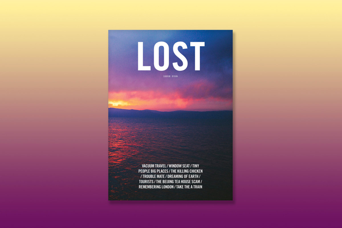
Lost | Shanghai | Nelson Ng
Lost is a travel magazine interested in the journey of self-discovery. They seek personal stories of curious individuals who have experienced ‘epiphanies’ in unfamiliar environments, compiling their reflections into a beautiful stitch-bound magazine.
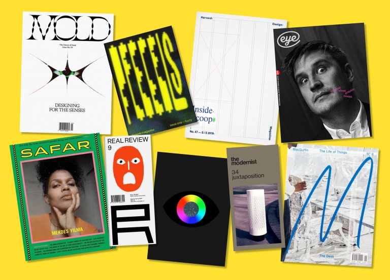
MacGuffin | Amsterdam | Kirsten Algera & Ernst van der Hoeven
MacGuffin is a design magazine that obsesses over one single thing for each issue. Previous instalments have seen studies on the bed, the window, and the rope, and their submitted issue is a fanatic exploration of the sink.
Migrant Journal | London | Isabel Seiffert & Christoph Miler
Throughout this issue of Migrant Journal, silver inks were subtly integrated into the photography and typography, dancing in the light as pages were flicked. The publication about migration also features tactile covers and an iconic custom typeface.
Mold | Brooklyn and Montréal | Eric Hu & Matt Tsang
A magazine about the future of food, Mold is interested in the value of good design. This ethos permeates throughout their publication, where bold graphics and metallic inks guide readers through the stories.
Mold Magazine wants you to care about the future of food
→ https://t.co/4G7Mw1CPaX pic.twitter.com/9LqqTIiS1G
— StackMagazines (@StackMagazines) October 17, 2017
Sabat | London | Cleber de Campos
The mysterious, occult world of Sabat shines through their inventive print designs. Messages are hidden in the magazine’s spine, while quotes can be felt on subtly embossed pages — this is definitely magazine that rewards readers who are curious and attentive.
Sofa | Berlin | Studio Yukiko
Exploring “tantalising, terrifying, and taboo subjects”, Sofa magazine’s latest issue discussed cultural phenomenons like cyber romance and online activism. Their style is chaotic and stimulating, making the reading experience utterly absorbing.
Special Request | London | Paul Sethi
Making an issue all about the television, Special Request employed visually rich elements that does more than hint at the cultural significance of the subject in the 90s. Their pixel font and deliberately grainy imagery are just two examples.
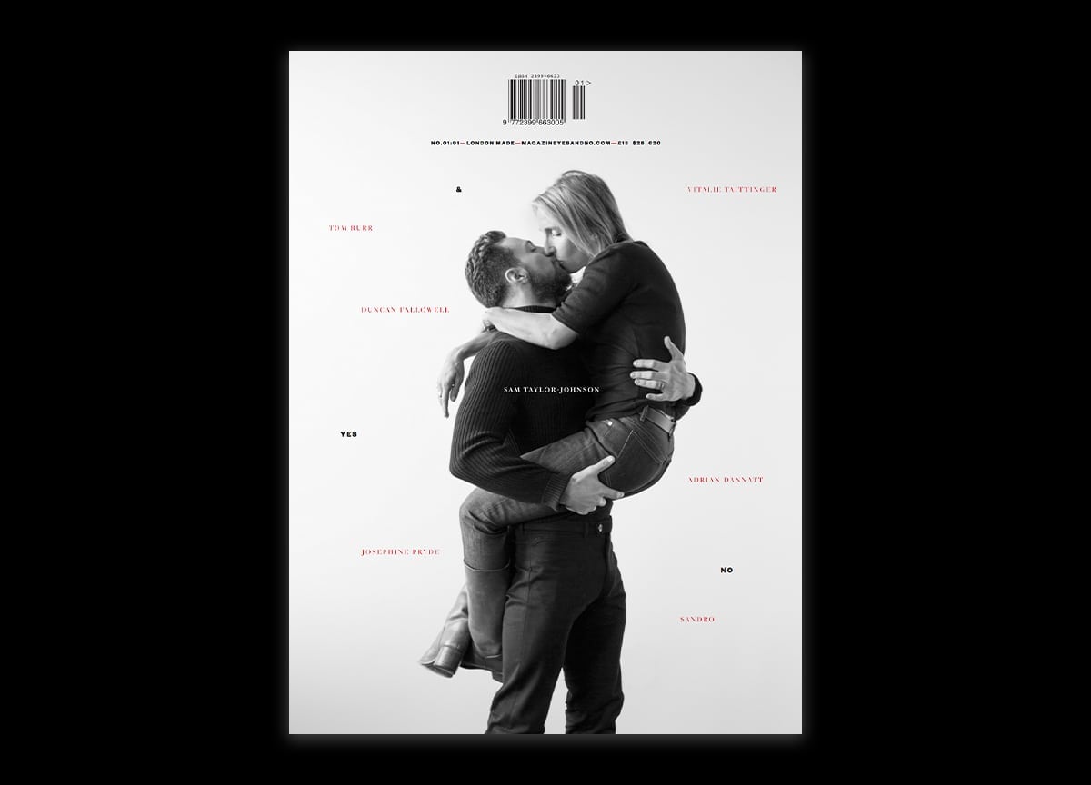
Yes & No | London | Domenic Lippa & Jeremy Kunze
Yes & No is a totally original title that defies categorisation in both its subject matter and style of storytelling. Founder Cassius Matthias comes from a background of filmmaking, and brings a particularly filmic approach to the printed page.
—
Sign up to Stack to keep updated with the best independent publishing