
Stories on the surface of words
Deciding which magazines to write about on our blog, it can be easy to overlook Eye magazine. Their 102nd issue is out now and it’s every bit as good as you’d expect – and that’s the problem. It’s just so consistently brilliant that it ends up sliding down the list of magazines I want to feature, because after more than a decade of this great graphic design magazine it’s not exactly a surprise when the new issue comes out and it’s ace.
This issue is different for me, though, because it’s a type special. I don’t know anything about typography, and at times I’ve been a bit dismissive of it. (Sitting at editorial design conferences, watching a type designer show how they spent six months slightly increasing the angle on a ‘z’, I’ve wanted to scream, “But why!?”)
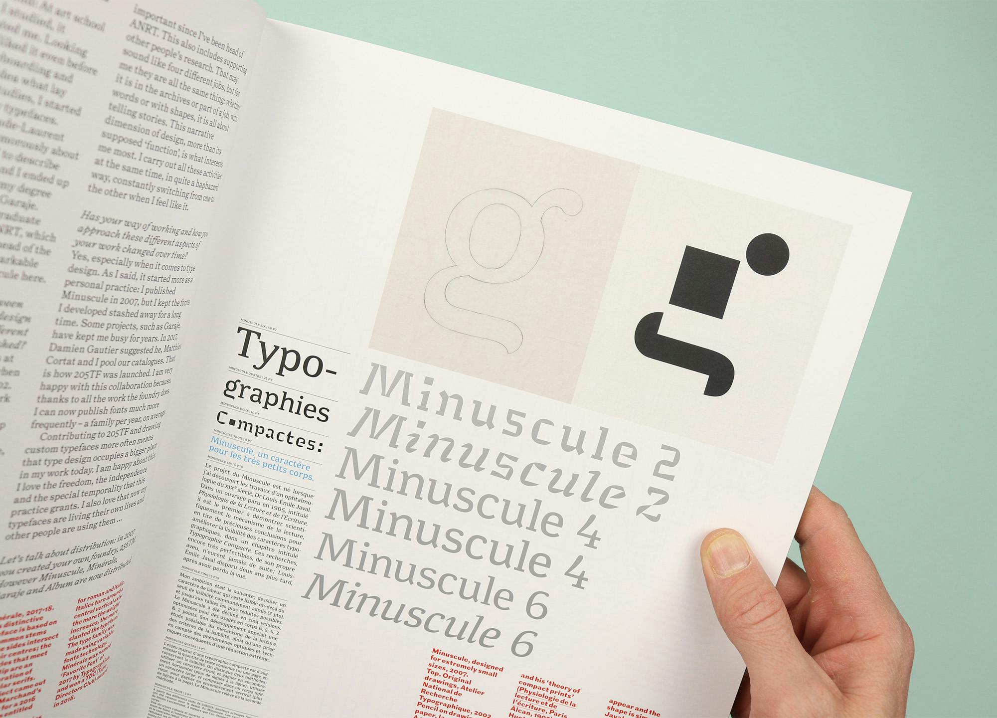
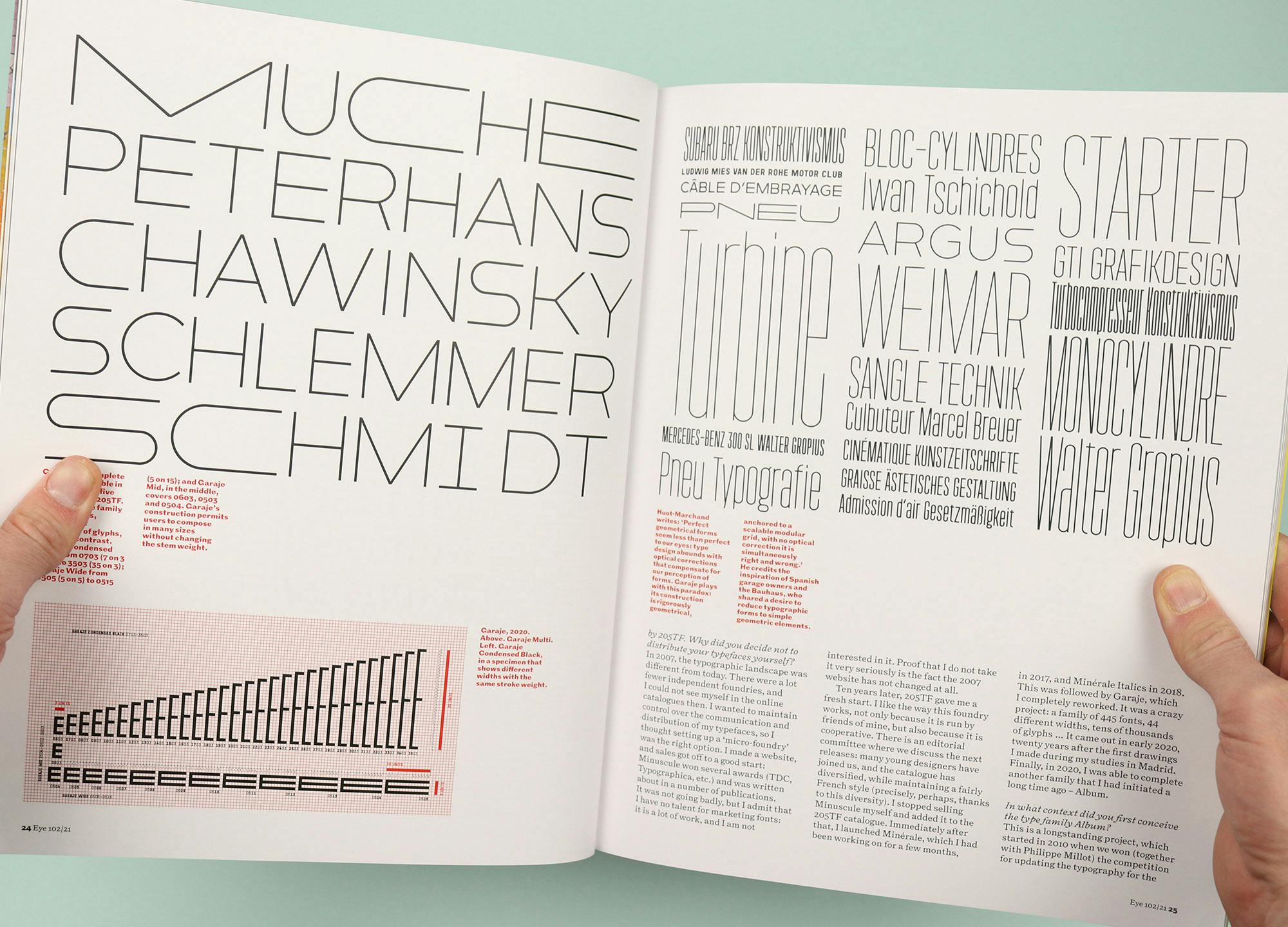
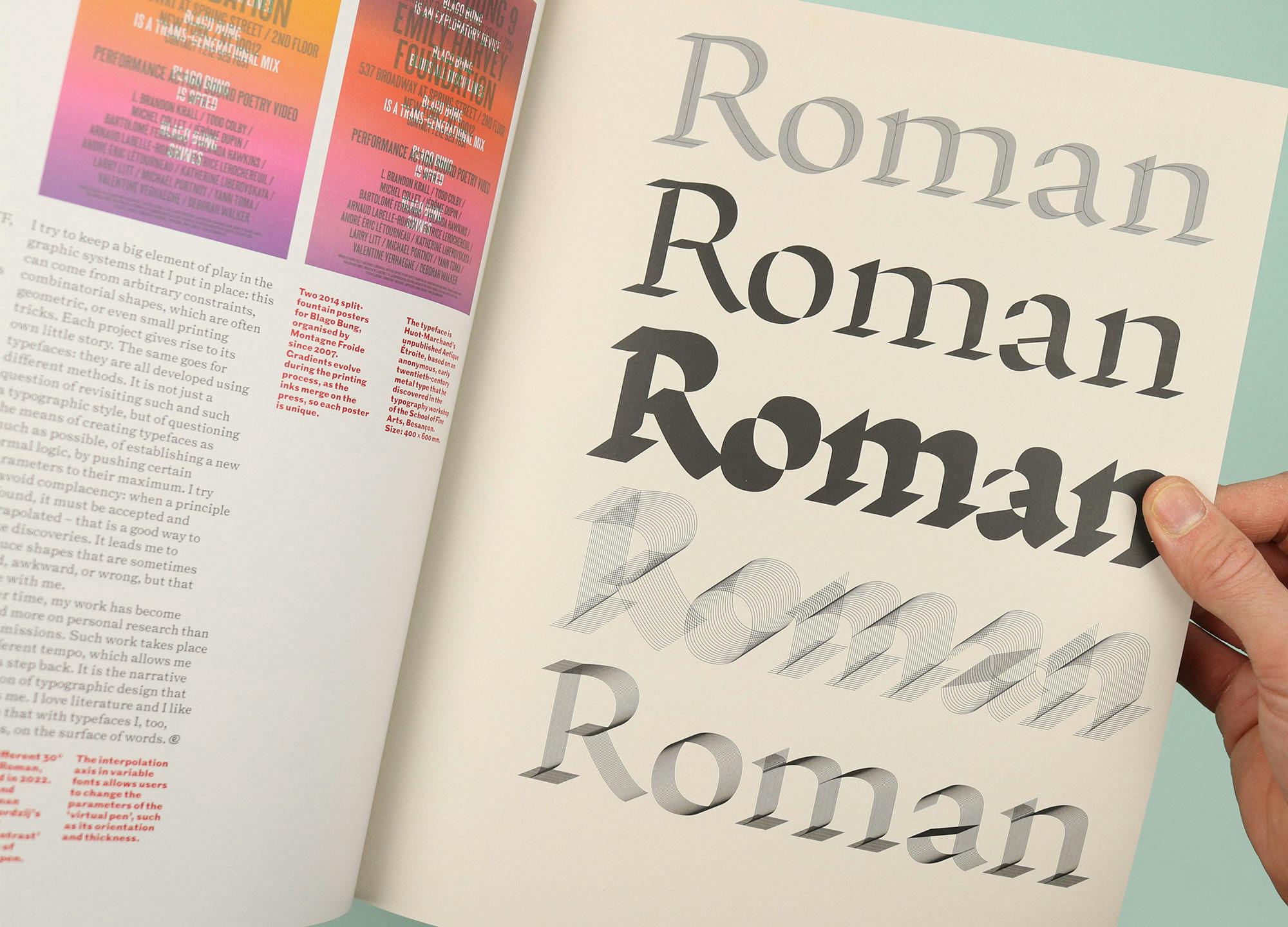
So flicking through this latest issue of Eye, I was pleased to see lots of ‘why’. For example the opening interview with French type designer Thomas Huot-Marchand tells the story of his career so far and explores the passion he feels for his craft. There are lots of samples of his work, all beautifully reproduced, but his final word is the most revealing. Speaking about the narrative dimension of typographic design, he says: “I love literature and I like to believe that with typefaces I, too, tell stories, on the surface of words.” There’s something wonderfully humble about that idea, and it makes perfect sense as the motivating force behind his fastidious attention to detail.


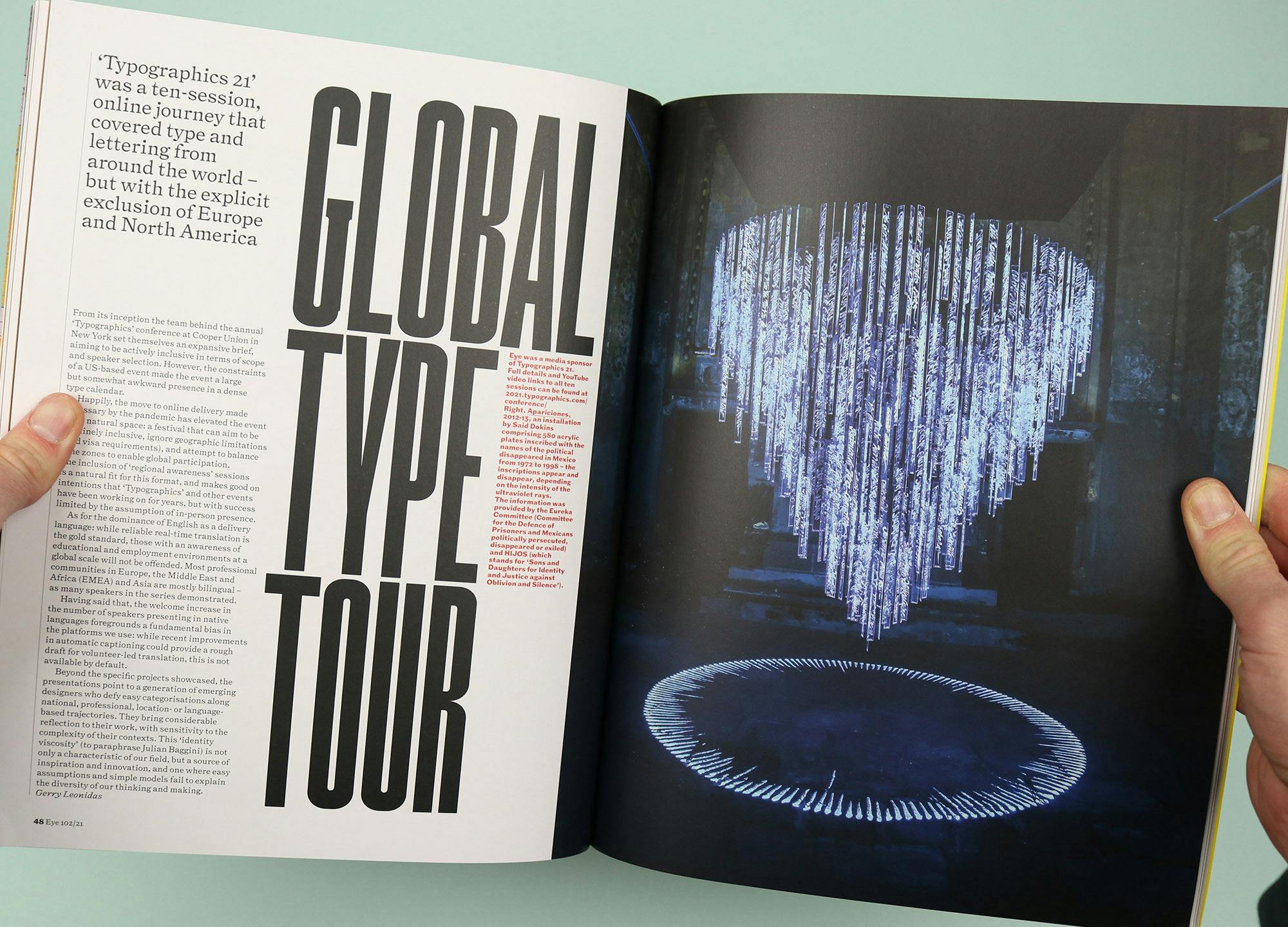
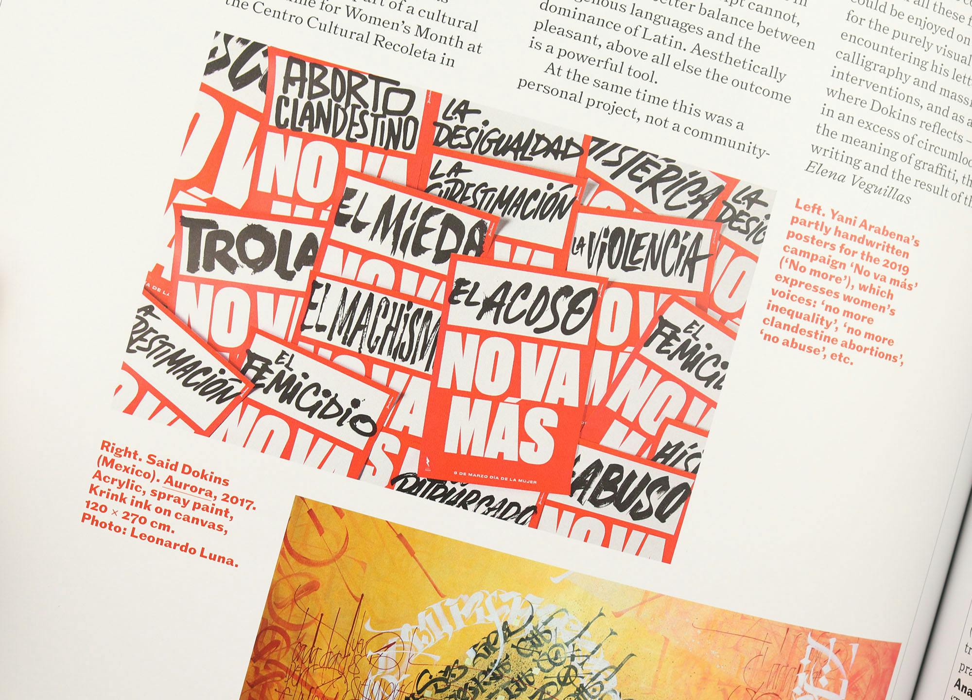
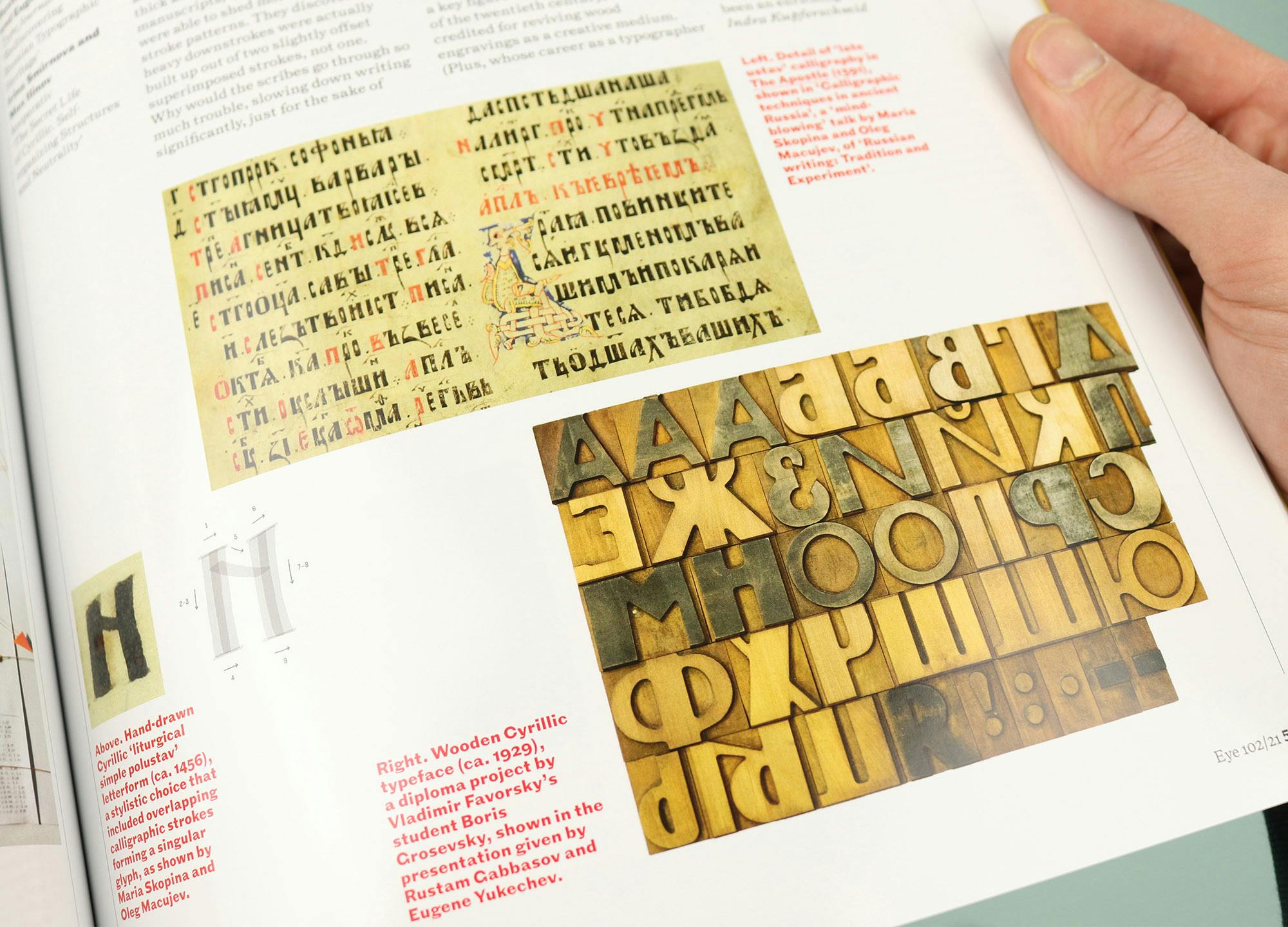
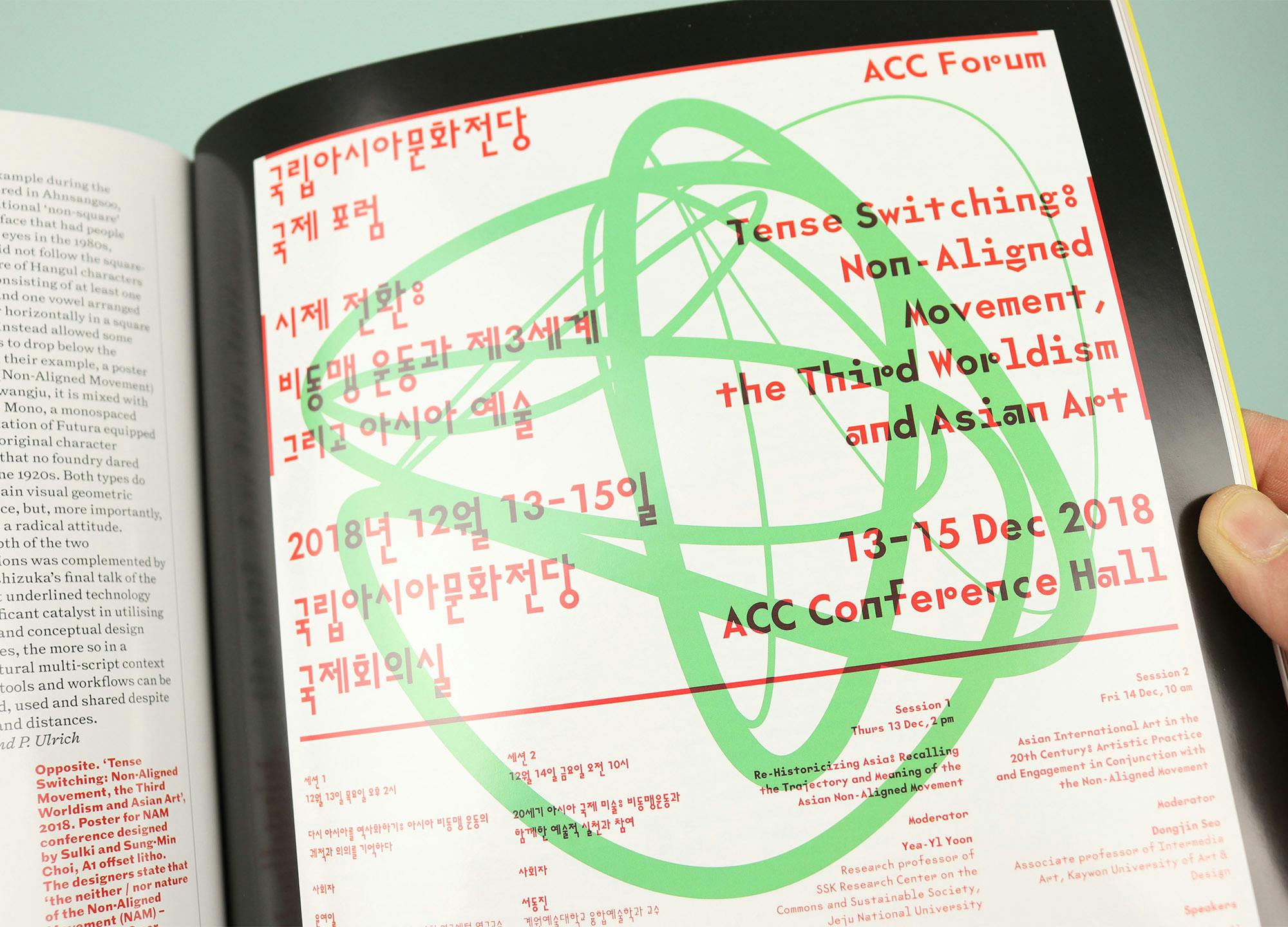
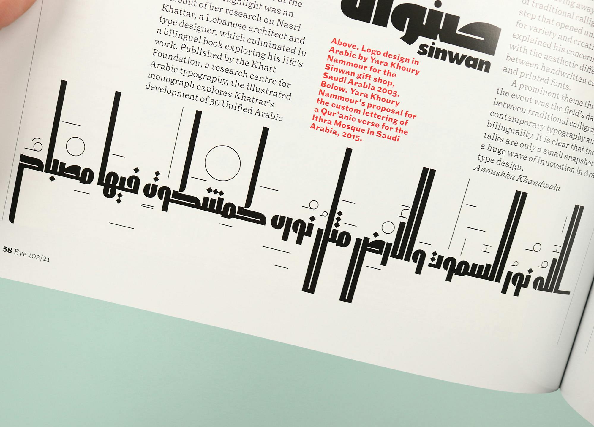
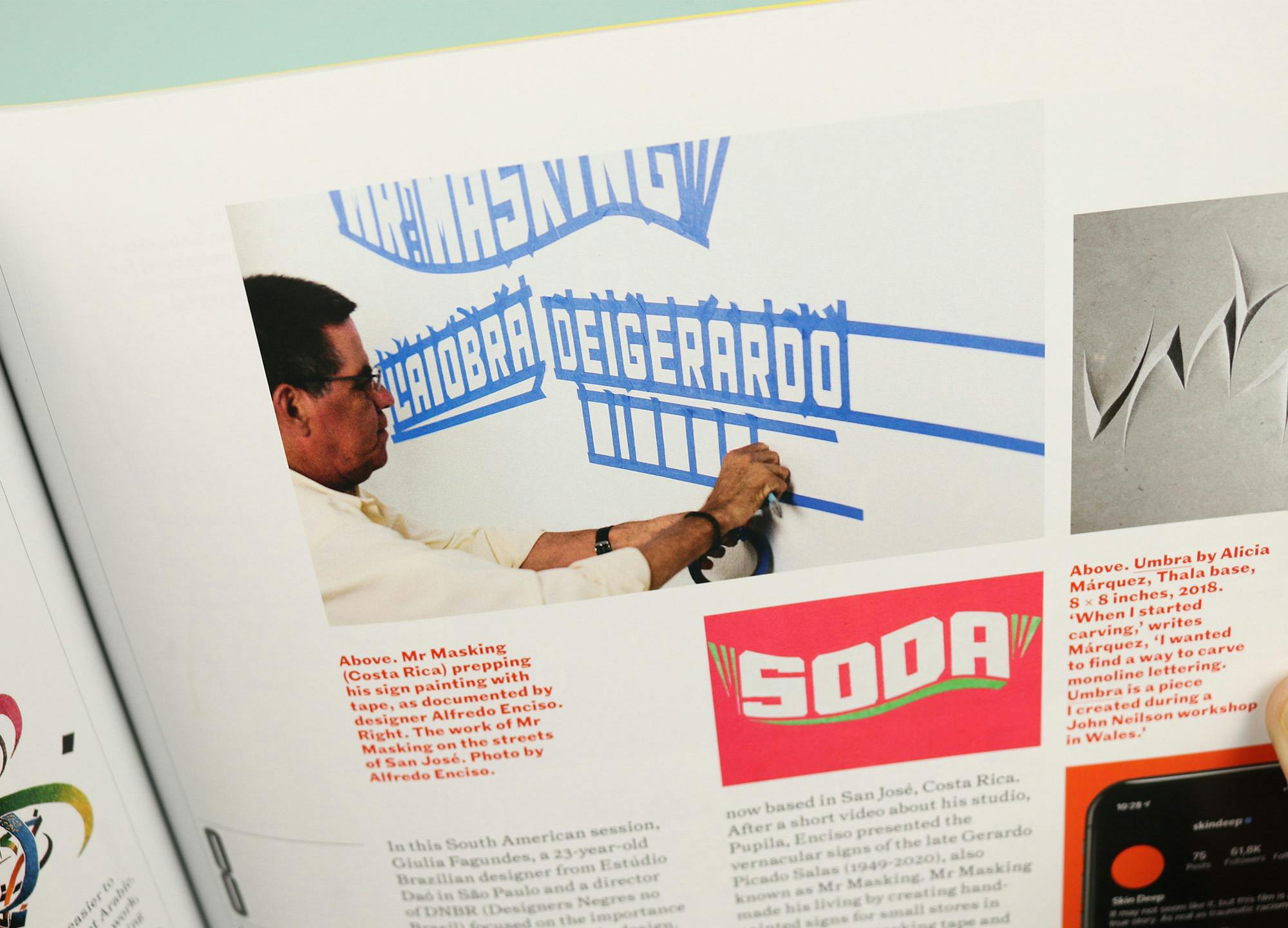
There’s also a report from the Typographics 21 event, which was held online last year, and which set itself the challenge of not featuring any work produced in Europe and North America. The event was held across 10 sessions and each one is given its own space here, each reported on by a different writer to provide a whistle stop tour of type from around the world. Of course this opens the door to languages with non-Roman letters, and there’s space here for Cyrillic, one for East Asian languages and scripts, and one for Arabic type design. But there are also special focuses, for example on the innovative work coming out of South America, or work united by the theme of activism and resistance.
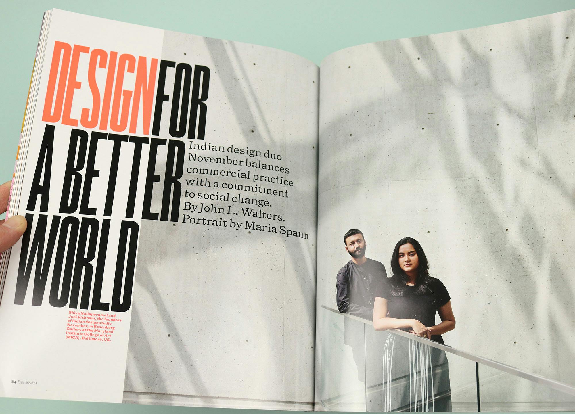
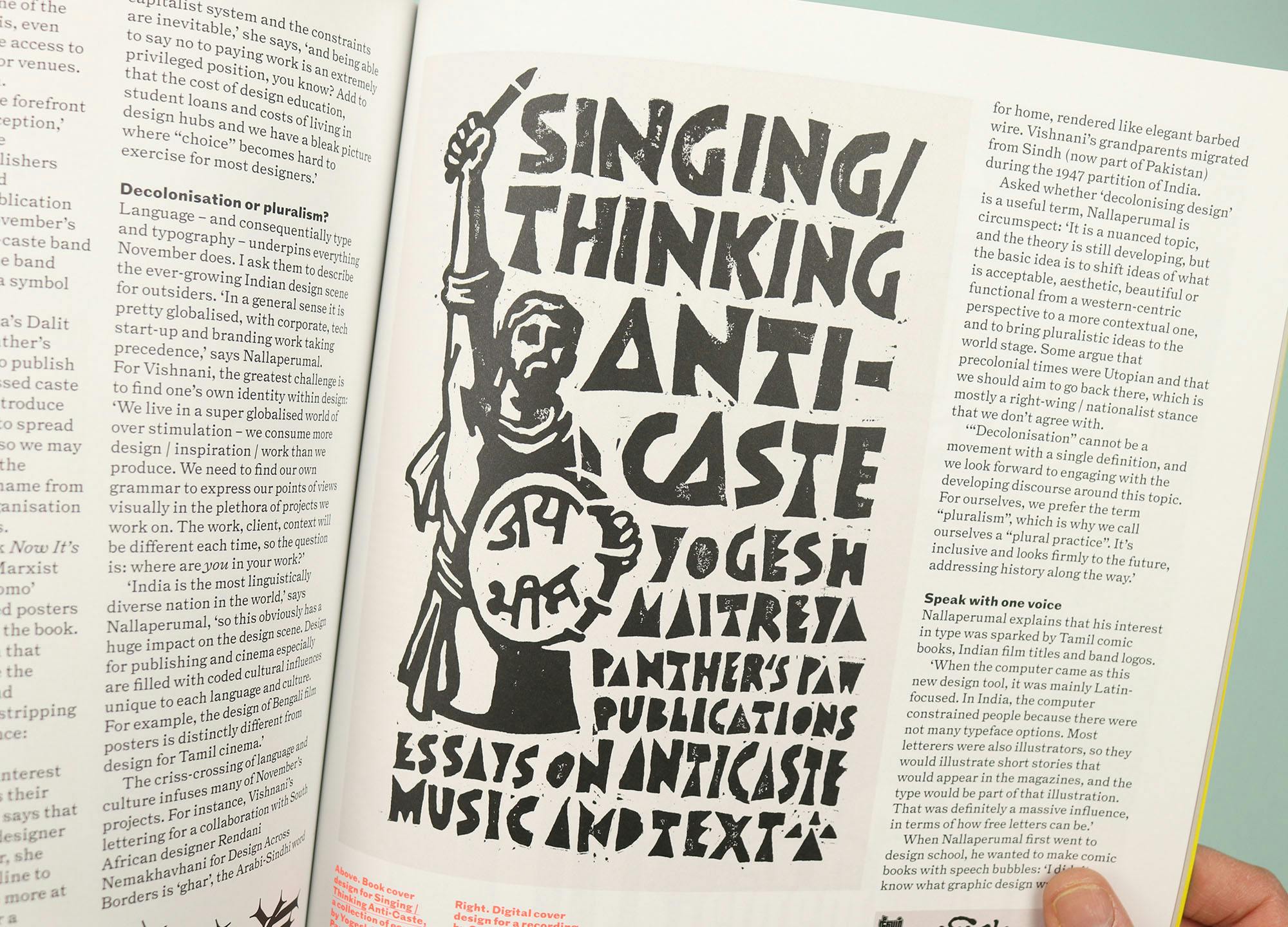
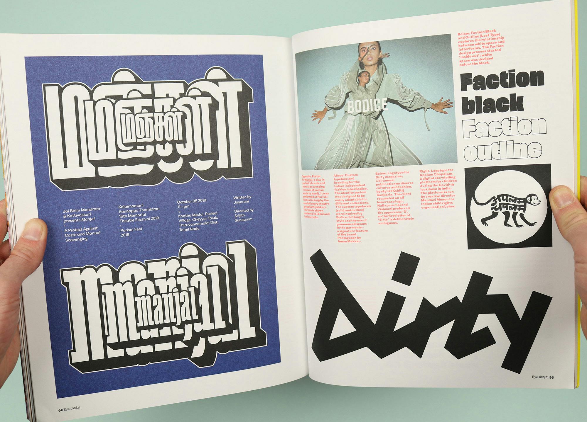
And the non-Roman theme continues with a feature on Mumbai design studio November, which works across many different languages and scripts. Co-founder Shiva Nallaperumal explains the reason for that range: “India is the most linguistically diverse nation in the world, so this obviously has a huge impact on the design scene. Design for publishing and cinema especially are filled with coded cultural influences unique to each language and culture.”
They design type and layouts for anti-caste activists while also working on big corporate projects for clients like the NBA, and this profile offers a fascinating insight into their processes, but also the social and cultural situation in contemporary India.


Absorbing and entertaining and beautifully produced, I love the way that Eye’s immersion in graphic design ends up reflecting on pretty much everything else in the world too. If you’re a regular reader I’m sure you know all this already, but if you haven’t picked the magazine up for a while this is the perfect place to jump back in and reacquaint yourself.


