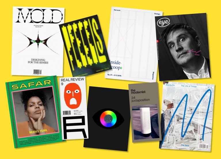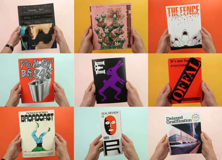
Unrestricted contents
A magazine is a machine designed to make you read. The cover is built to catch your attention from across the room; the editor’s letter is a one-page pitch of what’s to come; and all the photos, illustrations, headlines, pull-quotes and picture captions have been set in place to draw you into the stories.
One of the most effective (and often underappreciated) of those tools is the contents page. On the simplest level it’s a quick and easy way of jumping to the bits you want to read first, but for some magazines the contents page performs a more abstract role, becoming a distillation of the essence of the publication, rather than a practical way of showing what the stories are and where to find them. The following is a collection of interesting and experimental contents pages, and what they say about their magazines as a whole.
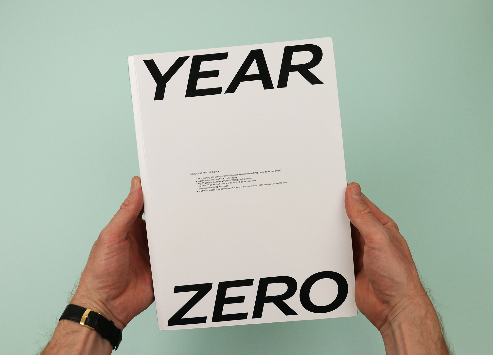
Year Zero
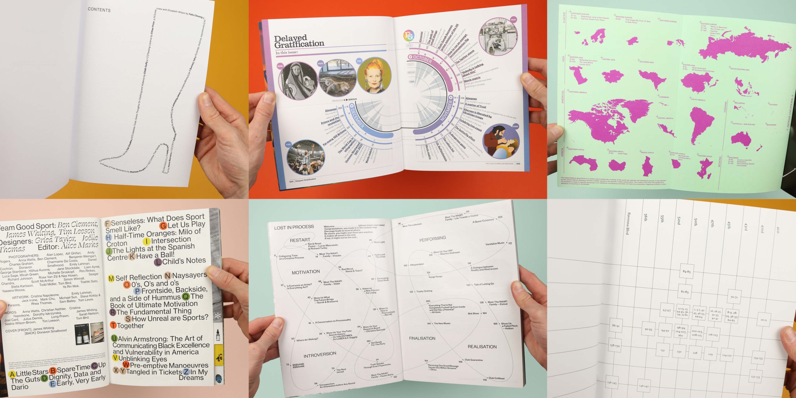
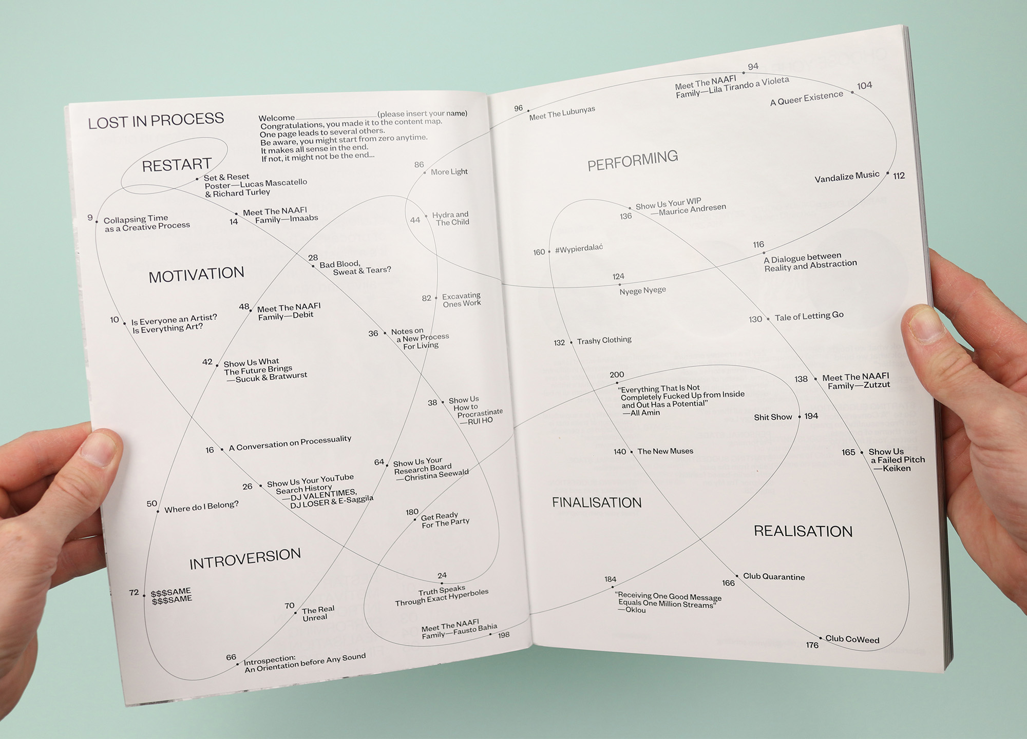
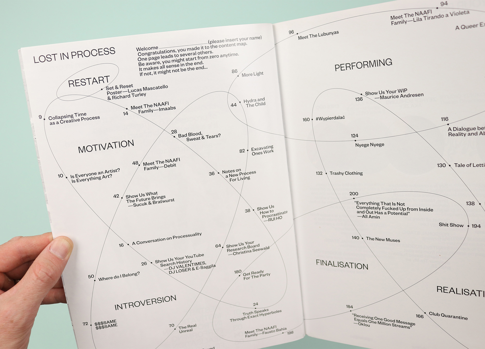
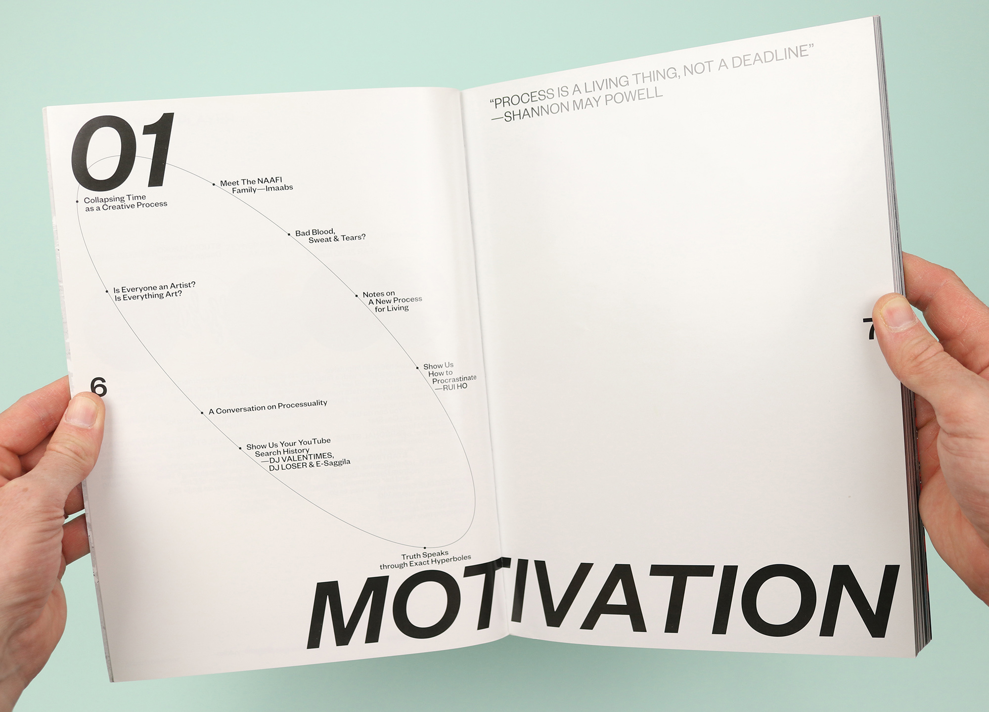
Published in Istanbul and designed in Berlin, Year Zero presented a hugely varied selection of underground music, fashion, art and more. This issue is themed around ‘process’, deconstructing the concept and breaking it into six stages that are visualised on the contents page as a sort of lunatic venn diagram, showing the places where the processes overlap one another. It’s surely not an accident that the interlinking ellipses are themselves suggestive of big zeros sprawling across the pages, and the message here is clear: There is no beginning and there is no end; there is just the process, so surrender yourself to it and see where it takes you. (In a further break from boring old front-to-back linear reading, each article finishes with a ‘choose your own adventure’ A/B selection, encouraging the reader to pick their way through the magazine, flipping forwards and back to jump from story to story.)
Delayed Gratification
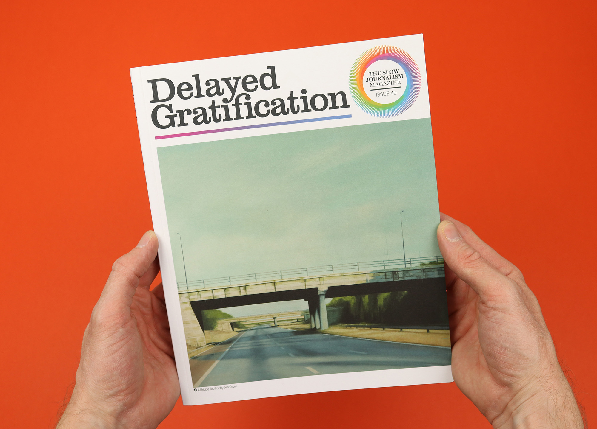
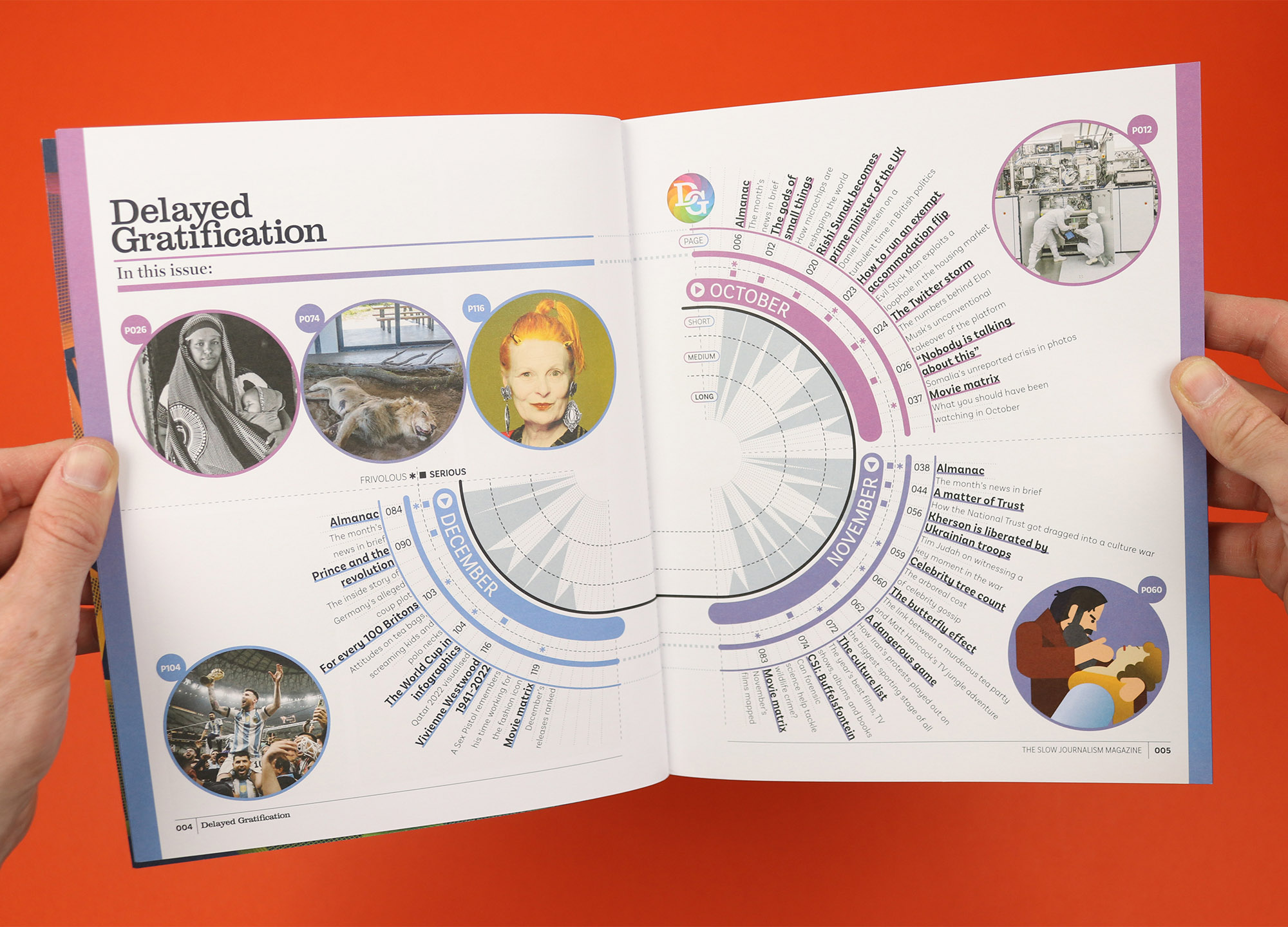
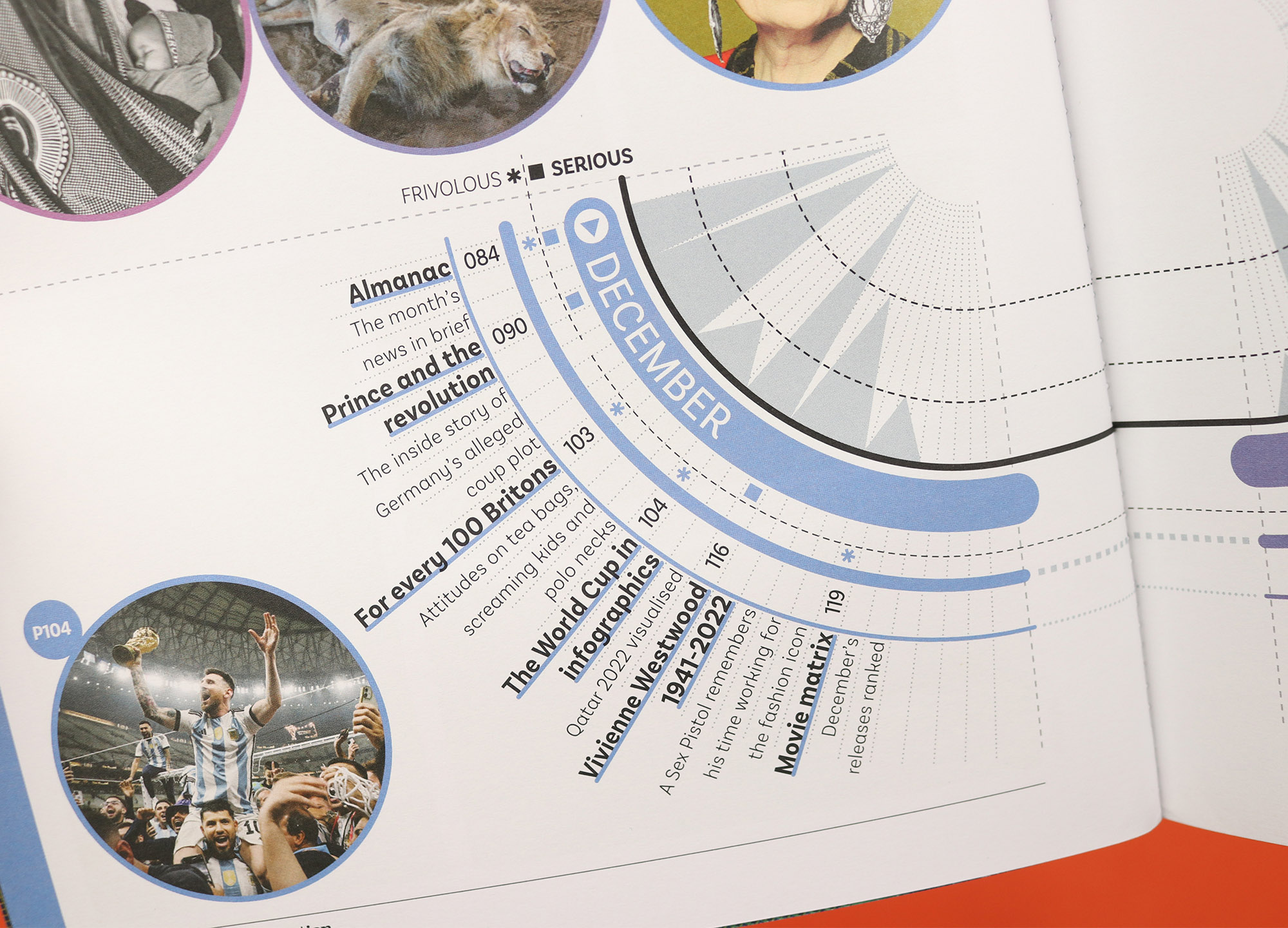
A magazine that looks back at the news after the dust has settled, Delayed Gratification orders its pages chronologically, allowing readers to flip through three months of stories each issue. So it makes perfect sense that the contents page is also arranged chronologically, but this is Delayed Gratification, so it doesn’t stop there. Because this slow journalism magazine is also renowned for its data visualisations, so as well as showing when the stories took place and where to find them, the contents page also gives readers an at-a-glance overview of how long the stories are, and how serious they are. I’m not sure whether anyone would really use that information to decide what they’re going to read, but it makes for a fantastic expression of the magazine’s obsessive interpretation of the news.
slow-journalism.com
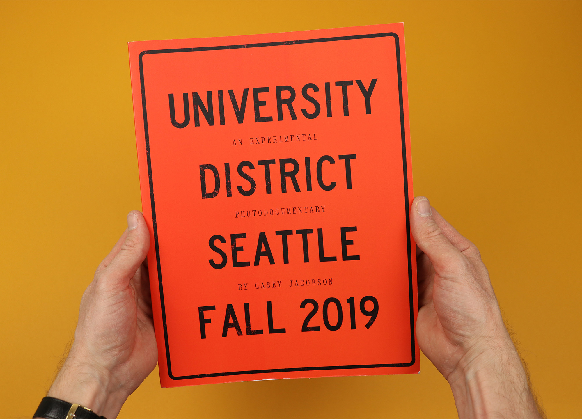
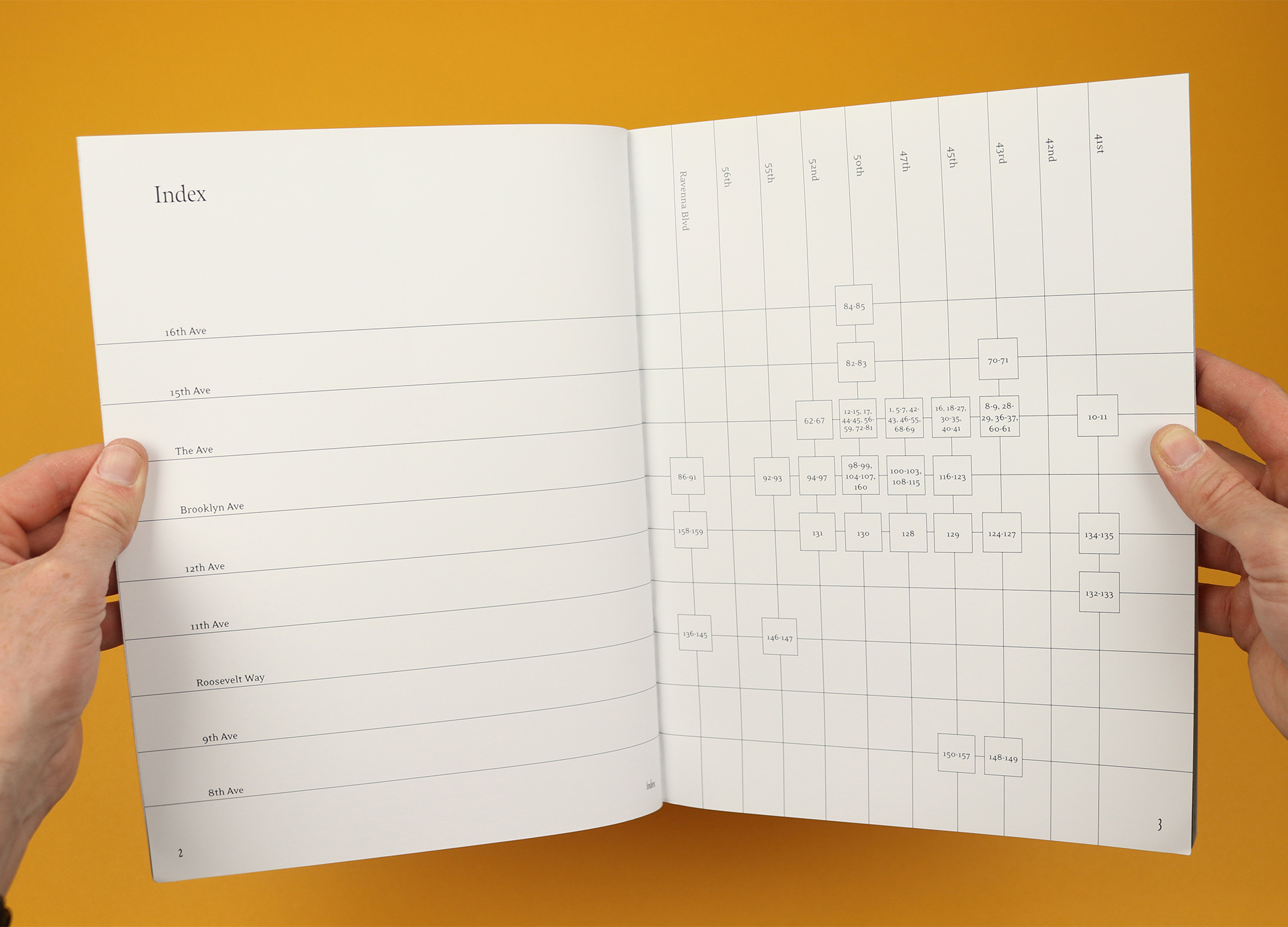
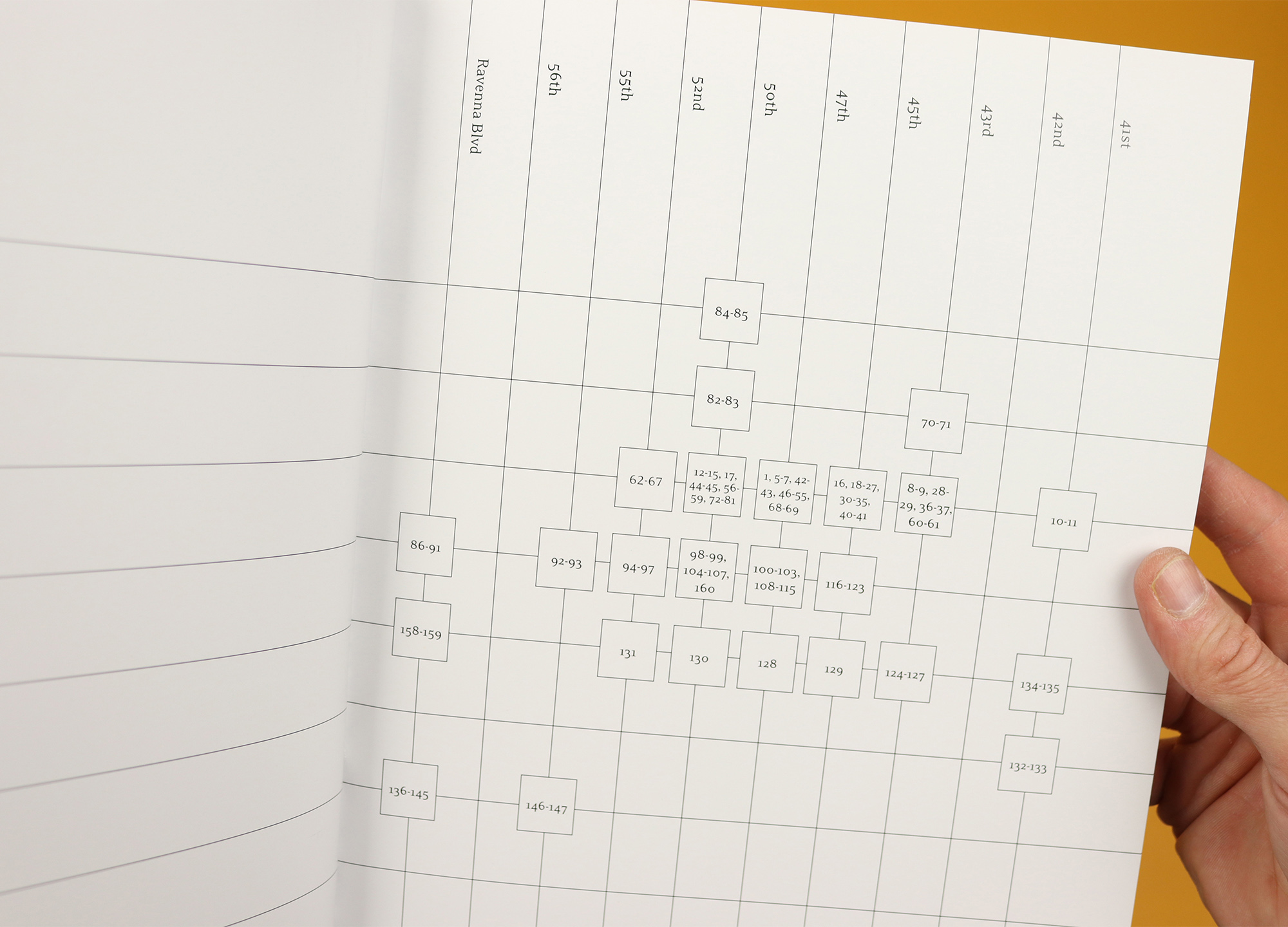
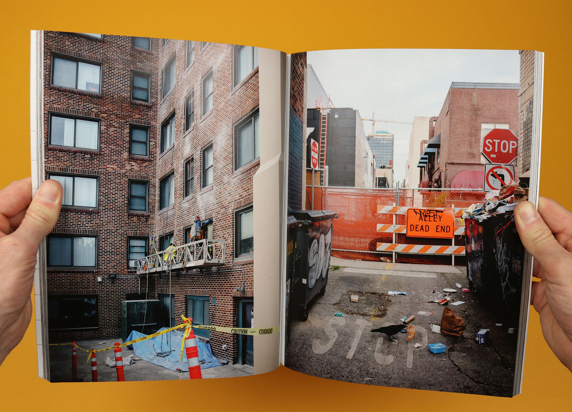
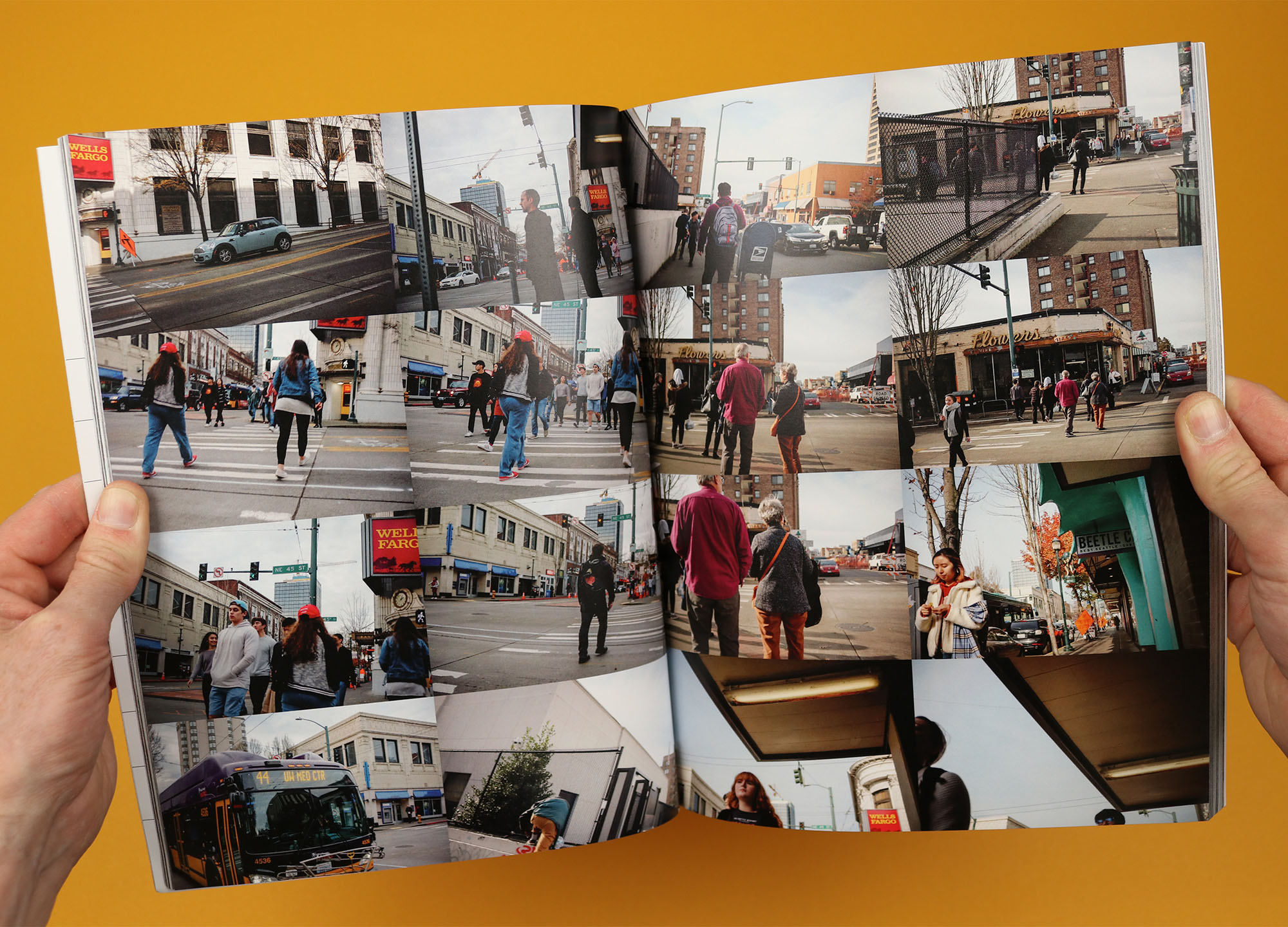
University District Seattle
A one-off photo magazine, University District Seattle was created by photographer Casey Jacobson when she lived in the area at the end of 2019. The magazine takes readers around the streets of the University District, as she interviews locals and photographs the scenes she finds along the way, creating an image of a messy, chaotic but characterful neighbourhood. By contrast the contents page uses the clean, clear grid layout of the streets themselves to show where photographs were taken, giving the reader an extra layer of context and also emphasising the difference between looking at a neat map, and being lost in the landscape itself.
caseyjacobson.bigcartel.com
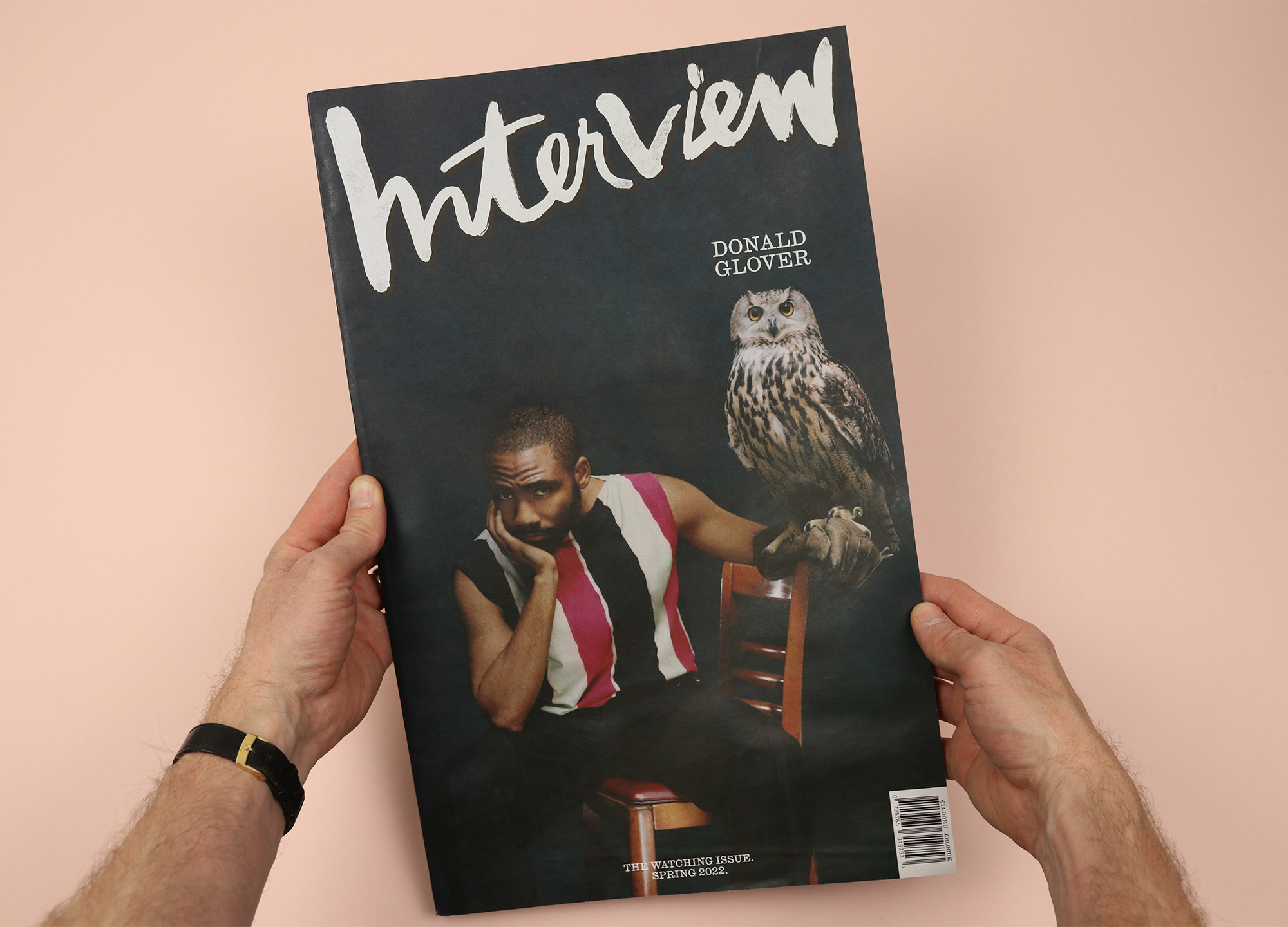
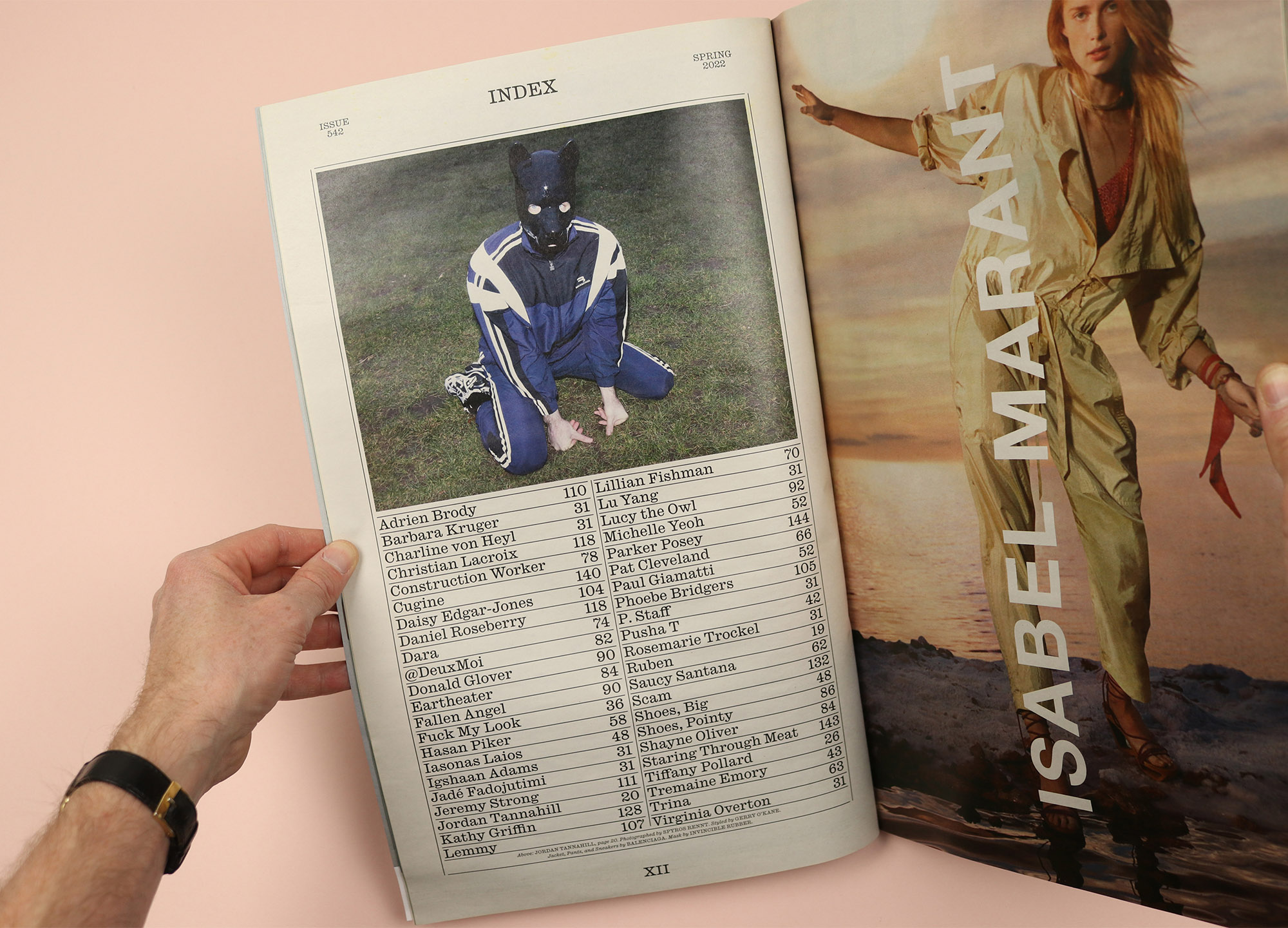
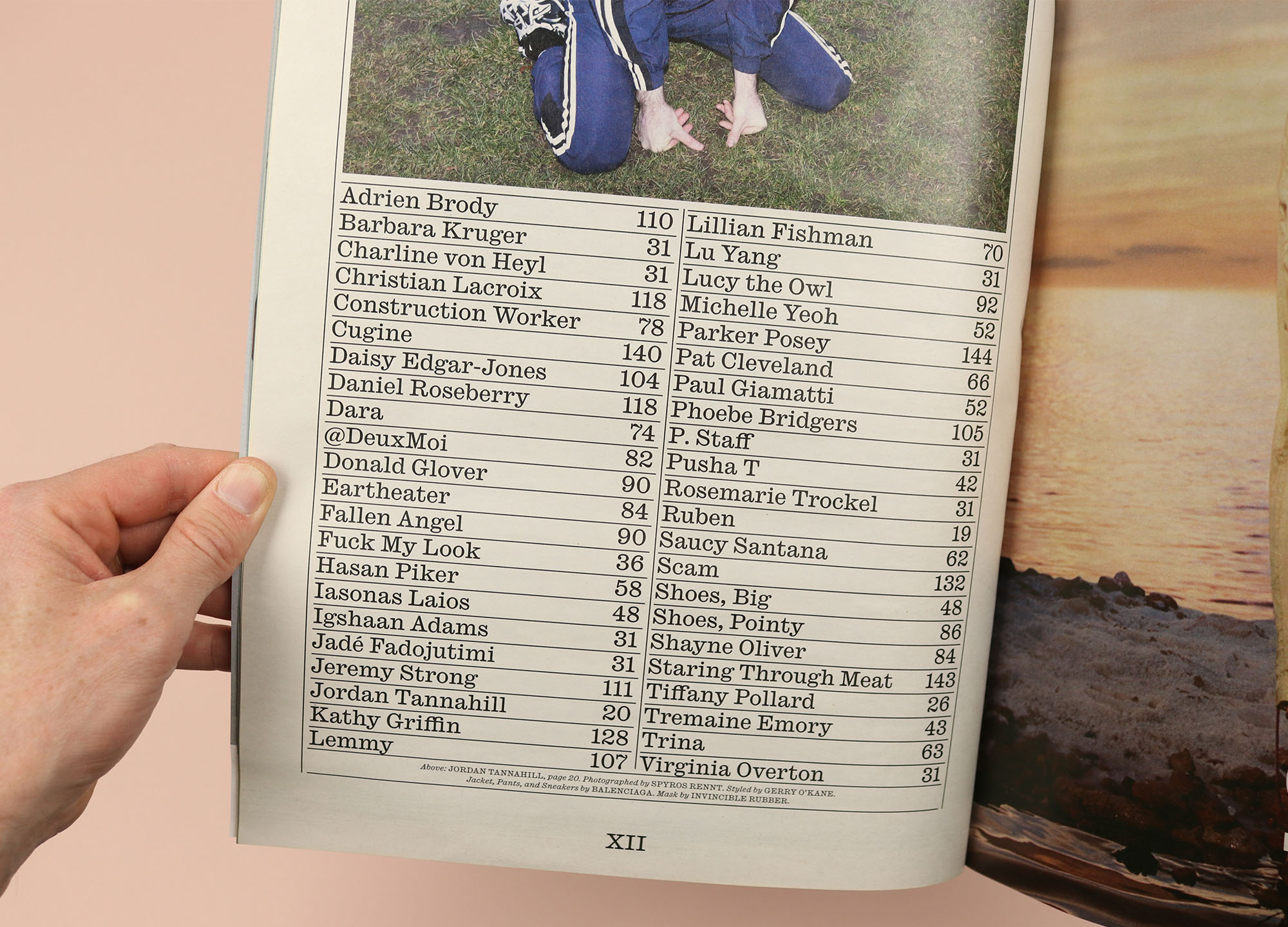
Interview
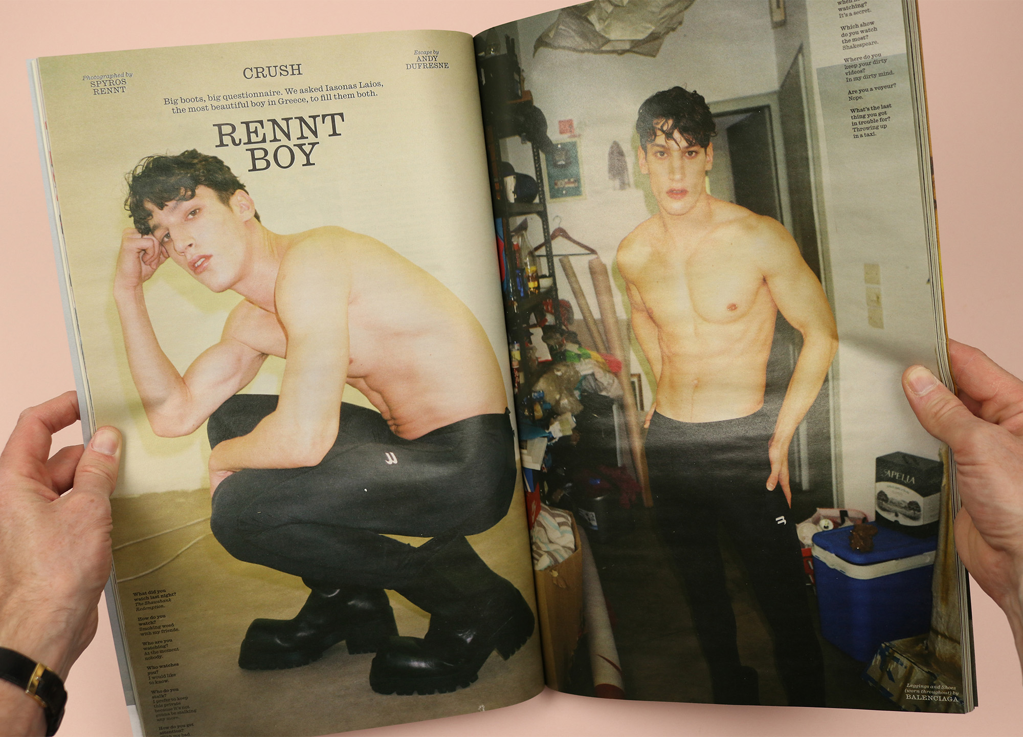
A magazine that has always been about big names, Interview’s contents page opts for a simple alphabetical order that means you can jump straight to the star interviewee or interviewer of your choice. Of course this isn’t all about straight-up practicality, though, and alongside the parade of famous and cool people is a sprinkling of funny and characterful additions, like Lucy the Owl, from Donald Glover’s cover shoot; Shoes, Big (page 48); and Shoes, Pointy (page 86).
interviewmagazine.com
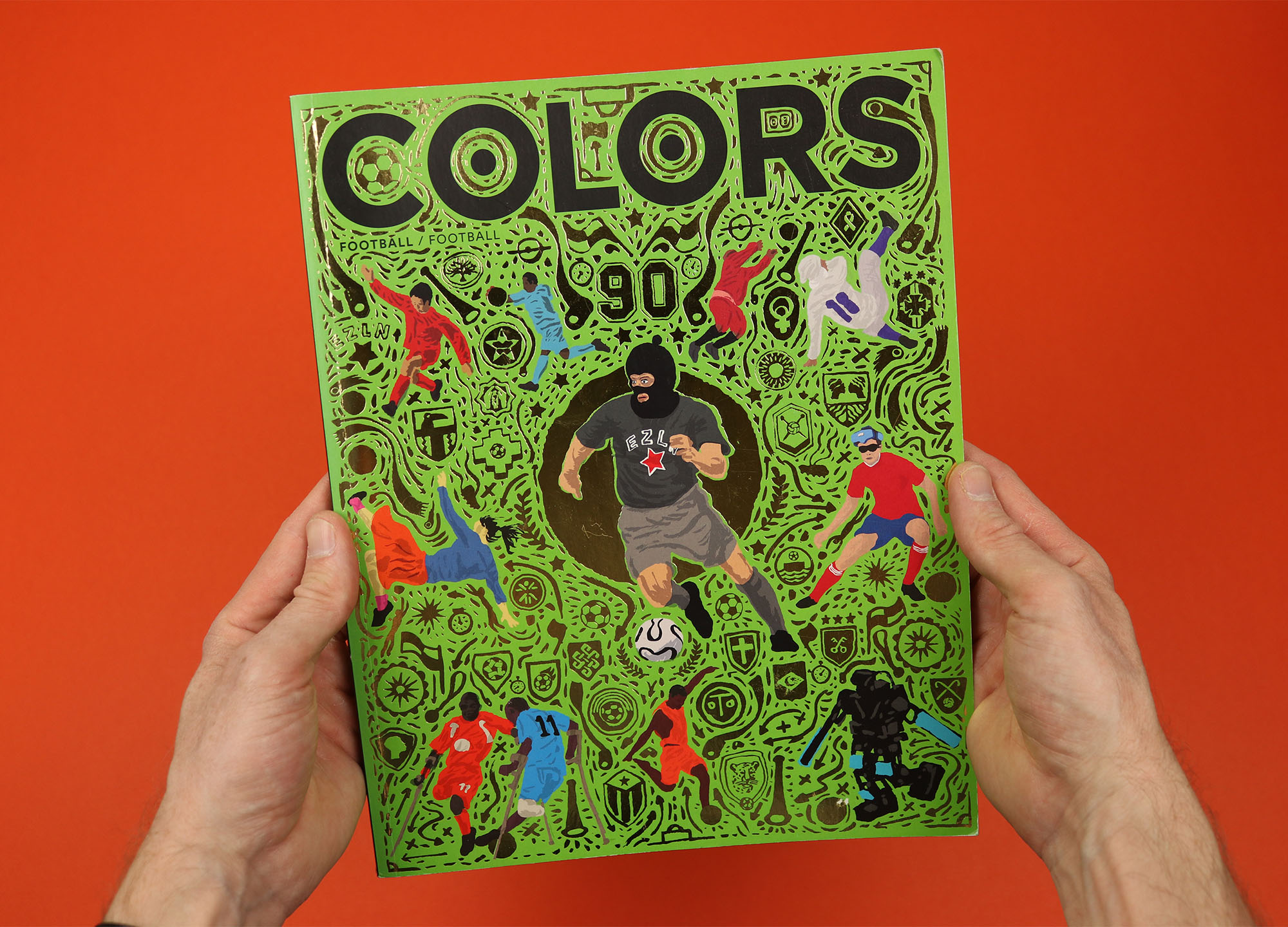
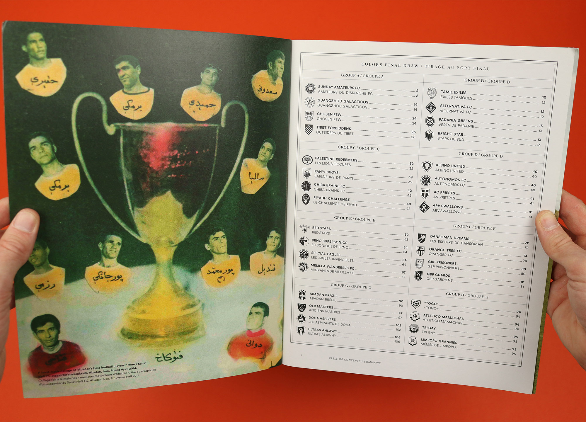
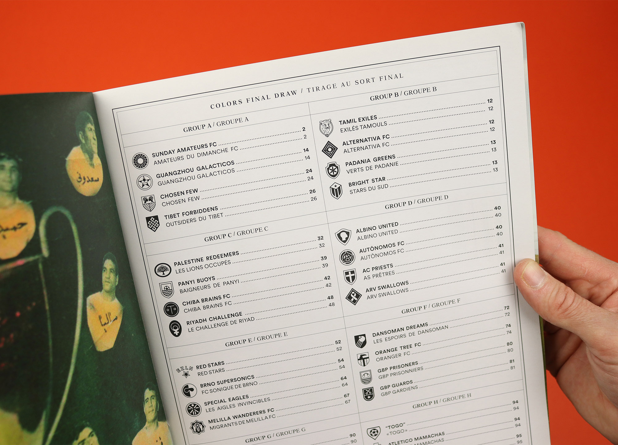
Colors
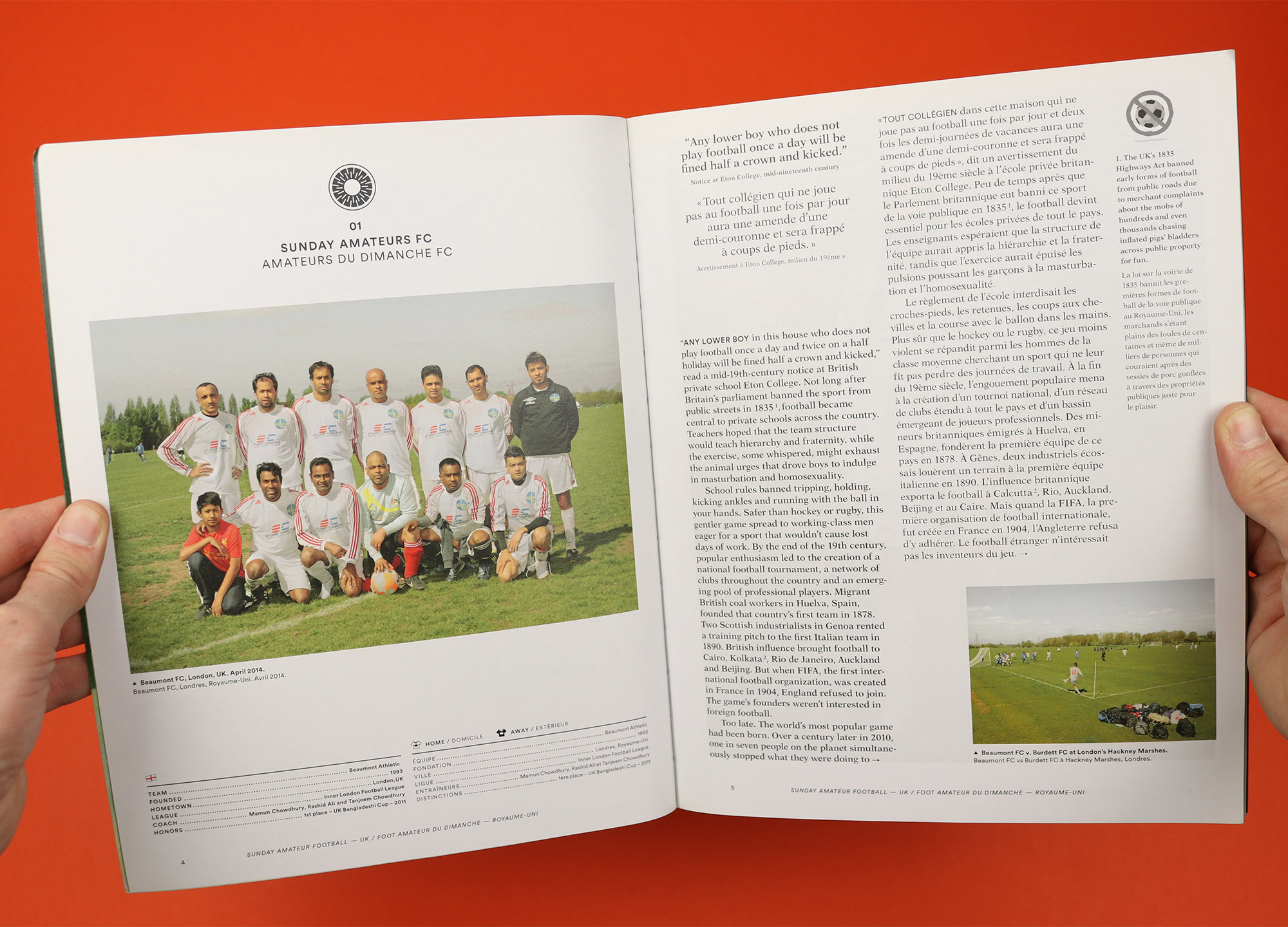
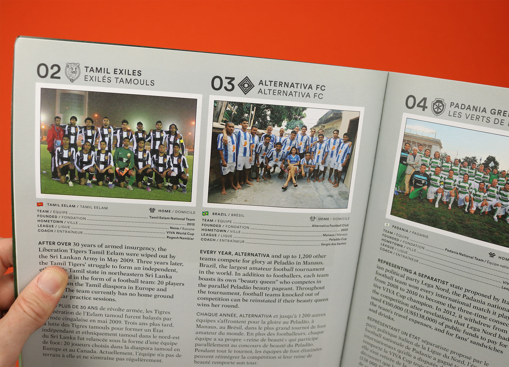
When I was pulling together magazines for this list I was sure I remembered Colors doing fun things with its content pages, but the only one I have that really fits the bill is the ‘Football’ issue, which displays the stories and teams featured in the magazine, arranged in eight groups as if facing off against each other in a tournament. It’s a smart idea that perfectly reflects the magazine’s combination of playfulness and fastidious attention to detail – every story and team is given its own club crest, presumably created by art director Ramon Pez and his designers, which is used both on the contents page and on the articles themselves.
colorsmagazine.com
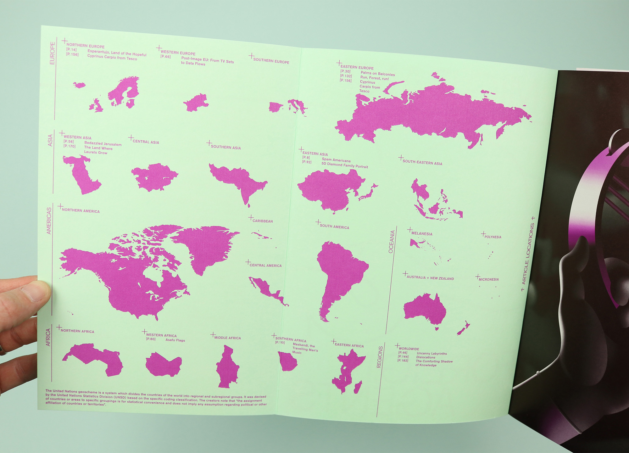
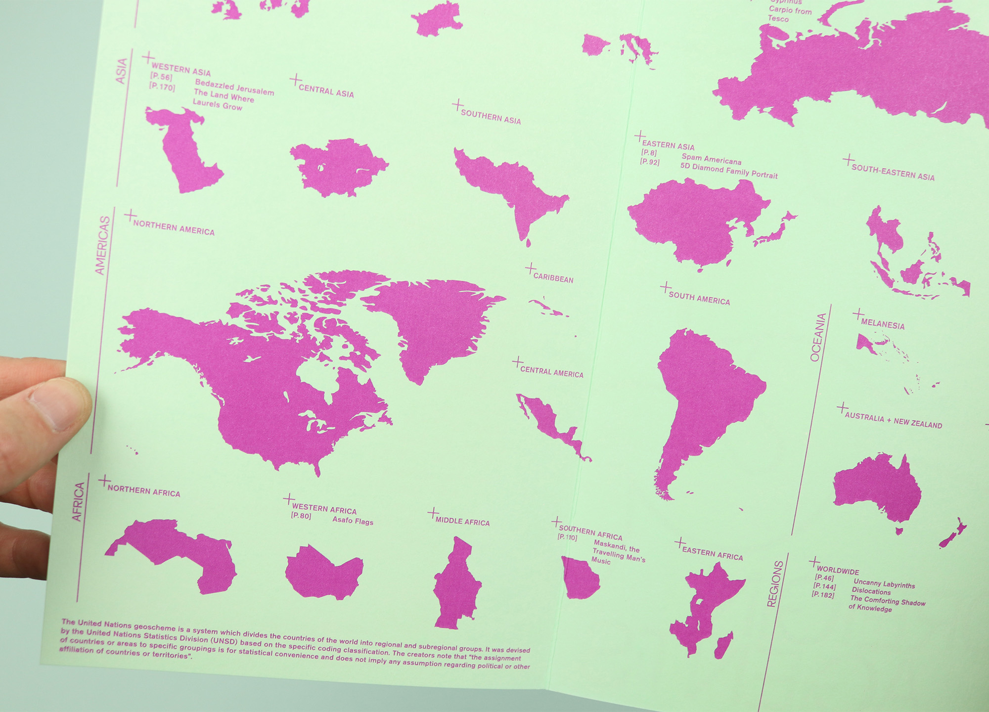
Migrant Journal
World maps are a common way for magazines to organise their contents pages, especially when they’re trying to show at a glance that their stories are gathered from all around the globe. Too often, though, those maps actually end up revealing the places that are not covered, with large blank spaces unintentionally showing how difficult it is to produce a genuinely global magazine. Migrant Journal played with this convention by splitting the world map up according to the regions and sub-regions of the United Nations geoscheme system. It means that readers of the final issue could see the magazine included stories from Northern Europe, Eastern Europe, and Southern Africa, for example, and also that there was nothing from North America, Central Asia and South America. But just as importantly, it allowed the magazine to repeat the note from the creators of the geoscheme; “the assignment of countries or areas to specific groupings is for statistical convenience and does not imply any assumption regarding political or other affiliation of countries or territories.” The same message appeared at the start of every issue, neatly establishing the magazine’s project of looking again at the existence of borders and what it means to travel across them.
migrantjournal.com
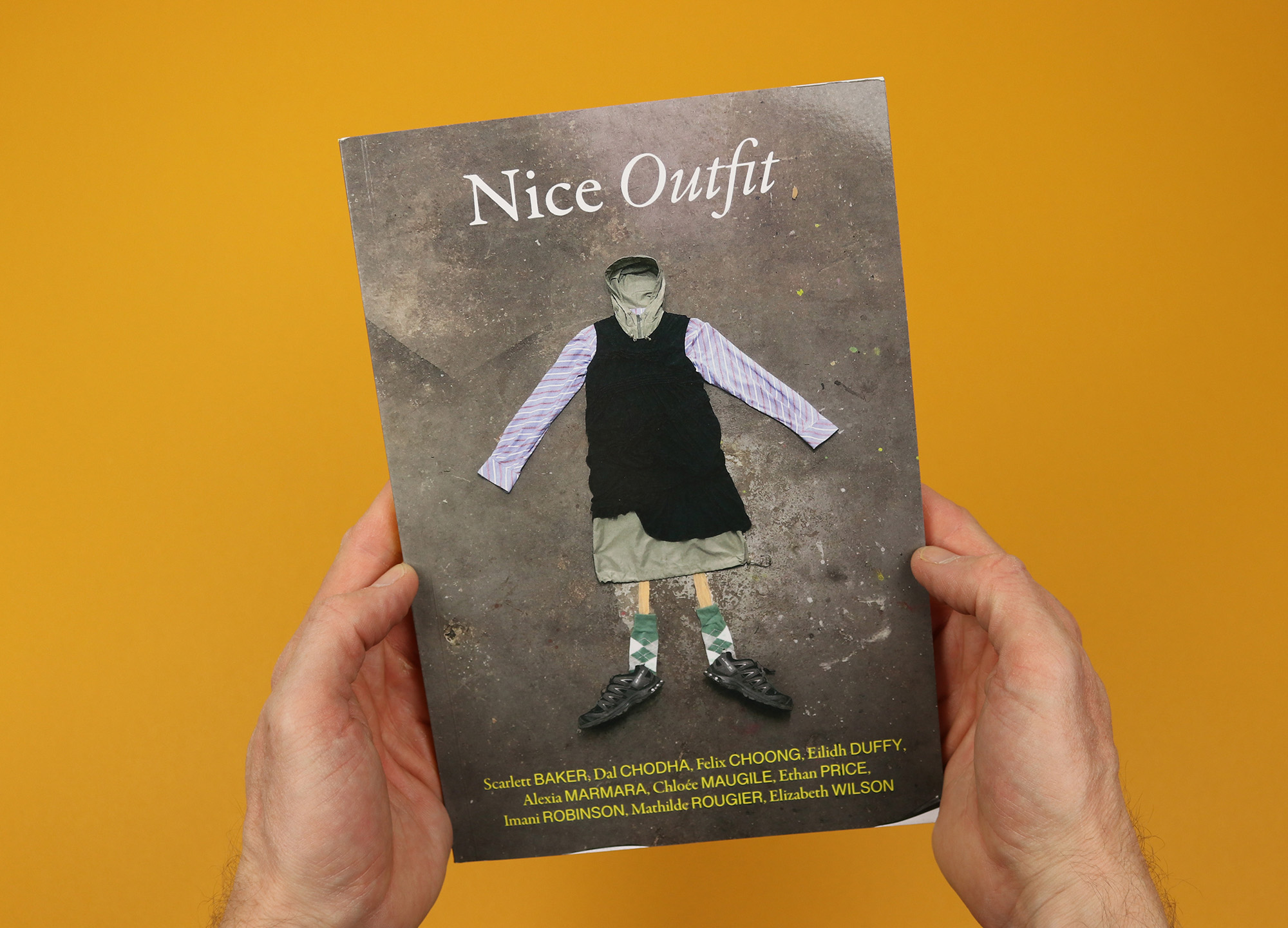
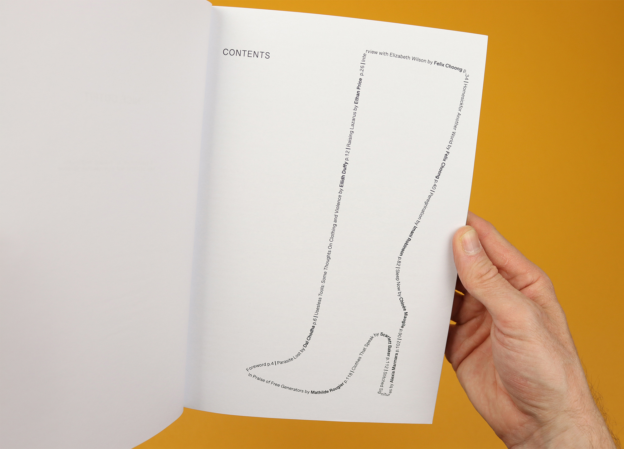
Nice Outfit
The self-described “publication on fashion criticism, body politics and experimental fiction”, Nice Outfit takes a playful and provocative approach to the fashion world, or as editor Felix Choong puts it in his foreword: “Fashion, like the people producing and wearing it, is hysterical and within this hysteria we arguably make our clearest assertions and most astute gestures towards the worlds we find ourselves thrust into.” Existing within the madness of fashion, the magazine is both intellectually rigorous and aware of its own ridiculousness, a contradiction that seems to be summed up by the unwieldy silliness of rendering the contents in the shape of a boot.
felixchoong.com
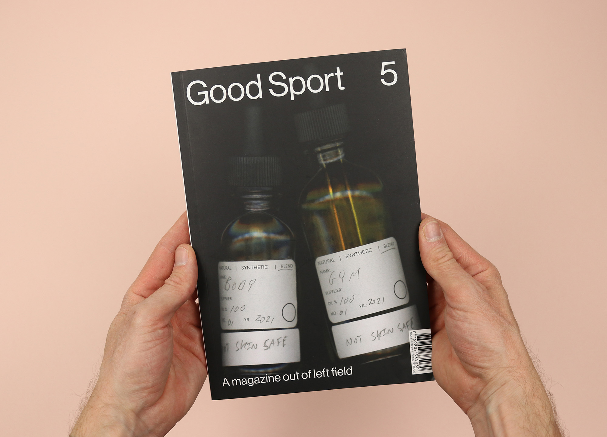
Good Sport
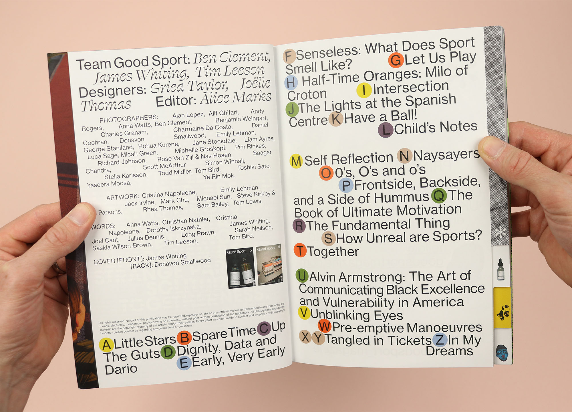
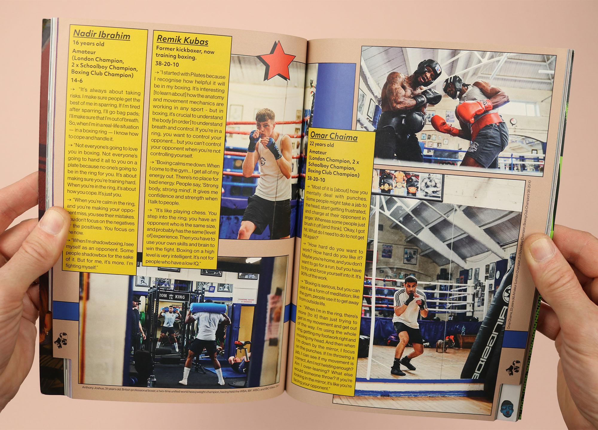
A sports magazine like no other, this fifth issue of Good Sport shuns page numbers in favour of an alphabetical order for stories. Sometimes the significance of the letter is obvious, like ‘E’, a photo story about people who get up ‘Early, Very Early’ to play sport. Other times the association is less clear, like ‘M’, a series of interviews with boxers at Finchley Boxing Club in London, who reflect on themselves and their sport, leading me to guess that the ‘M’ is for ‘mirror’? As a result the contents page looks sort of like a subway guide, with all the letters crowding together, and while it would technically be possible to navigate the magazine from there, the main method of wayfinding in the magazine is its tabbed pages, which encourage readers to jump forwards and backwards, rather than starting at the front and reading all the way to the back.
goodsportmagazine.com