What does feminist design look like?
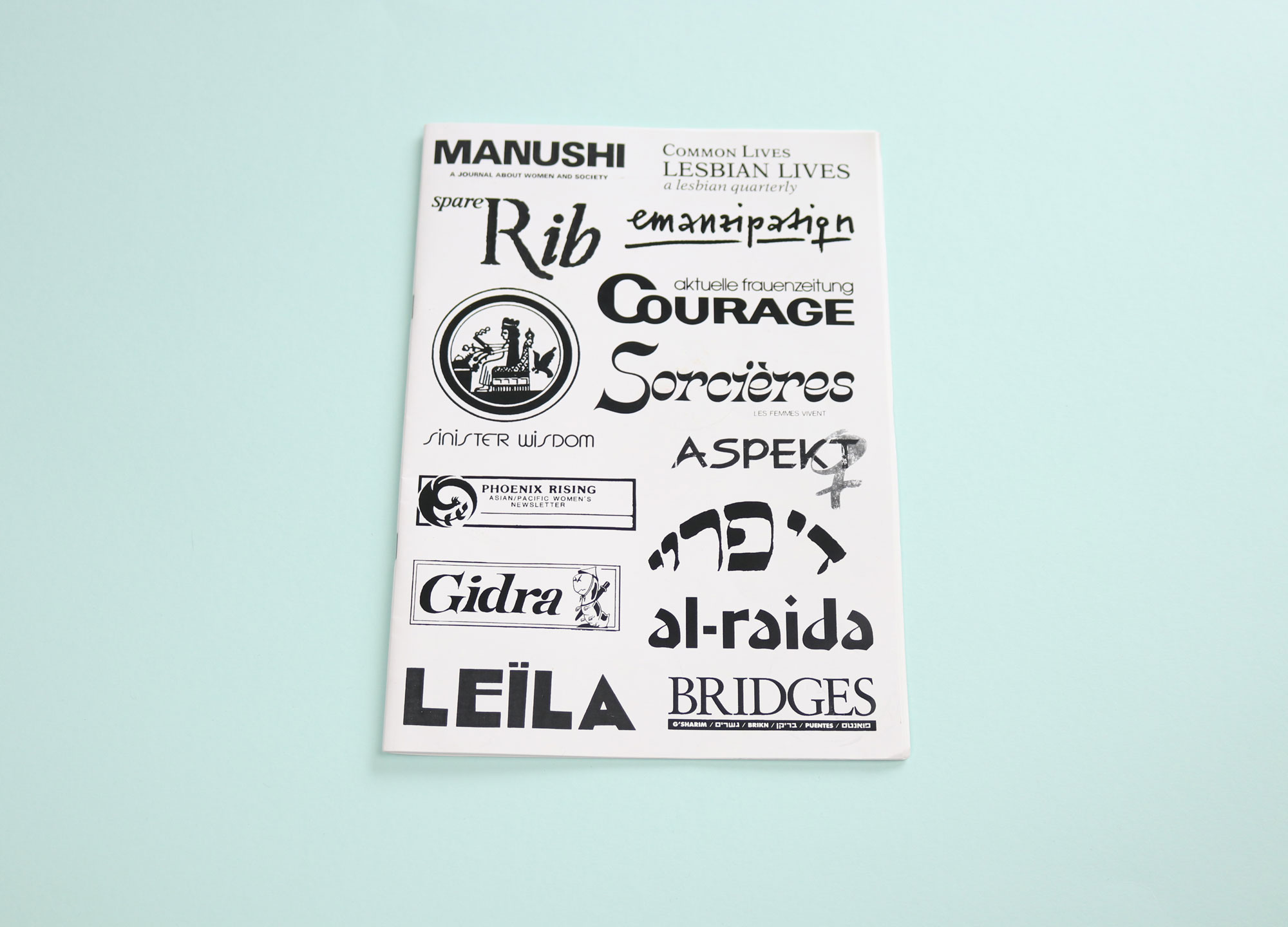
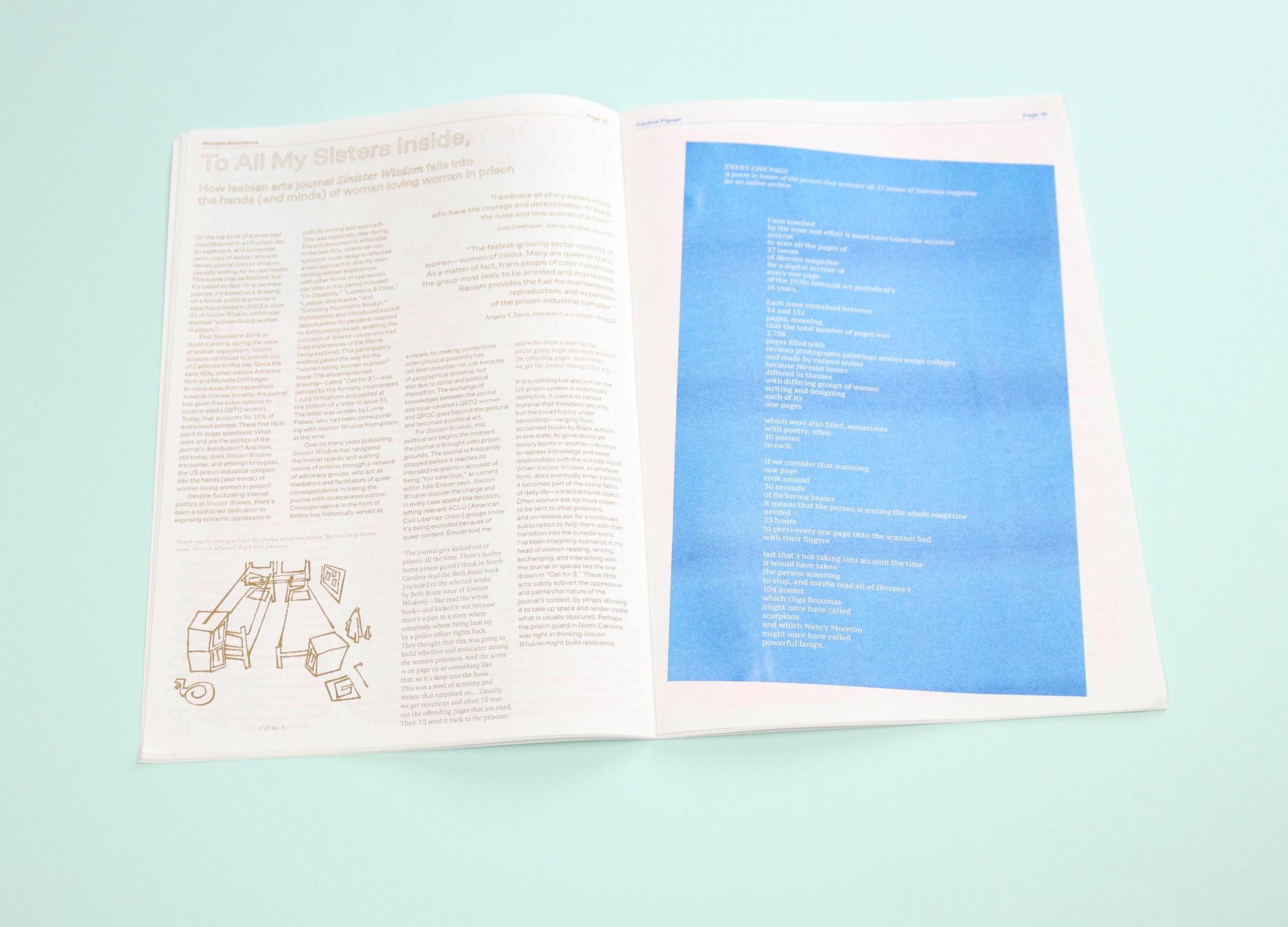
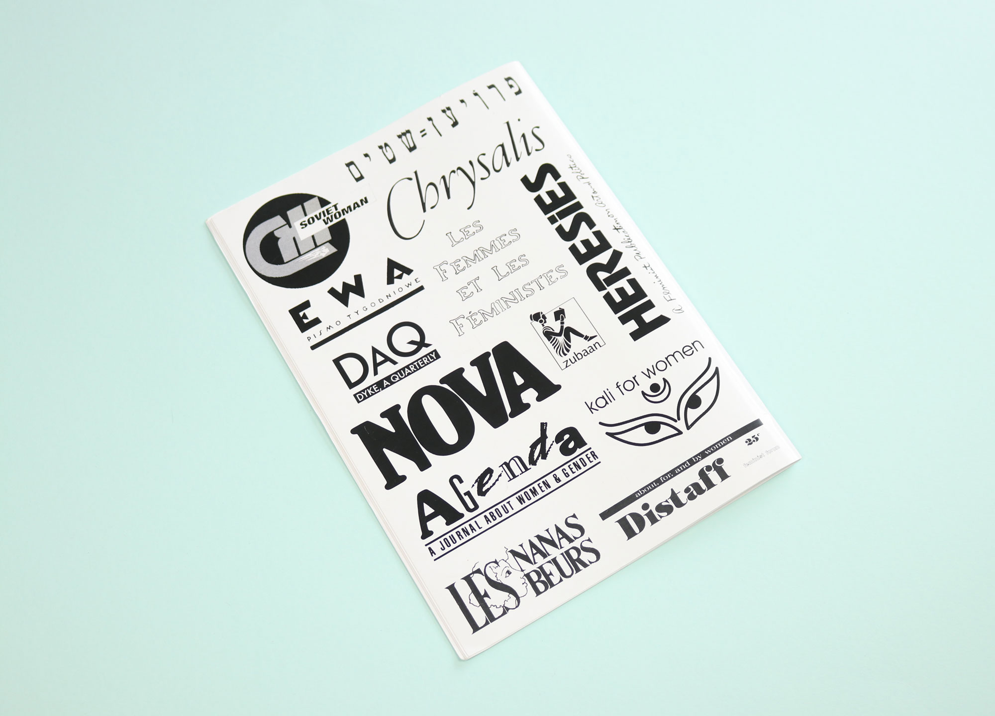
Adorned with the titles of feminist periodicals from around the world, Feminist Findings charts the history of womxn-run independent publishing. The magazines unearthed here are wonderful, and often very rare: there is Pheonix Rising, an Asian-American lesbian newsletter; Leïla, a 1930s Tunisian women’s periodical; and Manushi, India’s first feminist journal. One of my favourite pieces in the issue is a poem, written as a kind of homage to an unknown, unnamed woman who had taken the time to scan every single page of an obscure feminist periodical.
Devotion — the kind of careful, painstaking work it takes to record women’s voices for posterity — is a theme here. One article tells the story of how Sinister Wisdom, a lesbian literary and arts magazine that has featured contributions from Adrienne Rich and Audre Lorde, has been distributed through the prison industrial complex. The magazine provides free subscriptions to womxn in prison and mental institutions, with the editorial team working diligently with advocacy groups to get each issue to an incarcerated readership, despite censorship by prison authorities.
In a lovely way, Feminist Findings is itself an act of devotion. The magazine is made by the L.i.P collective (short for “Liberation in Print”), who came together as a result of a workshop facilitated by Futuress, an online magazine and community space by design researchers Corin Gisel and Nina Paim, and the journalist (and former Eye on Design editor) Madeleine Morley. Formed in the first days of lockdown, the collective decided to each choose one publication to discover, and to meet via Zoom every Wednesday to share research.
The loneliness of self-isolation has something in common with the loneliness of feminist study, Nina explained to me: “All of a sudden we were part of this group of womxn who were also isolated — what Li.P collective gave us was this wonderful sense of belonging. Feminist subjects are marginalised spaces within design discourse, but we were able to support and embrace one another’s interests”.
I spoke with Nina over the phone, who afterwards reached out to members of L.i.P to collectively answer my questions.
I was interested by the passage in your editor’s letter about how devoting oneself to feminist study is often lonely. That resonated with me. Can you tell me a bit about that loneliness?
Feminist subjects are still mostly marginalised within design discourse. Often myself, Maddy [Morley] and Corin [Gisel] do feel alone. With the L.i.P collective, all of a sudden we were a group; we were all people who were isolated, but we had found one another. One of our collective, the type-designer Naïma Ben Ayed, discovered what is probably the rarest piece of print in the magazine: Leïla, a 1930s Tunisian women’s periodical. Another example is Pheonix Rising, an Asian-American lesbian newsletter, which was researched by Sophia Yuet See. That was not the easiest periodical to find — perhaps one of the hardest — but that’s what makes the search so significant. Combing through the history of print is a feminist labour that at its heart is about connection. When you find the piece of print you are looking for, it is almost like finding yourself.
One essay asks why the prominent Lebanese women’s studies journal Al-Raida received funding from the Ford Foundation. Can you tell me a little bit about following the money, and what you uncovered?
We are all interested in the invisible structures that allow certain histories to become public. L.iP member and graphic designer Elham Namvar wanted to write about Al-Raida, which, since it started printing in 1976, has been publishing articles on women’s issues in the Middle East. It was founded by the Institute for Women’s Studies in the Arab World (IWSAW) — now known as the Arab Institute for Women — located at the Lebanese American University (formerly Beirut University College). Elham wrote about her curiosity about the fact that Al-Raida receives funding from the American Ford Foundation. Why was this Lebanese women’s studies journal receiving money from this huge American foundation? Was the journal being used by America to exert influence in Middle East? The interesting thing is that this can be the case: Al-Raida can indeed be a vehicle of soft power for American imperialism, but at the same time it can also be an emancipatory space in Lebanon. Things can be both. In general, we want to embrace this kind of complexity with Feminist Findings.
Another essay, by Phoebe Eustance, is about how the lesbian journal Sinister Wisdom has been distributed through the prison industrial complex. How does one distribute print in prisons?
What I find more interesting is the question of how the journal finds its way back into prison after being initially kicked out by prison authorities because it is “too salacious” — when actually it is being excluded because of its queer content. I was fascinated by the tenacity of the editorship in these situations; Julie Enszer, the current editor, told me that Sinister Wisdom are constantly pushing back. The magazine’s team document the rejection notes they receive from the authorities and send them to advocacy groups, who then write letters back to the prison authorities to try to get Sinister Wisdom back in. Sometimes the team actually have to tear out passages of the magazine the authorities have deemed to contain “offending images” and send them back to incarcerated subscribers. Inside the prison, the journal becomes a transactional, desirable object that can be swapped in exchange for something else.
Can you talk to me a little bit about the design of Feminist Findings? I find it evocative, but interestingly spare.
It looks like that because it’s a response to the material conditions in which it was produced. The zine was only made possible because Le Signe — who invited us to do the workshop in the first place — have a little printer. It’s a riso printer, and it can print in 6 different colours. The zine is A3 because that is the printer’s maximum format. A lot of the L.i.P collective are designers — so people very quickly started imagining their contribution in a visual form. While we were analysing the publications we talked a lot about typography: what is feminist design? What is feminist type-setting? We agreed as a collective to only use the typefaces by womxn, because type-design is a boys club.