Have a Bad Day

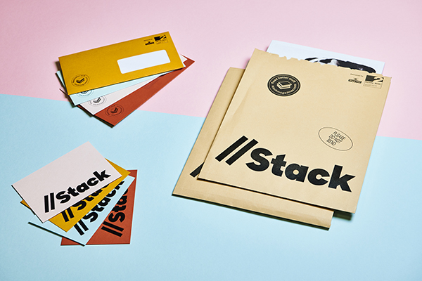
The last Stack America mailing of the year contained three publications (one entirely on postcards) and a remarkable Designers Series print that’s got New York magazine talking.
We were delighted that one of the magazines was the Toronto-based publication Bad Day, filled with smart interviews (including one with cover star Glenn O’Brien from Interview) and an exclusive poster as well. It’s a lovely, one-color publication with a tight design and bold content. We cornered Eva Michon to ask her all about the magazines, and if her day is going any better.
How did Bad Day come about?
Colin Bergh, my creative director, and I wanted to collaborate on a publication together, and the more we talked about it the more we wanted to include our friends and artists we admire. It started as a sort of photocopied zine, and grew from there.
Why the name?
We thought it was a pretty solid name that spawned a good logo, and eventually became a subversion of negativity. You should read it when you’re having a bad day, because it’ll turn it around!
What is the idea behind the magazine? What makes it different?
We’re different because we don’t follow any standard of magazine publishing; we carefully curate every issue and make it special for the reader. Every issue is slightly different in format, a different colour, and comes with a limited edition artist multiple. The idea is to showcase a dialogue with artists we find important today, and to put emerging artists on the same platform as established ones.
Was it difficult to start in Toronto? How is the magazine scene there?
When we began, there was nothing else like our publication in the Toronto art scene, so we’ve been supported ever since. We also throw fun events and have good parties in the city, so we’ve become part of the community. Now there are other publications like our friends Hunter and Cook, and a lot of artists have migrated there from other parts of the country. Having said that, we’ve also been warmly received internationally, which is encouraging.
I love the different colored tints on each issue. Was that always the idea?
I don’t think we ever consciously decided that as a choice, we just started doing it to switch things up, keep it interesting. I couldn’t imagine the magazine being the same colour, now.
How has the magazine changed since it began?
The design and content and layout gets better and changes with every issue, so I think the only thing that has stayed relatively the same has been our size. I think one of our goals is to keep evolving, so we’ve changed a lot since the beginning.
Who would you love to feature in the future?
We have quite a wishlist going, like we would love to feature Charlotte Gainsbourg, Peter Doig, Ricky Gervais. Oprah, Coco Gordon Moore, Grace Jones, Dennis Hopper. Some of those are impossible, but we’re featuring Sofia Coppola in the upcoming release, which I’m really thrilled about!
If you had an unlimited budget, what would Bad Day look like?
I don’t know if we would change our format, but we would probably switch to green printing and experiment with really expensive ink. Holograms, flocking, insane artist supplements that cost a lot to ship. I think with financial restrictions you’re forced to be more creative, so it’s difficult to imagine. But maybe someday we’ll find out 😉
