Magazines we want to stroke
Think of a magazine and chances are you think of its cover. The cover is almost always the most important page of a magazine – the single, defining combination of text and image that encapsulates what the entire issue is about (and hopefully convinces you to buy a copy). But we’ve seen a few magazines recently adding in an extra dimension of cover appeal – going beyond the visual, they also play with texture to capture readers via their sense of touch.
Holding a magazine in your hands, the feel of the thing is inescapable – the paper, card, cloth or whatever else it’s made of can’t help but communicate something about the entire project. Of course it’s not as easy to communicate that via a screen, but I hope the following collection can go some way to explaining what these magazines are like in the flesh…
Gossamer
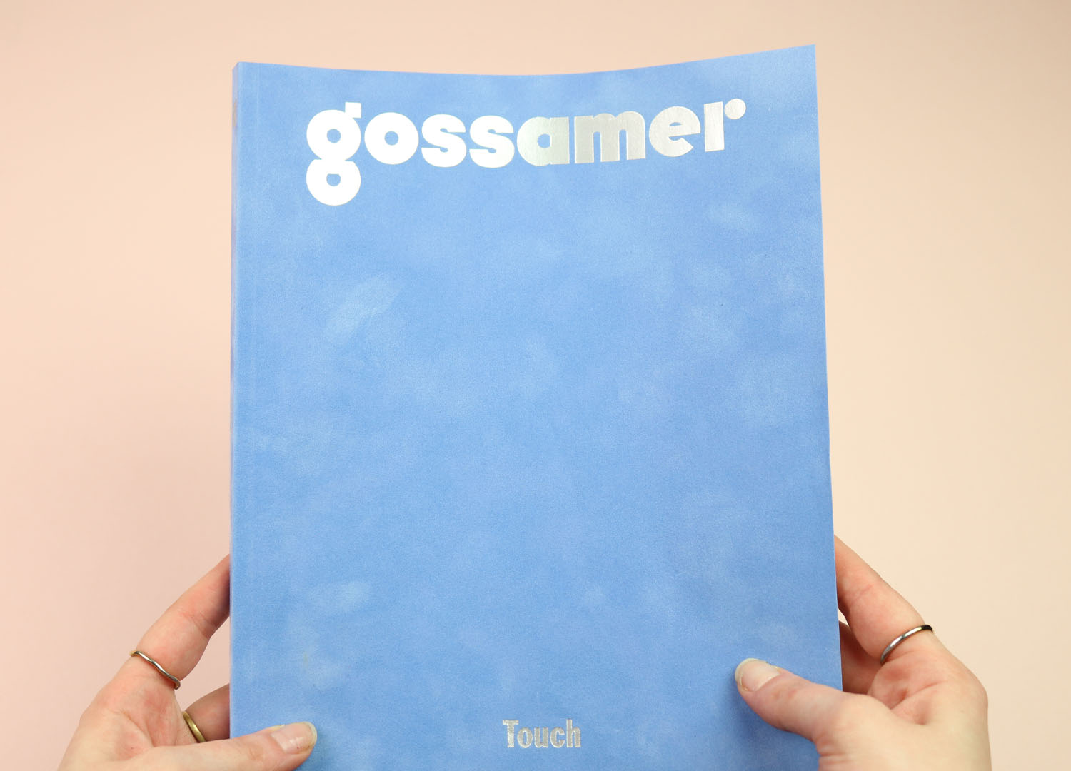
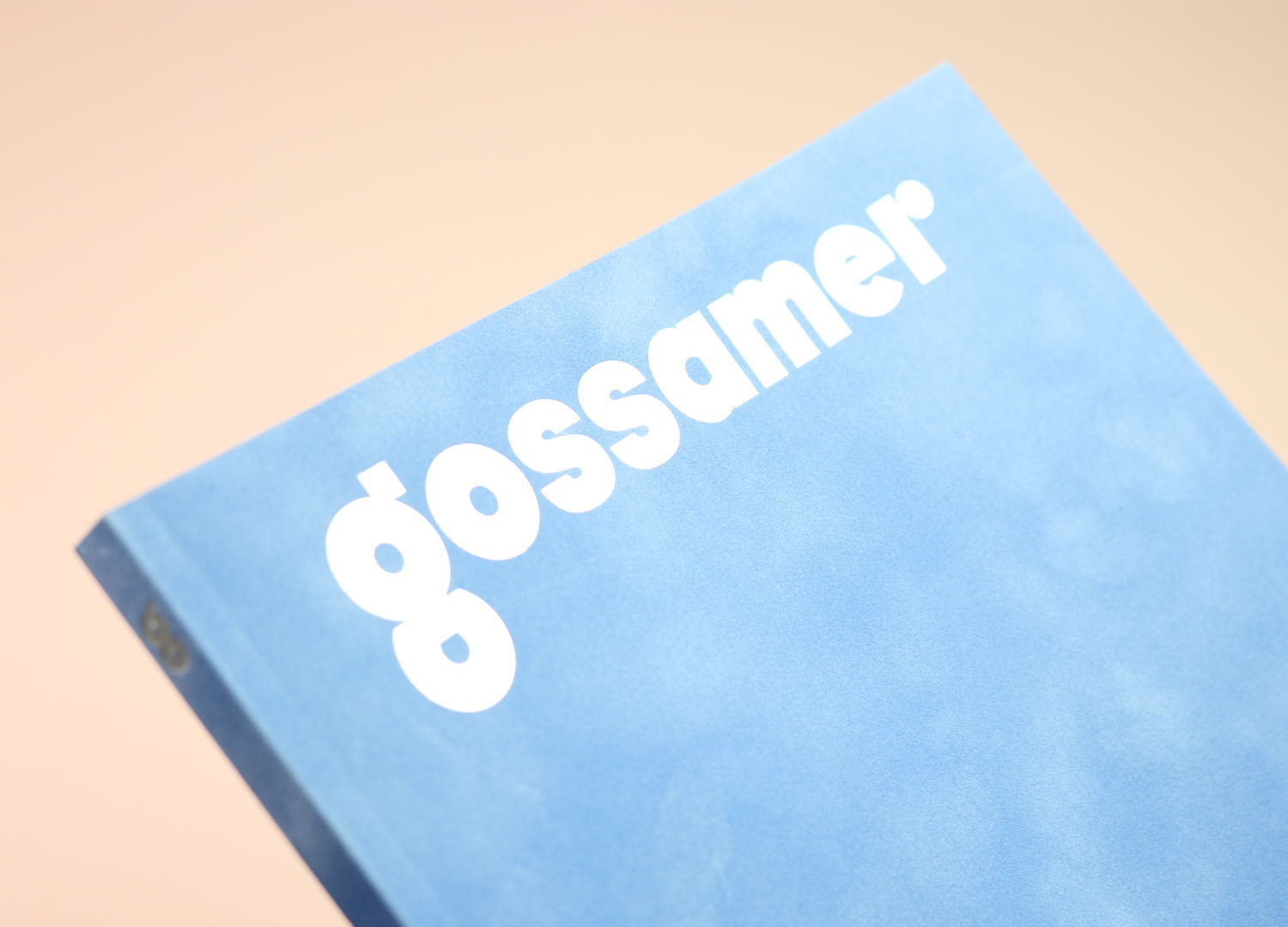
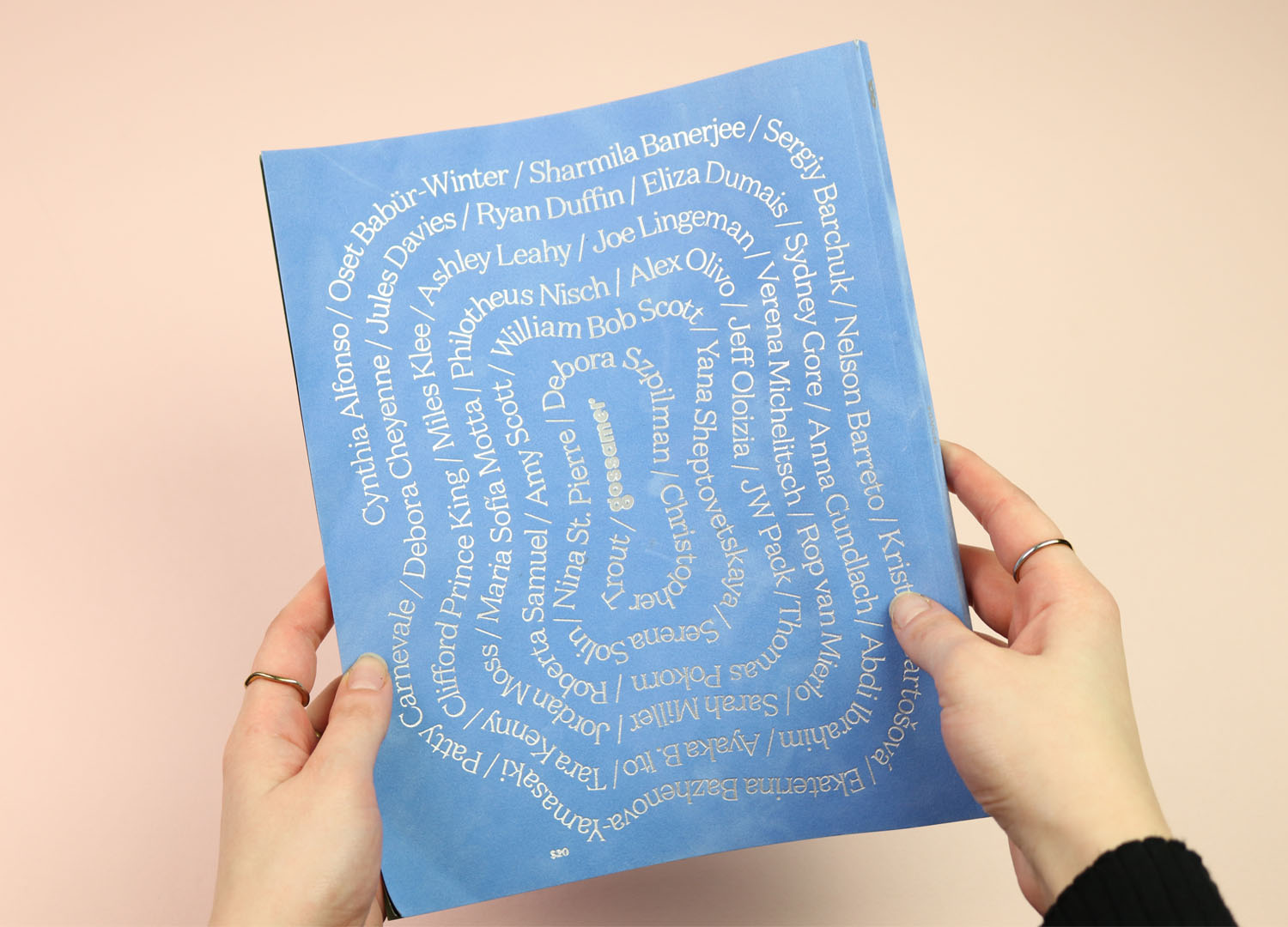
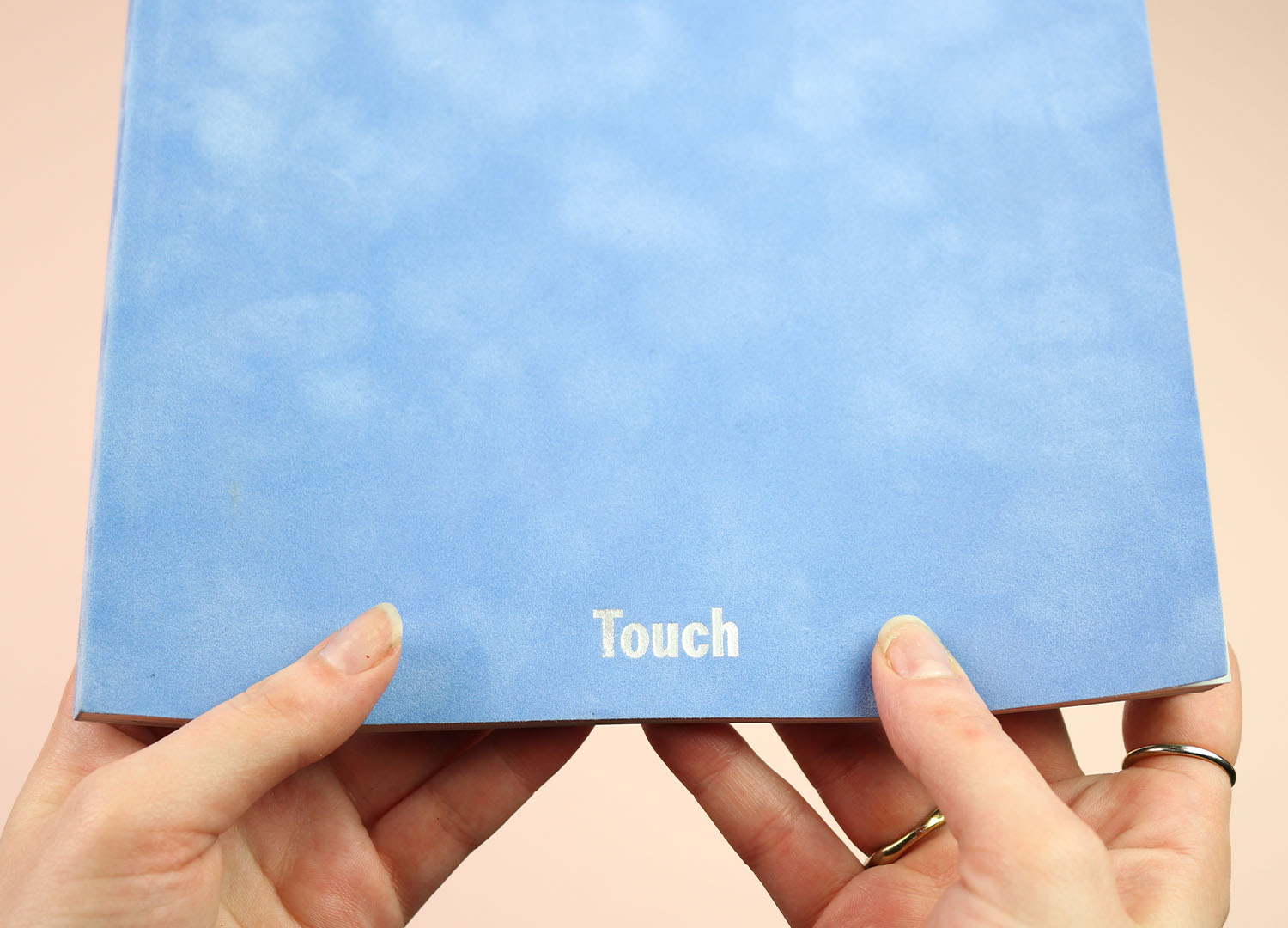
This whole post started out with the latest issue of Gossamer, which is themed ‘Touch’ and comes wrapped in a lovely soft, flocked cover that I find myself stroking absentmindedly whenever it’s on my desk. The front is given over to just the masthead and the word “Touch”, while the back is a lovely meandering list of the contributors, all of it stamped into the fluffy blue with sharp silver foil.
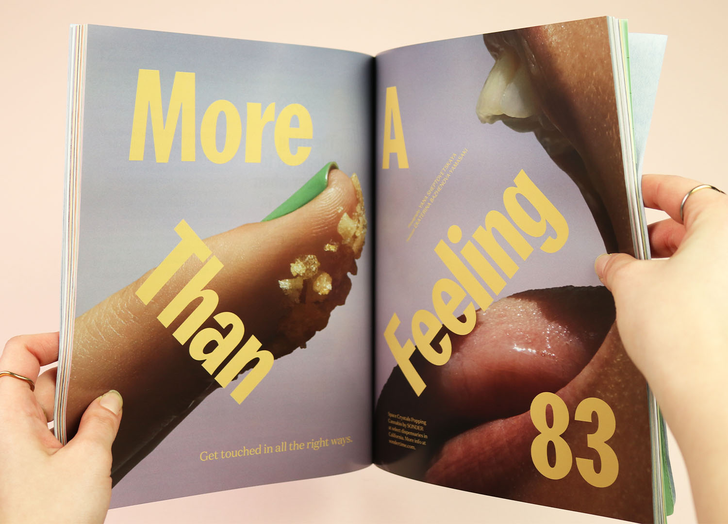
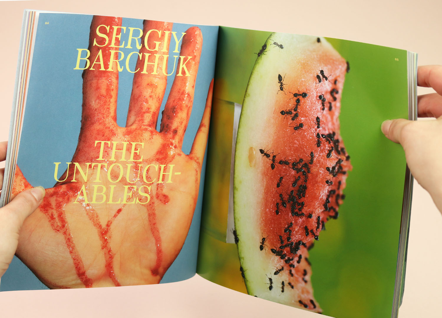
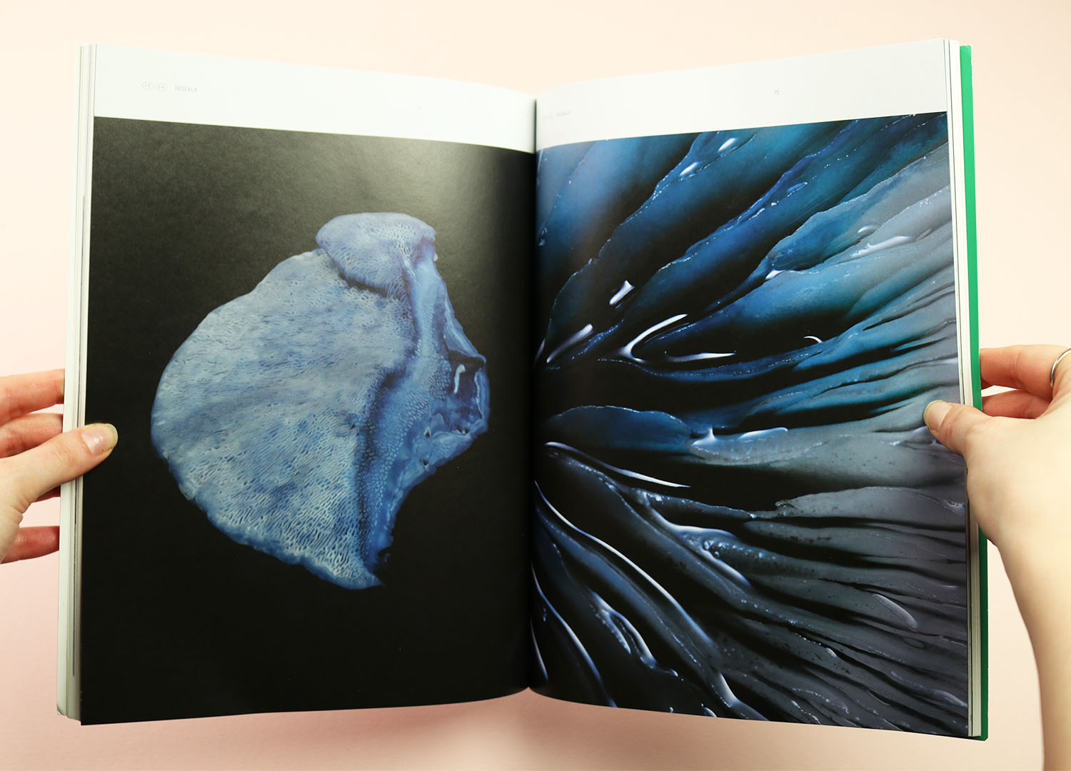
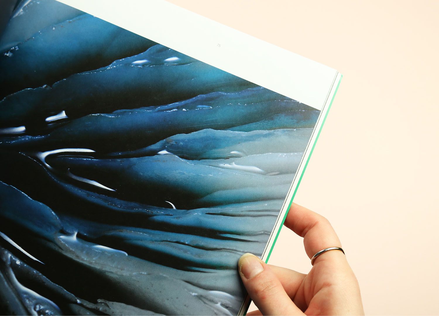
Gossamer is nominally a magazine about cannabis, and the connection to the theme is clear: “Naturally, the experience of touch is heightened by cannabis, whether in beverage, flower, or even infused popping candy form. (If you’ve ever hotboxed a shower or felt the rays of the sun after an edible, you know what we’re talking about.)” I haven’t done either, but I think I can imagine what they mean, and several of the stories offer a helping hand, like More Than a Feeling, with a big close up on that infused popping candy. Or Sergey Barchuk’s brilliantly sensuous The Untouchables.
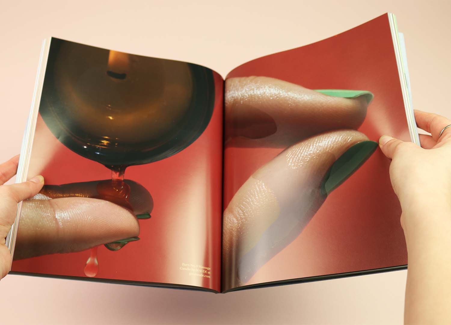
Matching intelligent, entertaining writing with this gorgeous photography, Gossamer’s delights last well beyond that strokable cover.
Buy Gossamer in the Stack shop
Indie
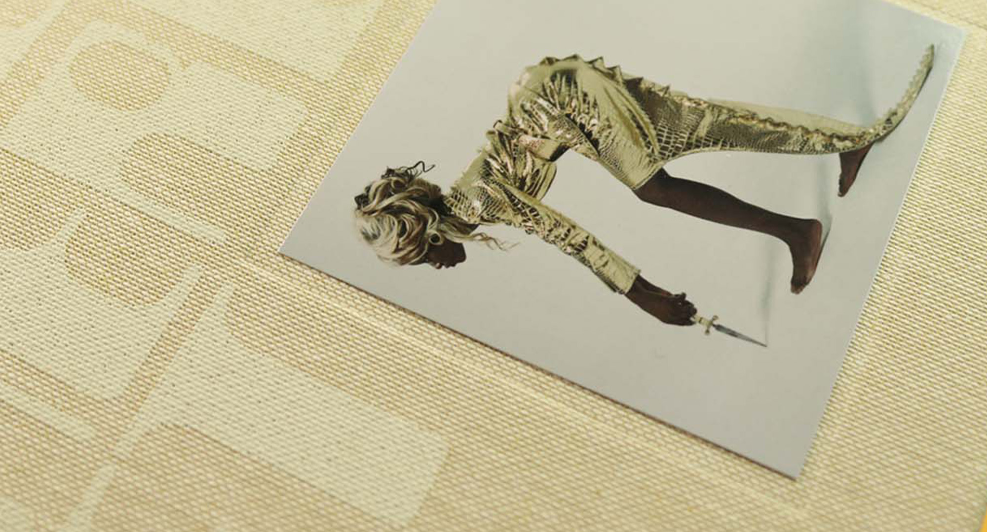
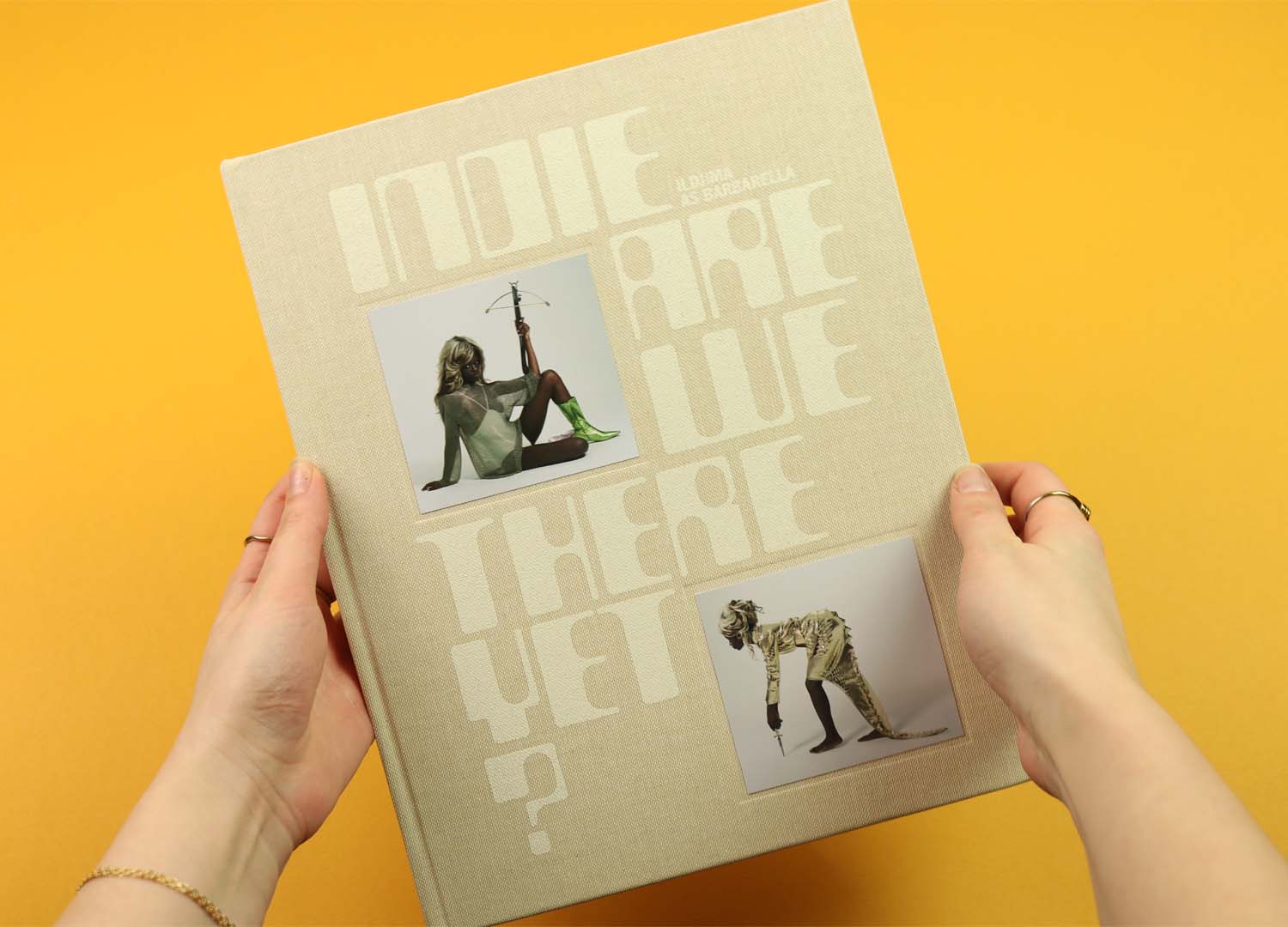
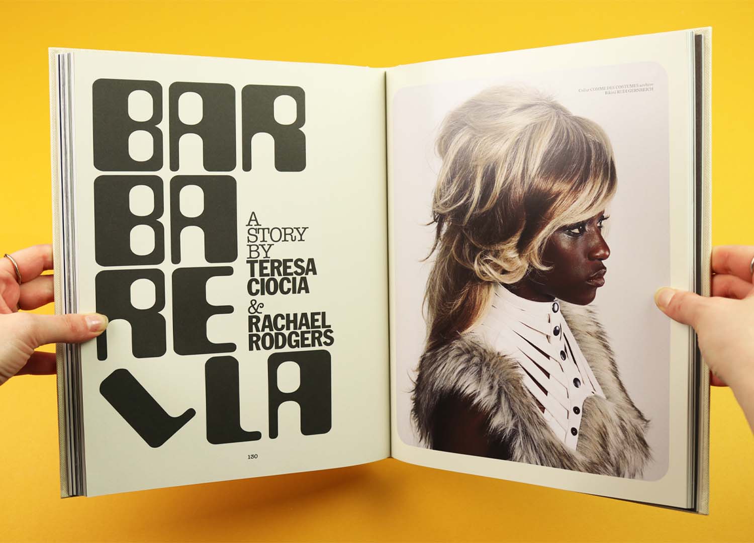
The latest issue of Indie is less interested in touch as a theme, but uses it to create a totally distinctive publication that subtly plays on ideas of past and future. The size and format is similar to the last issue – a big, thick, hardback book of a magazine. But this time it’s been wrapped in a textured cloth that makes it feel more like a vintage photo album, complete with photographs that have been stuck into debossed frames.
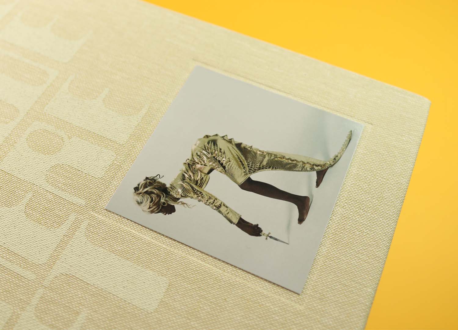
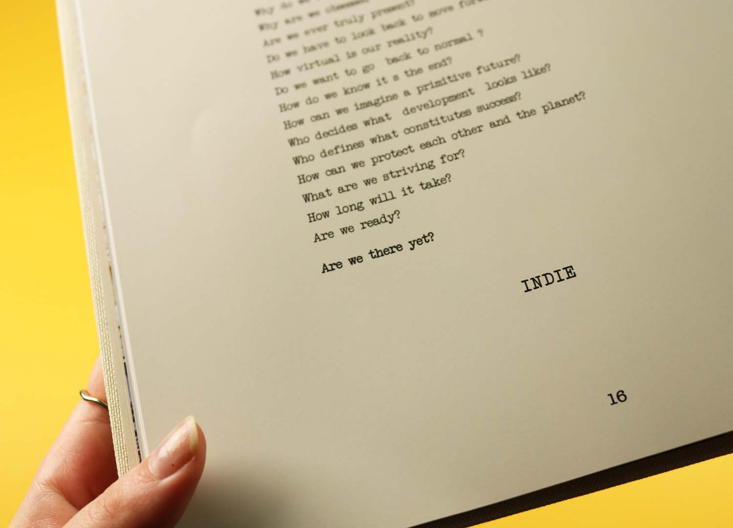
There are four alternate covers for the issue, with this version featuring a Barbarella-inspired photo shoot, starring the model Ildjima, photographed by Teresa Ciocia and styled by Rachel Rodgers. There’s a playfully nostalgic sense to the pictures, with Ildjima posing in a massive blonde wig and shiney, space age clothes, and the poetic editor’s letter offers a hint at the thought process motivating the issue: “Why do we romanticise the past? / Why are we obsessed with the future? / Are we there yet?”
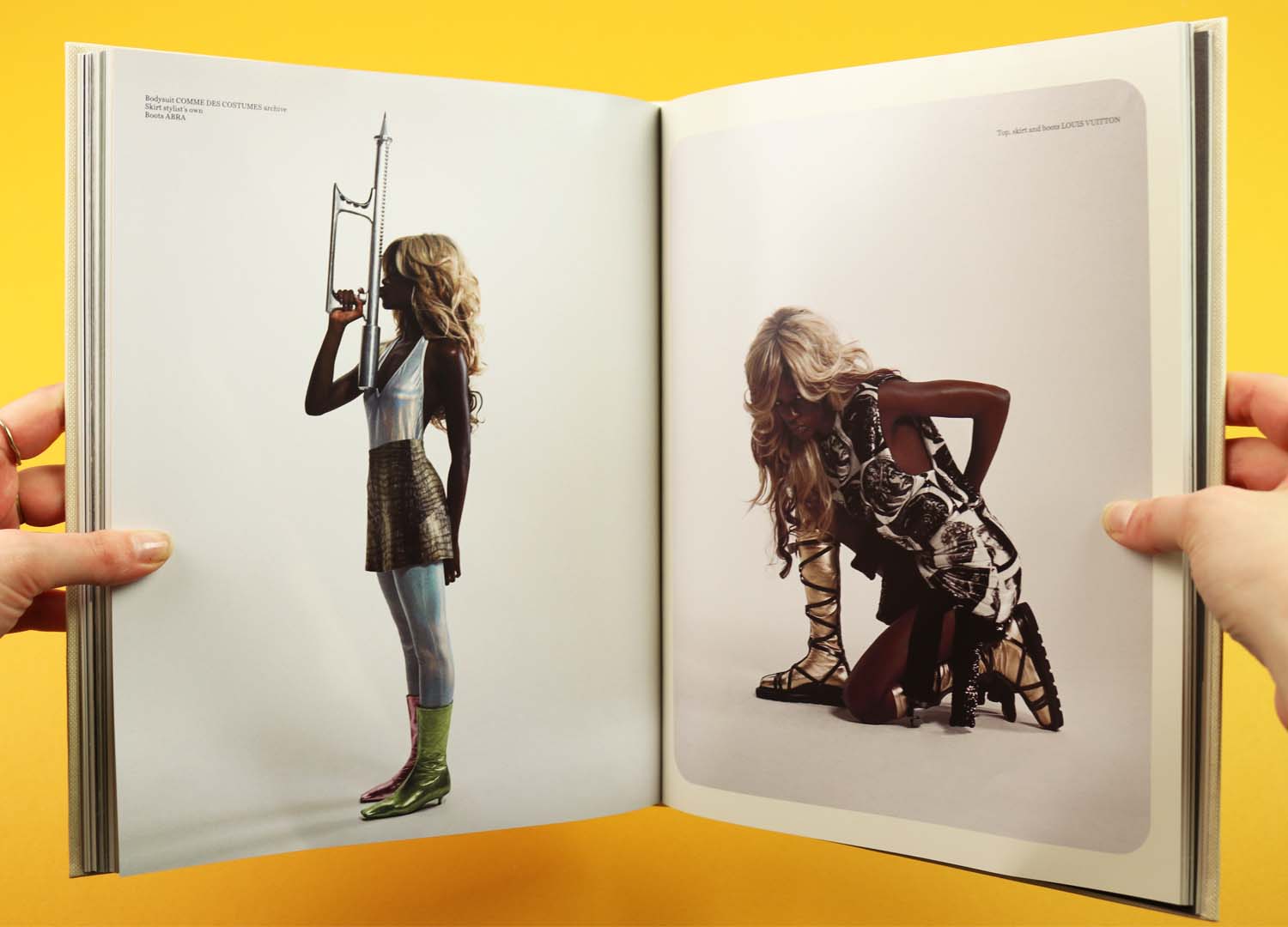
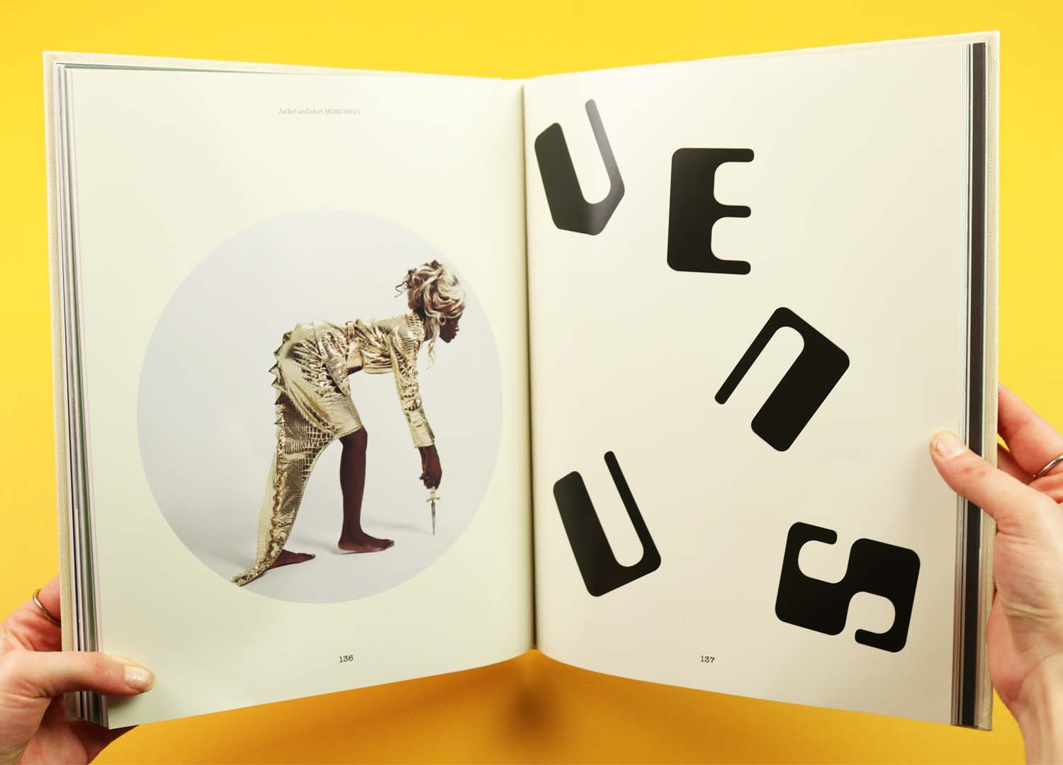
Unmoored and floating through time, the issue becomes a sort of scrapbook of looks and ideas, mixing nostalgic memories with exciting ideas of the future, all bound up within its thick covers.
Paperboy
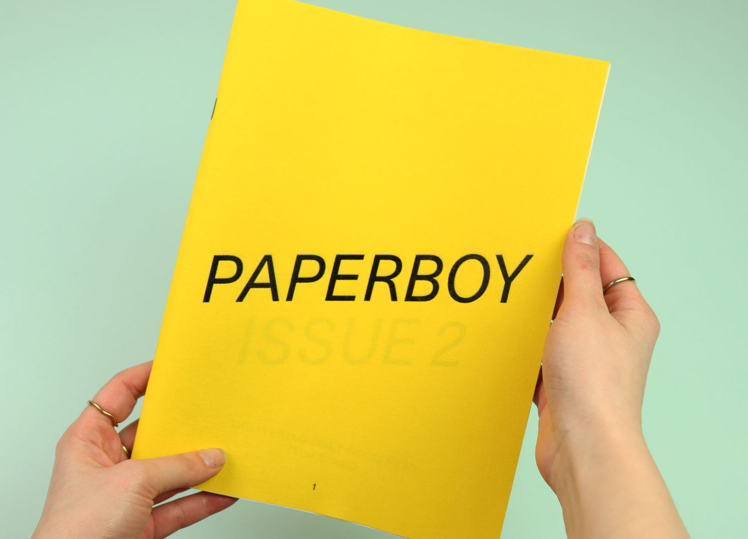
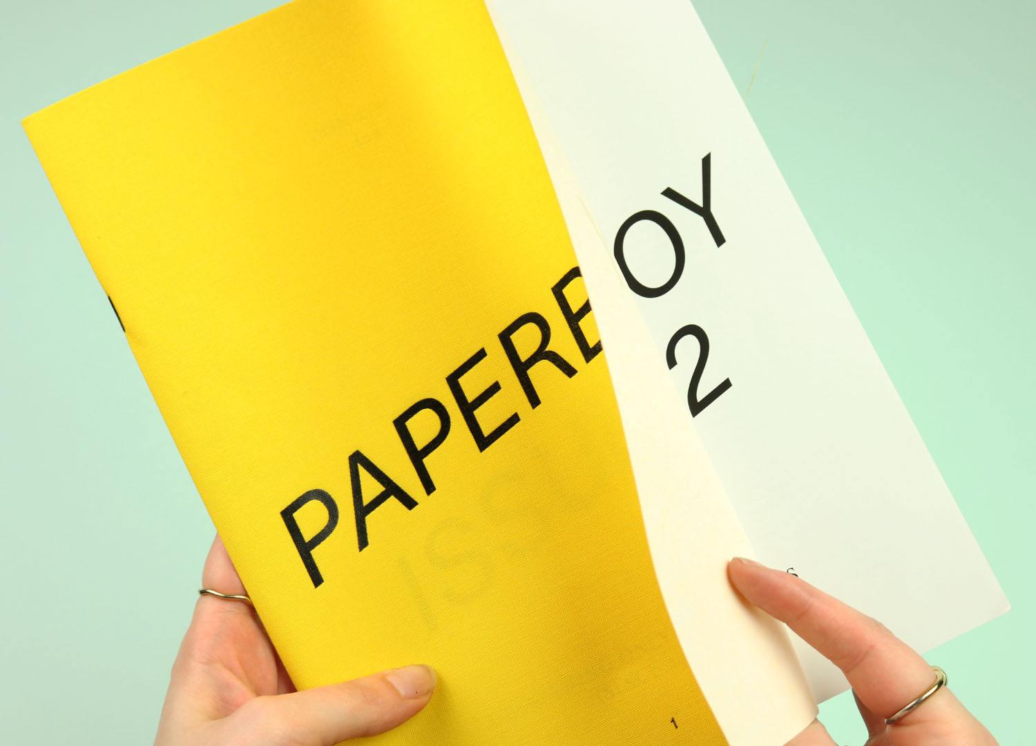
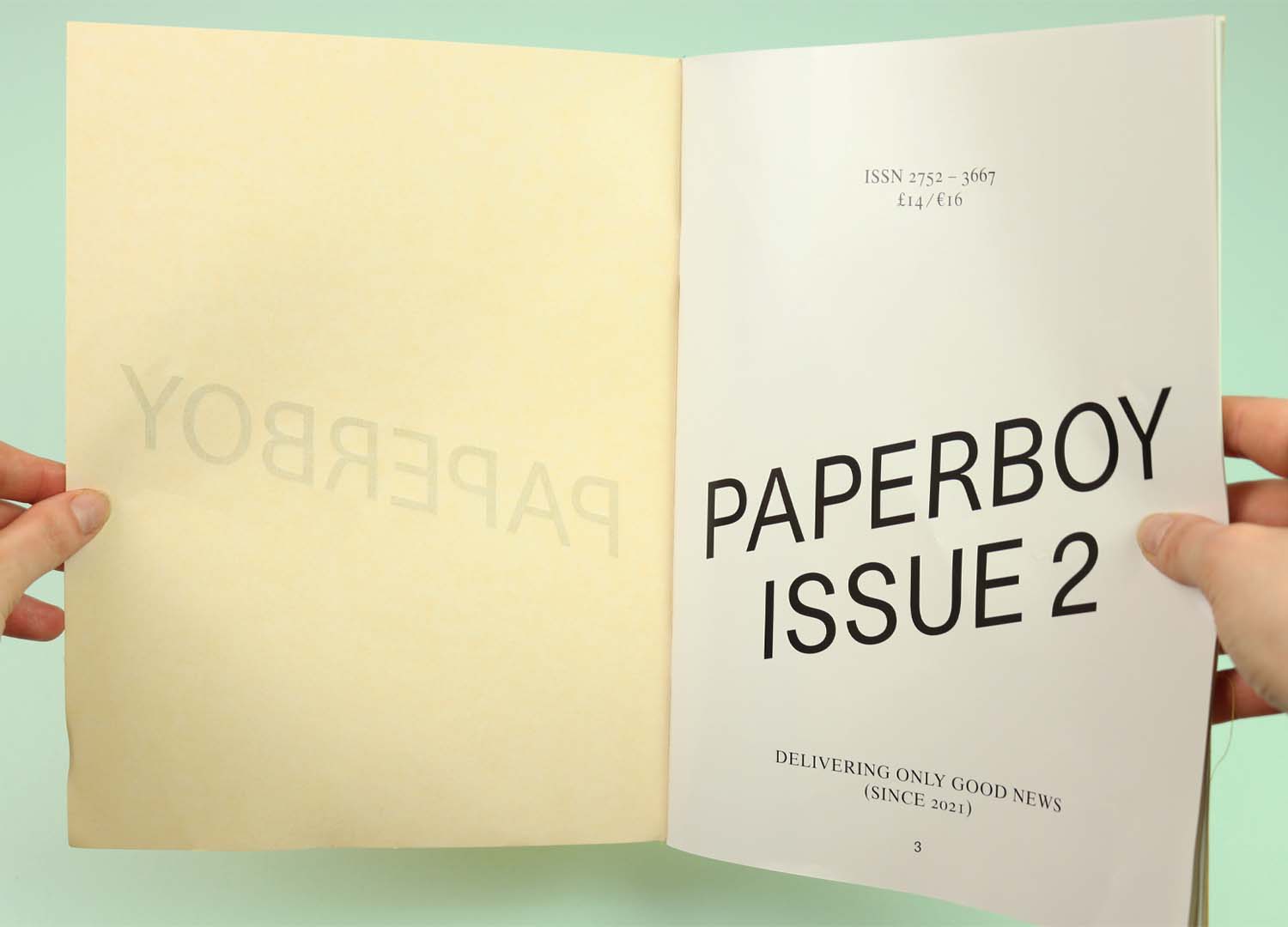
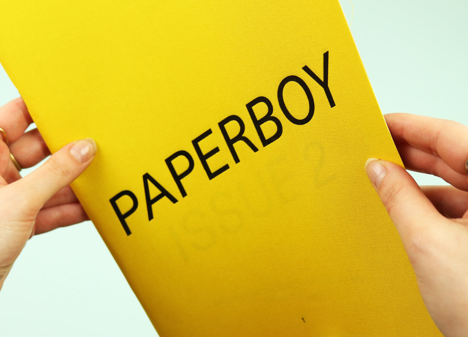
The bright yellow cloth cover of Paperboy helps to set the tone for a fun and sunny collection of stories, presented in the magazine that proudly says it’s been, “Delivering only good news (since 2021)”. The cover material is tough but thin, allowing the issue number to show through from the page behind and creating a nice little interaction on opening the magazine for the first time.
There’s some lovely first-person writing in here, but the photo shoots are my favourite bit, with their bucket hats, cheery titles, and children wearing a ridiculous number of coats.
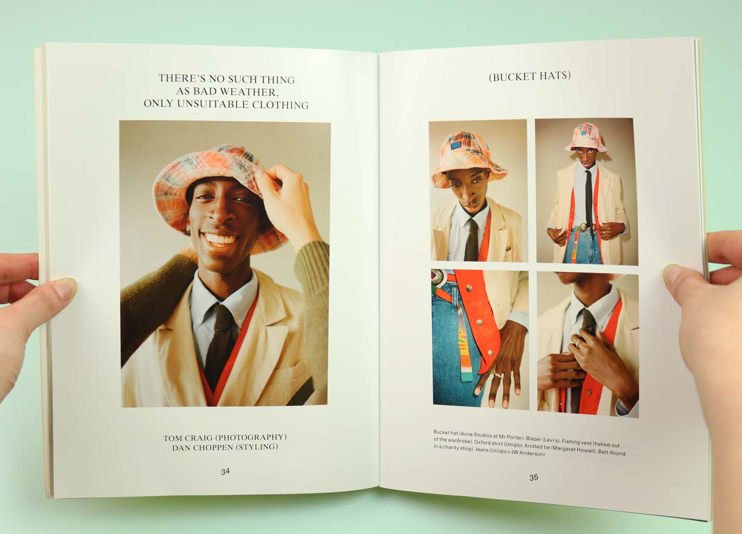
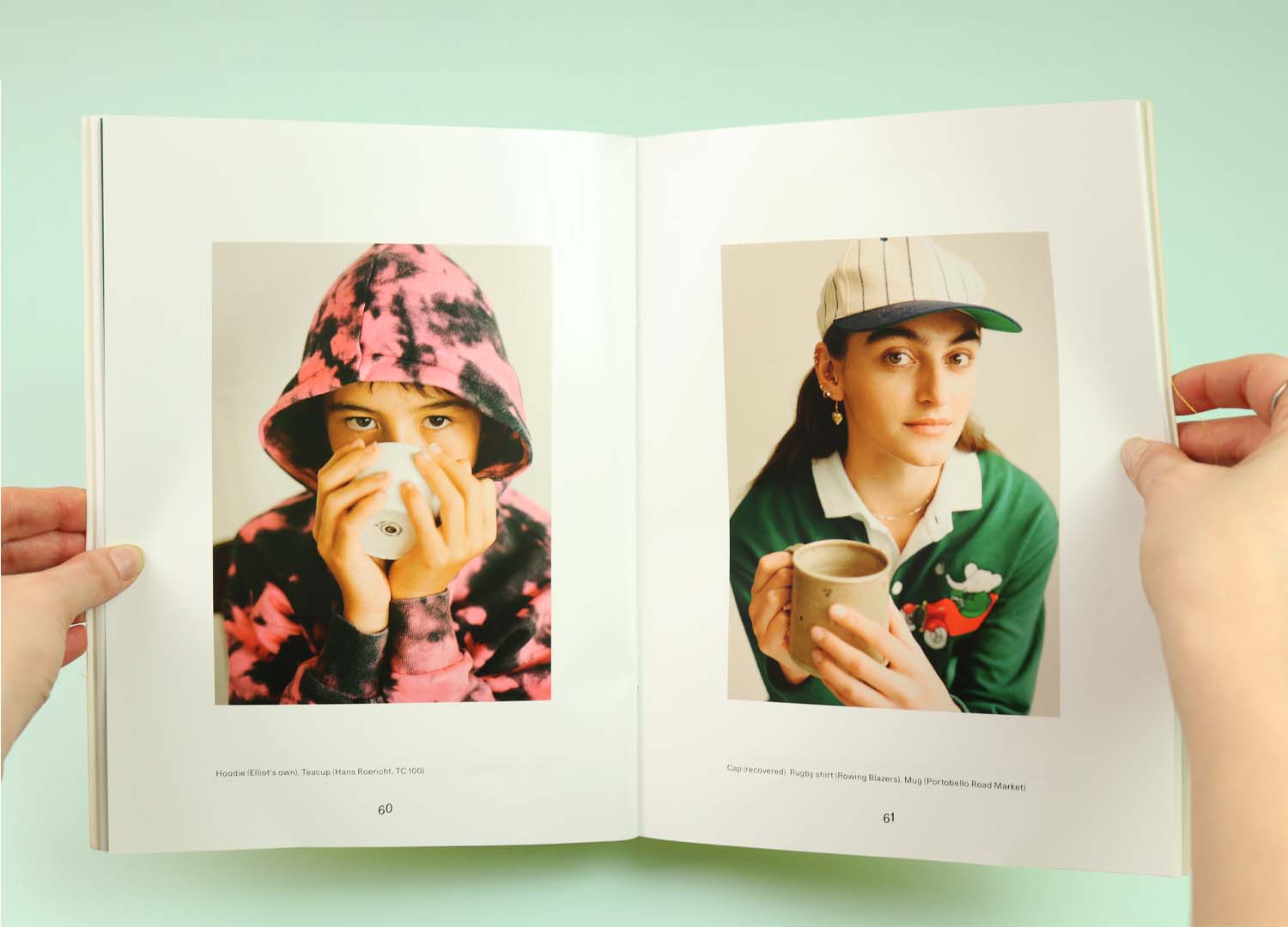
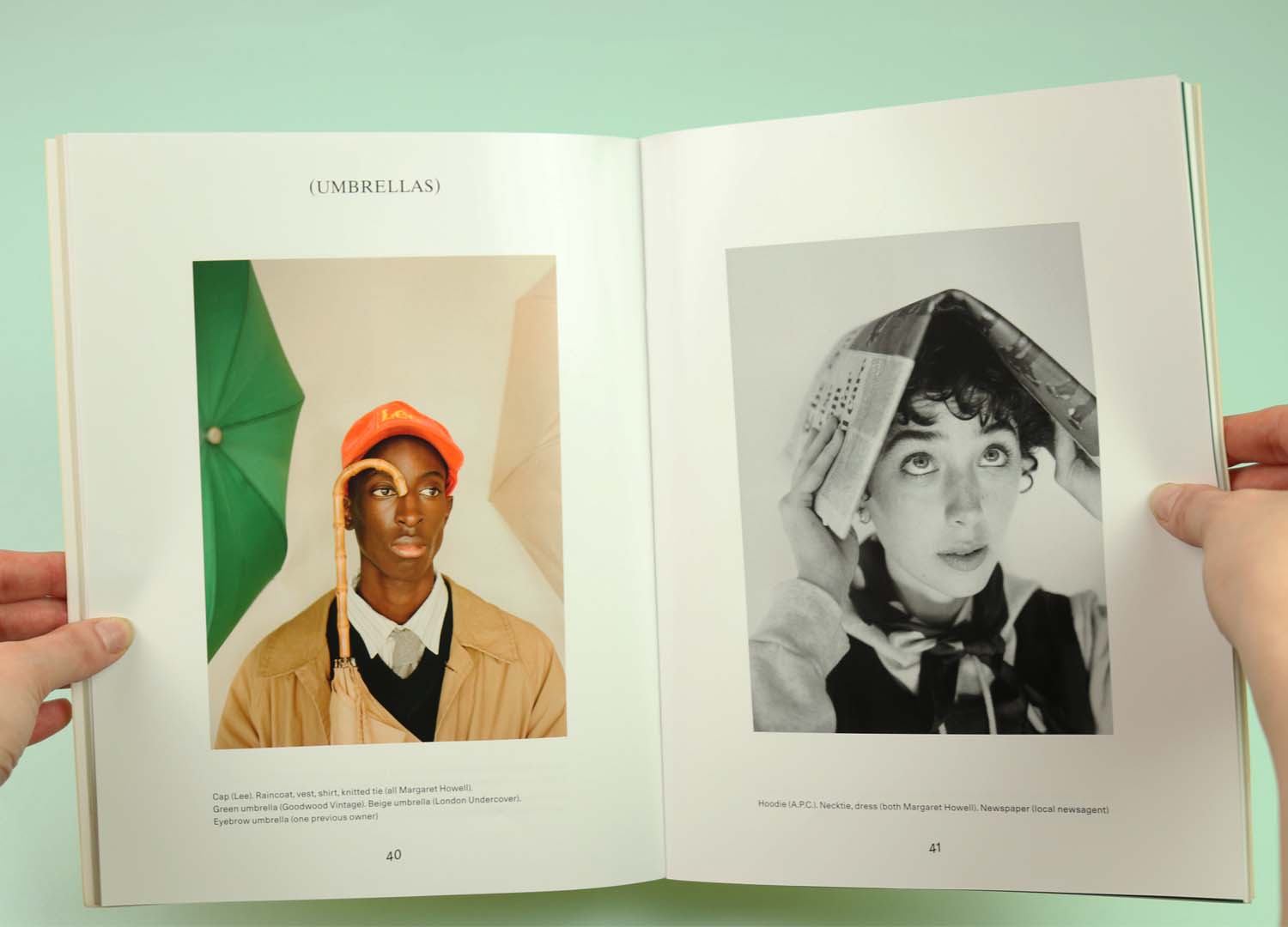
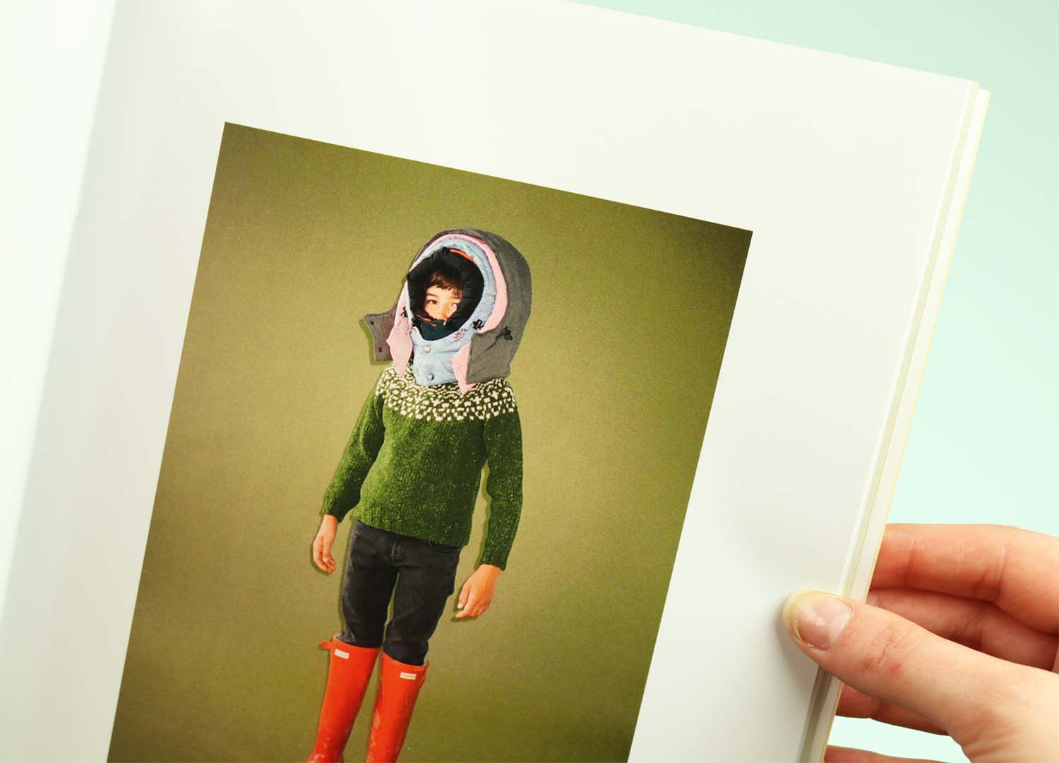
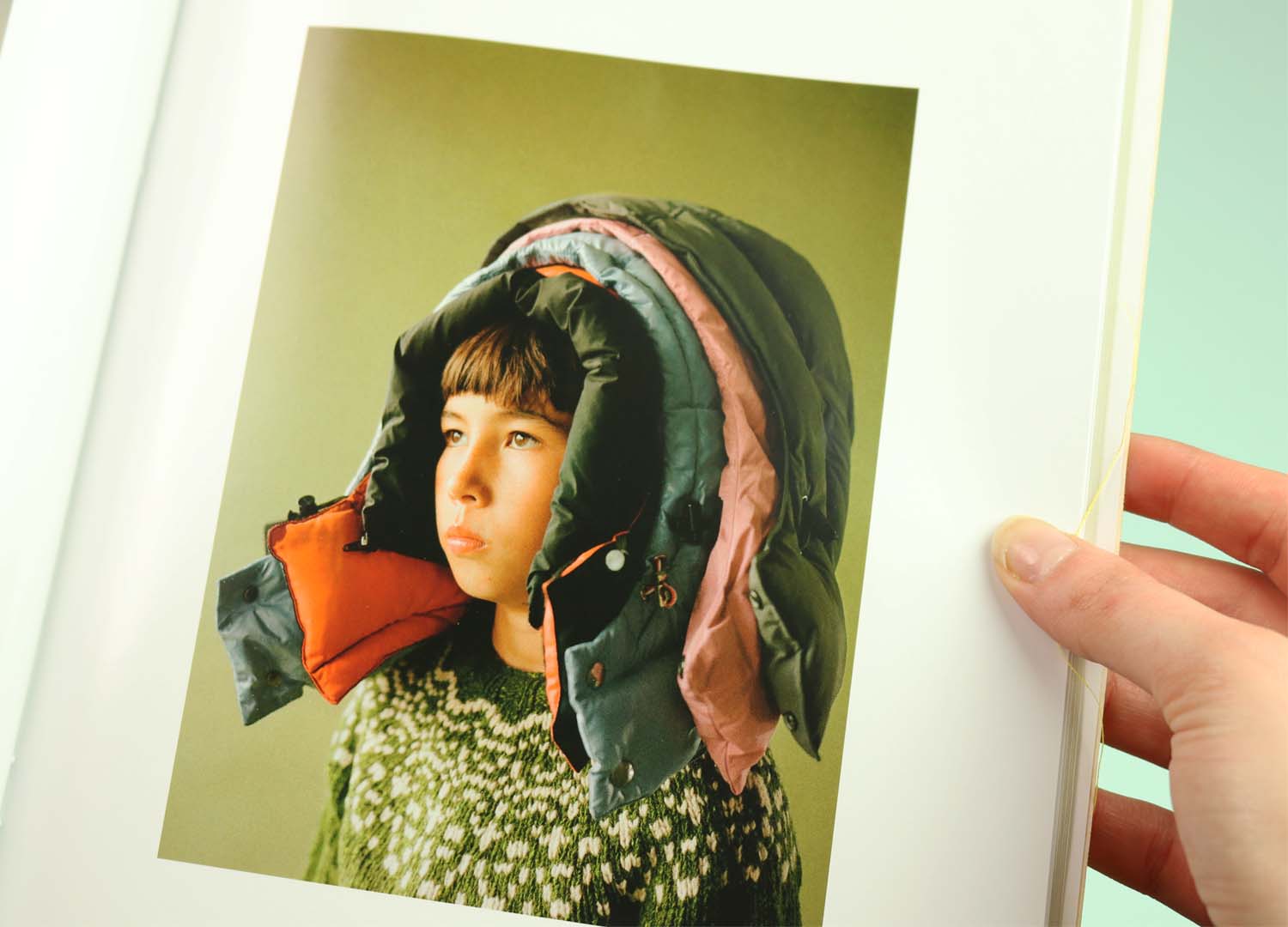
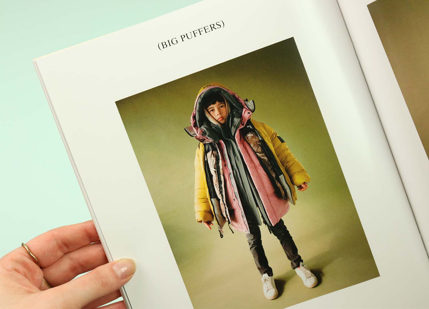
With its beautifully characterful shoots and clever little touches Paperboy manages to be sweet without getting sickly, and it totally wins me over to the good news mission.
Buy Paperboy in the Stack shop
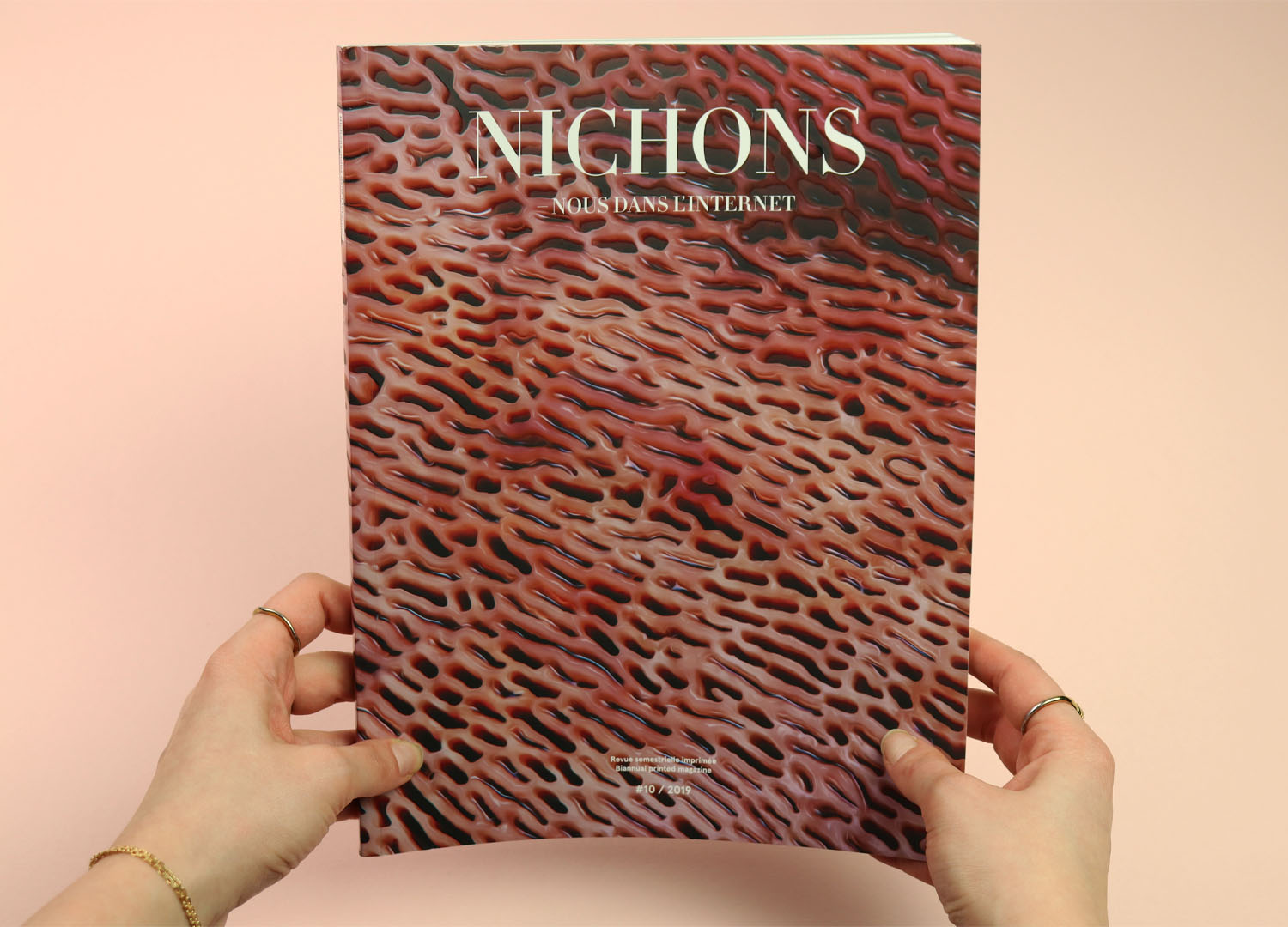
Nichons Nous
Published a couple of years ago, this is the oldest magazine in the selection but I wanted to include Nichons Nous because I love the way it attracts by repulsion. Like some kind of printed corpse flower, it uses the disgustingly fleshy texture of its wraparound cover to attract readers, with a gloss varnish picking out the ‘raised’ parts around the matte ‘holes’. (I put this cover on Instagram when it first came out and I don’t think I’ve ever seen a more disgusted response – I’d never heard of trypophobia before this magazine, but the fear of small holes is definitely a thing.)
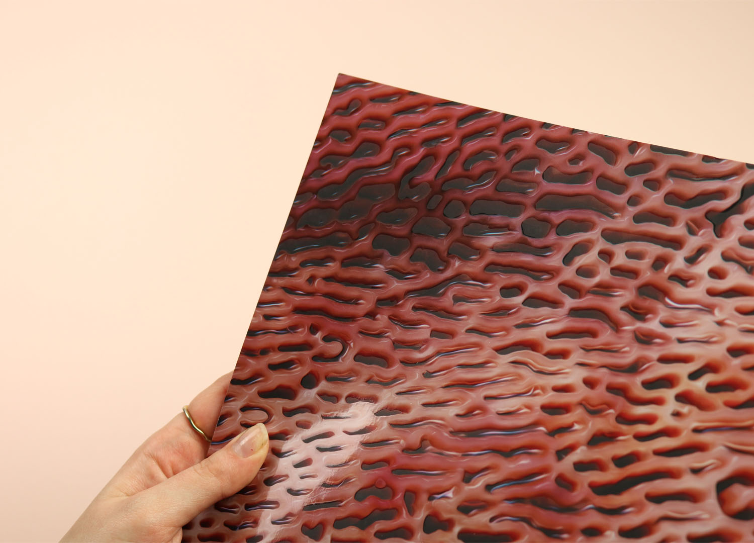
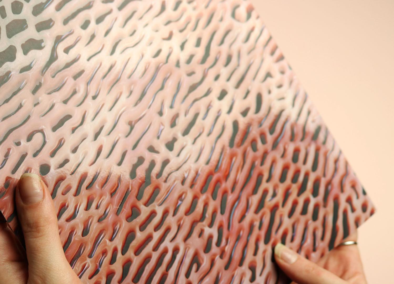
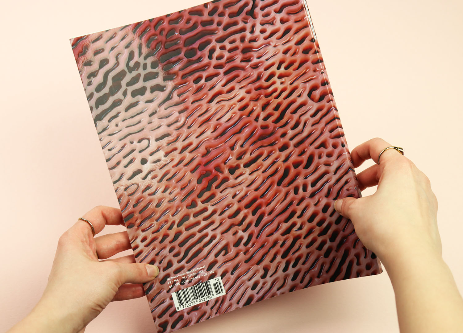
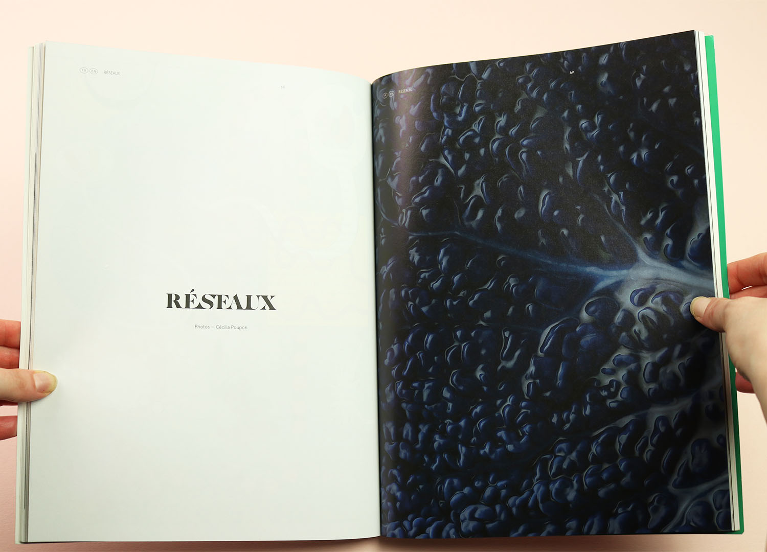
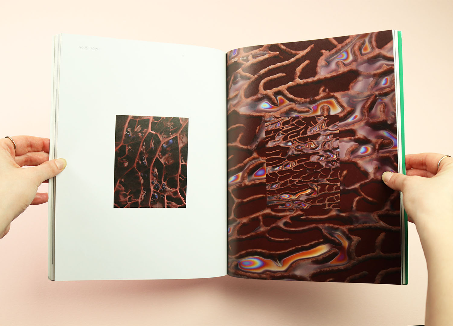
Nichons Nous is a French magazine about the internet and digital culture, and the cover shows a digital image created by the artist Cécilia Poupon. There are more of her weirdly visceral artificial artworks inside the issue, but none of them have the repulsive power of the cover, testament to both the image itself and the way it has been used here.
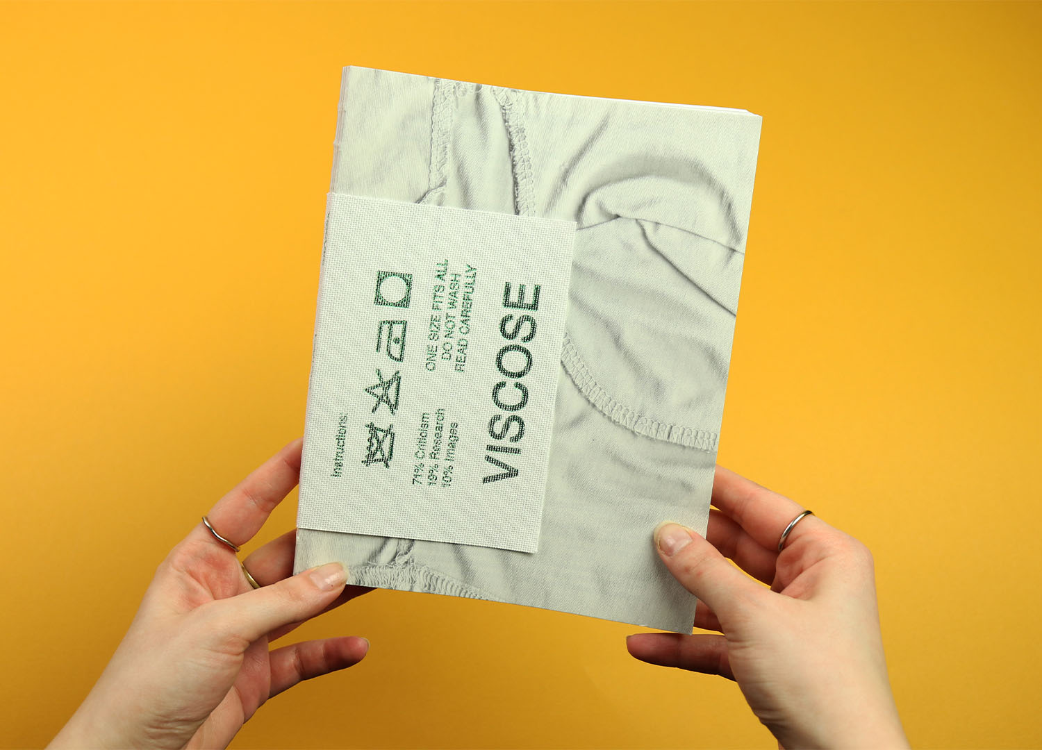
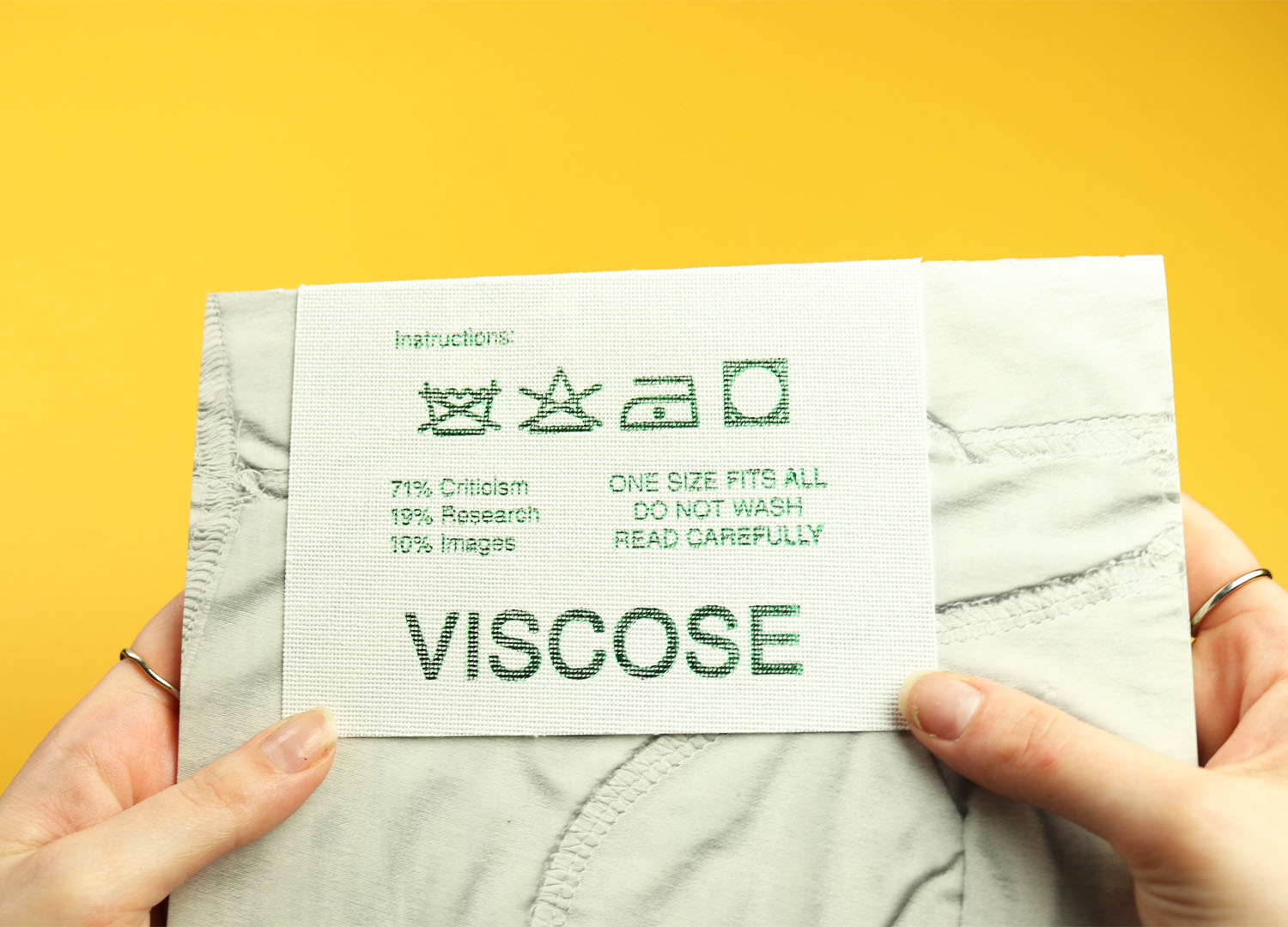
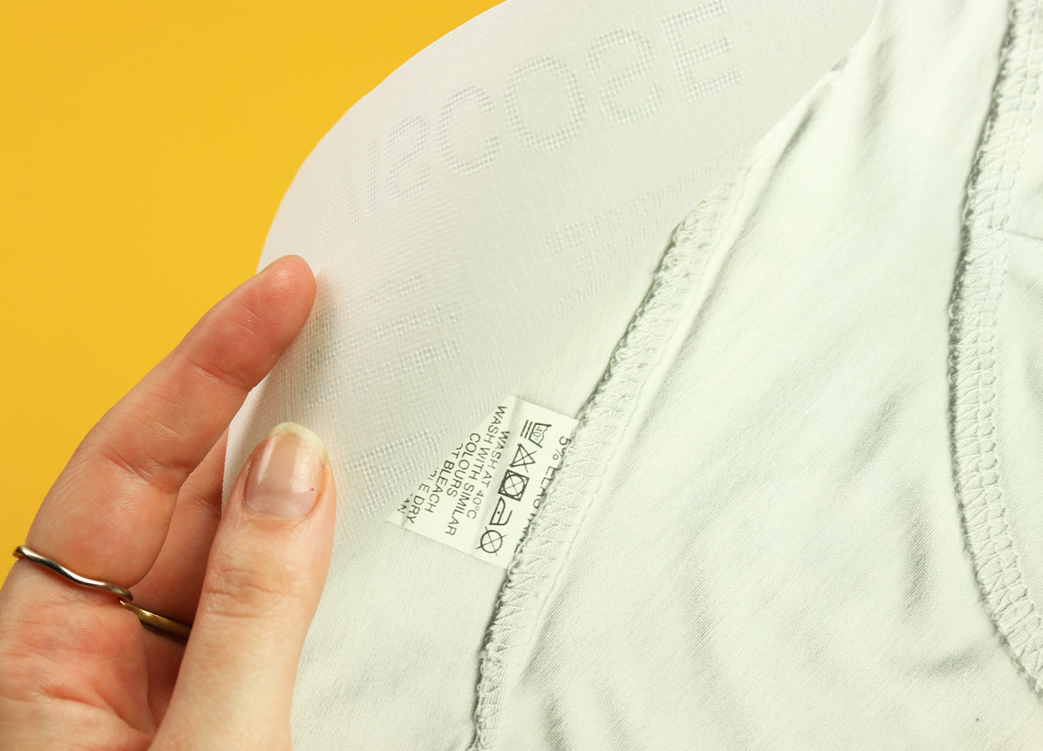
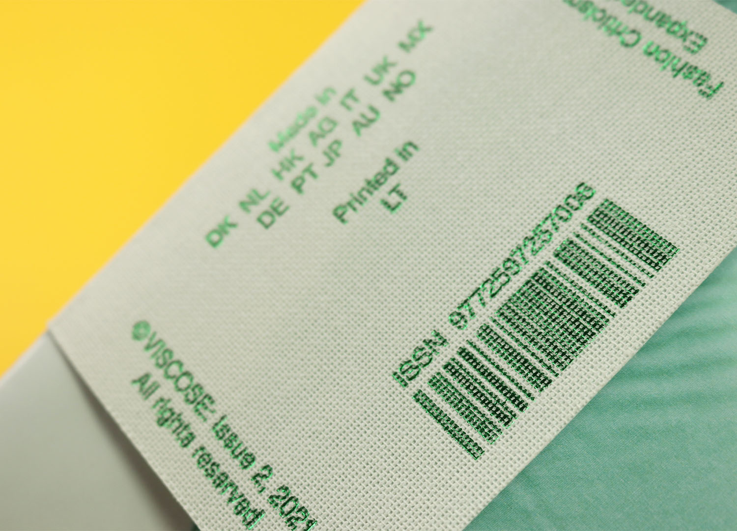
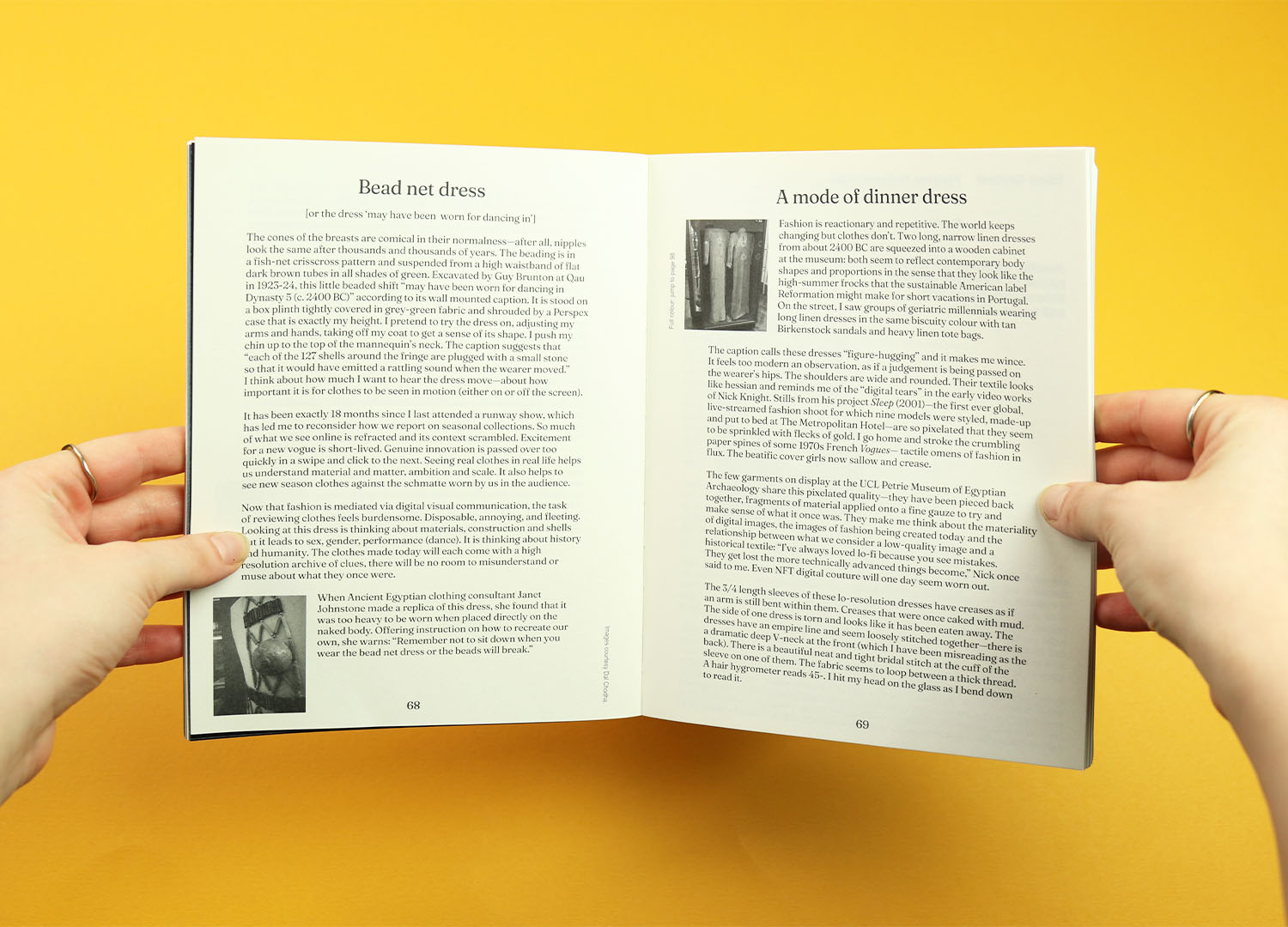
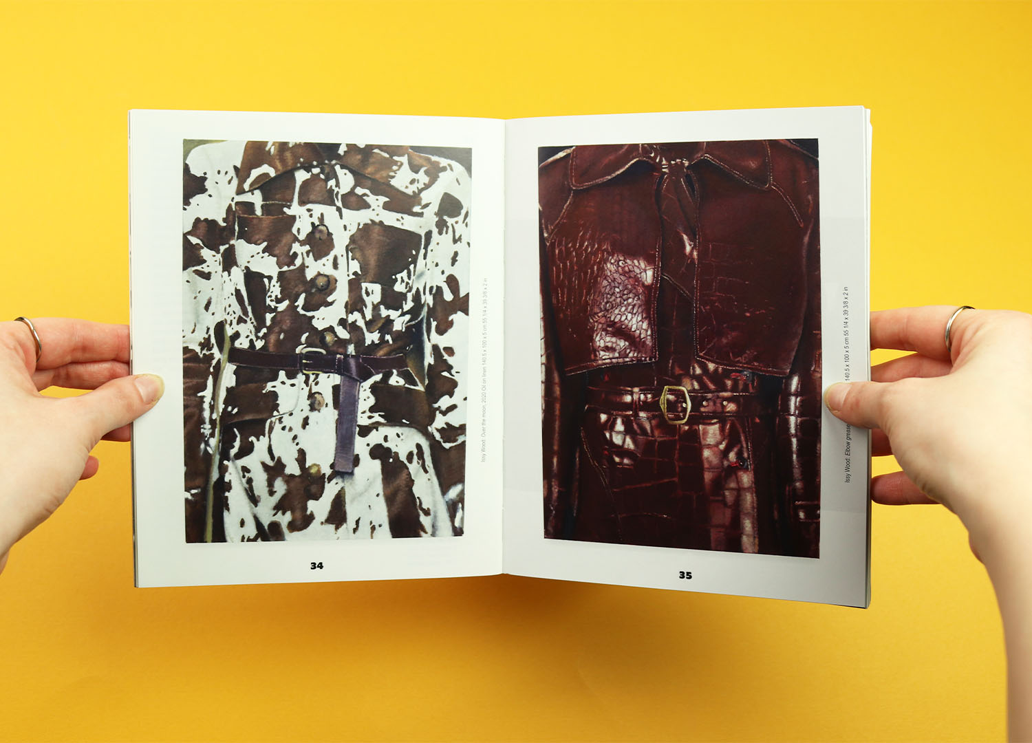
Viscose
A magazine of fashion criticism that also wants to have fun with its subject, the first issue of Viscose was published as the world’s first ‘bagazine’, complete with leather-effect cover and a die cut handle. And this second issue comes with a care label attached to the front and back covers, printed with advice like, “One size fits all”, “Do not wash” and “Read carefully”. Like the instructions themselves the textured material is a pastiche of a real care label, and I like the way they’ve included a picture of one, hidden behind the big, loud, attention-grabbing version.
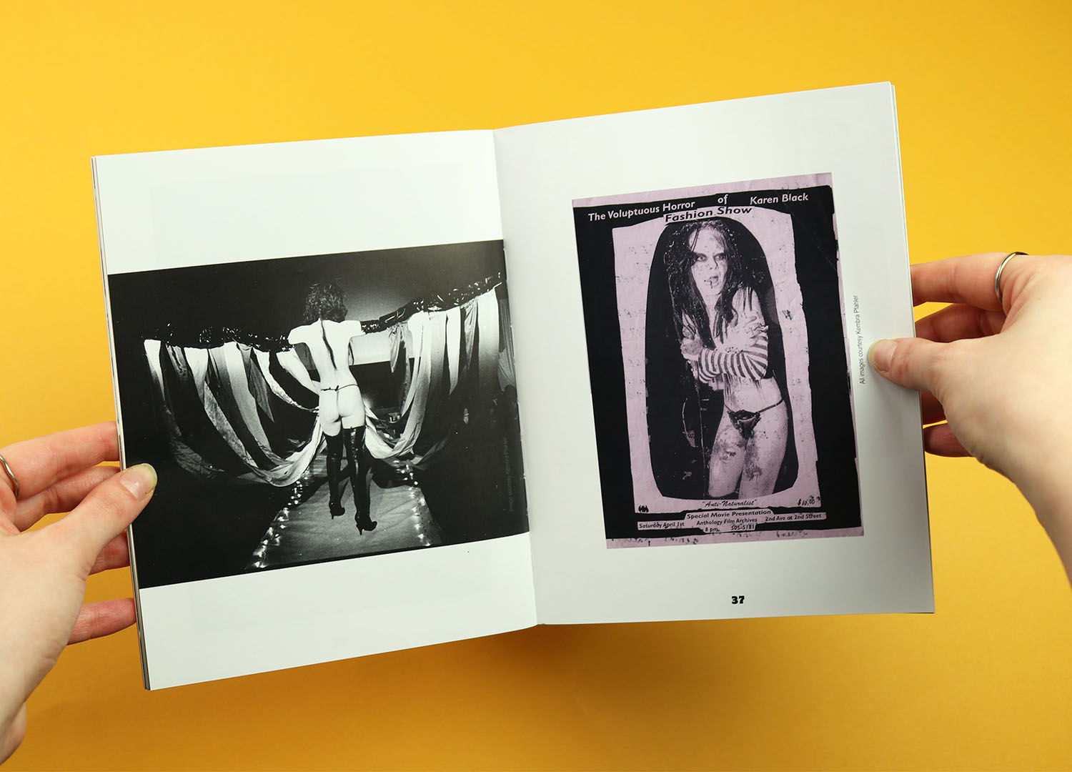
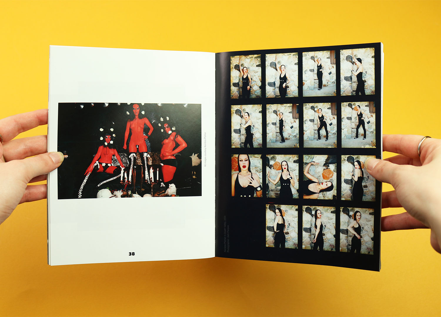
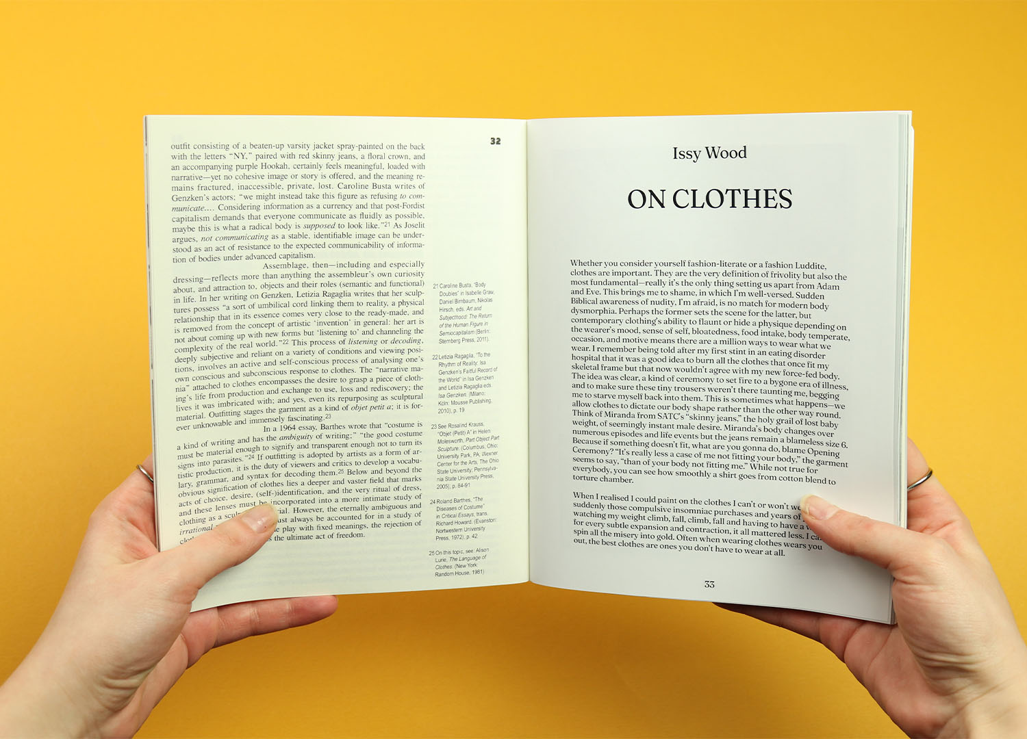
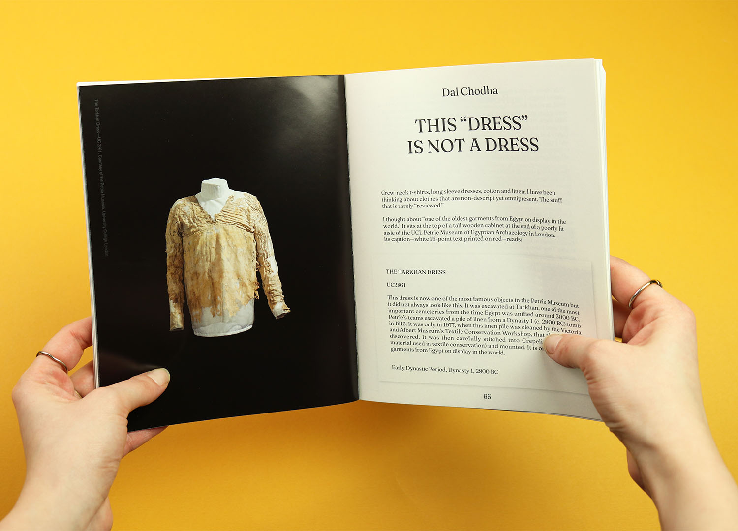
The theme of the issue is clothes, and it brings together a collection of stories that consider the things we wear as the most fundamental building blocks of fashion. There’s critical writing on the history of clothing, stories that consider the impact clothes have on us, and brilliantly bizarre, extreme experiments in fashion and performance.
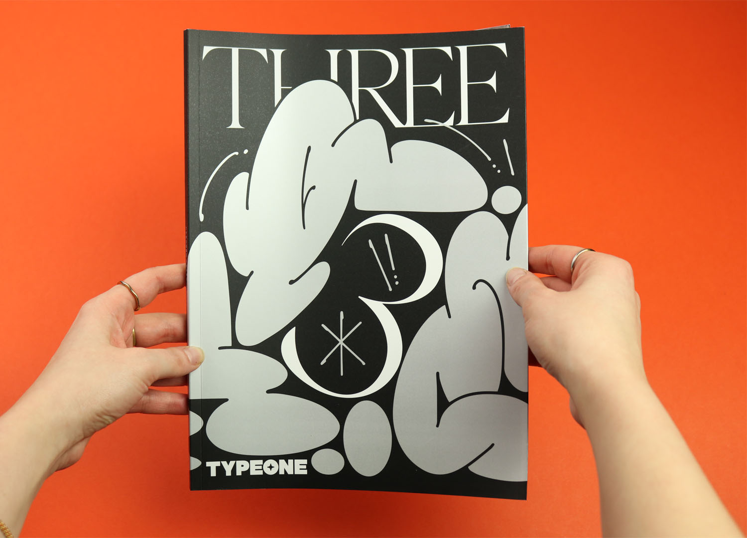
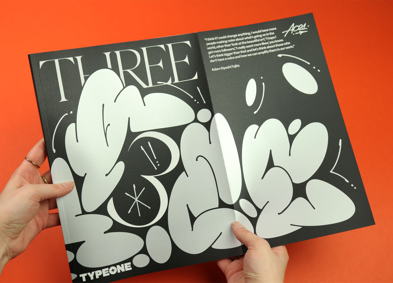
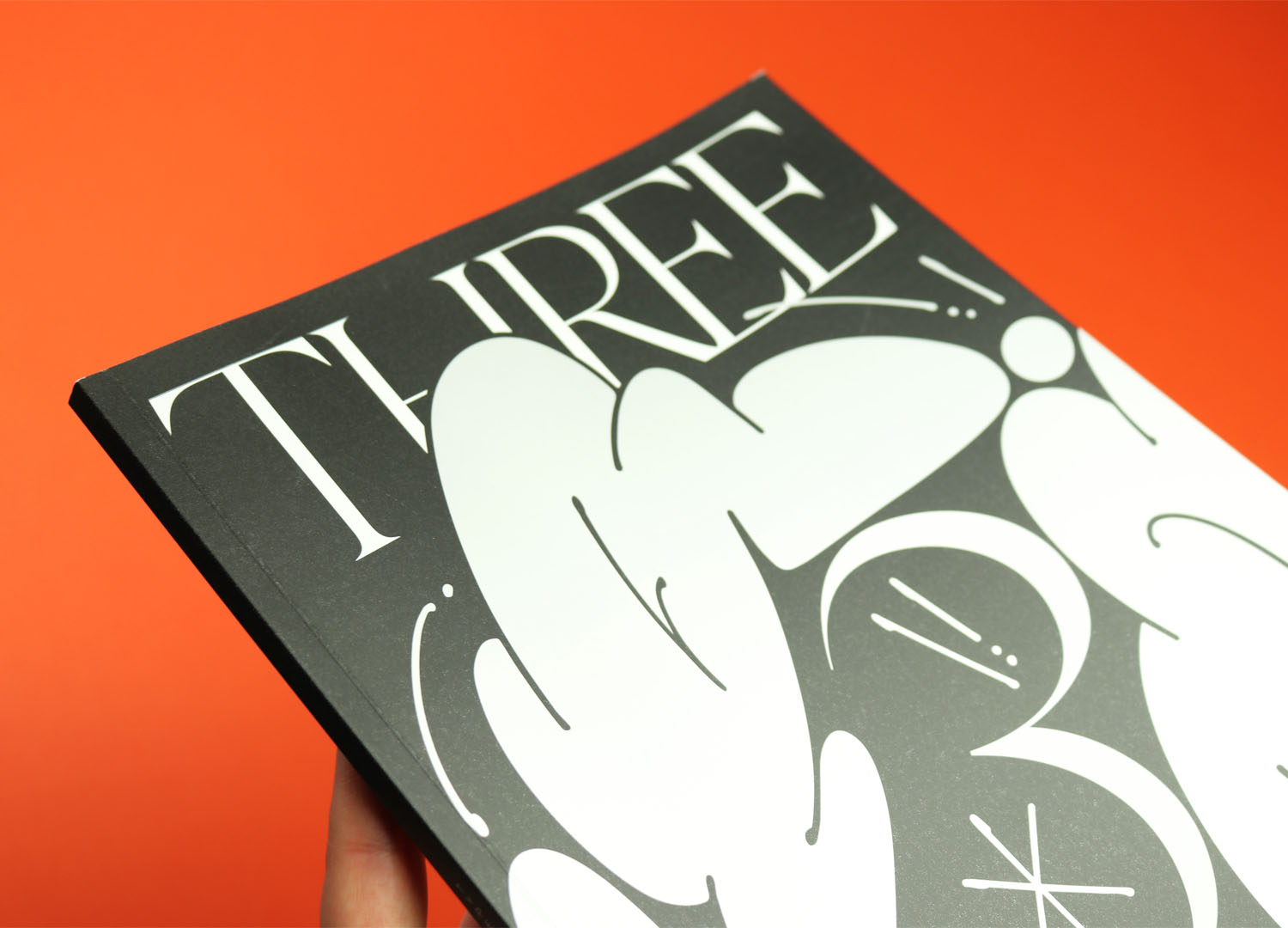
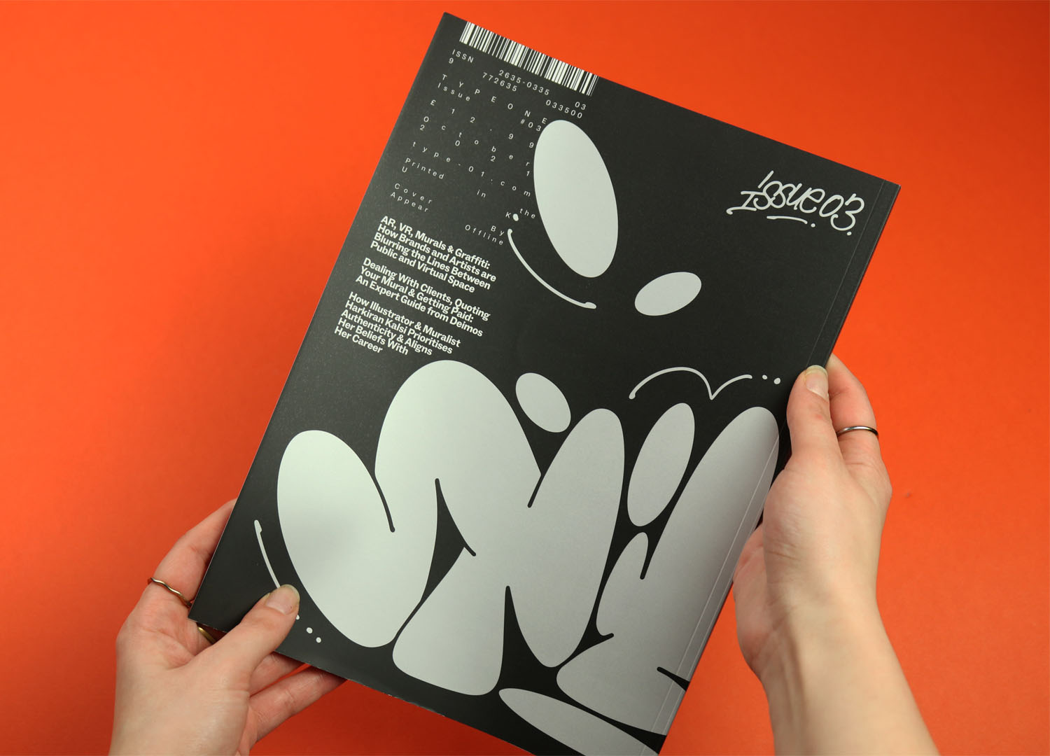
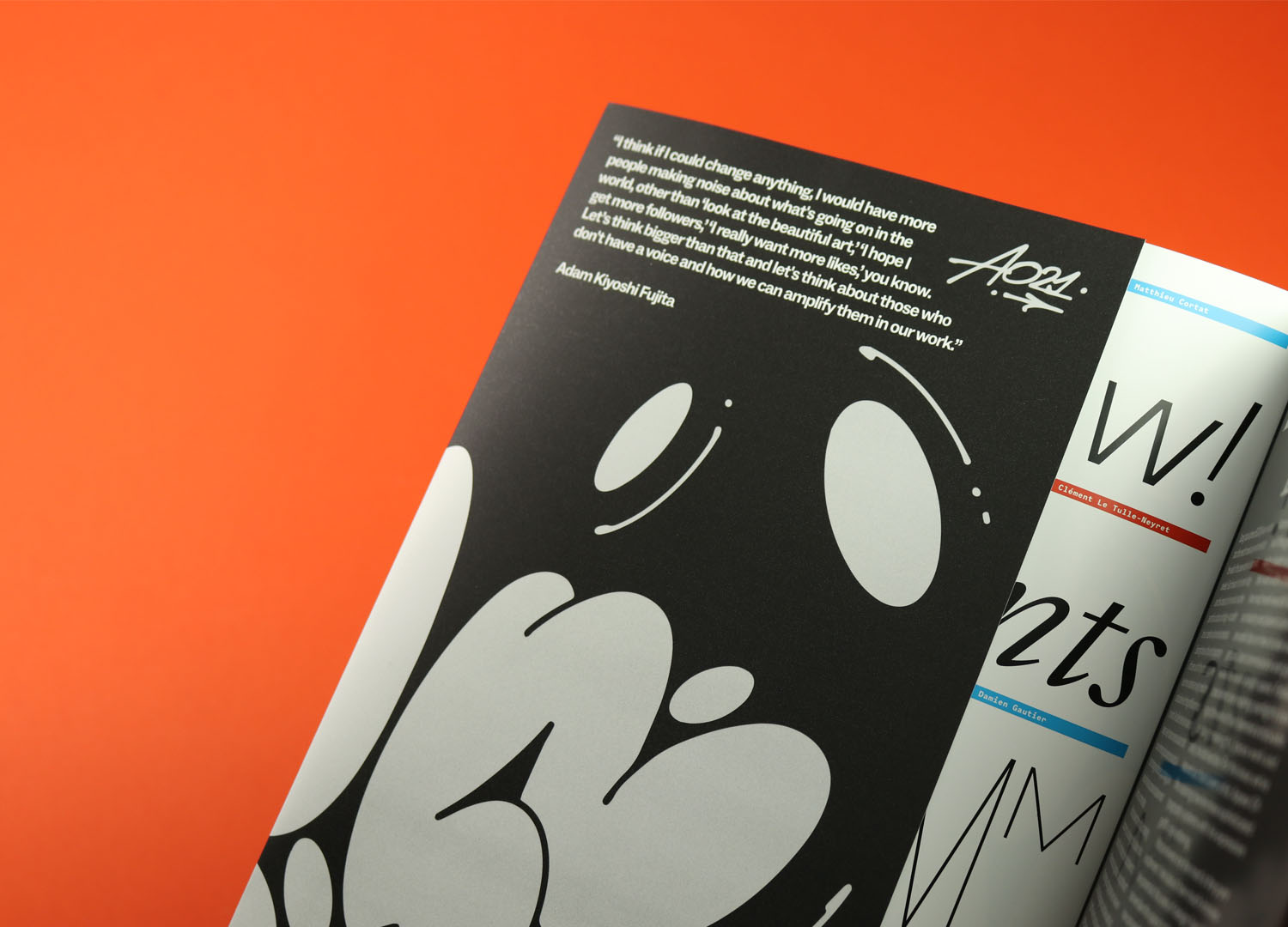
Typeone
The subtlest example of touch gathered here, the new issue of Typeone uses a thick, textured, almost sandy laminate coating to lend the magazine a sense of quality and durability. Typeone is a typography magazine and this issue is dedicated to street art, and a recurring motif running through the issue is the need to properly understand and respect the heritage of graffiti, and the struggle of street artists to have their work considered as an art or craft in its own right. I think this cover is a way of doing just that, the rich metallic silver ink suggesting premium quality and the toothy texture implying permanence and longevity.
The inside back cover is an advert for Pressision, the UK-based printer that produces Typeone, and I suspect the cover is also an extended ad for them, allowing them to show the sort of processes they’re able to bring to a magazine project.