“Text is just really boring sometimes”
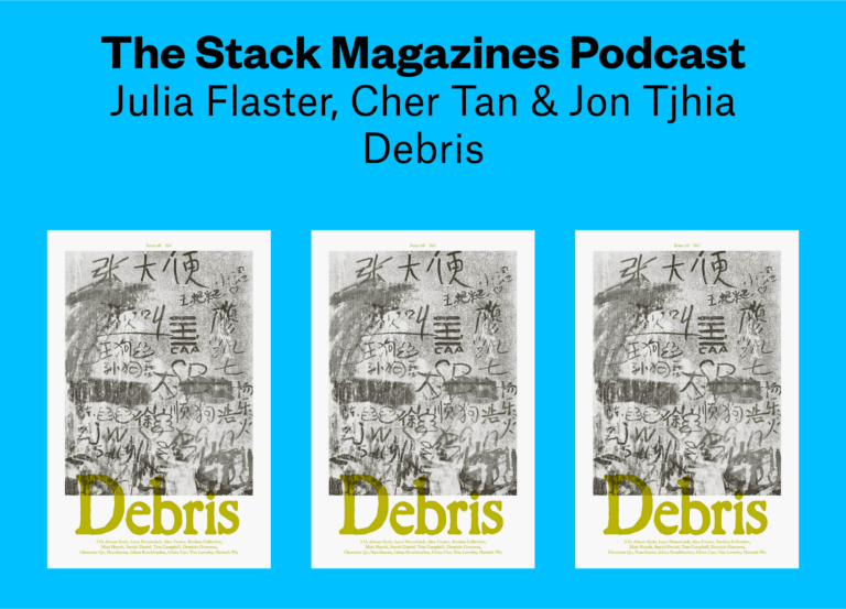
Rotten is a provocative, deliberately scrappy photography magazine. The cover is a mass of scribbles, like a public toilet wall, and images are printed with unconventional commentary. Photos from Gareth McConnell’s ‘Sex Drugs + Magick’ series — of young visitors to Ibiza, the morning after — are accompanied by comments from pillreports.net, a global database of ecstasy pills based on both subjective user reports and scientific analysis. There are no introductions to any photographer’s work included in the issue, and pictures are often manipulated and defaced; Zara Carpenter’s series about chronic illness, for example, is almost impossible to make out. The distortions give these pages unique energy. In a sea of photography magazines, Rotten demands immediate attention.
Joel Seawright and Lucy Jackson, who make the magazine as a couple, talked us through a compelling second issue.
You print Gareth McConnell’s ‘Sex Drugs + Magick’ photographs alongside comments about the series. That’s something you did with Ciaran Og’s series, getting wrecked in post-recession Ireland, in Rotten’s first issue. Why do you like juxtaposing the images and the comments section?
Joel Seawright: I’m very interested in the way people think — like when I watch YouTube or read an article, I spend more time reading the comments than anything else and Lucy’s the same.
These comments in particular are user reports from pillreports.net. I used to use this site when I was a teenager before taking any drugs. The comments remind me of the irony of that; I would do my research and think to myself “oh but I’m being really safe”, but in reality, it was a dice roll every time.
McConnell has talked about deliberately manipulating his images, which were originally taken between 2002 and 2011, so that they become more visually dissonant. You took that even further with the way you printed them in the magazine: they’re grainy, and sometimes difficult to make out. Why did you do that?
Lucy Jackson: McConnell’s distortion of his images was definitely on our mind when we thought about the route his feature would take. Gareth’s photographs are so brilliant as they are, it was hard to force ourselves to wreck them further. But in every feature we try to push the images as far as we can while still honouring the originals. I think the same goes for what we did for Zara Carpenter’s work — taking the essence of it and pushing it even further.
Similarly, a lot of the text in Rotten is so blurred it’s difficult to read. Why did you make that choice?
JS: It was a joint decision based on the magazines we both like to read. I get very put off when I see big blocks of text on a page. We’ve had a lot of influence from magazines like Civilization and Mushpit — the way they display information is really digestible.
LJ: Text is just really boring to read sometimes and the layout of it makes a huge difference as to whether I want to read it or not, regardless of the subject.
JS: I think editing the text like making it blurred or breaking it up makes it less intimidating and more interactive for the reader. Distorting the text makes me want to try to distinguish what it says.


Your first issue was entitled ‘Look Daddy I made a magazine’ and focused on Joel’s relationship with his father. Is there a similar personal story that animated the making of this issue? If it’s not the father-son dichotomy, what’s the inspiration this time?
JS: Initially, this volume was going to be a lot more personal than the final outcome. My Grandad has been suffering from dementia which has been progressing quickly through lockdown. Seeing him go through this made me want to explore the concept of memories and looking at how they warp and change with time. This was why we worked with Gareth and Zara who play with the actual process of photography and reproducing images until they are unrecognisable.
However, midway through production, the situation with Covid worsened and it made it very difficult to dive into personal issues and get into that headspace. The ongoing state of everything started to make our struggles feel relatively unimportant. So that explains the direction we took with the cover in the end. It became much more about everyone’s voice and the collective struggle we have all had.

You made the magazine as a couple, living together, over lockdown. How was that?
LJ: A lot easier than giving Joel DIY haircuts at home.
It was hard to separate the magazine from spending time together because Volume Two was constantly on our minds. Like we’d both just be talking about layout ideas while we’d be watching a film. It kind of took over our lives.
JS: It was also really tough trying to stay creative while just sitting in our flat. We had all this time to spend together but there was nowhere to go for inspiration. I think in the end it did bring us much closer together though. We’re much more open with our ideas now, and the magazine has turned out better because of it.


