Stack Awards 2019: Art Director of the Year
Art Director of the Year is the award for design that defines and elevates the magazine’s editorial identity. Attention is paid to picture selection, type, layout and production to identify the creation of an exceptional magazine brand. Our judges are Gail Bichler, design director of the New York Times Magazine, and Steven Heller, the author of over 180 books on graphic design.
Scroll down for the most beautiful magazines of the year.
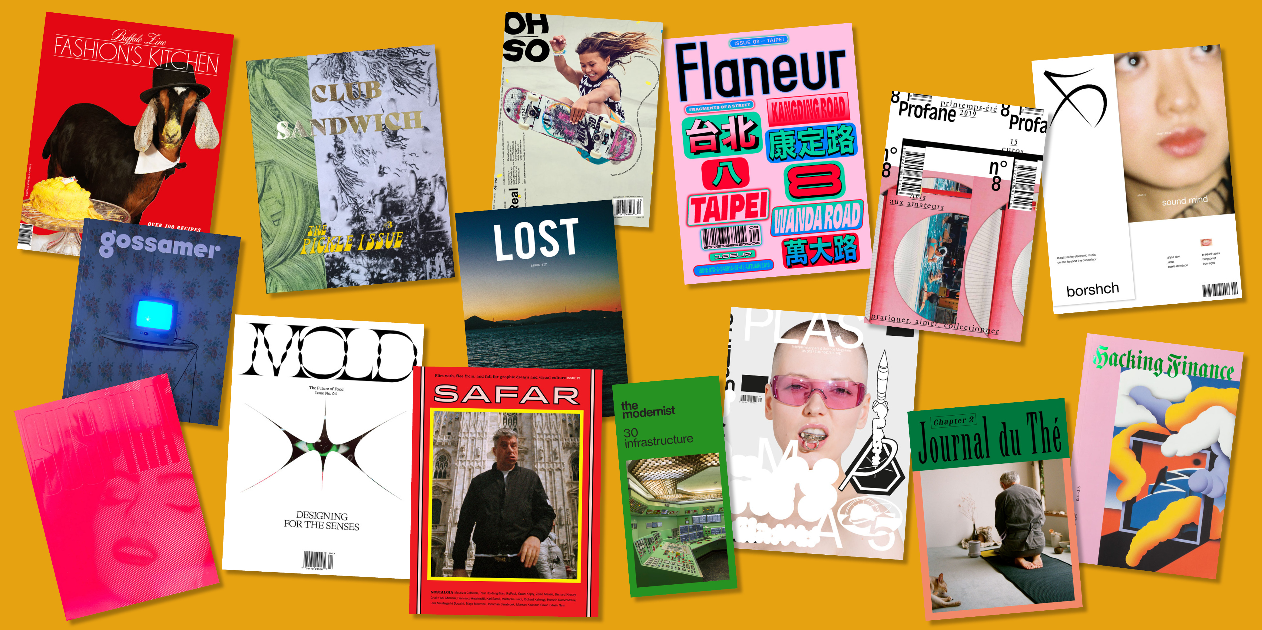
Borshch | Beirut
Borshch no.4 is themed ‘Sound Mind’, and it explores the power of dance music to purge. Design is distinctive, and minimalistic; layouts lead the eye literally to the edge of the page.
View this post on Instagram
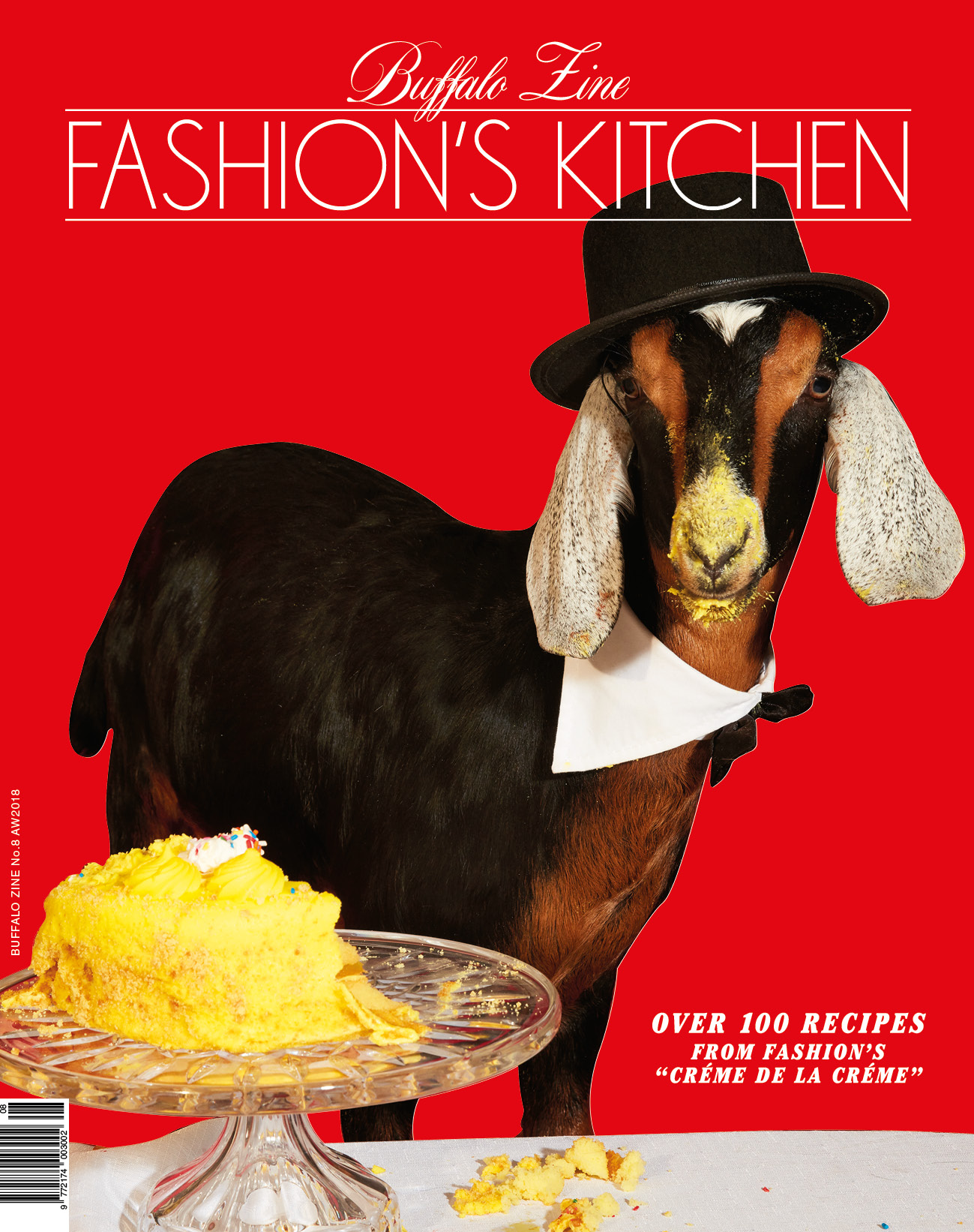
Buffalo | London
Satirical fashion mag Buffalo has made a food issue dressed up like an old-fashioned hardback recipe book. Food shoots are hazily lit, with lipstick-tipped cigarettes and packets of diet pills in the foreground. There is also a wonderful shoot titled “Strict Diet”, full of very thin models contorting themselves.
Club Sandwich | Paris
Club Sandwich is an annual food title from France (this is the first edition that’s been printed in both French and English), and it’s entirely dedicated to the pickle. Mixing images from art history, contemporary art and documentary photography, one fabulous piece tells the story of the archives of Saint-Charles, Illinois, pickle capital of the world.
View this post on Instagram
Flaneur | Berlin
Issue 8 of the nomadic magazine is based in Taipei, focusing on Kangding Road / Wanda Road. The design team, Studio Yukiko, worked with Meng Jiin Hsieh who grew up in the neighbourhood, “as it was important to have input from someone who knows the area better than we ever will”.
Gossamer | New York, NY
Every issue, Gossamer gives its design team what it describes as an impossible task: design a weed magazine that’s not about weed. Purple, hazy, and ever so slightly hallucinogenic, Gossamer’s design is familiar to cannabis consumers, but at the same time inviting to those who’ve never even seen a joint.
View this post on Instagram
Hacking Finance | New York, NY
Fleshy and wonderfully pink, Hacking Finance is so much more beautiful than a magazine about money has a right to be. Expect rainbow pages, superb illustration and sparkles.
View this post on Instagram
Journal du Thé | London
Journal du Thé is a magazine about tea: as a drink, a culture, and a way of slowing down. The design is clean and calming, with lots of green space, light and water.
View this post on Instagram
Lost | Shanghai
Lost frames travel as something personal and emotional. A bilingual title based in China, photos are beautiful and richly coloured, and pages are spaced to allow for both English and Chinese script.
View this post on Instagram
The Modernist | Manchester
The Manchester-based magazine takes its themes alphabetically, a letter per year, 2019 being ‘I’. Issue 30 is themed “infrastructure”. It opens by making “no apologies” for being “provincial, municipal and functional (with a touch of the Cold War, post-colonialism and Franco-era funk).”
View this post on Instagram
Mold | New York, NY
Issue 4 of this food magazine is themed “Designing for the Senses”. Looking at the ways we might change our habits if we’re going to meet the challenge of feeding nine billion people by the year 2050, the design is futuristic.
View this post on Instagram
Oh-So | Mount Kisco, NY
A joyful celebration of the global female skateboarding community, Oh-so’s design is a study of movement. Quotes spiral across the page, mimicking the flips of the women profiled.
Plasma | Berlin
Plasma’s bold, wacky design speaks to its subject matter: the intersection between science and art. Particularly satisfying is the sticky, plastic-bound cover.
View this post on Instagram
Profane | Paris
Profane is dedicated to the amateur. People obsessed with things they aren’t payed to do are its stars, and the design is a reflection of that. Side-projects jostle for space on the page, like collage.
View this post on Instagram
Safar | Beirut
Beirut-based magazine Safar highlights graphic design as an integral part of cultural exchange in the Middle East. A gorgeous piece of print, the publication creates new ways of navigating its two languages — Arabic and English — to avoid mirroring articles.
Suspira | London
Inspired by the 1960s-70s exploitation film aesthetic, Suspira infuses high-end design with the tactile roughness of its Holmen paper and the low-budget campiness of the era. Suspira deliberately mixes digital and analog photography to translate the visual language of horror films to print.
View this post on Instagram
Winners will be announced on November 14 at the Stack Awards ceremony at Somerset House. Tickets are available now.