
The Stack Awards: Cover of the year
When is a shortlist not a shortlist? We sent a whopping 20 magazines to our judges for the Cover of the year category, and on Monday night we’ll reveal the overall winner. But before that, take a look at the brilliant, beautiful and bizarre collection below in all its glory.
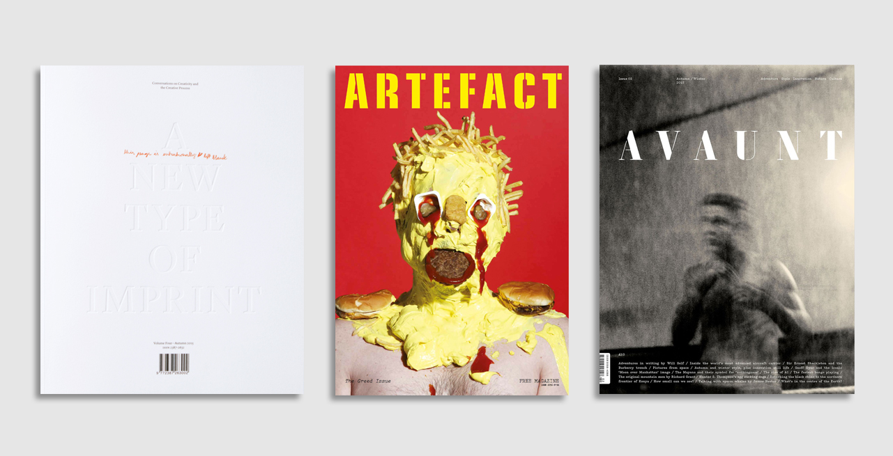
A New Type of Imprint (Oslo)
The third issue of Norwegian creative lifestyle magazine A New Type of Imprint is almost completely white, with an oversized, debossed masthead. A simple yet bold concept.
Artefact (London)
The ‘Greed’ issue of the student-run magazine out of London College of Communication uses a powerful image by photographer James Ostrer, making it shocking and compelling in equal measure.
Avaunt (London)
The cover of Avaunt’s second issue is striking in its simplicity, the dynamic, almost abstract portrait on the front showing just enough detail to make sure we had to pick it up.
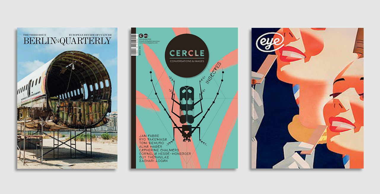
Berlin Quarterly (Berlin)
This cover perfectly encapsulates the complexity of Beirut, the main theme of Berlin Quarterly’s third issue. Broken yet beautiful, shocking yet welcoming and strange yet familiar.
Cercle (Strasbourg)
The custom-designed typeface reflects the topic of Cerle’s third issue, Insects, and demonstrates the attention to detail that makes it both compelling and unique.
Eye (London)
Free from cover lines, graphic design magazine Eye’s covers are always eye-catching and original. For their 89th issue they used a detail from a 1940s billboard for Wrigley’s Doublemint Gum.
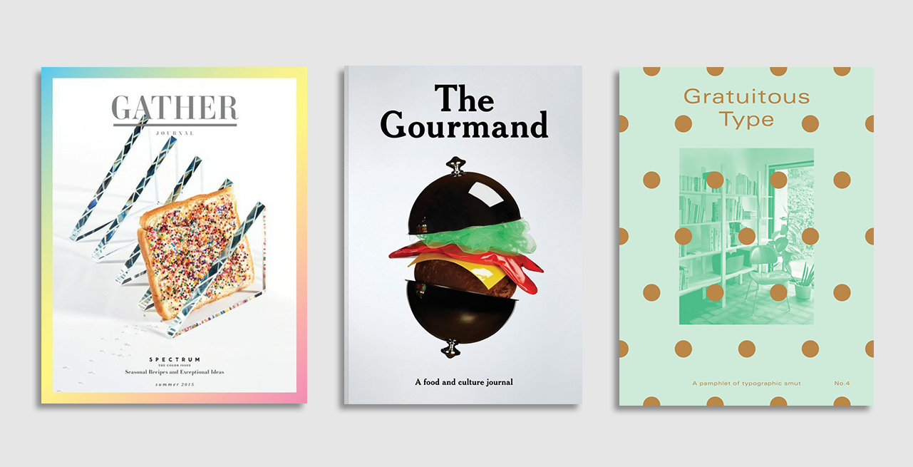
Gather Journal (New York)
Dreamy and absurdly sugar-sweet, the cover of the ‘Spectrum’ issue of Gather Journal wonderfully reflects the issue’s dive into a colourful world of food.
The Gourmand (London)
The sixth issue of The Gourmand was released with two fast food-themed covers – one a burger and the other a chip, and both dedicated to an artistic celebration of ketchup. Beautiful and bathetic, this is what The Gourmand does so well.
Gratuitous Type (New York)
The covers of Gratuitous Type are the work of a true print lover. Appropriating the conventions of pornography magazines, the cover of the third issue has copper polka dots printed on a see-through cover ‘censoring’ the image underneath.
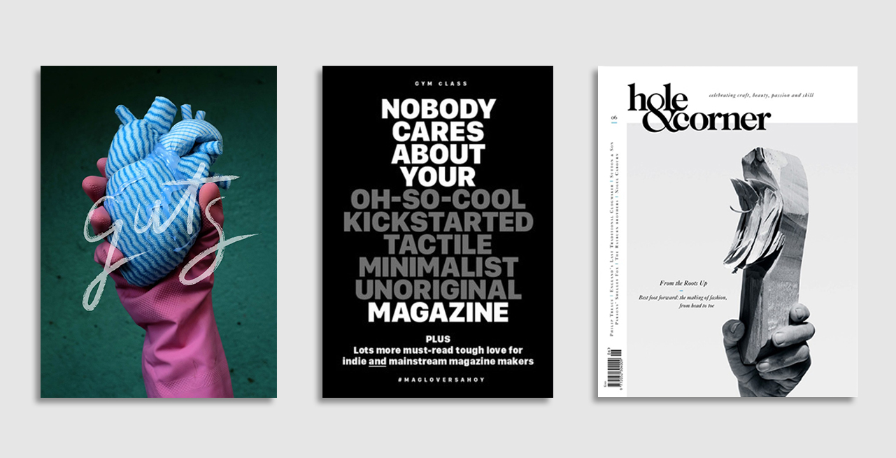
Guts (Dublin)
A truly iconic cover, the first issue of Guts featured a photograph of a J-cloth heart and received instant praise before being adopted by readers to express love and support for marriage equality in Ireland.
Gym Class (London)
A simple yet powerful cover that tapped into and gently satirised the current independent magazine zeitgeist.
Hole & Corner (Dorset)
The cover of Hole & Corner’s Fashion issue stays true to the ethos of the magazine and, listing only wood in the cover credits, offers a satirical nudge to PR-led fashion titles.
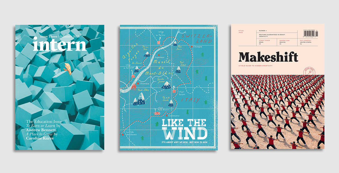
Intern (Manchester)
Intern magazine’s education issue features an eye-catching cover shot by Luke Evans and perfectly captures the pressure often felt at university to make the right choices.
Like the Wind (London)
Inspired by the plastic 3D maps you can buy in the Alps, the embossed cover of Like The Wind shows the route of the infamous foot race Ultra-Tour Mont Blanc.
Makeshift (New York)
The cover of Makeshift pictures hundreds of Chinese students performing kung fu in perfect synchronisation, and is the perfect embodiment of what Makeshift is – a field guide to hidden creativity.
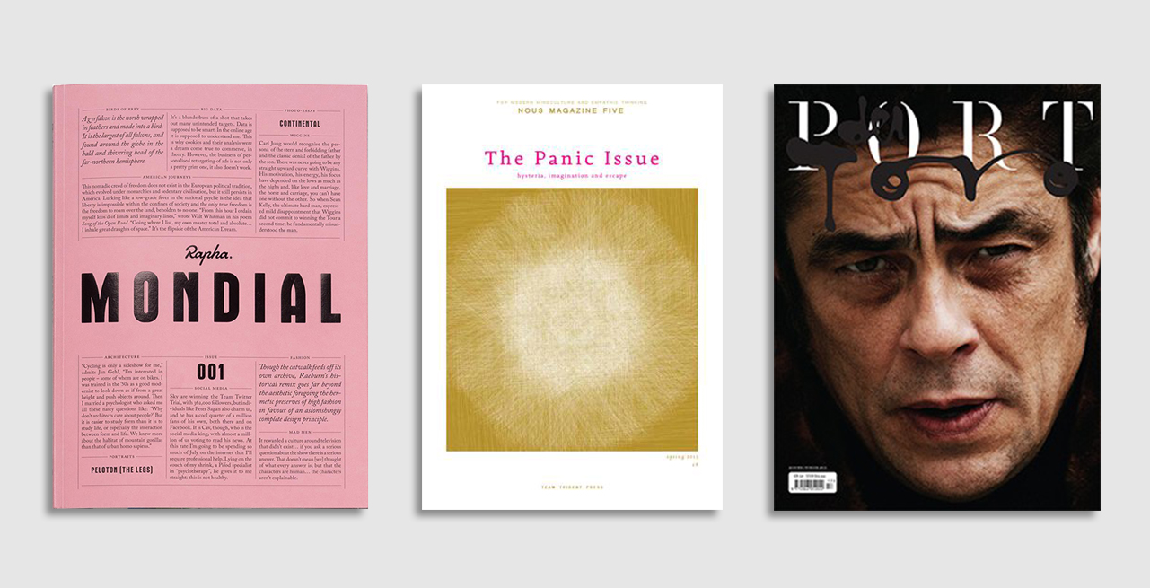
Mondial (London)
An homage to the legendary newspaper Gazzetta dello Sport, cycling magazine Mondial’s cover featured colours familiar to Rapha fans, a custom design typeface, and exquisite text design.
Nous (Manchester)
Printed with vegetable-based ink on recycled paper, the cover of Nous beautifully captures the sensitivity and hand-made quality of the magazine.
Port (London)
A dark, classy cover featuring Hollywood actor Benicio del Toro captured by Cedric Buchet. Great cover standing up to the conventions of the mainstream magazine market.
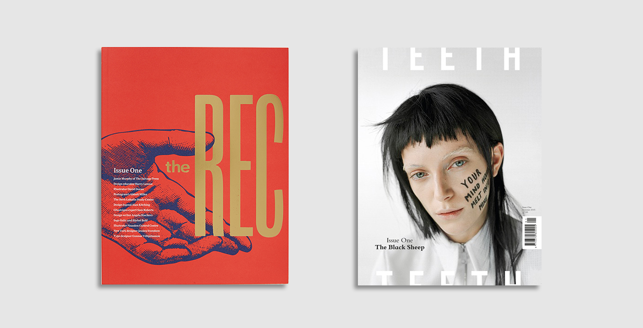
The Recorder (London)
Paying respect to its heritage, the cover of Monotype’s redesigned typography magazine The Recorder is simple yet striking with golden foil set on that red background.
Teeth (New York)
With its ice cold, almost monochrome style, the cover of new fashion and art magazine Teeth manages to feel both classy and youthful.
–
Love independent magazines? We’re celebrating the awards with a limited offer giving 10% off any subscription. Use the code AWARDS2015 to start receiving hand-picked, beautiful magazines to your door every month.


