Architecture’s human side in Superposition
The makers of new architecture magazine Superposition do not want you to flip through its pages. They also don’t want to tell you too clearly what it’s all about – this isn’t a magazine that believes in having a simple editorial mission printed on the opening pages. Instead, they lay down a series of editorial breadcrumbs and invite readers to go on a slow, speculative mission to figure out the story behind the stories.
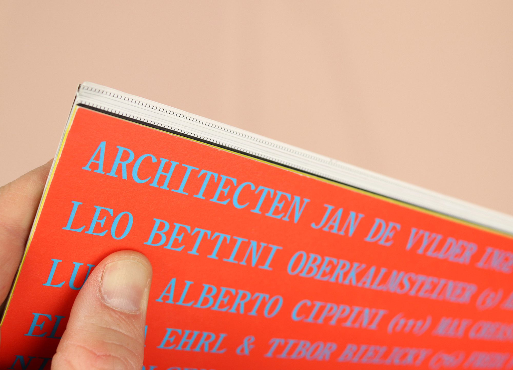
I was intrigued by this strange and lovely magazine, and particularly interested in its binding, which is simply folded and stapled, but also attached to a card cover that gives it a flat spine as if it were perfect bound.
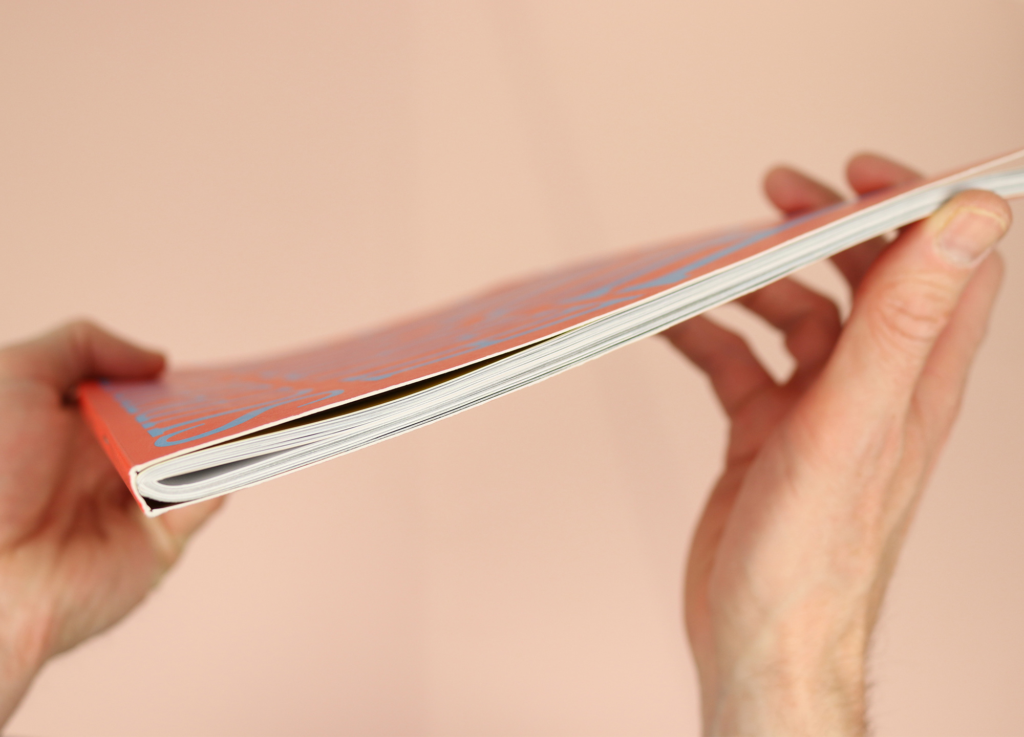
It’s an innovative way of making a magazine, and it means it has a proper spine that will stand up on a shelf, without needing to use the glue that normally sticks a perfect bound magazine together. But it also means they get a ‘V’ shape on the outside edge of the pages, stopping the reader from being able to easily flip through the magazine.
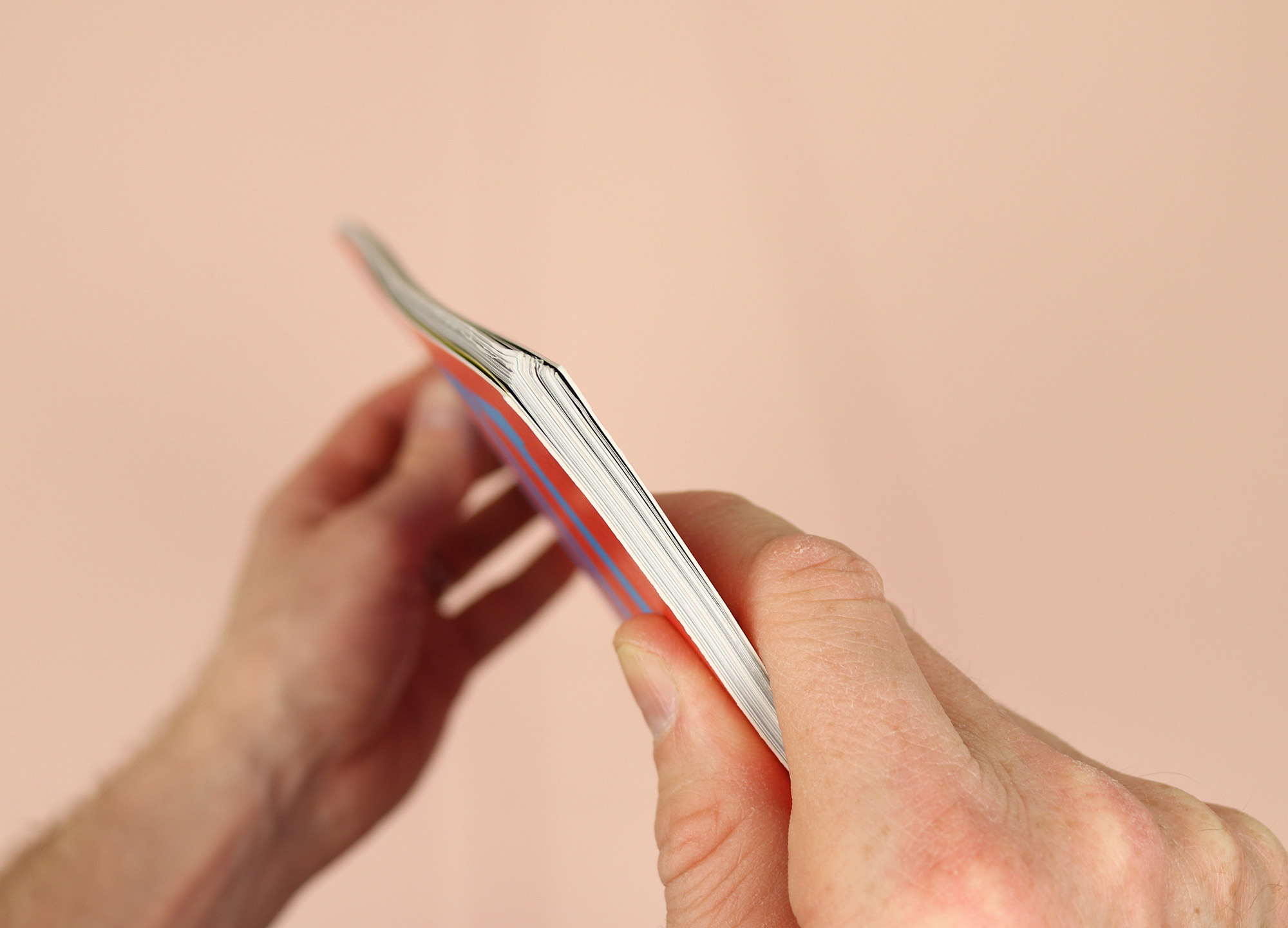
On first impression it feels like a design flaw, but this is a magazine made by architects – the sort of people who think deeply about every facet of how a designed object will be used and experienced. Surely they didn’t deliberately make it hard to read?
“You said that it’s not comfortable to flip through the magazine,” says editor Tibor Bielicky when I speak with him and co-editors Leo Bettini Oberkalmsteiner and Dominic Kim over Zoom. (Max Creasy and Ellena Ehrl are also co-editors but couldn’t join us for the call.) “That’s exactly what we don’t want. We don’t want people to just flip through the magazine and say, ‘Well I like it’, or, ‘I don’t like it.’”
Seen from this perspective, the binding becomes an obstacle that’s put in place to slow the reader down and encourage a more contemplative experience. The team continue by pointing out that while it’s not easy to flip quickly through the pages, when the magazine is placed on a table, the stapled binding means that every spread opens flat, with none of the pinching normally found in perfect bound magazines. So it’s all about perspective – a design flaw in one respect is turned around to become a unique design feature.
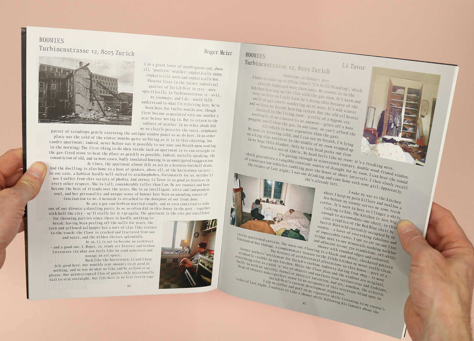
This same idea runs through the magazine, for example in Roomies, in which flatmates Roger Meier and Li Tavor wax lyrical about their freezing Zurich apartment: “In no other abode did we so clearly perceive the sweet, symphonic patter of raindrops gently caressing the antique window panes as we do here. In no other place was the cold of the winter months quite so biting as it is in this charming, but tawdry apartment…”
Or similarly in the loving portrait of Architecten Jan de Vylder Inge Vinck’s Berouw project in Gent: “A staircase outside of the house. In a window that is too big for such a small house. A too big window, but really a lot of small windows. Small windows together. And all kinds of windows…”
This is not the way that normal architecture magazines cover buildings, but then Superposition is very clearly not trying to be a normal architecture magazine. Tibor outlines their mission in more detail: “We talk about the human side of architecture, meaning that it’s all about the narratives, also about a very personal perspective on architecture. Not so much objective, but really a subjective way of observing architecture, which we thought was a little bit missing in the realm of architecture magazines.”
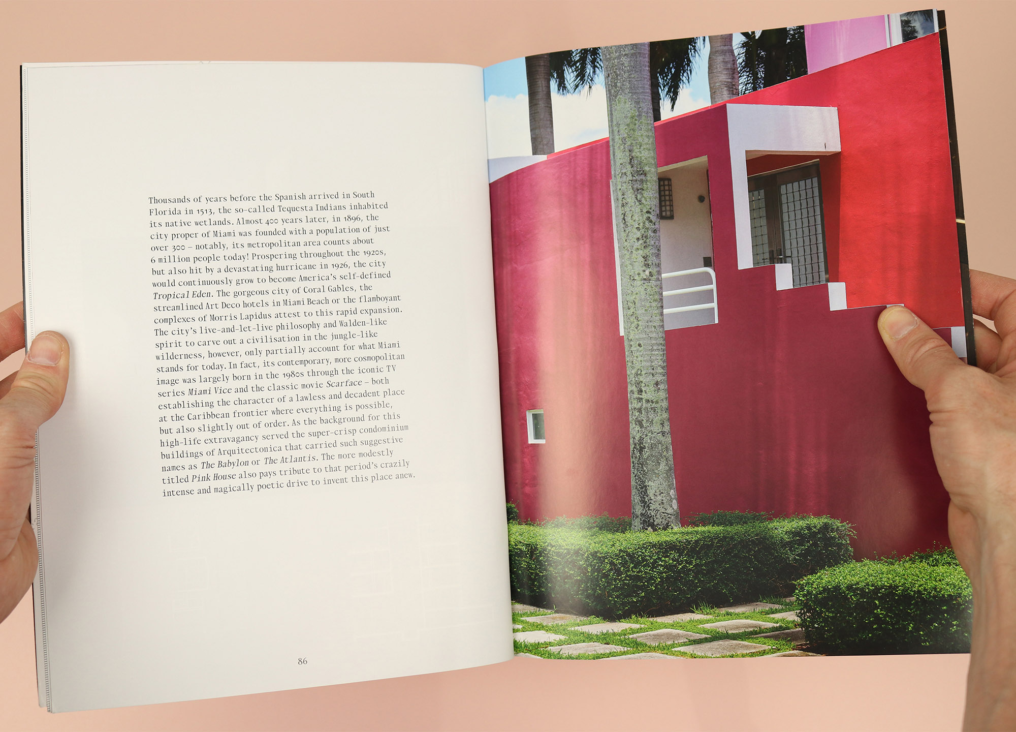
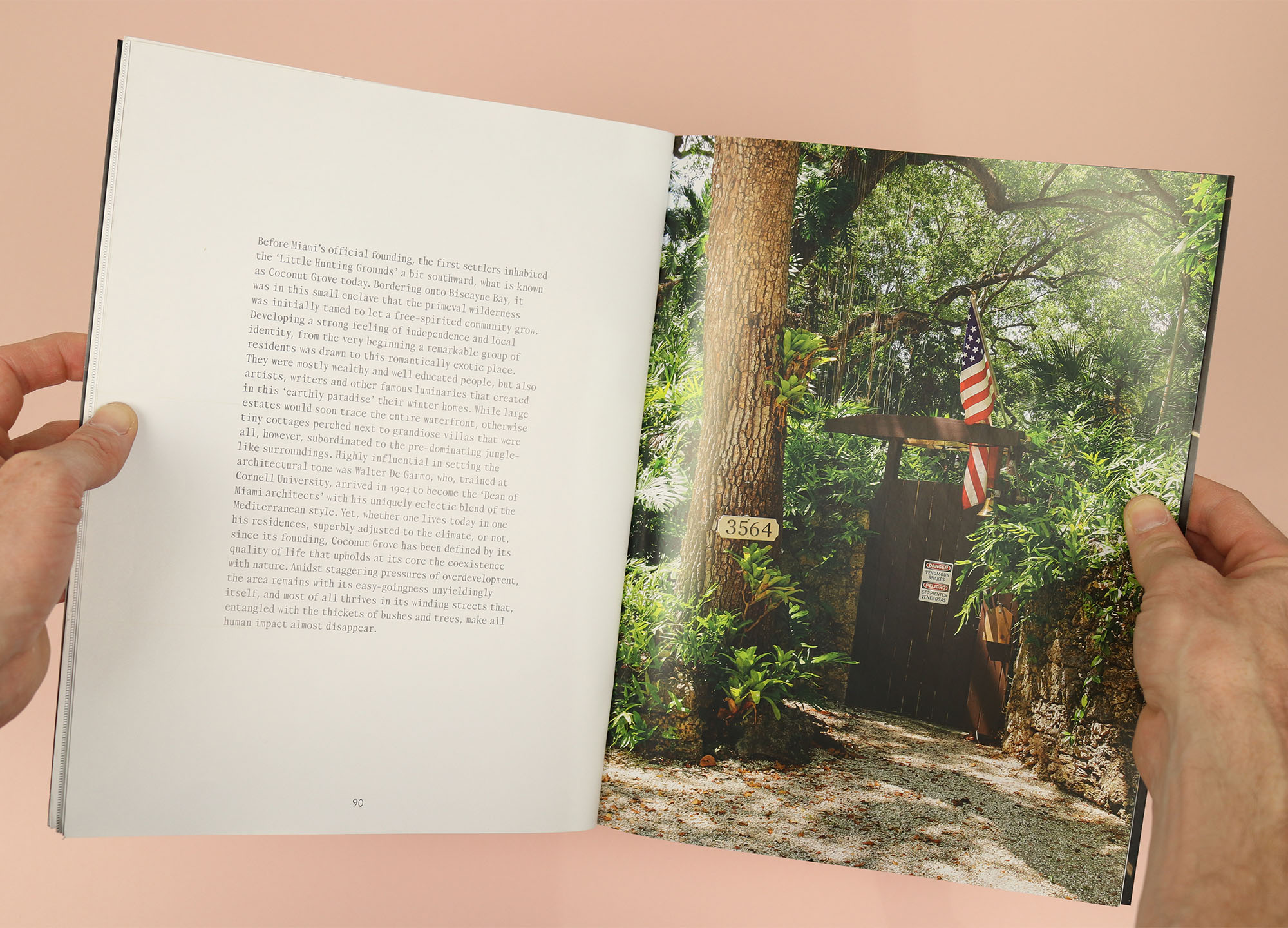
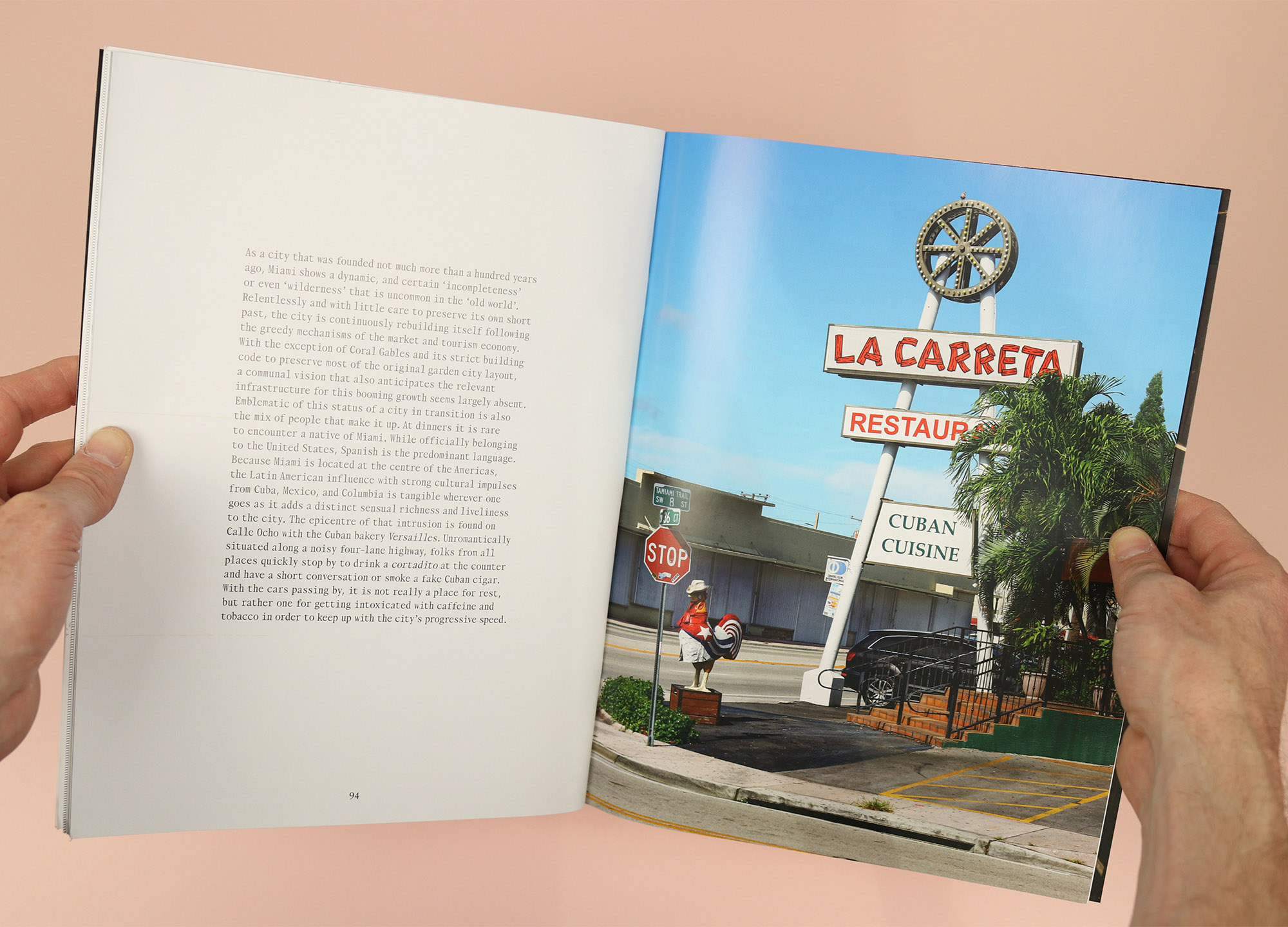
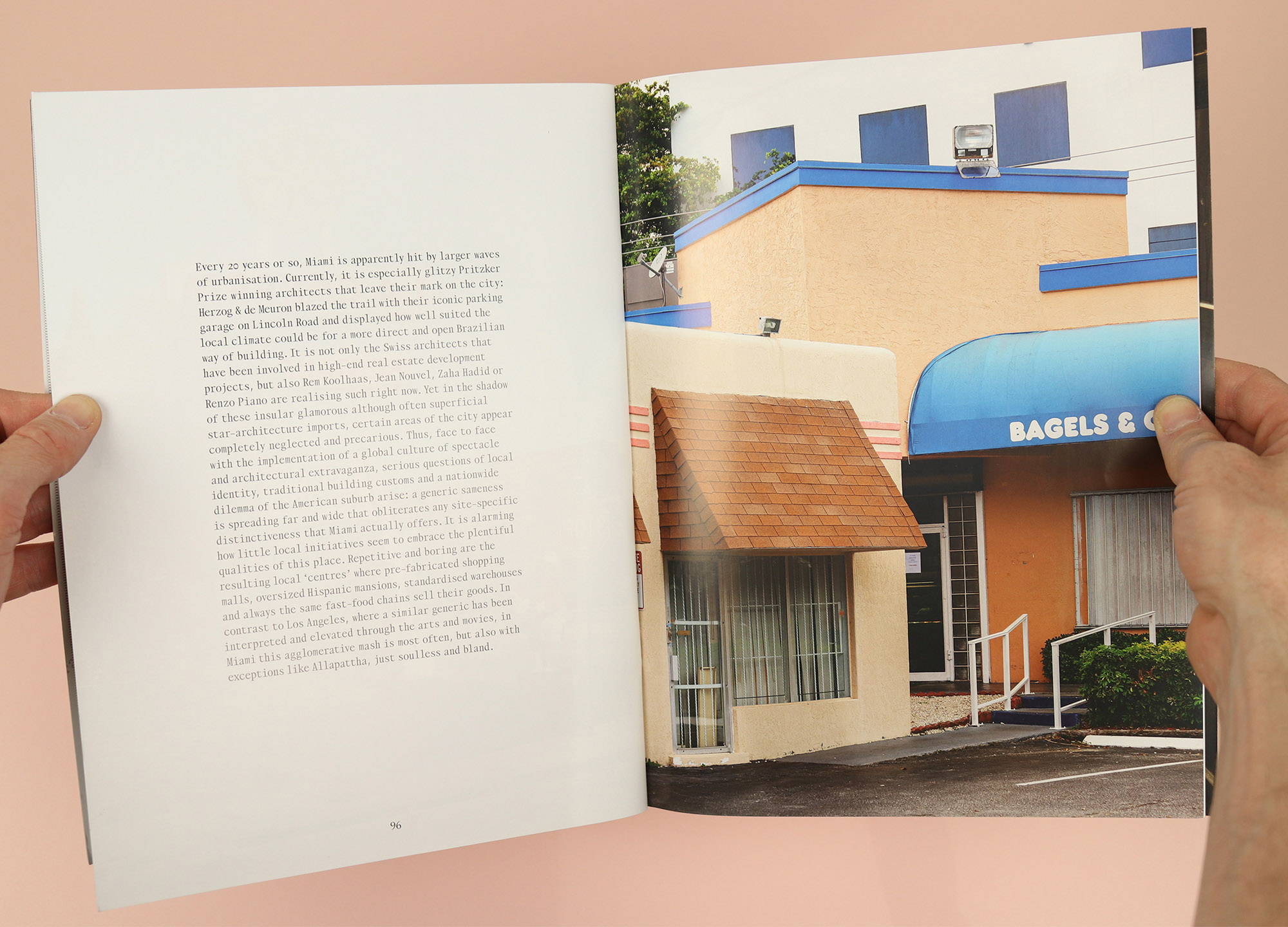
Led by this personal, subjective approach to architecture, the magazine is free to wander in various lovely and idiosyncratic directions, like Miami Bricolage, a photo-led essay on the city’s architecture, and its broader character as, “The only tropical city in the United States… romantically exotic… [which] shows a dynamic, and certain ‘incompleteness’ or even ‘wilderness’ that is uncommon in the ‘old world’.”
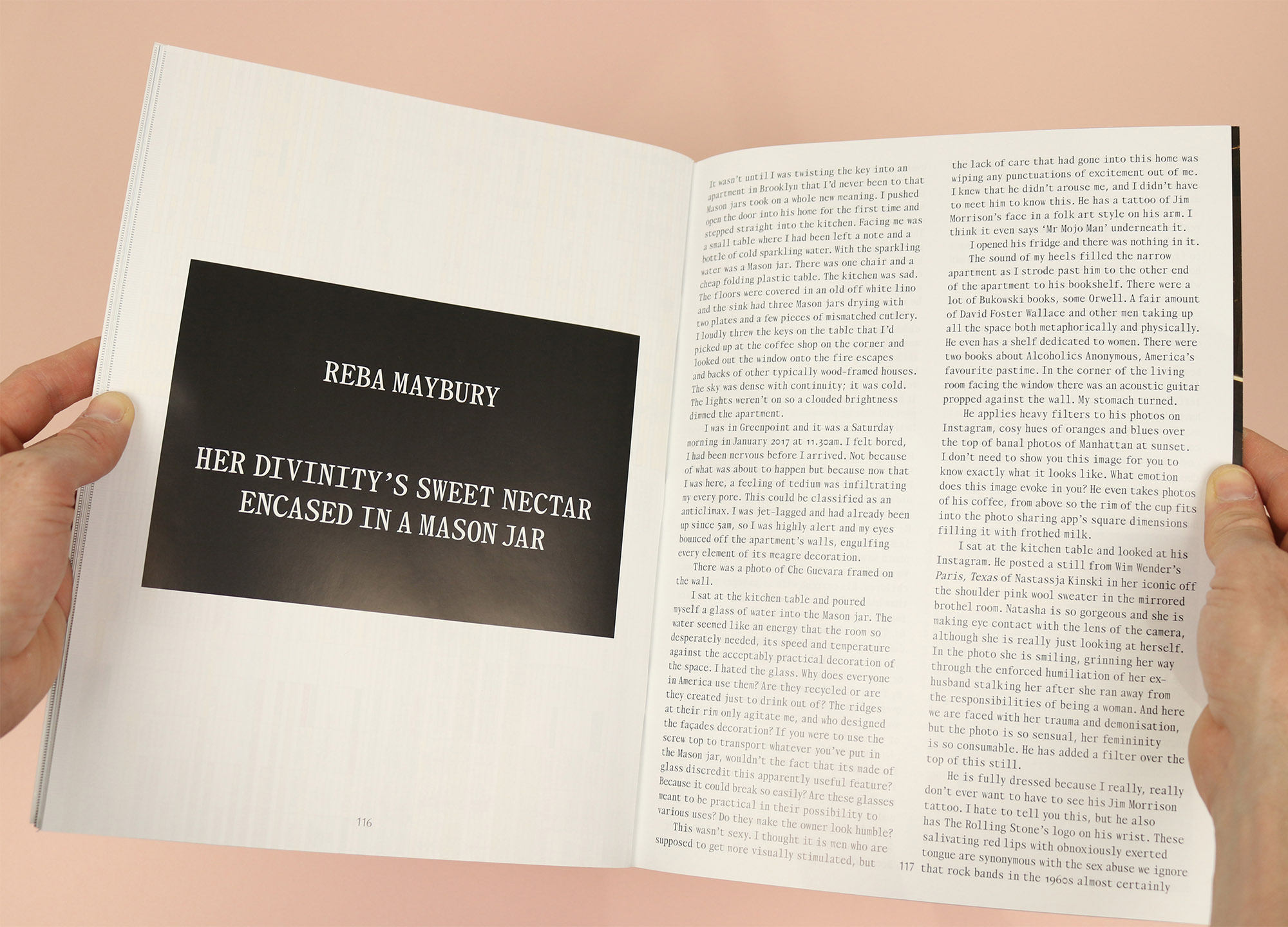
Or this piece by artist and political dominatrix Reba Maybury, who goes to visit a client in his apartment in Greenpoint and describes being disgusted and disheartened by his framed photo of Che Guevara, his ‘tasteful’ bookshelf and the mason jar that he left out for her to use as a glass: “Why does everyone in America use them?… The ridges at their rim only agitate me, and who designed the facade’s decoration?… Are these glasses meant to be practical in their possibility to various uses? Do they make the owner look humble? This wasn’t sexy.”
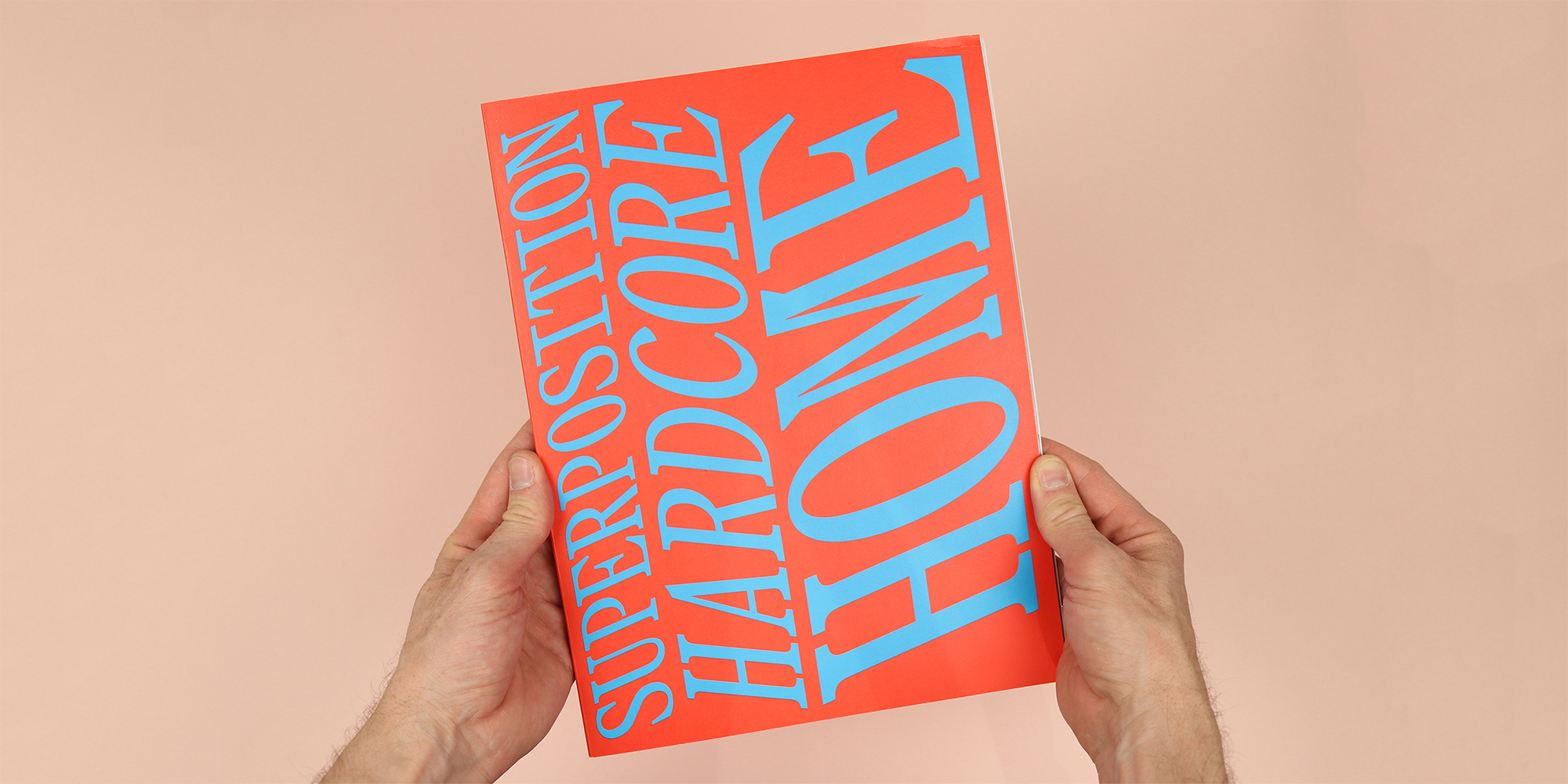
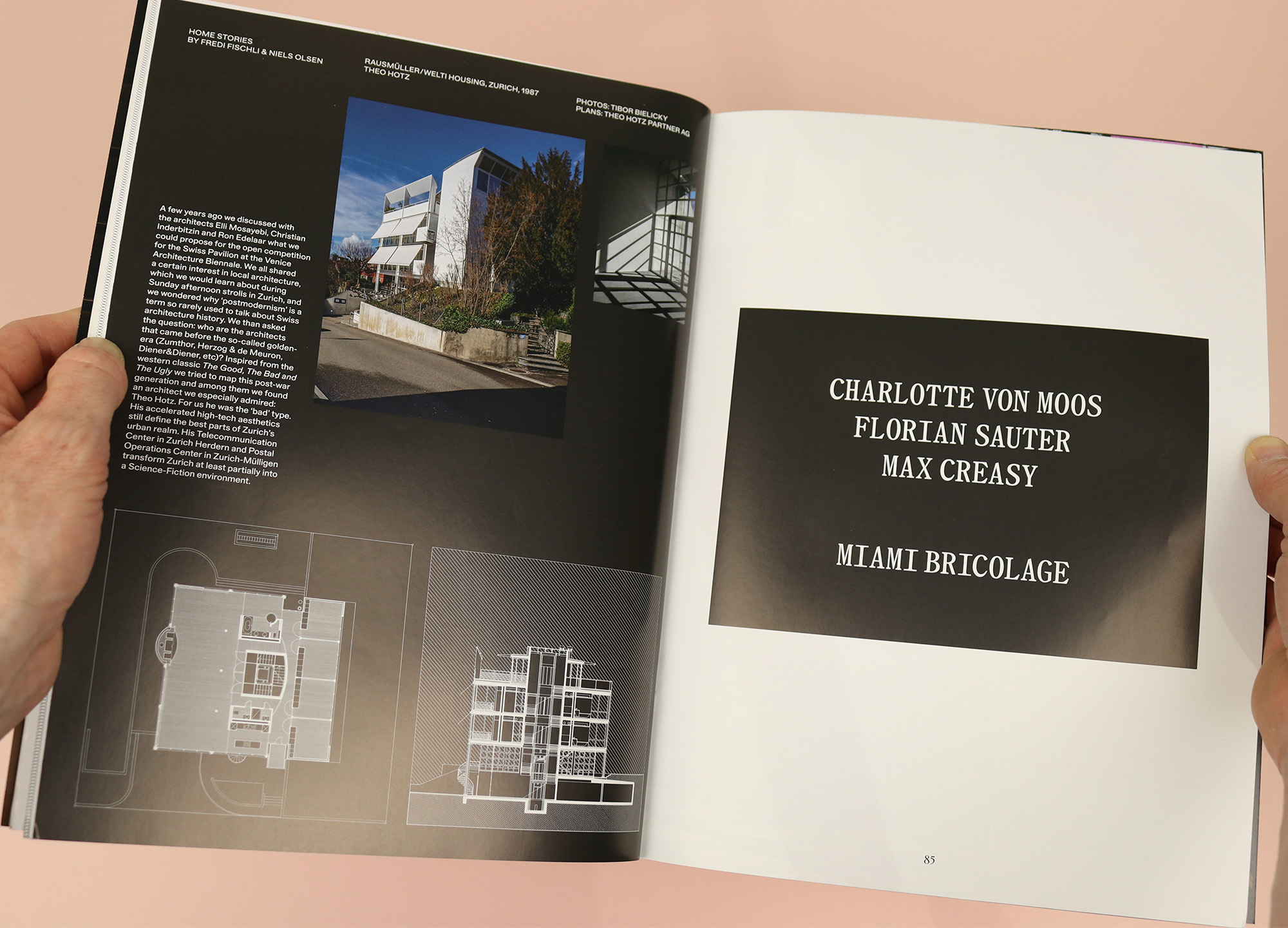
Those stark white headlines on black boxes look like a playful nod to a different media; more like video title cards than a traditional magazine headline. And the V-shaped wedge figures here too: three separate articles focus on projects by Jan de Vylder Inge Vinck, and all of them have black and white stripes on the page edges, recalling the queue dot that appears in the corner of the screen at the end of programmes on TV. It’s a tiny detail, but one that also links directly back to the name of the magazine itself, as Leo explains:
“The name ‘superposition’ can be found in architecture and in geology. An architectural superposition is the layering of different styles, so at the Colosseum in Rome, for example, you have the different layers of columns; Doric, Ionic, and Corinthian… And in geology the superposition is the layering of the earth, with the youngest layer always on top. And so with the V-shape you always have the layers on top of each other, so it’s a little bit of a funny game and the superposition is represented in this layering of the pages… We were really trying to make use of the opportunity to have a physical magazine; why not play with it? Why not play with the idea of having this artifact?”
A magazine that pays as much attention to the edges of its pages as it does the surface of them, and which rethinks architecture to present a personal, playful and challenging picture of the way we live, Superposition is a great read, and a lovely object to add to the shelf.