Uncovering Sabat magazine’s hidden occult designs
We recently sent out modern witchcraft title Sabat magazine on our Sampler service, and after seeing a few readers getting curious about the magazine’s many hidden design gems, we decided to dig deeper.
Below is a Q&A with editor Elisabeth Krohn and art director Cleber de Campos, in which we talk about logos, making print magazines three-dimensional (and working with technical limitations), plus leaving clues for readers to have ‘a-ha!’ moments.
Why did you want to embed ‘hidden’ design elements in the magazine?
The word ‘occult’ stems from the Latin for ‘to hide’. Witchcraft was practiced in the shadows for centuries for fear of persecution, and it felt right that Sabat would echo that.
We try to not explain elements in the magazine so that readers can have some ‘a-ha!’ moments. In our cover logo, for example, the word ‘Sabat’ is repeated five times, the letters gather and dance around something — but what? If you connect the letters (S-S, A-A, B-B and so on) you’ll discover pentagrams — obvious symbols of witchcraft. If they could be seen, one could think it was cliché, but as they are not shown, you need to notice them and ‘get it’.
Every little detail in Sabat magazine feels carefully considered, starting from this varnish logo on the cover…
Our conceptual framework is carefully considered, but leaves space for things that were not planned — ‘coincidences’, or if you prefer, ‘magic’. Cleber is a big fan of Irma Boom’s work, and how she makes books that enhance the three-dimensionality of print. While making Sabat, we kept thinking, “What can we do here that we can’t do in digital?” The logo varnish beckons with a slight shimmer, suggesting that the magazine is something you need to enter to discover.
Tell us about the ‘shifting’ moon and foetus graphic on the edge of the magazine (below) — was it difficult/expensive to print?
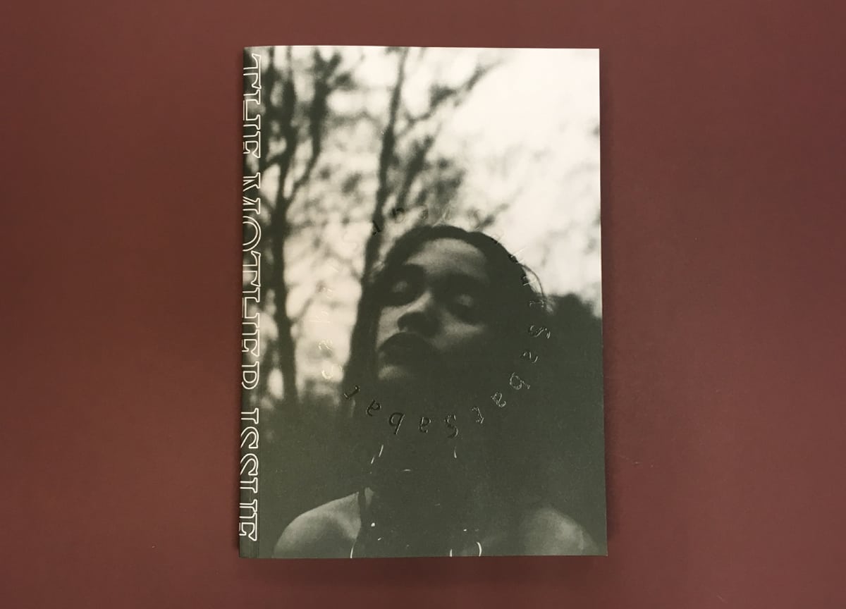
Sabat magazine was imagined as a trilogy, reflecting the three phases of the moon and the Neo-Pagan deity of triple goddess (the Maiden, the Mother and the Crone). For this Mother-themed issue we incorporated a foetus — a seed of life, growth and the grotesque all in one, a bit like the mood of the issue overall.
The design was Cleber’s idea and Tomas Almeida’s design. We were looking for ways to play with the edging and this splitting of one image across the pages became an economic (it doesn’t change the price of printing), though labour-intensive (in the end, it was handmade one night before sending to print!) alternative to, say, spray edging.
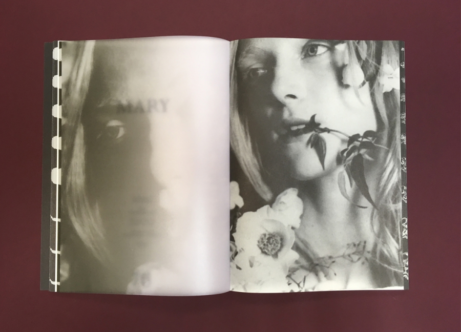
Transparent pages (below) divide the features, and also provide a clever way to showcase the subtitle once you flip the page over. What did you want the reader to experience?
The initial idea was to have magazines inside magazines (like a pregnancy), or French folding pages with different messages inside. But in the end, we opted to use translucent pages that reveal and conceal content. In this way, the reader can re-frame images and text and feel a sense of depth. Transparent paper has some technical limitations — you can’t print in the back of it due to the drying time. However, printing only one side gives you two page layouts when flipped.
What were your reasons for having the chapters and page numbers near the spine?
We were interested in the “immediacy/transparency” theory from Remediation (Bolter and Gruisin), which aims to make the medium disappear for the viewer. That’s why we put page furniture in the gutter, and took it out completely in photographic spreads.
The Sabat logo is hidden throughout graphics in the magazine…
The logo frames interesting elements in the images, saying: “pay attention to this, it’s telling a story”. Unless you are the type of person that lines up for hours to buy an iPhone, logos are not ‘cool’, so we try to keep ours meaningful, minimal and a part of telling the Sabat story.
—
Keep updated with the best independent magazines — Subscribe to Stack and we’ll do the rest.