Skeuomorphic magazine design
Skeuomorphic design is generally an attempt to reassure. Defined as, “An object or a feature that copies the design of a similar object… but [which] does not usually have the practical purpose that the original does”, the skeuomorph is often used to make new technologies feel more familiar. For example, Apple arranged its Newsstand app on digital bookshelves when it launched in 2011 because we’re used to seeing newspapers and magazines sitting on wooden shelves. And take a look at any electric car today and you’ll see all sorts of meshes and panels and decorative flourishes sitting between the headlights, because the new cars don’t need a radiator, but they do still need something ‘car-like’ to go on the big space at the front.
Of course this reassurance only lasts until it starts to irritate and offend, and there was widespread jubilation when Apple switched to its ‘flat’ design with iOS7. But there’s also a more playful version of skeuomorphic design that can be used to provide a sort of creative dissonance rather than fake familiarity, and it doesn’t suffer from the same short shelf life.
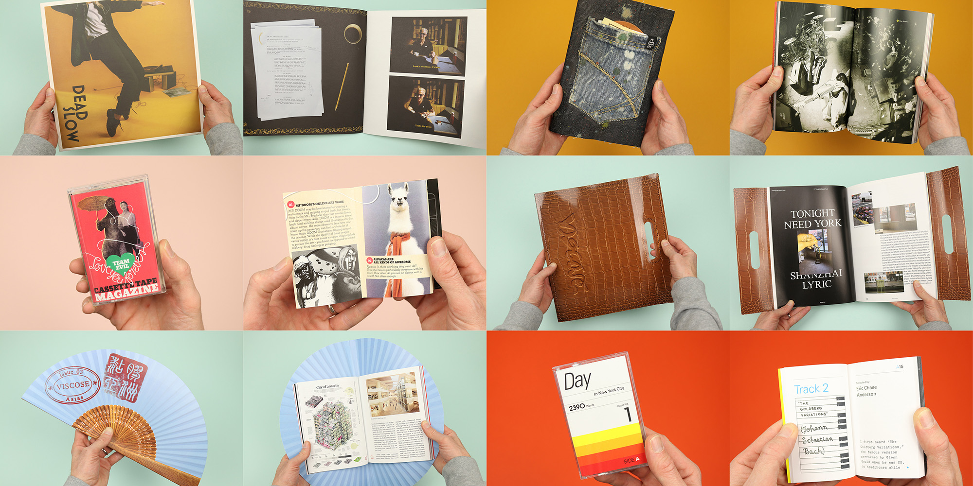
This version of skeuomorphism evokes the characteristics of something else in order to draw upon that object’s meanings and associations, and there’s a small and strange collection of magazines that parade themselves as other things. Carefully dressed up as cassette tapes, vinyl records or fashion accessories, they undergo a sort of shamanic transference of powers, assuming the significance of the objects they invoke, but undercut with the obviously ridiculous joke of a magazine that thinks it’s a bag or a back pocket. I wanted to take a closer look at this odd phenomenon in action, so I pulled some examples from the Stack archives to see the different ways these magazines present themselves to the world.
Viscose
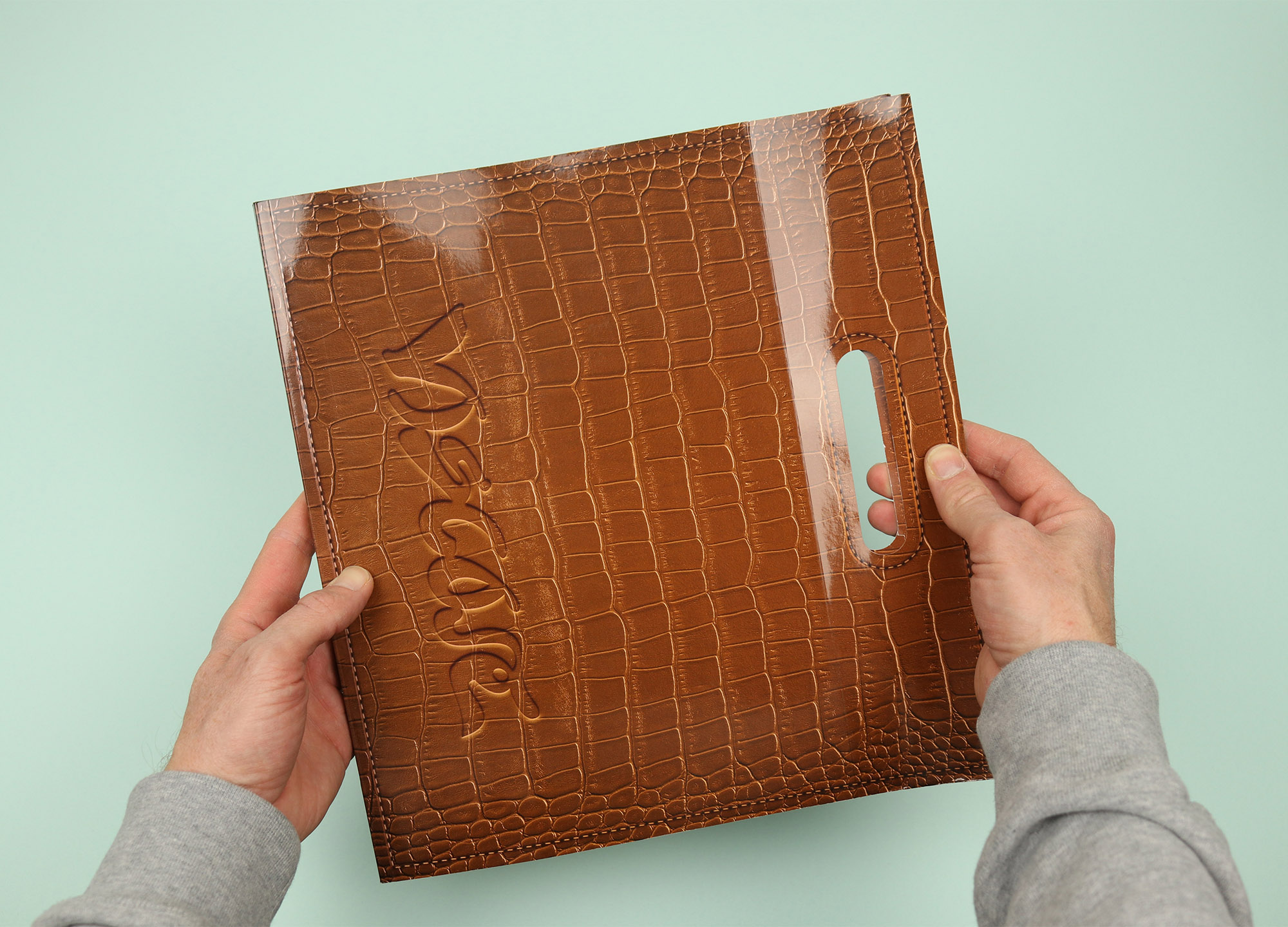
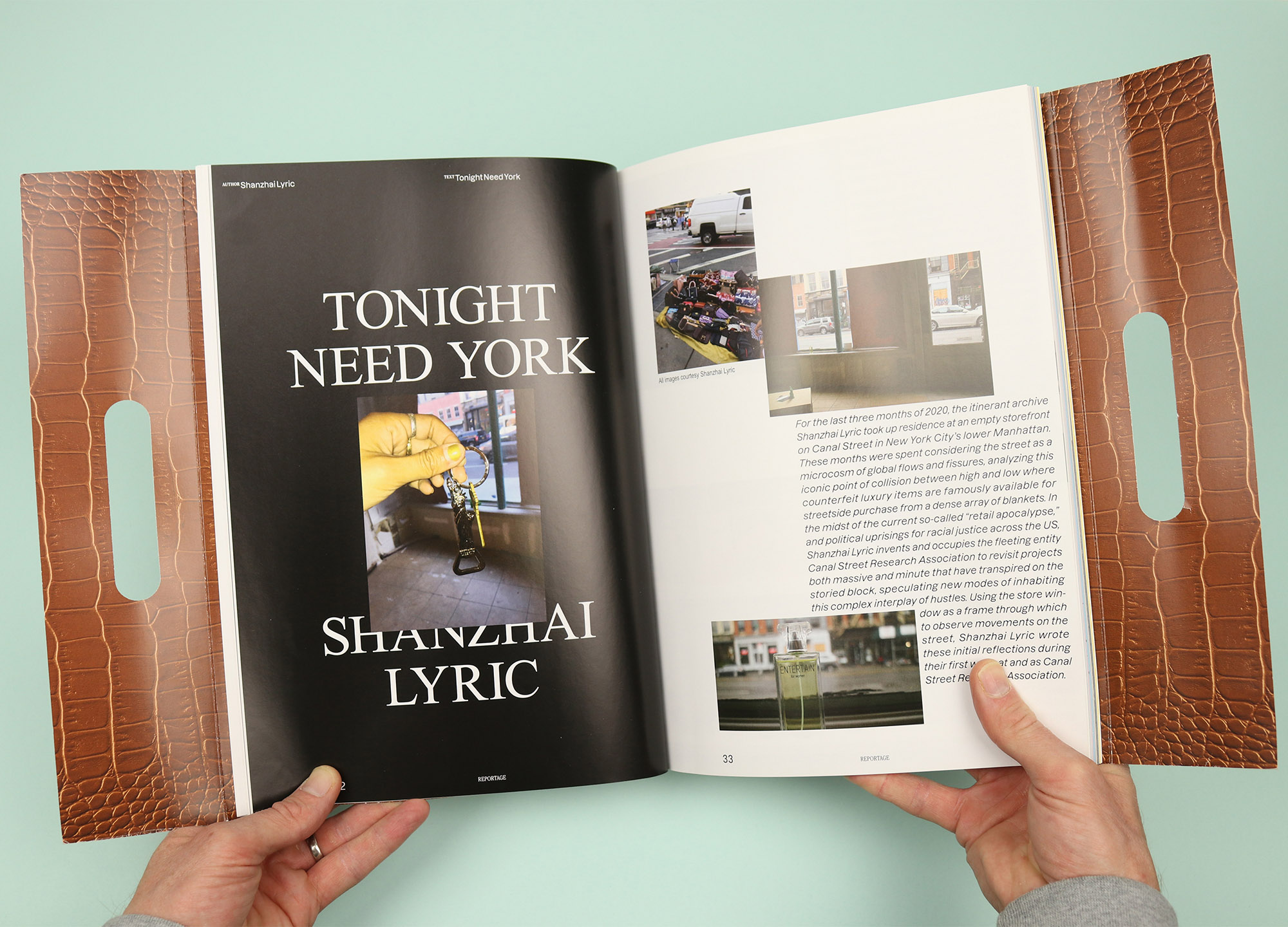
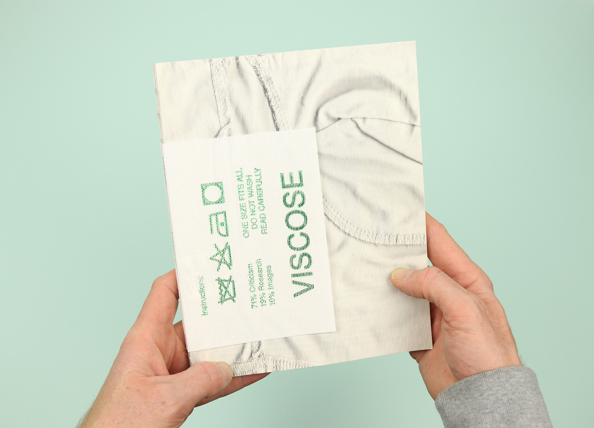
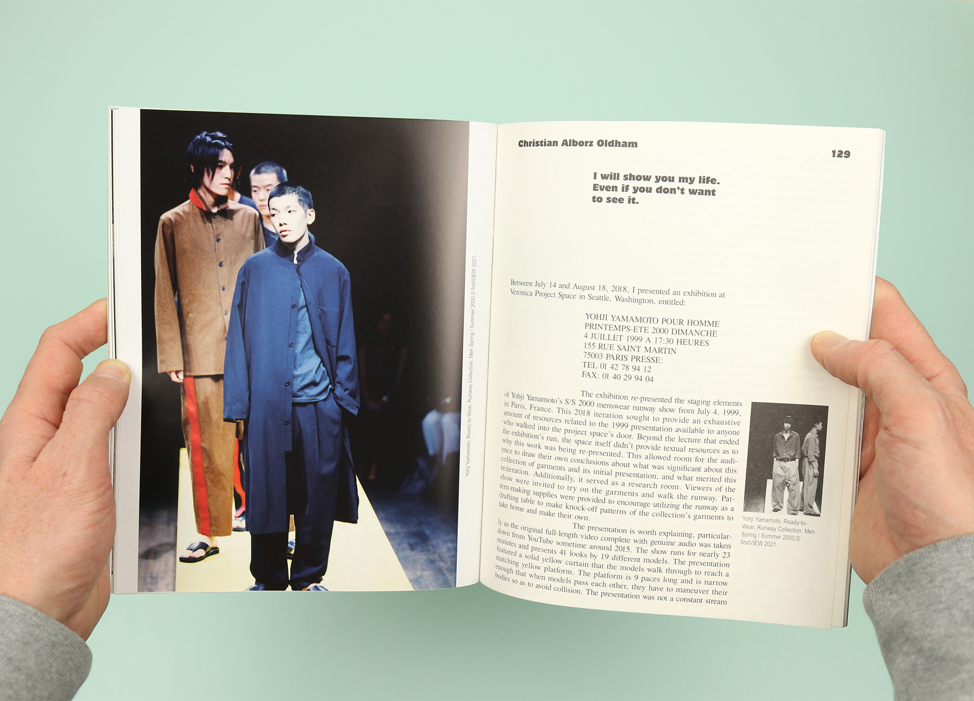
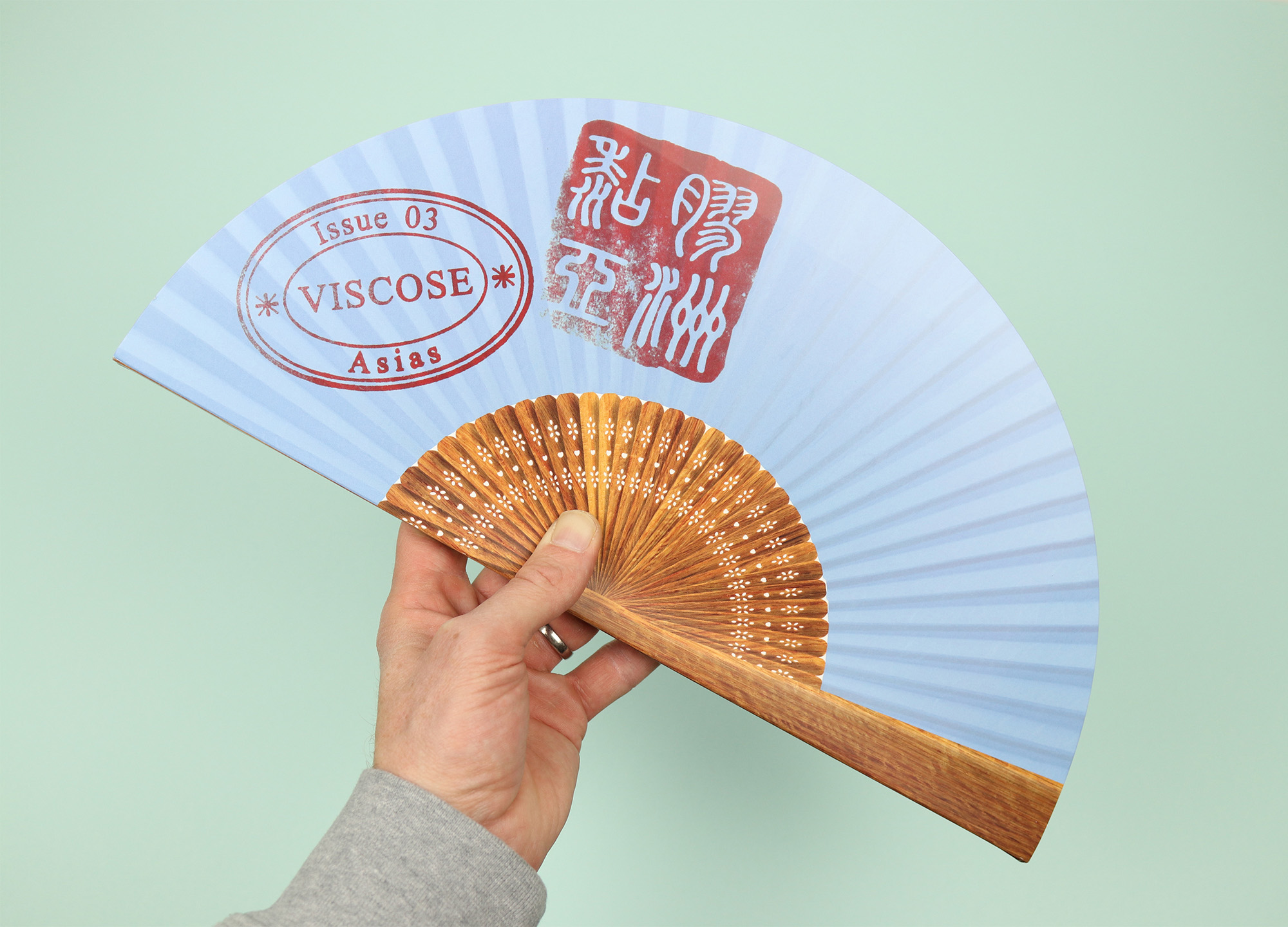
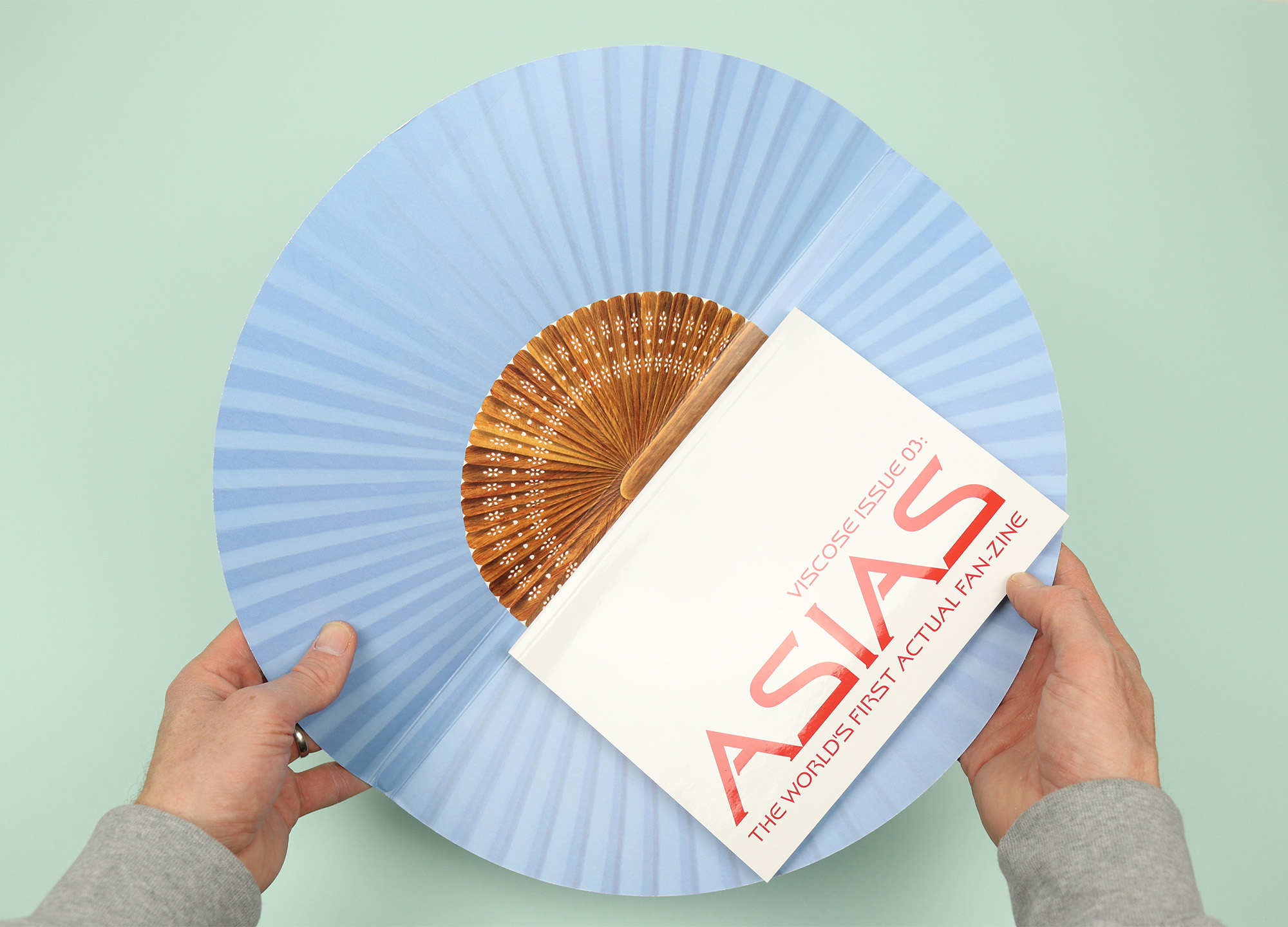
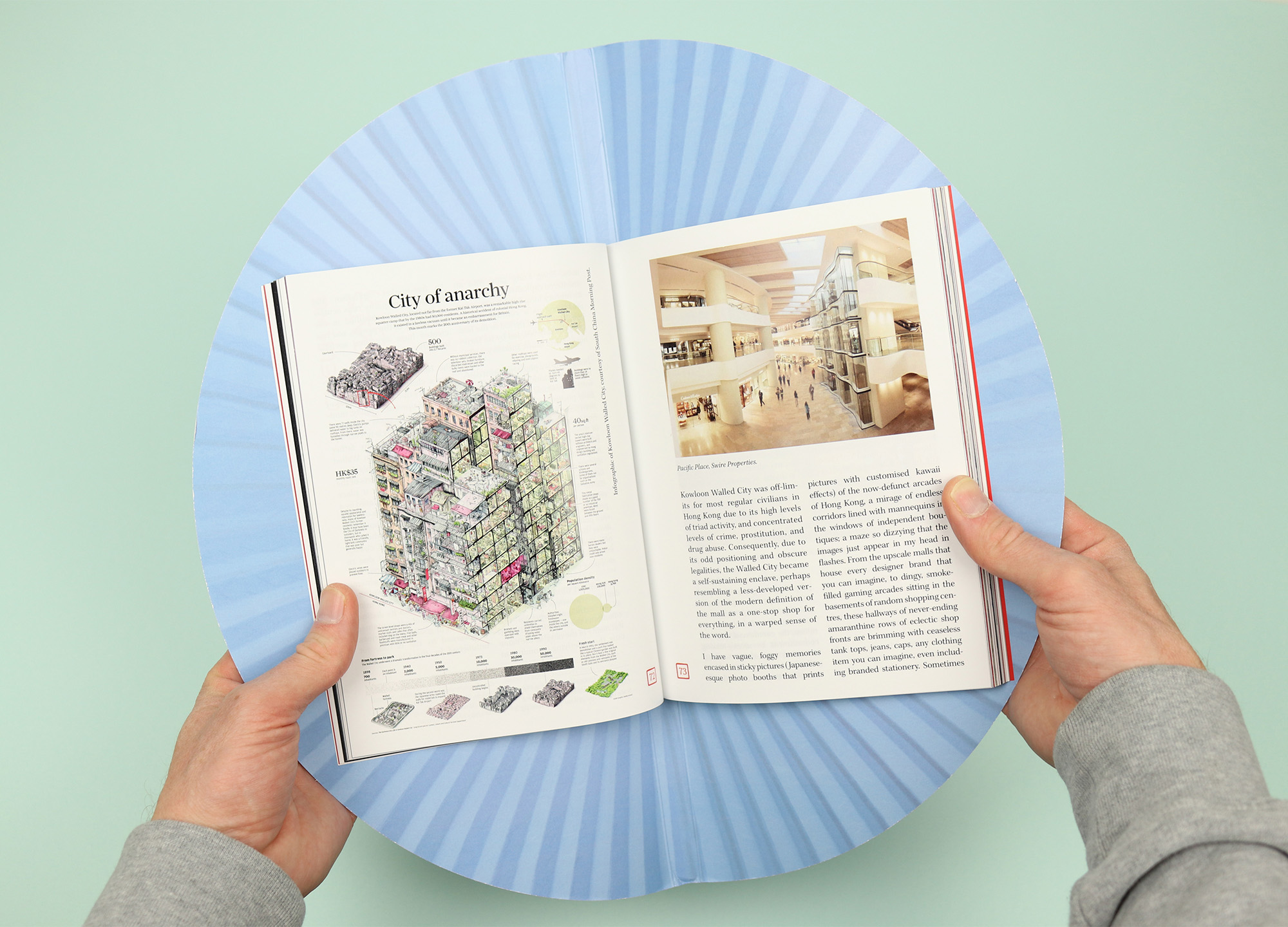
The most adventurous shape-shifting magazine in our collection is Viscose. A critical fashion title based in Ribe, Denmark, it looks closely at themes running through the fashion world, and is published with a sly sense of humour and a love for punning and wordplay. The first issue was presented as the “bagazine”, with a leather-effect cover and a handle cut out of the cover stock, while the third issue was the self-titled, “world’s first actual fan-zine”, with its fan-shaped case alluding to the theme of ‘Asias’, examining different notions of Asian style and fashion.
These production flourishes help the magazine to stand out on the newsstand (can you imagine how awkward it must have been to display the fan issue on a shelf?) but they also encapsulate something of the magazine itself. All three of the issues are interested in understanding fashion as the object that is produced, fetishised and sold, and I think it’s significant that they mirrored that process in creating the magazine itself. The punning joke also works well with the tone of the magazine, which reads as serious and carefully considered throughout, while also acknowledging the ridiculous superficiality that runs through so much of the fashion world.
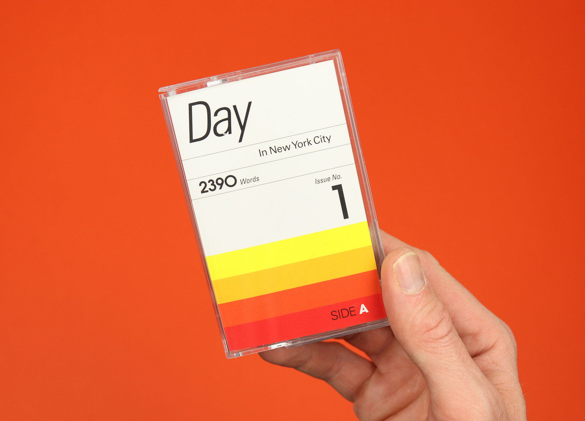
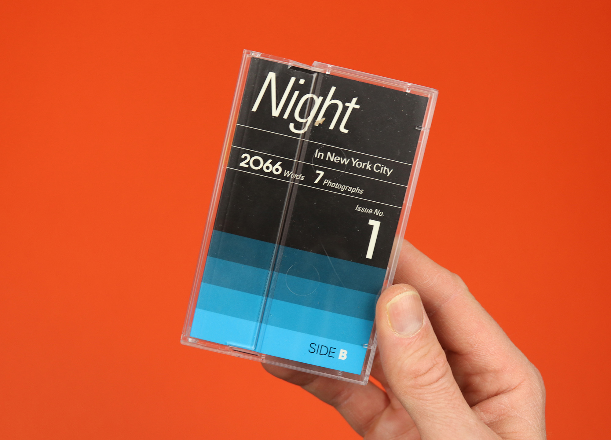
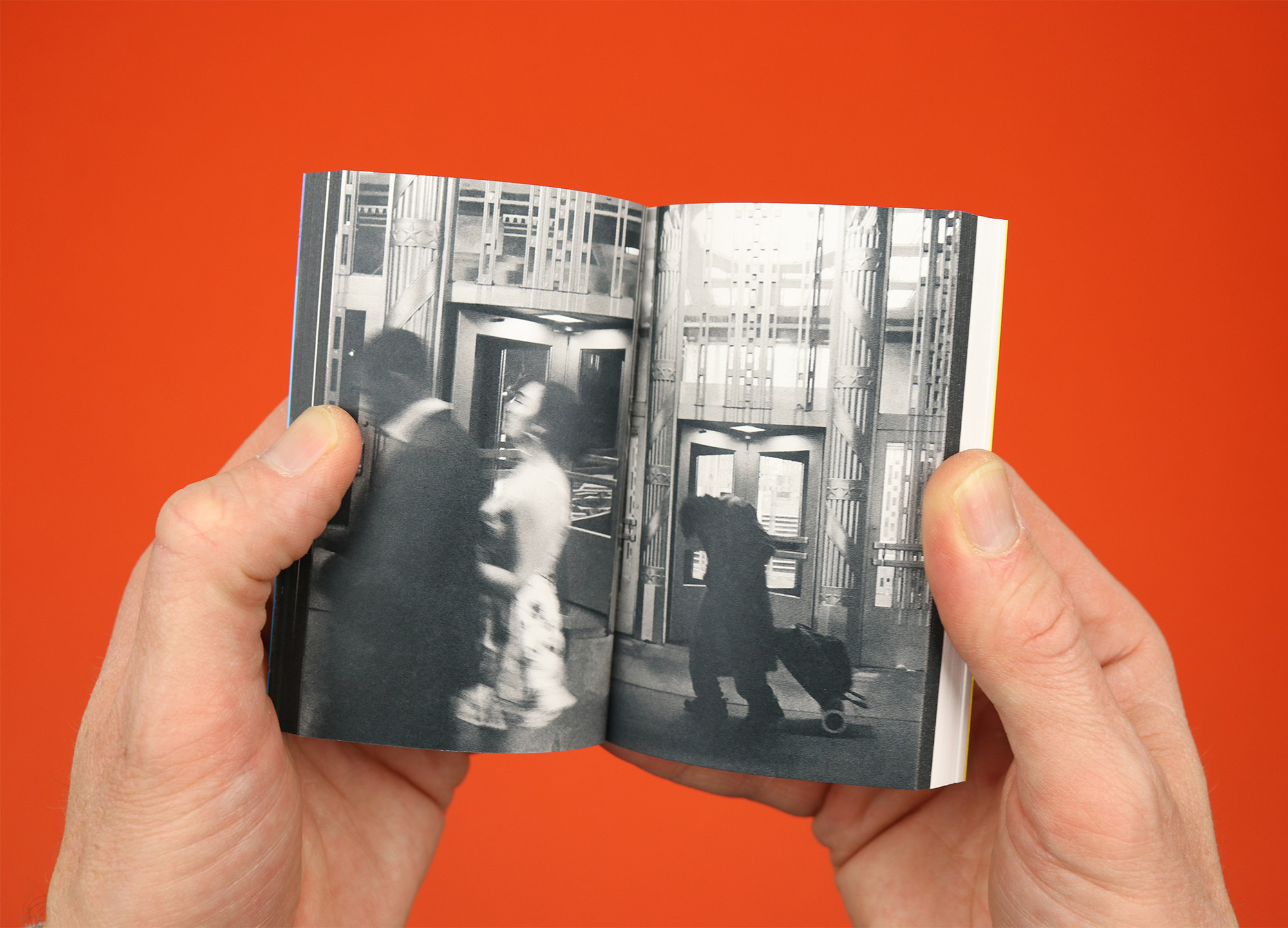
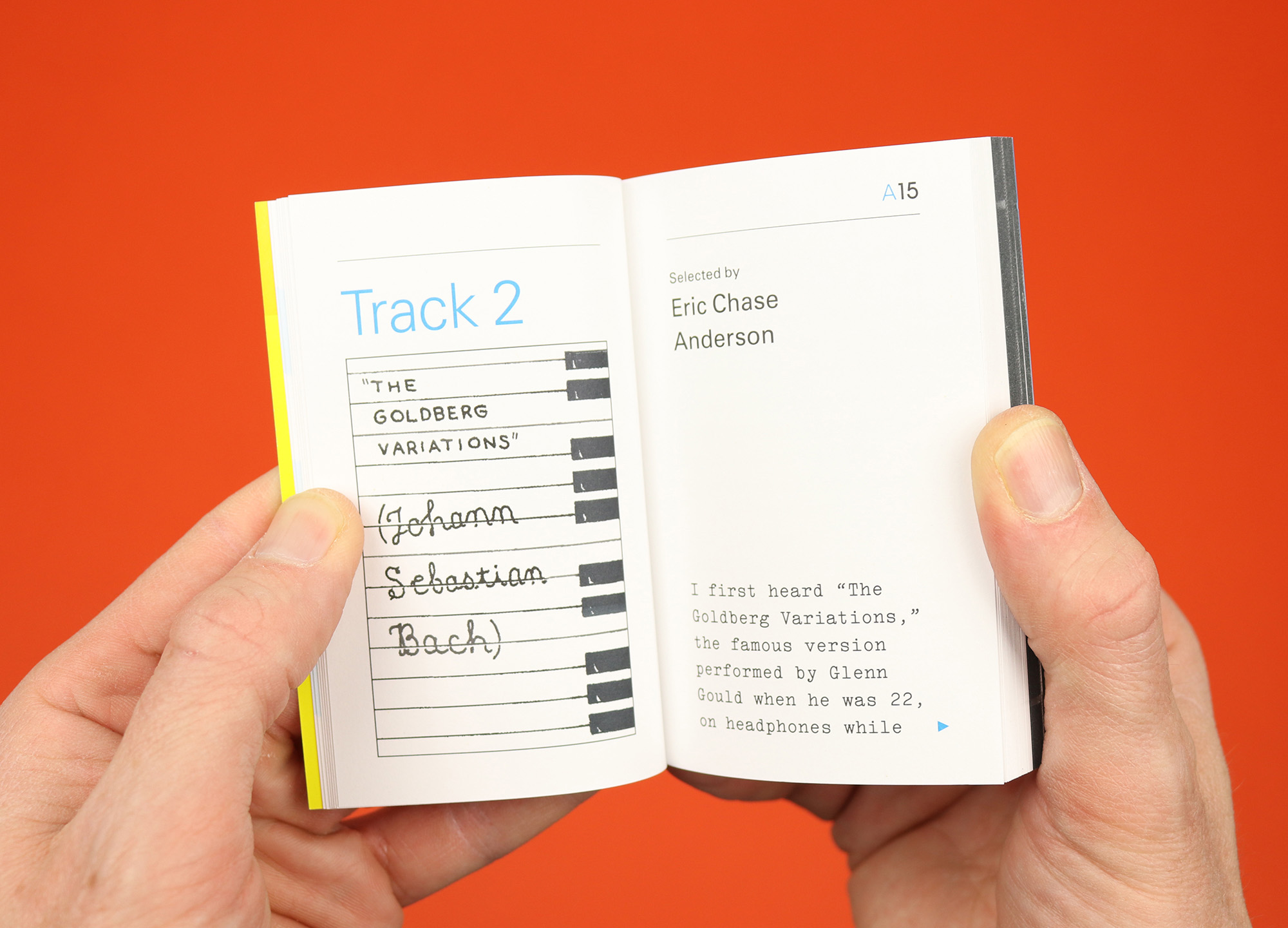
Day + Night
“Liner notes for a New York City mixtape”, Day + Night is made to fit inside a cassette tape case, and presents seven songs for daytime and seven songs for nighttime in the city. Each song is selected by a different contributor, and everyone gets a few pages to explain their choice or provide a bit more context on the song. The magazine is split in half, with effectively two front covers, so you can read the daytime contributions, then flip over to read nighttime and vice-versa, and it feels like the perfect format for the concept: A short and sweet read that’s enough to give you a glimpse of somebody else’s life and evoke some sense of being in New York, it manages to feel precious and personal in the way a real mixtape does.
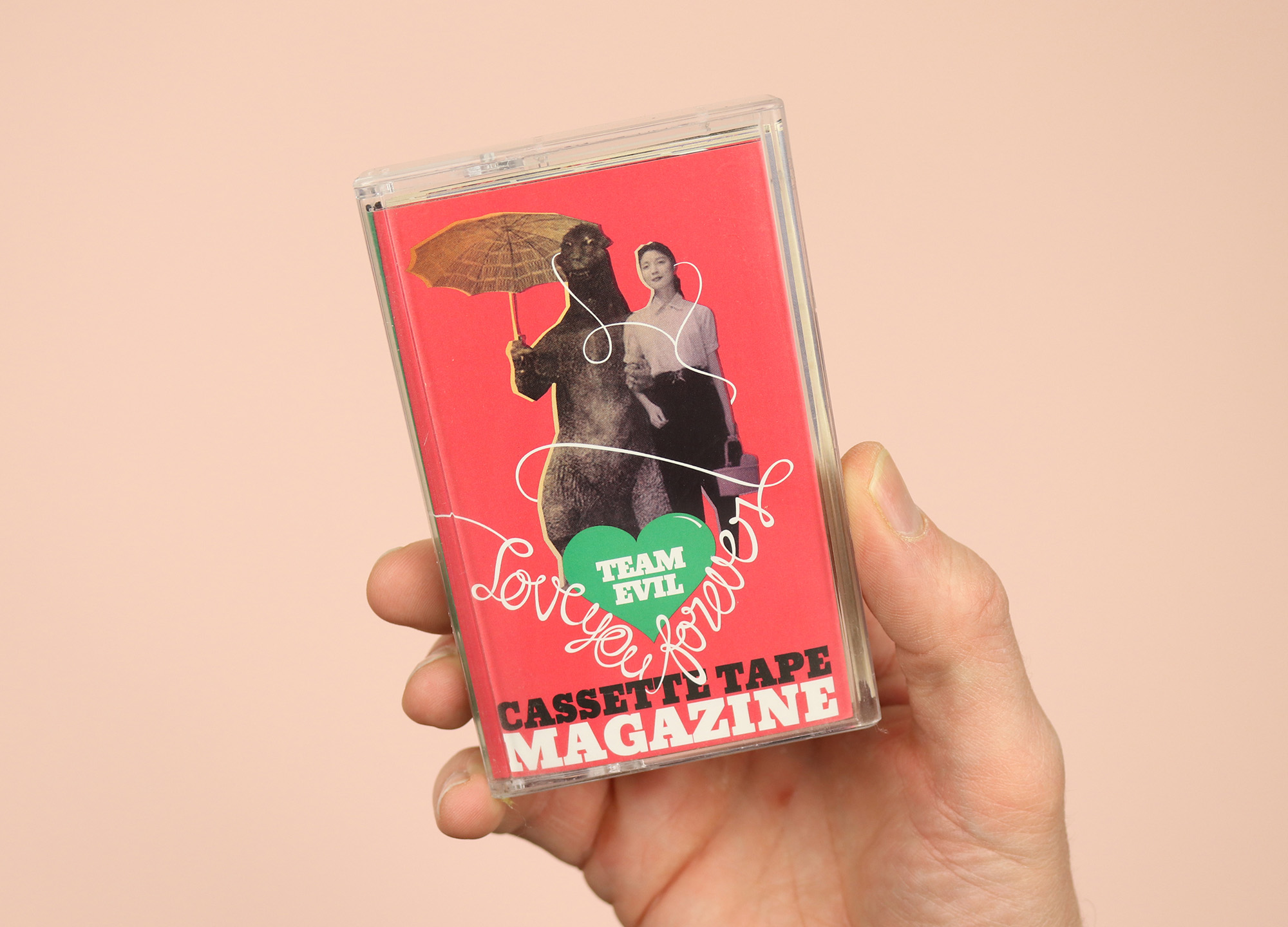
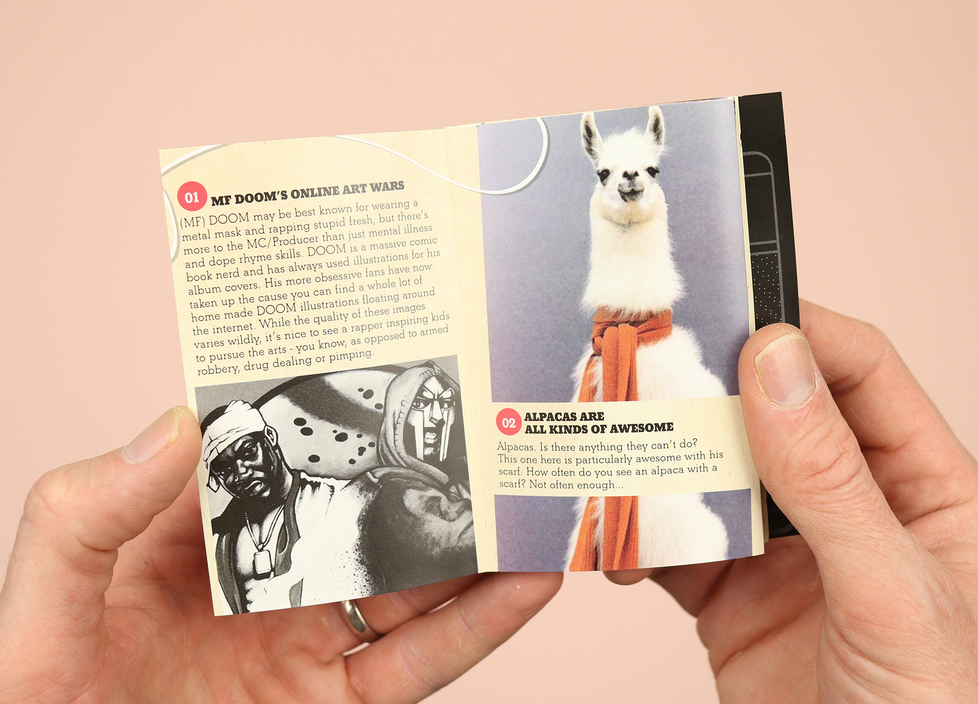
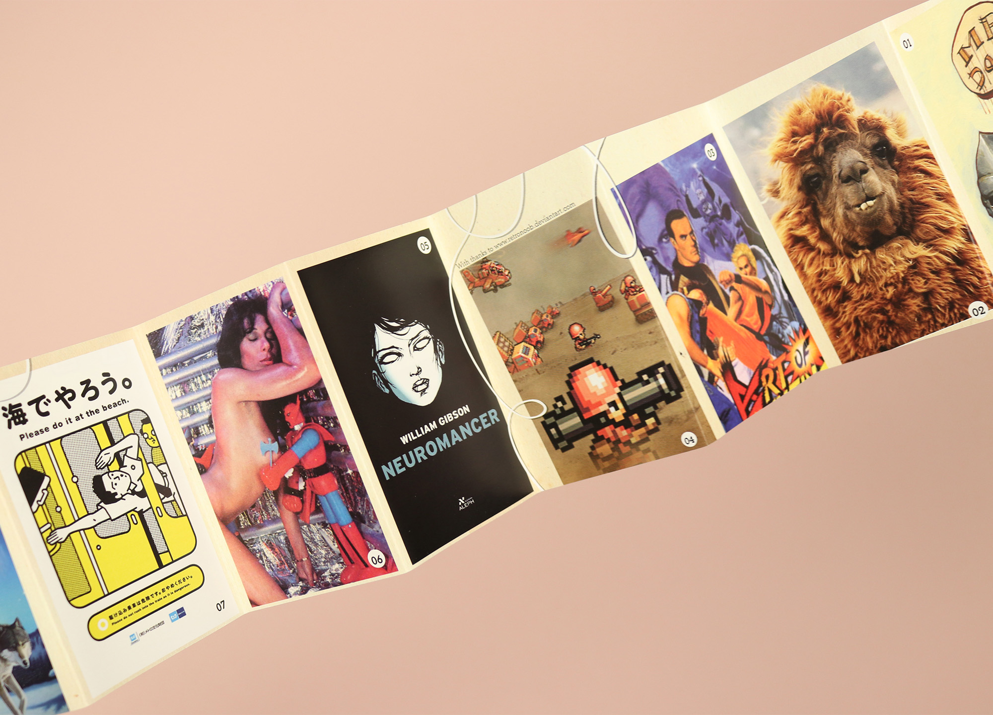
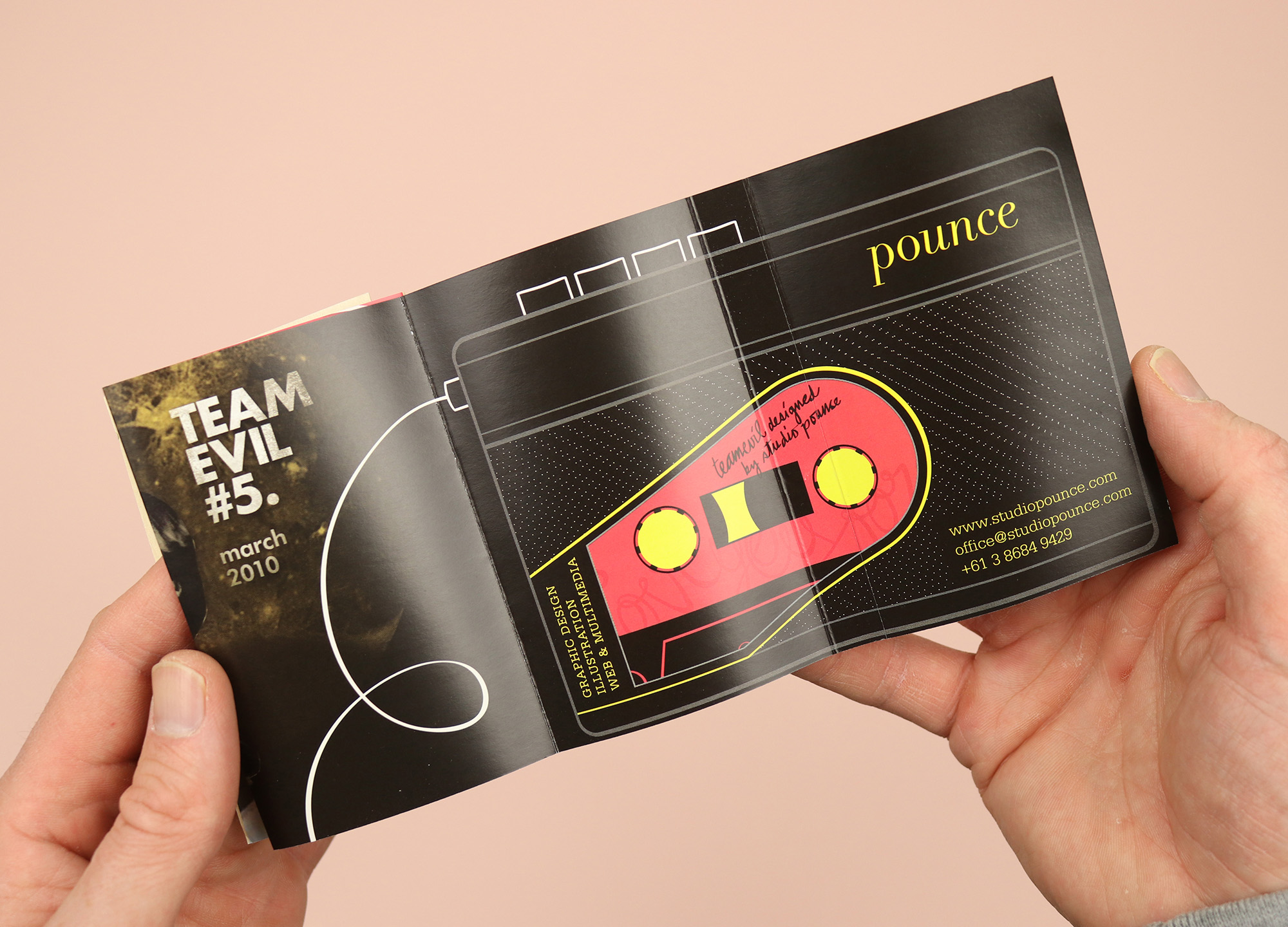
Cassette Tape Magazine
Another magazine squeezed into a cassette tape case, this collection of pop-cultural observations was published in 2010 by Melbourne’s Team Evil, adapting pieces that had been published online and printing them on a long concertina format that folds out with short pieces of text on one side and images on the other. In the introduction editor Mikolai remembers his schooldays, when “a mixtape was the quickest way to someone’s heart… This project has exactly zero to do with mixtapes, and very little to do with picking up girls. It does, however, have a whole lot to do with producing something you can hold in your hand.” And it worked – the Team Evil site has disappeared, but 13 years on Cassette Tape Magazine still has its place on our shelves.
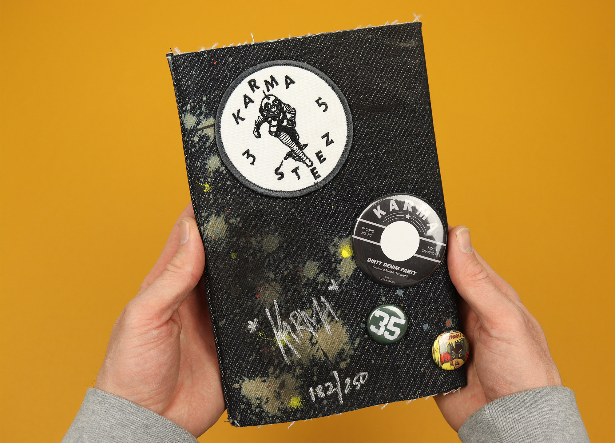
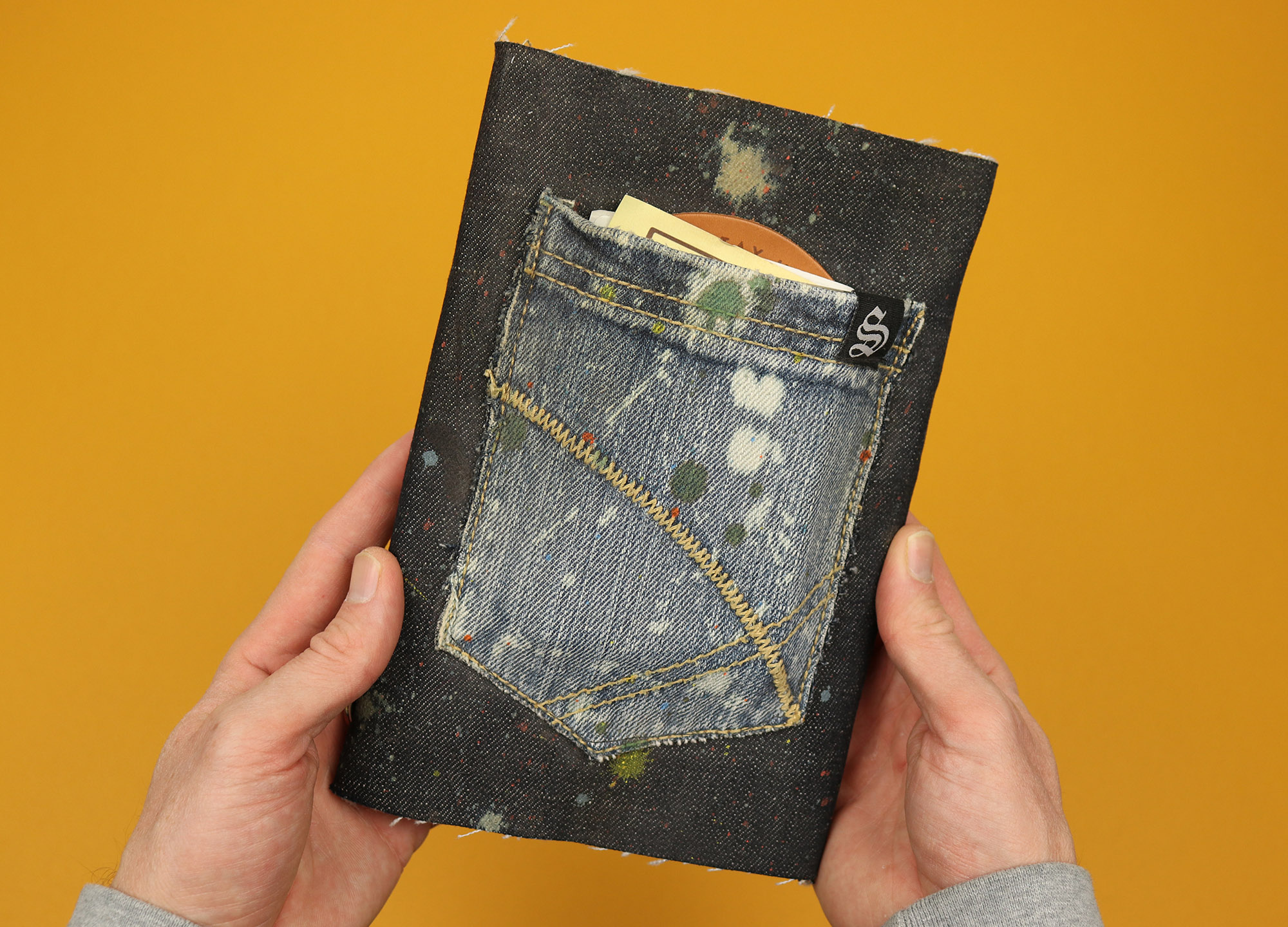
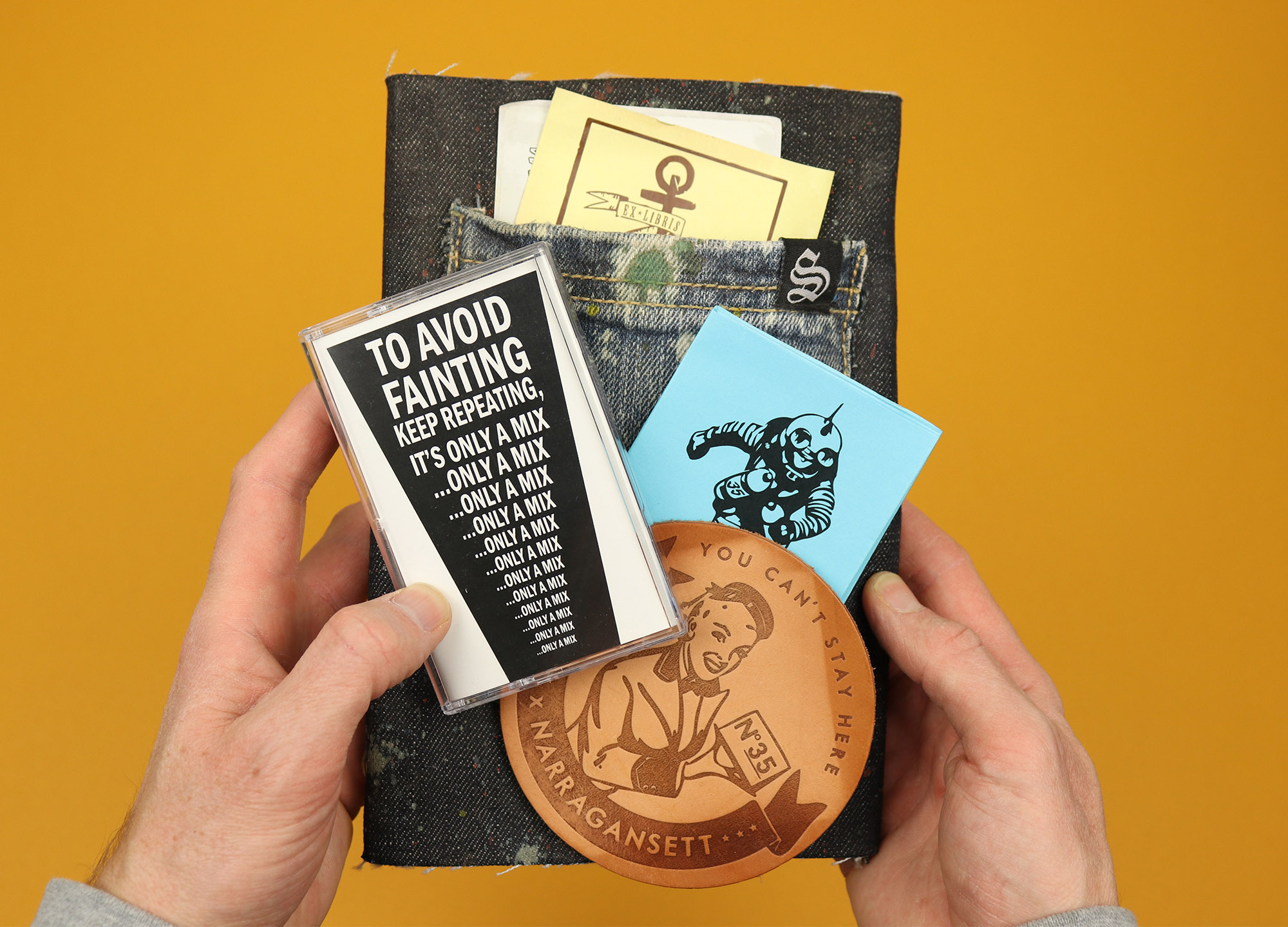
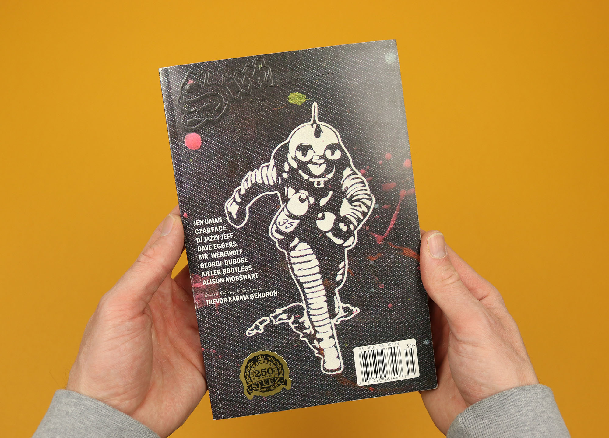
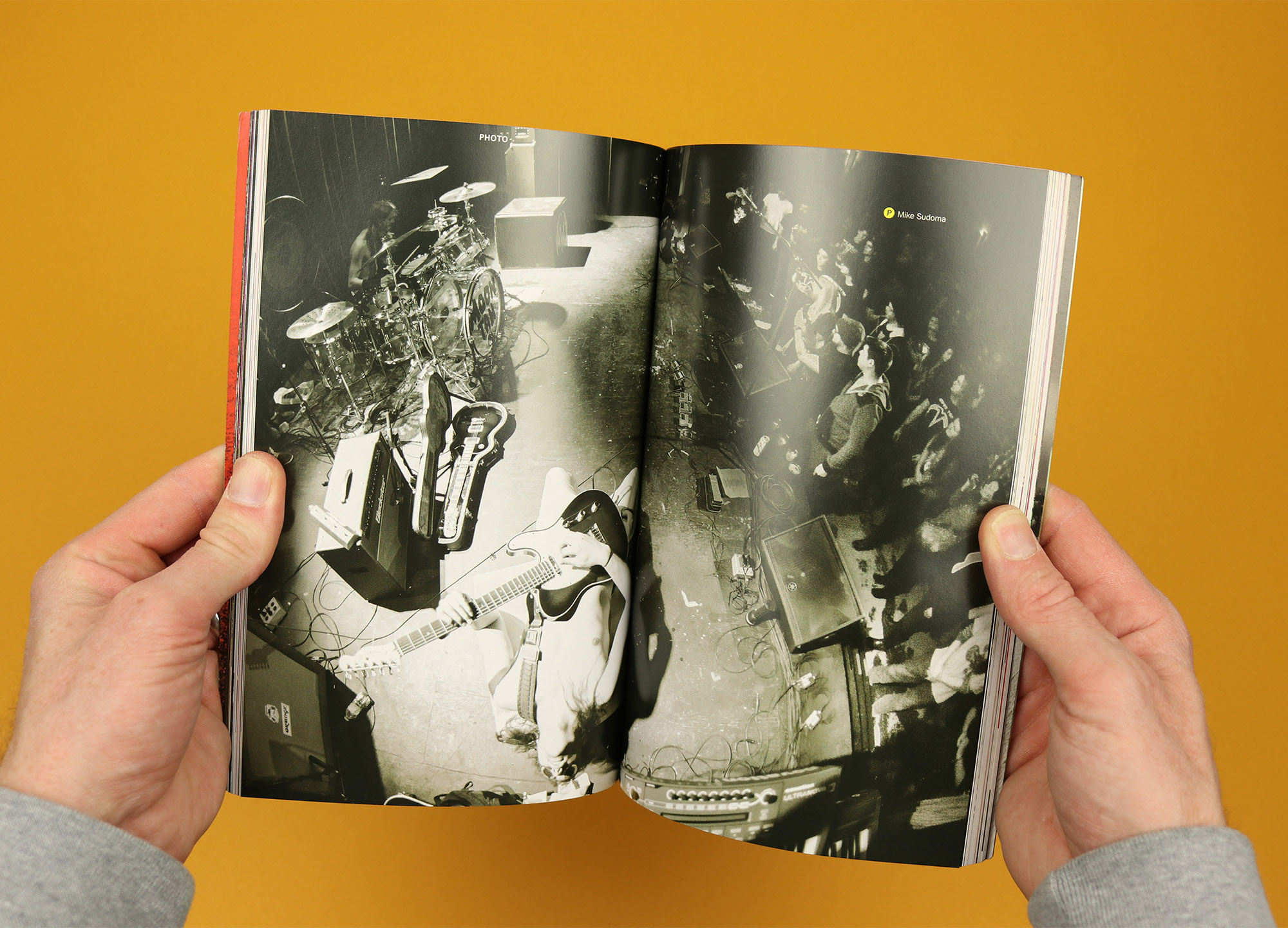
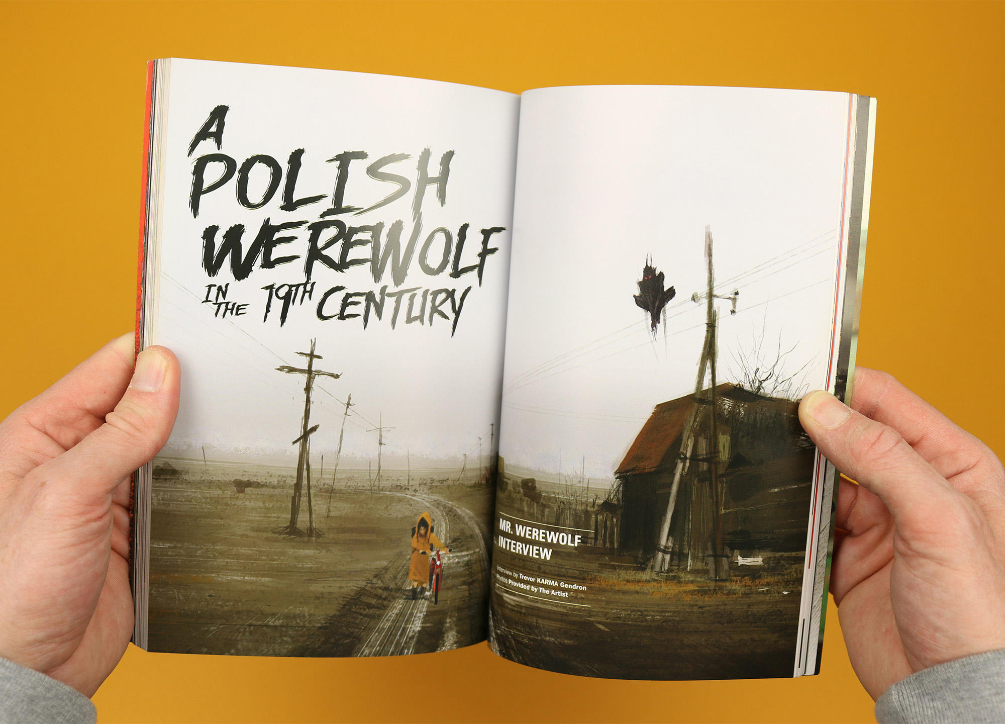
Steez
Issue 35 of Steez came tucked into its own denim slipcase, featuring badges, a patch, and a back pocket stuffed full with stickers, a leather beer coaster, and a cassette mixtape (a real actual cassette this time). It’s a brilliantly exuberant, totally over-the-top celebration of the magazine and the community that had grown up around it, and I think it was also intended as a farewell – the 35th issue was the last one Steez published.
The magazine cover has a denim design that ties it into the slipcase, but more than that the jeans pocket seems to symbolise what Steez was all about; crammed with skaters, rockstars, DJs and artists, it was a celebration of lowbrow pop culture that overflowed with enthusiasm for its subject, in the same way the custom-made ephemera spills out of the pocket, feeling lived in and made with genuine love.
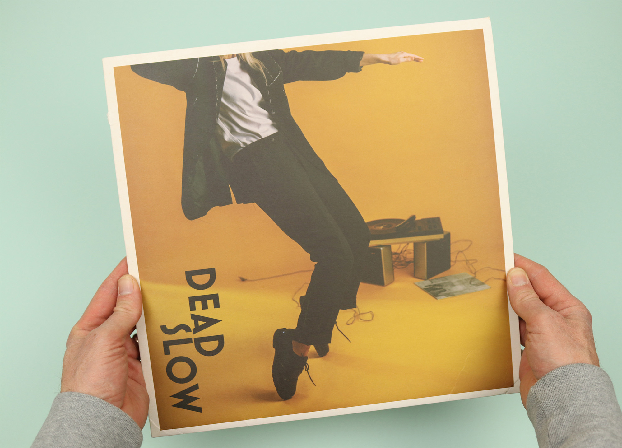
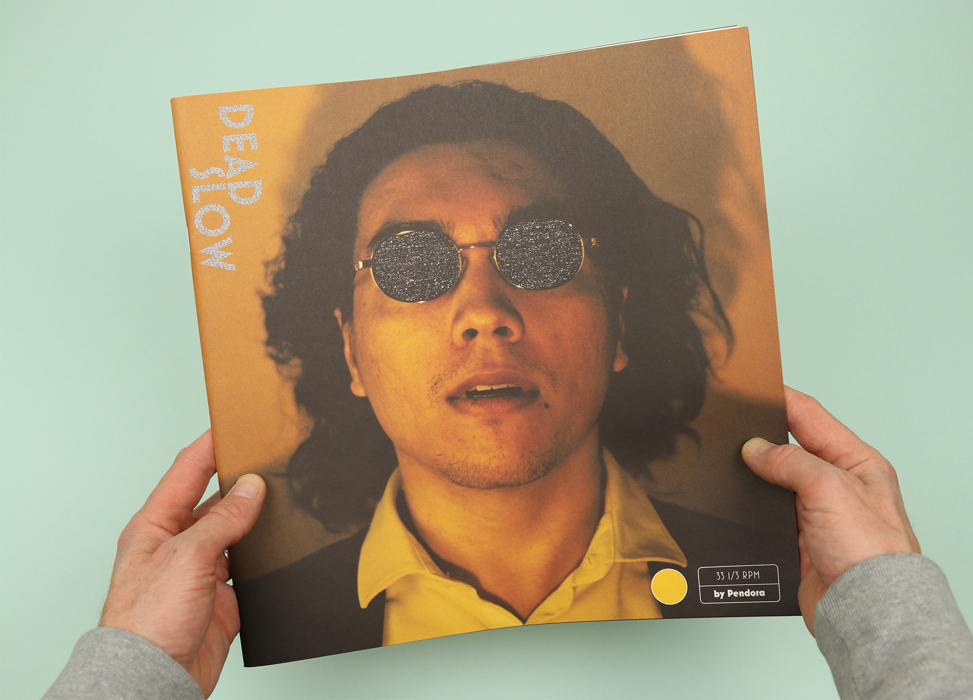
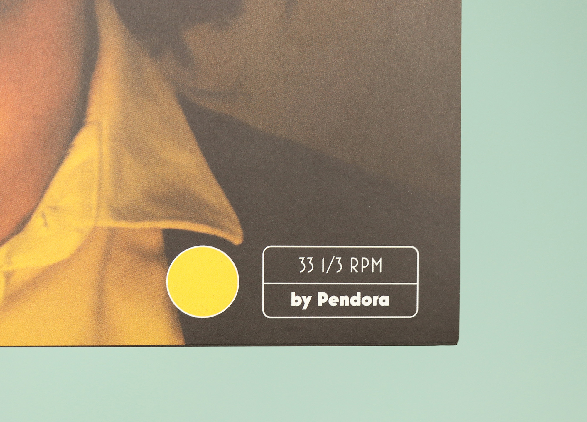
Dead Slow
When I started thinking about this post I assumed there were going to be loads of magazines that dressed themselves up as vinyl records, but when I started searching the shelves the only one I could find was Dead Slow. It comes packaged in a slipcase, and makes use of several vinyl references, like the 33 ⅓ RPM on the cover and the idea of splitting the magazine in half and labelling them Side A and Side B.
The whole magazine is dedicated to the idea of slowing down and escaping from digital overload into the more deliberate pleasures of the physical, analogue world. In that sense the vinyl stylings suit the content, but of all the examples gathered here I think Dead Slow’s skeuomorphism feels the most awkward, the two ‘sides’ of the magazine not reflected in the content and the vinyl references functioning as stylistic quirks rather than something that runs deeper through the magazine.